


Pattern Play: Masculine Ruggedness, Modernized
4 designer tips make mixing fabric patterns fun

Using patterns is often near the top of the list of homeowner design concerns. Suggest using multiple patterns together and some nearly have an anxiety attack! There are a few simple rules you can follow to ease the scare factor of mixing patterns.
1. Start with one print you really love. The more color in it, the easier time you will have pulling in other colors and patterns. Let it guide you!
2. Use your initial print for your color palette. If your print has grey, green and blue in it then for the next print look for a blue and white or a combination of just a couple of the colors. Colors do not have to match exactly they just have to blend well with the eye.
3. Vary the style of the patterns. If you started with a floral then your next pattern could be a stripe, plaid or geometric. You can also still mix another floral in but they need to be different types of florals. for example, a two toned floral with a mixed colored floral.
4. Vary the size of the patterns. You want a mix of small, medium and large scale when mixing patterns. If all your prints had the same sized scale on it, your eye would not know where to look and nothing would stand out.
The combination reads slightly masculine to me, and that is the look I was going for with this set.
Try to think about what your prints are saying. Are they reading feminine, traditional, or whimsical? Is your floral looking more island like than country cottage like?
Next, see these patterns up close.
Try to think about what your prints are saying. Are they reading feminine, traditional, or whimsical? Is your floral looking more island like than country cottage like?
Next, see these patterns up close.
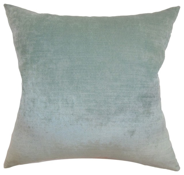
DwellStudio Fabric Plush Dotscape Dove
The plush dot added a bit of sheen which I loved against the mattes of the other linen-like fabrics.
Home Decor Signature Series, Vinyl Crock Desert
Although this croc pattern could be used as pillows, it would probably suit and ottoman or bench better.
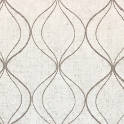
Jaclyn Smith Jasso, Oatmeal
Instead of using a solid fabric, I chose those diamond stitched pattern with small bead for just a little more interest.
The color I used in the photos was actually Caramel where as this link shows Oatmeal.
The color I used in the photos was actually Caramel where as this link shows Oatmeal.
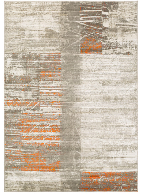
Croscill Abilene, Cliffside, Heather
The houndstooth has a great blend of grays with a touch of a warmer taupe-like tone.
Next, see a room where this pattern mix could work well.
Next, see a room where this pattern mix could work well.
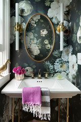
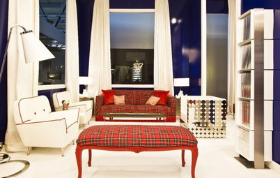
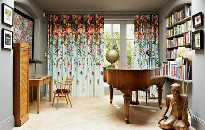
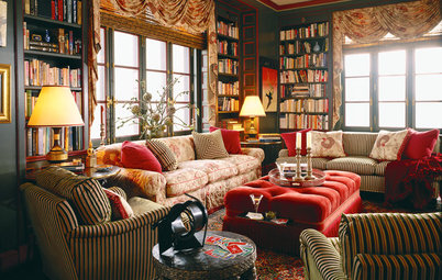
Here is an example of the type of room where the above pattern mix look could work very well. It's a gorgeous space that could read both masculine and feminine.
Let's imagine using our fabrics in a space like this:
Crocodile: Would work well on the bench at the end of the bed.
Snake-Chain: Could be really fun to use as the drapes behind the bed.
Diamond: Could work well on the Roman shades
Polka Dot & Houndstooth: Would look great used as throw pillows.
Next, see more great uses of patterns in interior design:
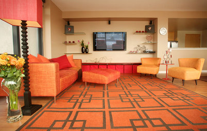
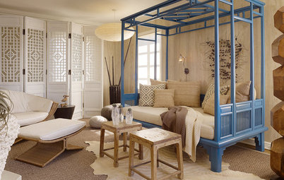
Here's a great mix of a large-scale floral with a medium-scale geometric. The quilted fabrics provide a small pattern and texture.
At first you see a lot of solid used in this room, but at a closer look, you'll see the sheets have a small pattern. The addition of the camel throw and wooden bedside lamps added just enough warmth to a mostly gray room.
Repeating a pattern in the drapes and throw pillows save this room from pattern overload. The large-scale medallion print on the benches was just the right amount of additional pattern mixed in.
More: Design Tips from the Countess of California Cool
Mixing and Matching Bed Linens
How to Layer Patterns Right
More: Design Tips from the Countess of California Cool
Mixing and Matching Bed Linens
How to Layer Patterns Right
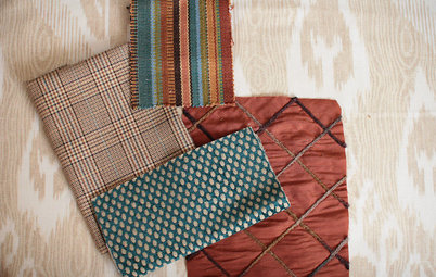
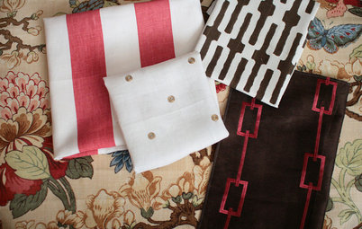
Here's how I used my rules of thumb to come up with this pattern palette:
1. My starting print. I started with the snake-chain pattern, then chose the big polka-dot pattern. Both are large-scale patterns, but there is still enough contrast between the patterns because the dot is dark, with a heavy texture, and the snake has a light linen texture and well as color.
2. Build the color palette. The snake-chain pattern has a very subtle caramel color in it. This gave me the ability to pull that color in using the diamond pattern and the crocodile. I really like mixing in some warmth whenever I use grays.
3. Vary the style. The crocodile pattern almost reads as a solid rather than pattern but its texture adds depth and interest. I originally tried this with a more uniform snakeskin pattern, but it just looked flat. The croc added more richness.
4. Vary the size of the pattern. The houndstooth I found last. This gave me a smaller pattern to mix in. I also liked it because it was a little unexpected and it had a nice range of grays. There were darker shades to pull in my polka dot and lighter to pull in my snake-chain pattern.
I also like to think in terms of shapes when choosing fabrics. I did use a lot of geometrics, but in this case they seem to work well. The snakes have a softer curve, the polka dot a more solid of a curve and then the diamond a very straight angle that acted more as a texture.