
Refinished Cabinets Give a Row House Kitchen a Fresh Look
A designer updates the cabinets, counters, lighting and appliances without changing the footprint

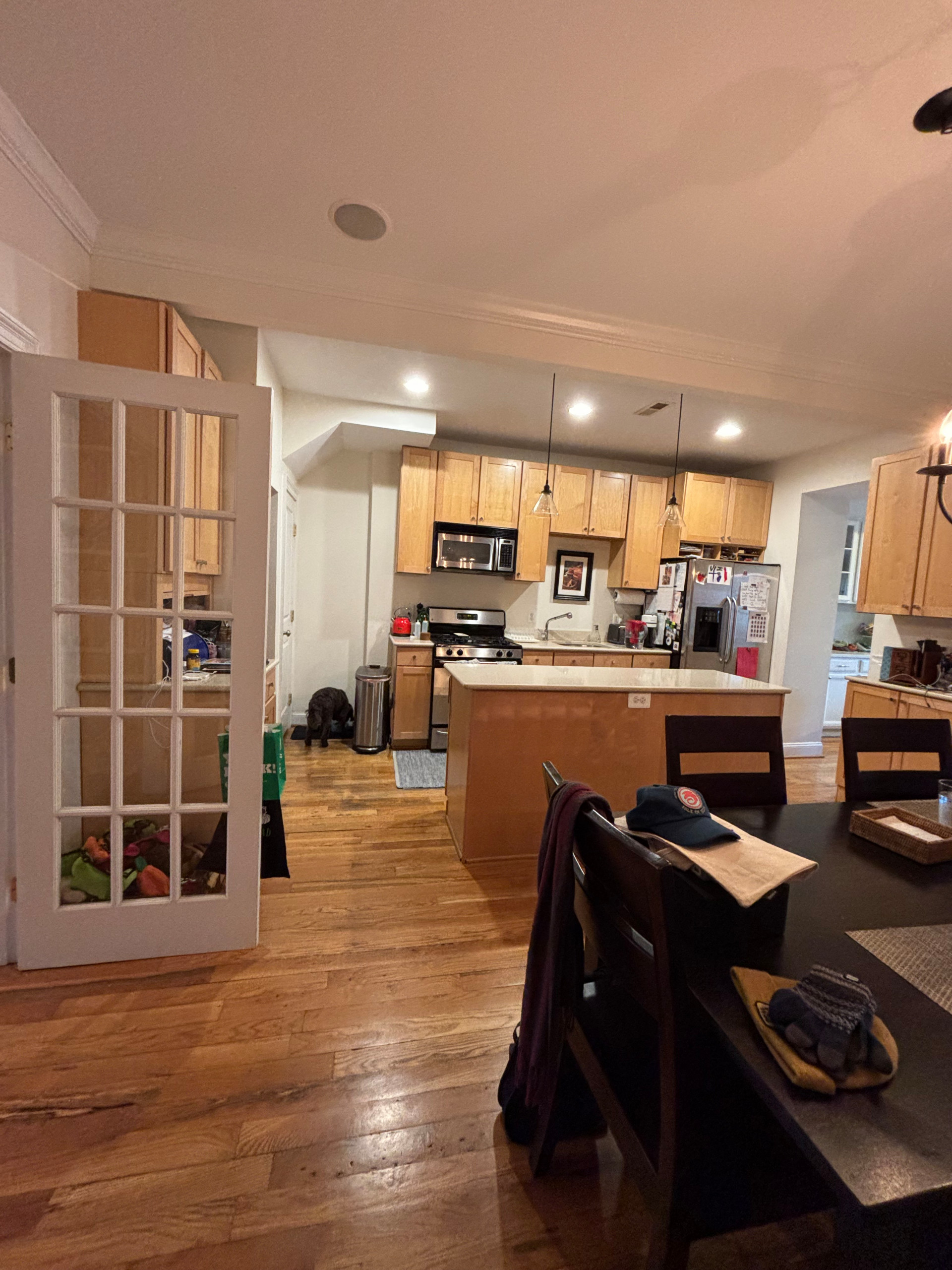
This couple and their young daughter had lived in their Washington, D.C., row house for 10 years when they asked designer Heather DiSabella to improve the home’s function and give it a more polished look. The compact kitchen was a prime opportunity, with plain maple cabinets, beige solid-surface counters and a simple island that connected the space to a dining area.
Without moving walls or adding cabinetry, DiSabella gave the kitchen a fresh new look. She refinished the existing cabinets in a light, warm greige and added honey-bronze knobs and pulls. A durable quartz now covers the counters and full-height backsplash, with a waterfall edge giving the island a streamlined finish. Tambour oak paneling on the island adds warmth and texture, while upgraded appliances and a newly stained wood floor further brighten the space. In the adjoining dining area, green botanical wallcovering brings a lively dose of pattern.
Without moving walls or adding cabinetry, DiSabella gave the kitchen a fresh new look. She refinished the existing cabinets in a light, warm greige and added honey-bronze knobs and pulls. A durable quartz now covers the counters and full-height backsplash, with a waterfall edge giving the island a streamlined finish. Tambour oak paneling on the island adds warmth and texture, while upgraded appliances and a newly stained wood floor further brighten the space. In the adjoining dining area, green botanical wallcovering brings a lively dose of pattern.
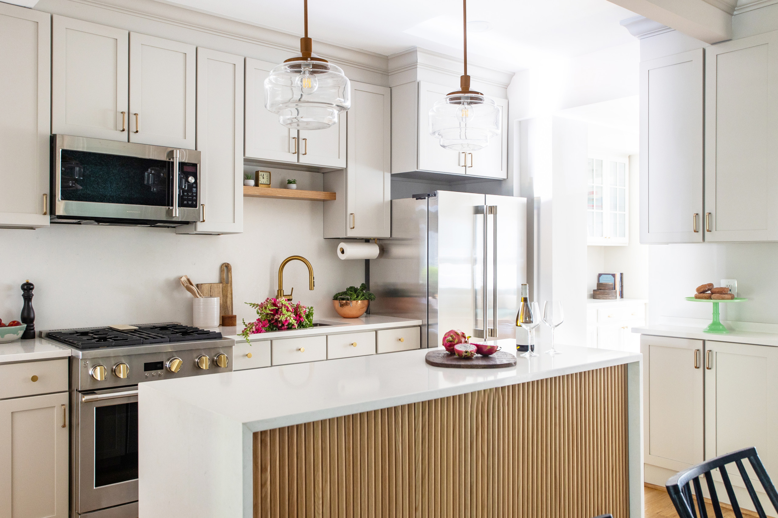
After: A soft, warm greige paint (London Fog by Benjamin Moore) on the existing wood cabinets refreshed the kitchen and brightened the space. New molding along the tops gives the cabinets a more finished look. “What we were trying to do was make it feel more customized,” DiSabella says.
Honey-bronze knobs and pulls add a touch of glam to the painted cabinets. “The warm tone of the metal against the lighter cabinetry gives it a nice touch,” DiSabella says. “We also like to do a variation with knobs and pulls to break up the monotony.”
A soft-white, limestone-look quartz became another key update, covering the perimeter counters, full-height backsplash and new waterfall edges on the island. The light surface helps brighten the compact kitchen, while its subtle pattern works well with the family’s needs. “They wanted something durable for a family environment but didn’t exactly like the look of faux marbles,” DiSabella says. “This one has a more simple pattern but still hides little crumbs and those things you get with children in the house. Cost was also a factor here. All of these selections were done with the budget in mind.”
Oak tambour paneling on the island base adds warmth and texture. “The island before had a bit of an overhang to it, but because this space is so narrow they weren’t using it for seating,” DiSabella says. “We decided as a group instead of forcing chairs there, we would eliminate that function since they have the dining table with seating nearby. It adds a nice decorative element and texture there that they didn’t have before.”
Paint colors: Pale Oak (walls), Chantilly Lace (trim) and Muresco in Ceiling White (ceiling), Benjamin Moore
Find a kitchen designer on Houzz
Honey-bronze knobs and pulls add a touch of glam to the painted cabinets. “The warm tone of the metal against the lighter cabinetry gives it a nice touch,” DiSabella says. “We also like to do a variation with knobs and pulls to break up the monotony.”
A soft-white, limestone-look quartz became another key update, covering the perimeter counters, full-height backsplash and new waterfall edges on the island. The light surface helps brighten the compact kitchen, while its subtle pattern works well with the family’s needs. “They wanted something durable for a family environment but didn’t exactly like the look of faux marbles,” DiSabella says. “This one has a more simple pattern but still hides little crumbs and those things you get with children in the house. Cost was also a factor here. All of these selections were done with the budget in mind.”
Oak tambour paneling on the island base adds warmth and texture. “The island before had a bit of an overhang to it, but because this space is so narrow they weren’t using it for seating,” DiSabella says. “We decided as a group instead of forcing chairs there, we would eliminate that function since they have the dining table with seating nearby. It adds a nice decorative element and texture there that they didn’t have before.”
Paint colors: Pale Oak (walls), Chantilly Lace (trim) and Muresco in Ceiling White (ceiling), Benjamin Moore
Find a kitchen designer on Houzz
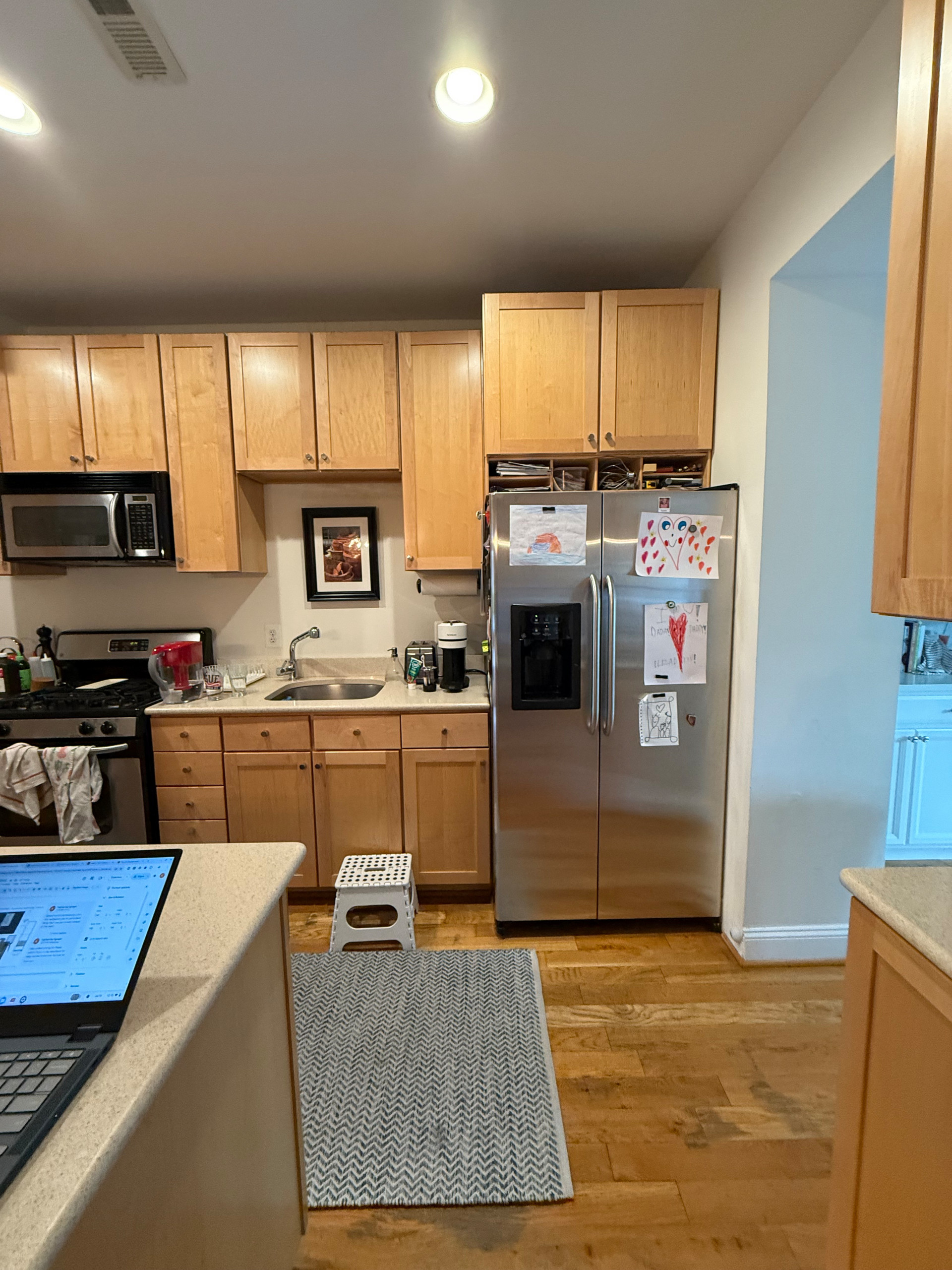
Before: The existing appliances were another candidate for improvement. “They were kind of old and at the end of their life cycle, so it was a good time to update,” DiSabella says.
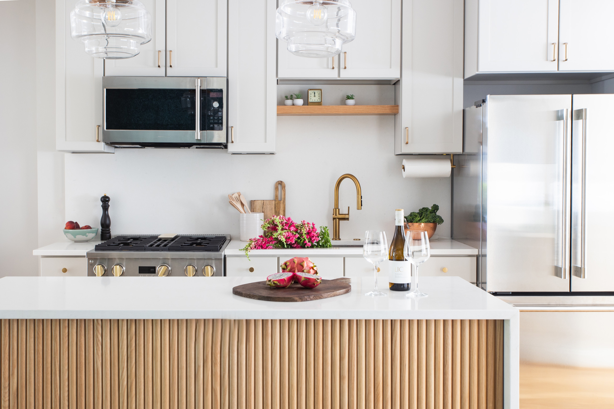
After: A new counter-depth stainless steel refrigerator, gas range and microwave update the kitchen and give the homeowners more flexibility for cooking and entertaining. “They wanted to make their home a place to entertain,” DiSabella says. “We wanted to give them a space where they could do that.” The existing dishwasher was incorporated into the updated island across from the sink, where it was before.
New under-cabinet lighting brightens the work areas, while a floating wood shelf above the updated sink and faucet adds storage and warmth. “It brings in a different texture and color for that back wall,” DiSabella says. “You can also put a plant there or salt and pepper shakers.”
Appliances: GE Monogram
Before and After: 4 Bright White-and-Wood Kitchens
New under-cabinet lighting brightens the work areas, while a floating wood shelf above the updated sink and faucet adds storage and warmth. “It brings in a different texture and color for that back wall,” DiSabella says. “You can also put a plant there or salt and pepper shakers.”
Appliances: GE Monogram
Before and After: 4 Bright White-and-Wood Kitchens
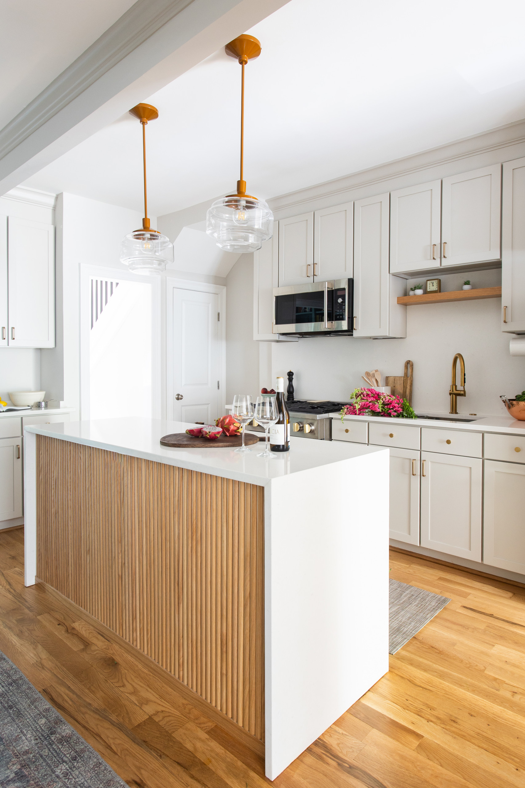
The ceiling beam seen here is structural and couldn’t be removed. “That’s why we played with different tones and shades of paint to make everything seem more seamless,” DiSabella says.
A pair of pendant lights over the island feature clear glass shades and a modern-vintage look. “We wanted some good lighting there, but because of the nearby fixture over the dining table, we didn’t want something big and obtrusive in that space,” DiSabella says. “The fittings on the fixtures are painted metal, so they add a bit of fun in a small way.”
The wood floor was refinished with a semi-transparent oil-and-resin blend stain that seals and protects the surface while giving it a soft satin finish. “There was nothing wrong with the floor, except the color,” DiSabella says. “There was no reason to remove it. We just stripped it and toned down the orange that was there before.”
The open doorway leads to the home’s front entry and staircase to the upper level. The closed door leads to a basement.
Pendant lights: Otto, Schoolhouse
See why you should hire a professional who uses Houzz Pro software
A pair of pendant lights over the island feature clear glass shades and a modern-vintage look. “We wanted some good lighting there, but because of the nearby fixture over the dining table, we didn’t want something big and obtrusive in that space,” DiSabella says. “The fittings on the fixtures are painted metal, so they add a bit of fun in a small way.”
The wood floor was refinished with a semi-transparent oil-and-resin blend stain that seals and protects the surface while giving it a soft satin finish. “There was nothing wrong with the floor, except the color,” DiSabella says. “There was no reason to remove it. We just stripped it and toned down the orange that was there before.”
The open doorway leads to the home’s front entry and staircase to the upper level. The closed door leads to a basement.
Pendant lights: Otto, Schoolhouse
See why you should hire a professional who uses Houzz Pro software
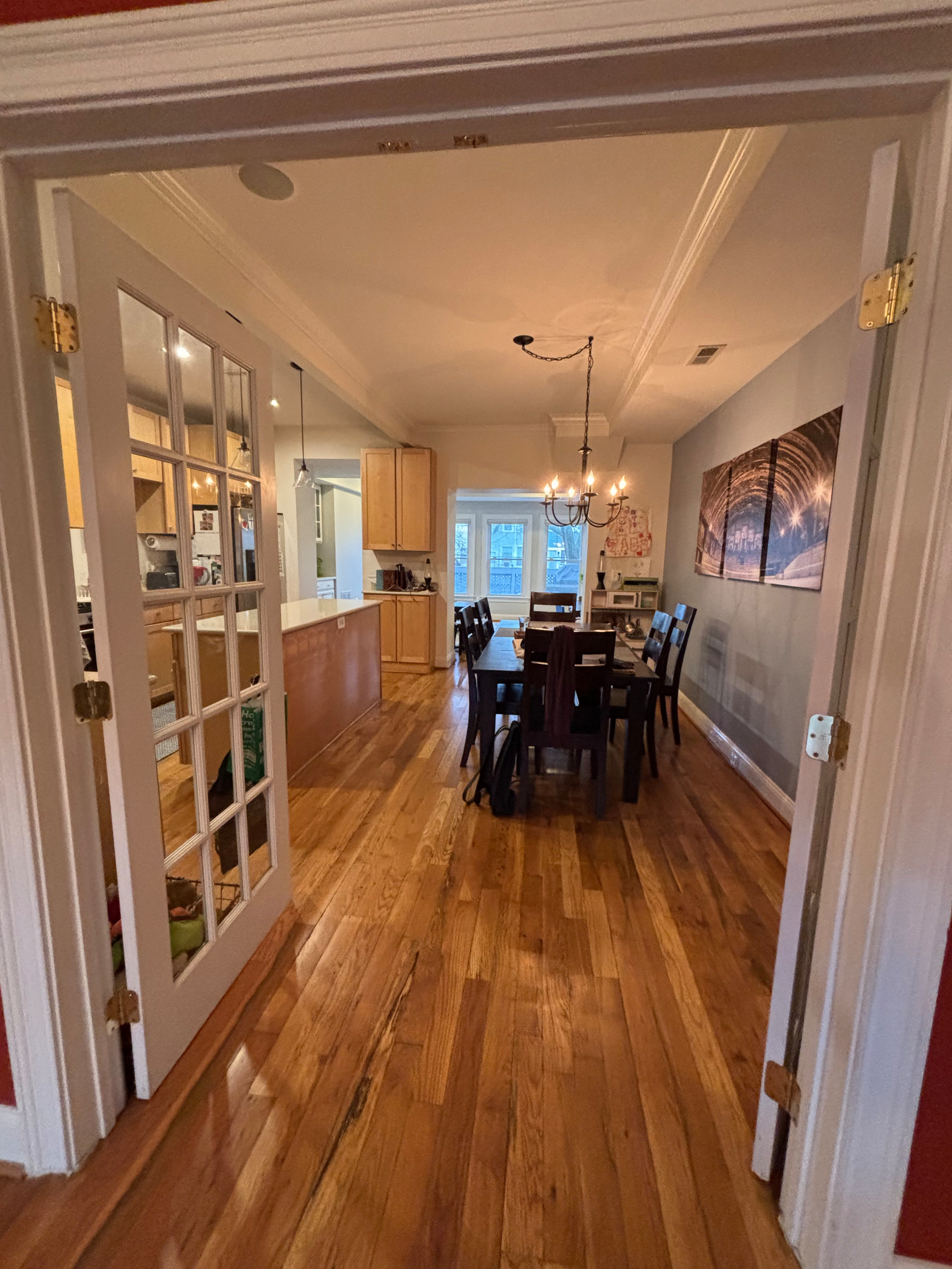
Before: The dining area off the kitchen felt cramped, dark and dated, with little personality.
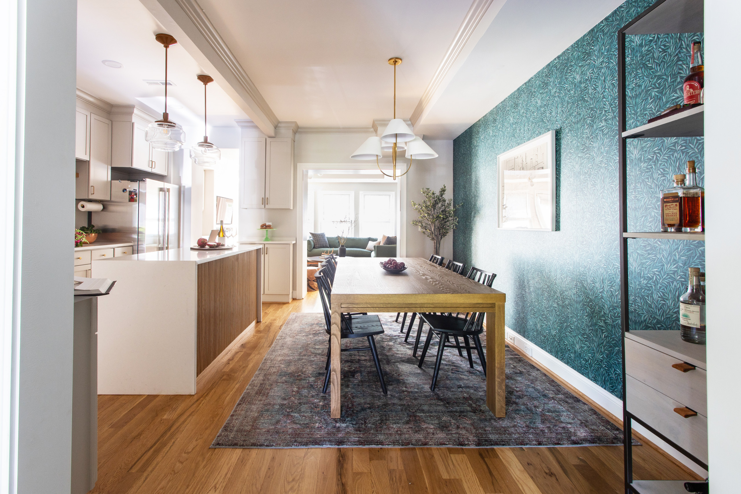
After: A new oak dining table puts a modern spin on a Parsons table, paired with clean-lined wood chairs inspired by Windsor chairs. On the right, a shelf-and-drawer piece doubles as a bar for entertaining. “They have an extensive whiskey collection that they wanted access to there,” DiSabella says.
A soft-brass chandelier with linen shades, large area rug and green botanical wallcovering bring pattern and warmth to the now-cohesive kitchen and dining space. “They were really clear on their expectations and budget,” DiSabella says. “In terms of aesthetics, I’m happy we were able to deliver to them a space that feels brand new but wasn’t.”
Chandelier: Kinsley, Visual Comfort; dining table and chairs: Millie Dining Table in Drifted Oak and Lewis Windsor Chair, Four Hands
More on Houzz
Read more stories
Browse photos for ideas
Find home professionals
A soft-brass chandelier with linen shades, large area rug and green botanical wallcovering bring pattern and warmth to the now-cohesive kitchen and dining space. “They were really clear on their expectations and budget,” DiSabella says. “In terms of aesthetics, I’m happy we were able to deliver to them a space that feels brand new but wasn’t.”
Chandelier: Kinsley, Visual Comfort; dining table and chairs: Millie Dining Table in Drifted Oak and Lewis Windsor Chair, Four Hands
More on Houzz
Read more stories
Browse photos for ideas
Find home professionals

Sponsored

Virginia's Award Winning One Stop Kitchen & Bath Remodeling Resource
Kitchen at a Glance
Who lives here: A couple with a young daughter
Location: Washington, D.C.
Size: 153 square feet (14.2 square meters), including dining area
Designer: Heather DiSabella Interior Design
General contractor: Victor Ortuno
Before: The maple cabinets were in good shape, but the homeowners wanted a fresher look. The beige solid-surface counters and short backsplash also made the kitchen feel basic. The layout worked well, but the homeowners were ready to upgrade the appliances and fixtures.
The table and chairs at the front right of the photo are in the family’s open dining area, which they also wanted to update. Doorways to the right lead to the family room, while the French doors on the left open to a formal living room. “In a townhouse everything is connected,” DiSabella says. “This kitchen was central in the floor plan. From a planning standpoint, this kitchen acted as the connector for the front and back of the house.” Its central location made both appearance and function especially important.