
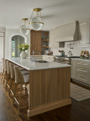
Warm Neutral Kitchen With Layers of Texture
A designer improves a kitchen’s layout and adds visual depth with mixed cabinetry, lighting and more

A cramped main floor with poor traffic flow left this Toronto-area couple with a house that didn’t work for their daily life. Interior designer Paige Groomes solved the problem with an overhaul that established the new kitchen as a central anchor with all the other spaces working around it. Hints of Craftsman and cottage influences in the home’s architecture inspired the kitchen’s neutral-hued transitional style enriched by a thoughtful mix of textures.
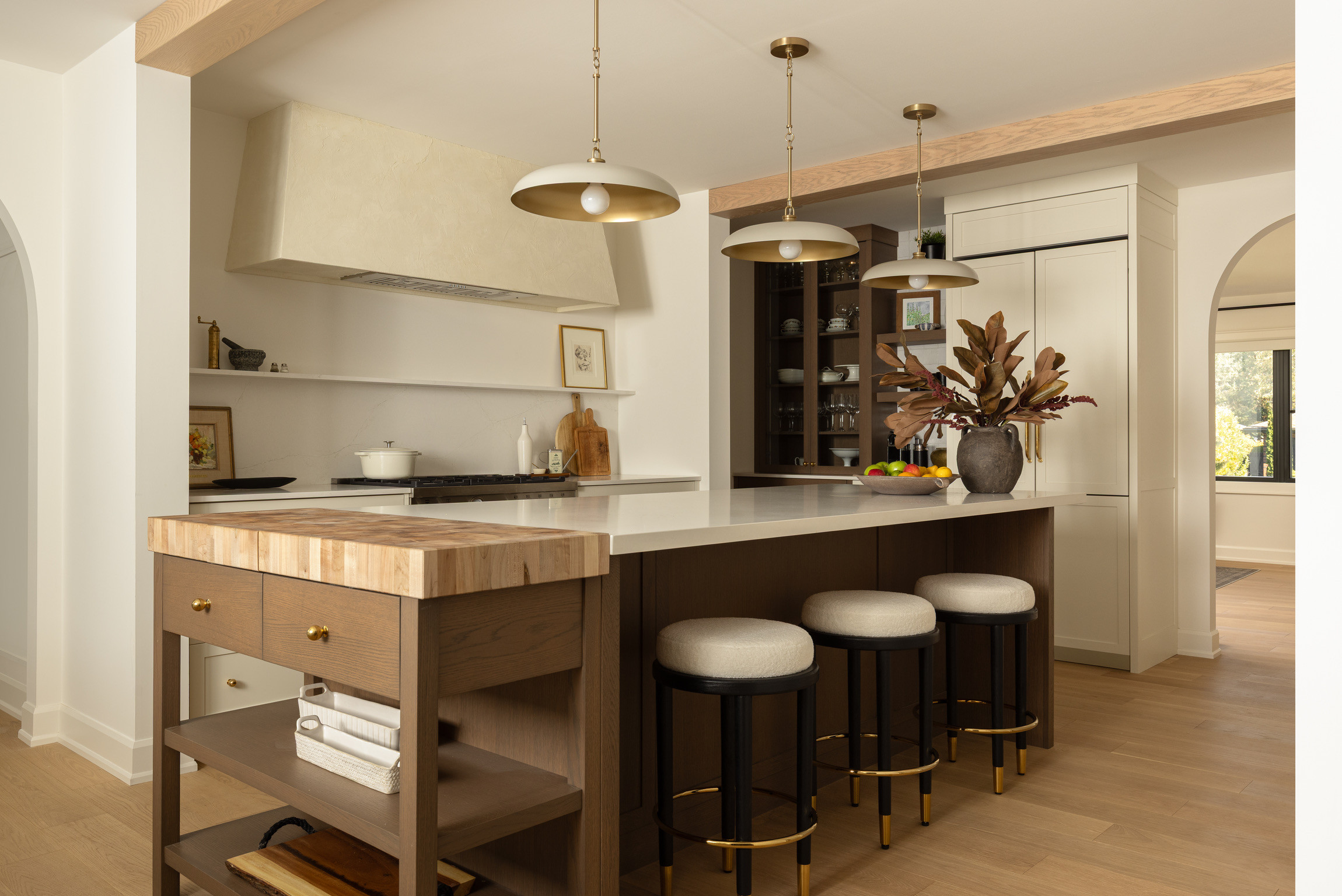
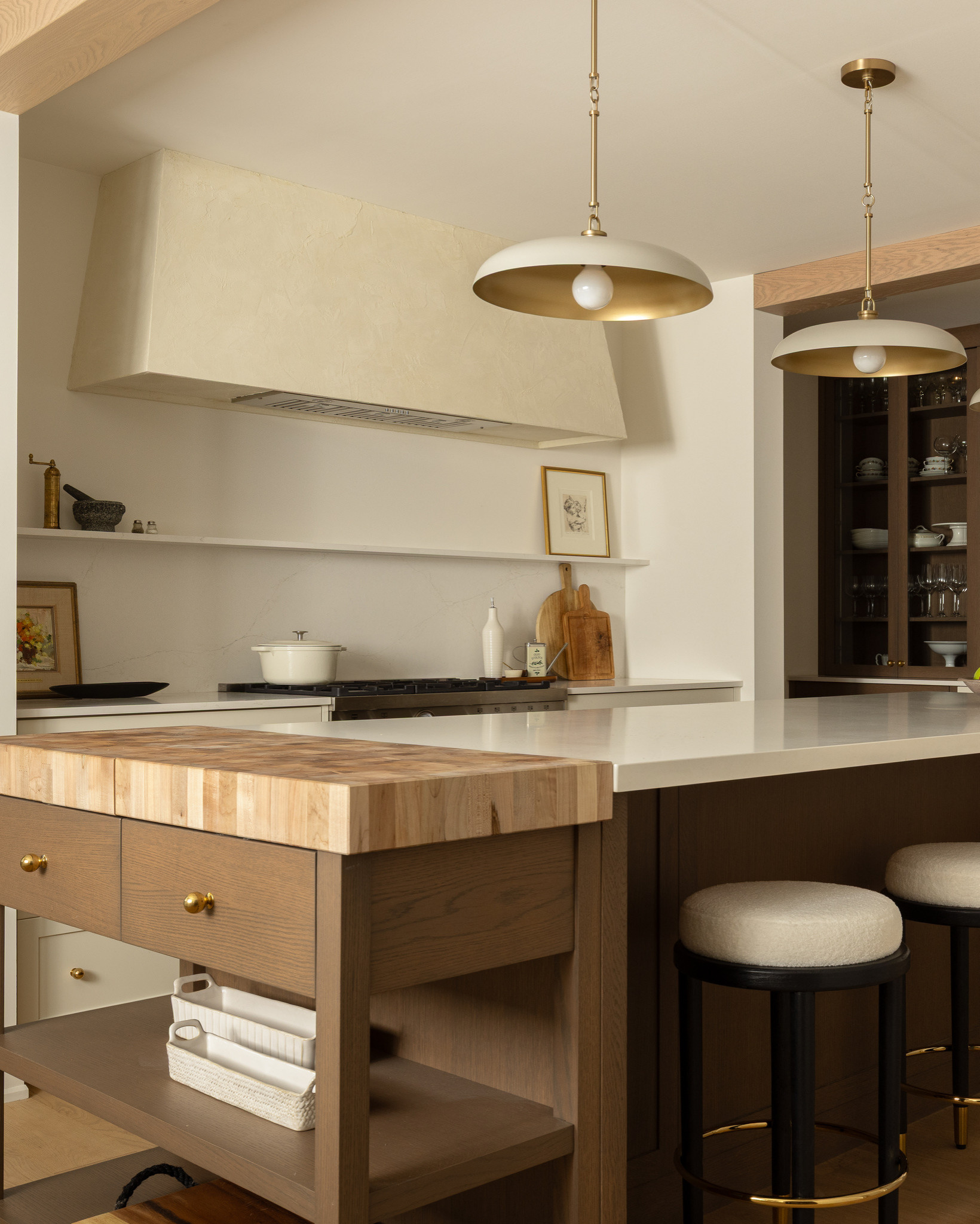
A balance of mixed cabinetry began with perimeter cabinets painted in a soft and light neutral hue. Groomes thought of these cabinets as a quiet backdrop for everything else. The next layer was a strong contrasting finish on the island base — a dark-stained oak.
An island benefits from being seen as a piece of furniture rather than as cabinetry, Groomes says. “The wood is what makes that distinction land.” Placing the butcher block-topped portion of the island between the sink and the range wall made it convenient for prep work.
Pendant lights with pale taupe metal shades, and lacquered brass interiors and chains introduce more texture and color.
Cabinetry: Touchwood Cabinets; perimeter cabinetry paint: Wind’s Breath, Benjamin Moore; pendants: Sadie, Hinkley Lighting
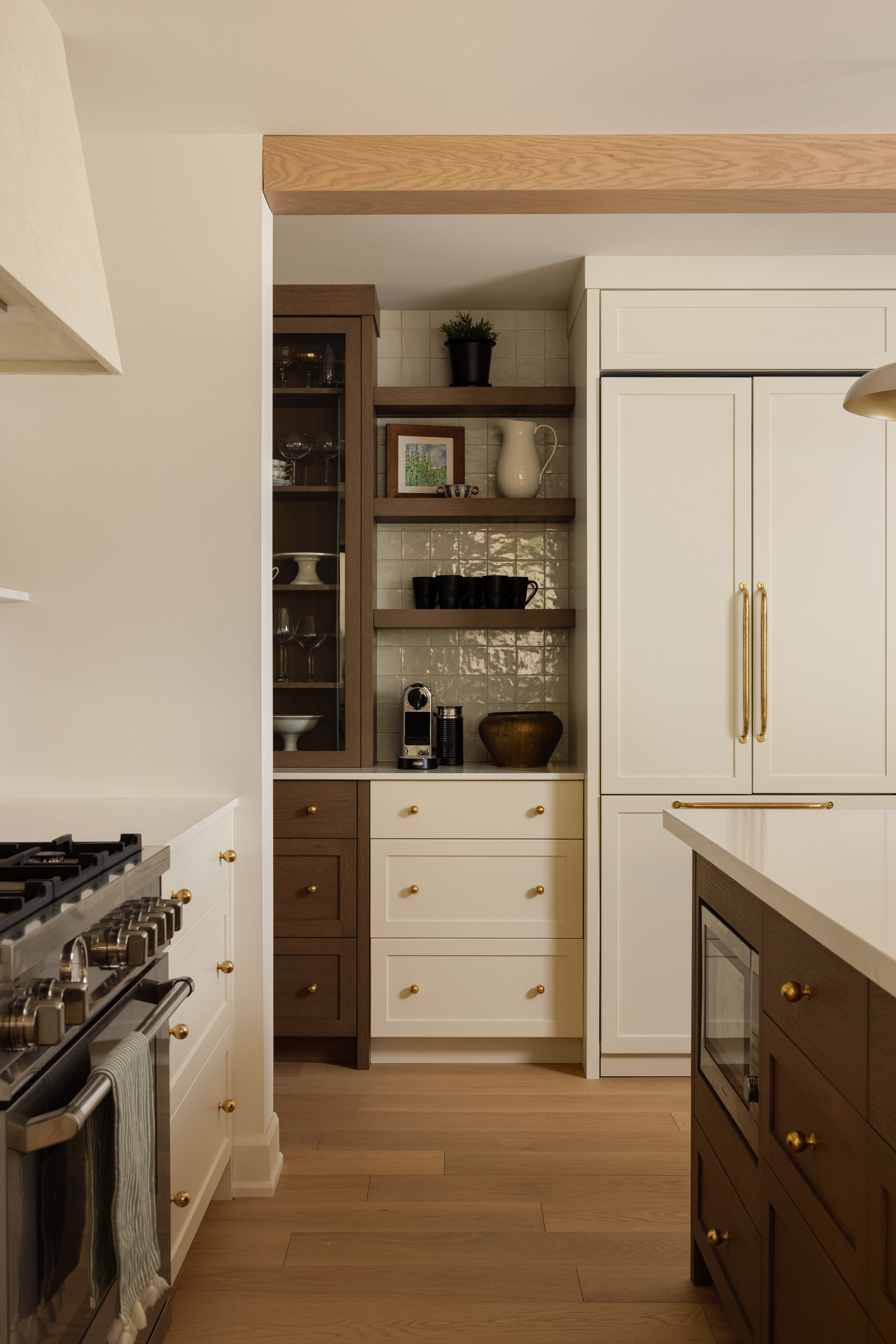
The dark-stained oak also appears at the back of the kitchen on a display hutch and on open shelves in the coffee station. “This gives those elements their own identity and creates visual interest across the room so the kitchen doesn’t read as one continuous run,” Groomes says.
A grid of square tiles behind the open shelves accentuates the area, adding another tactile accent to the space.
See why you should hire a professional who uses Houzz Pro software
A grid of square tiles behind the open shelves accentuates the area, adding another tactile accent to the space.
See why you should hire a professional who uses Houzz Pro software
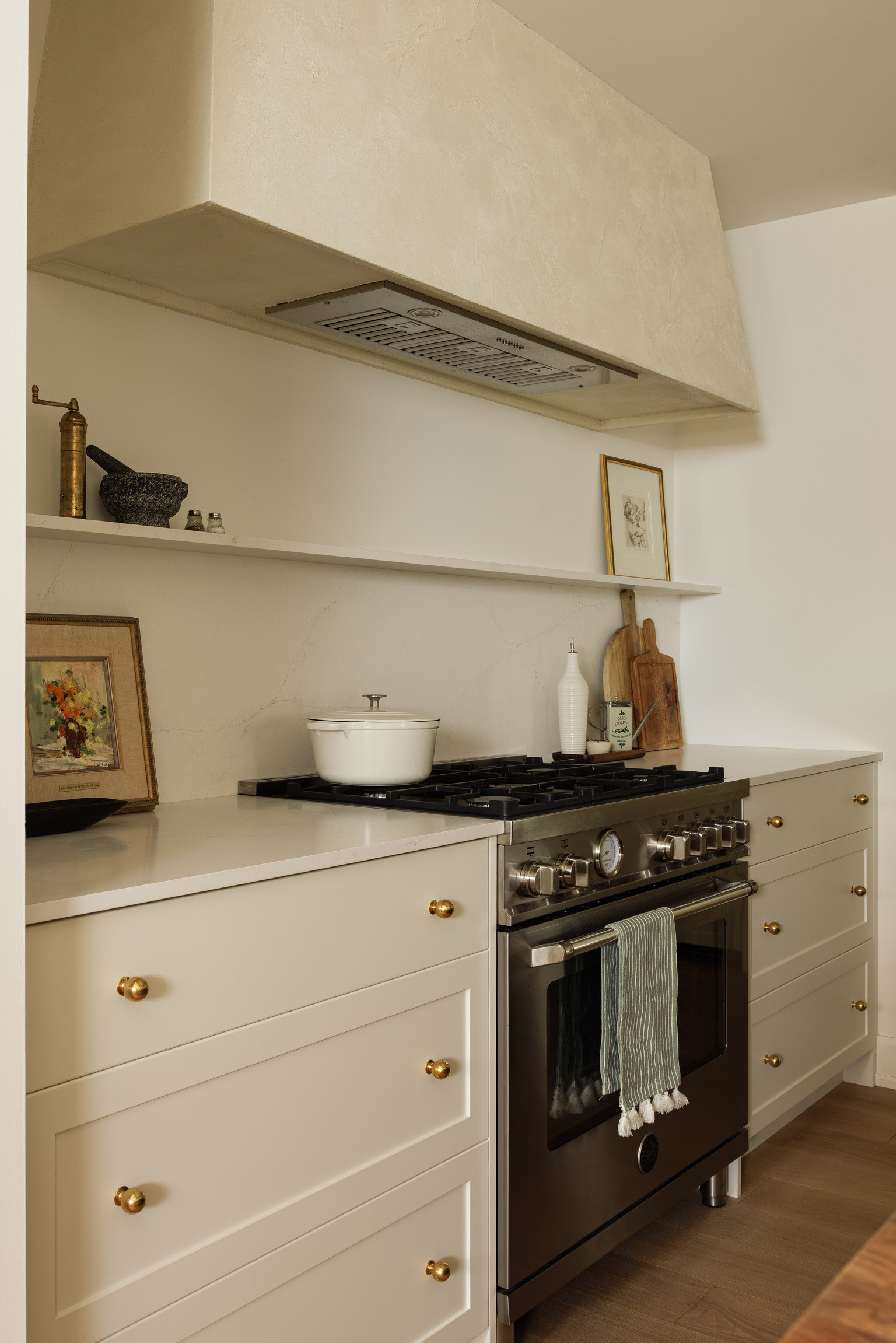
Extending the quartz countertops up the range wall and using it for the display shelf lends a minimalist feel.
Warm brass cabinet knobs, a plaster range hood and the objects the homeowners choose for the shelf inject more texture into the range alcove.
Warm brass cabinet knobs, a plaster range hood and the objects the homeowners choose for the shelf inject more texture into the range alcove.
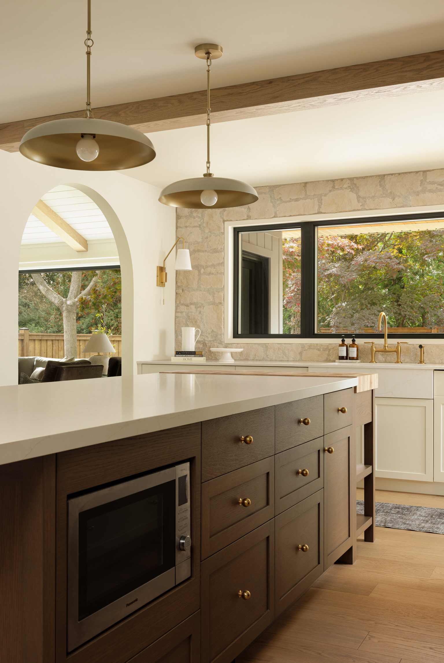
The new layout prioritizes the backyard views from the new large picture window over the sink.
This photo also shows some of the layout’s improved flow, with a gracefully arched opening to the great room on the left that includes sight lines from the kitchen through the great room’s windows.
“The views out to the backyard drove the placement of the sink, and the large windows in the adjacent dining room and great room informed how the kitchen opens to those spaces,” Groomes says.
Find a kitchen remodeler on Houzz
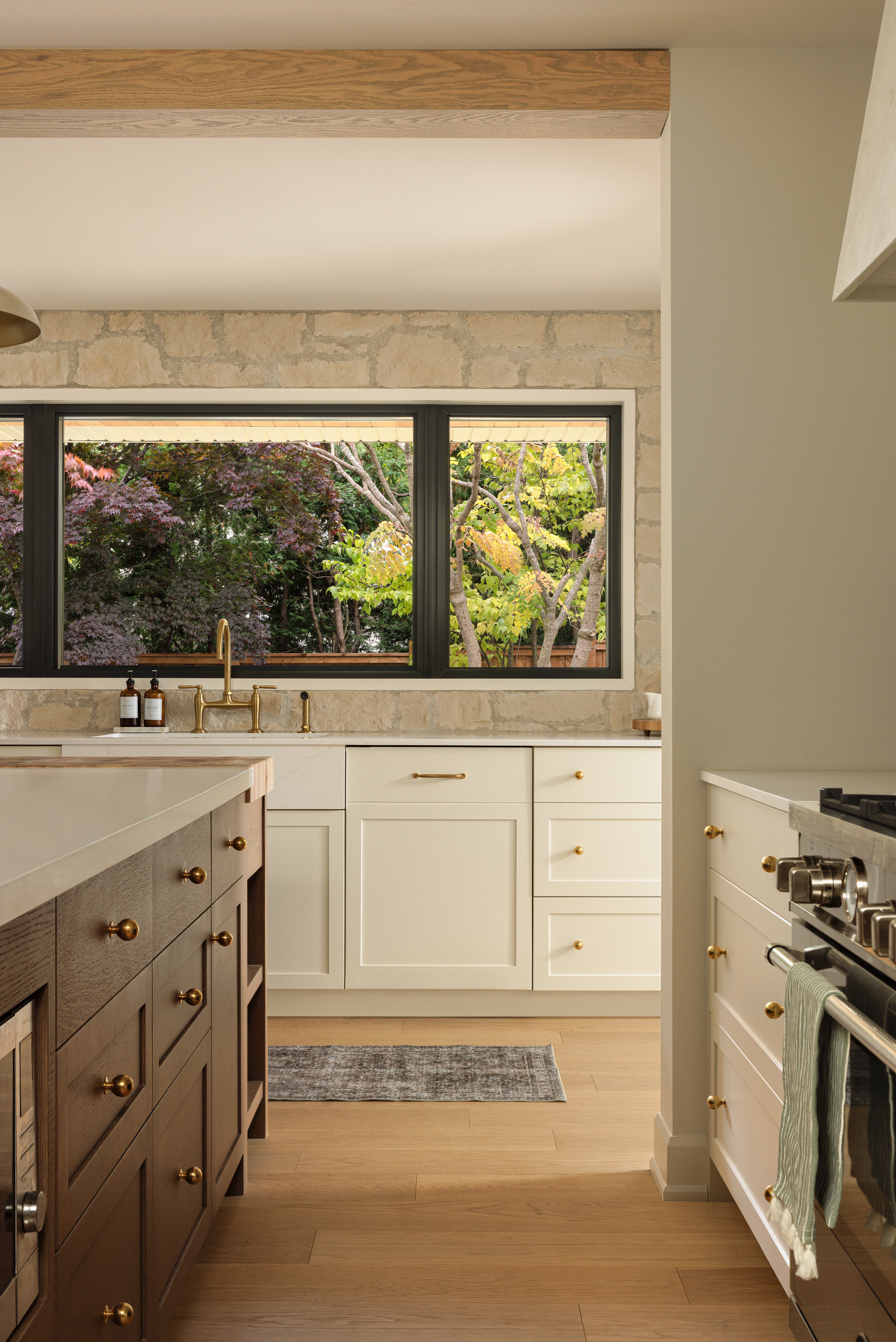
The most prominent texture in the room is the rough-cut engineered limestone wall around the picture window. The limestone wall provides a frame with an organic feel for the outdoor views.
Overhead, faux beams add visual weight while creating a connection to the wood beams in the adjacent great room.
See more photos of this home
Overhead, faux beams add visual weight while creating a connection to the wood beams in the adjacent great room.
See more photos of this home
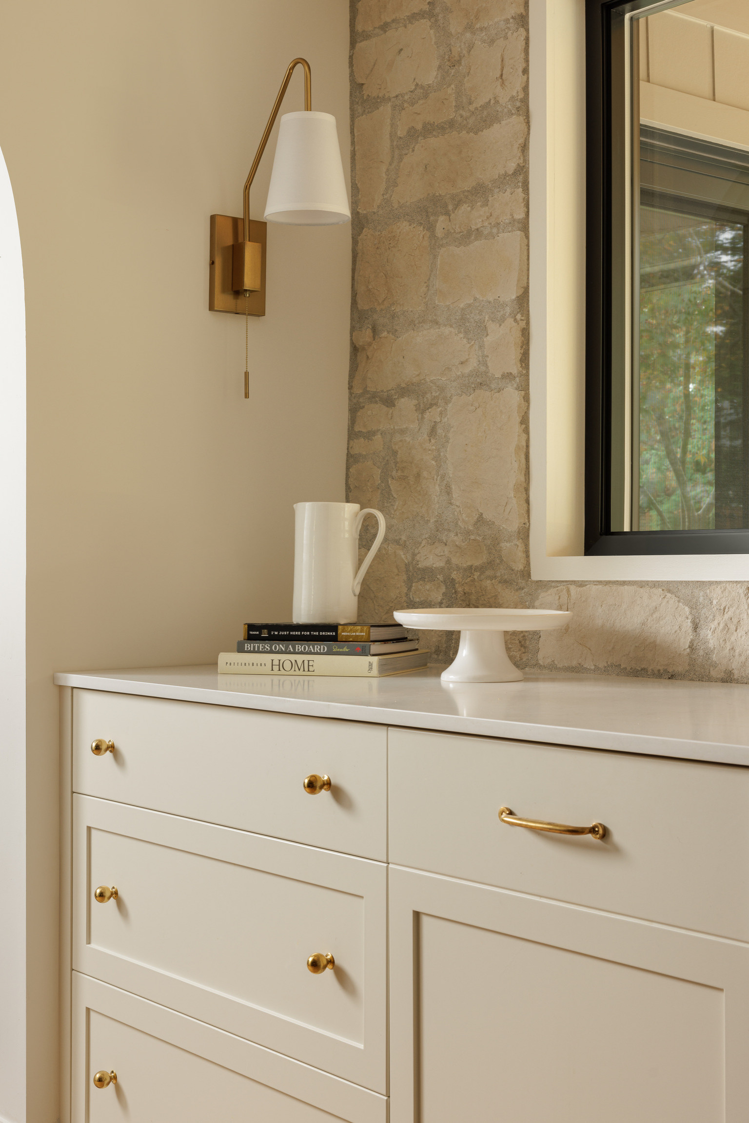
The rough stone adds a rustic element. “It brings a natural, tactile texture into a room that’s otherwise quite refined, and that contrast is exactly what a transitional space wants,” Groomes says.
Stone veneer: Casa Blanca RoughCut, Eldorado Stone; sconce: Owen, Savoy House
Stone veneer: Casa Blanca RoughCut, Eldorado Stone; sconce: Owen, Savoy House
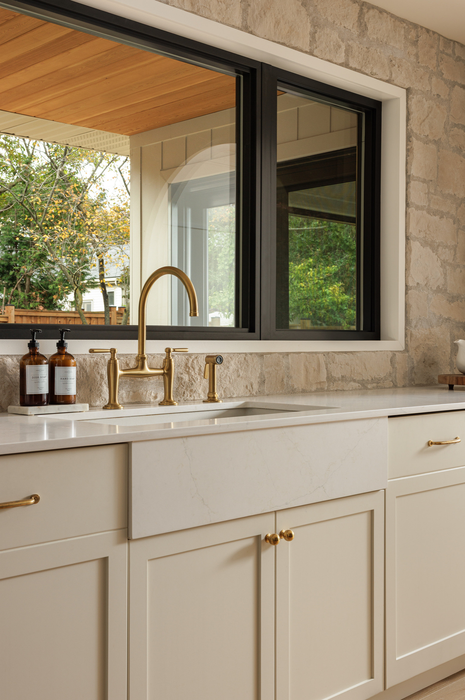
The Silgranit sink, composed of granite and resin, is durable and scratch resistant. The warm coloring of the countertop quartz works beautifully with the limestone. Groomes used it as an apron front for the sink, breaking up the painted wood of the base cabinetry.
Faucet: Edalyn by Studio McGee, Kohler; sink: Precis, Blanco; countertops: Antello quartz, HanStone; cabinet hardware: Massey, Rejuvenation
6 Things to Consider When Choosing a Kitchen Sink
Faucet: Edalyn by Studio McGee, Kohler; sink: Precis, Blanco; countertops: Antello quartz, HanStone; cabinet hardware: Massey, Rejuvenation
6 Things to Consider When Choosing a Kitchen Sink
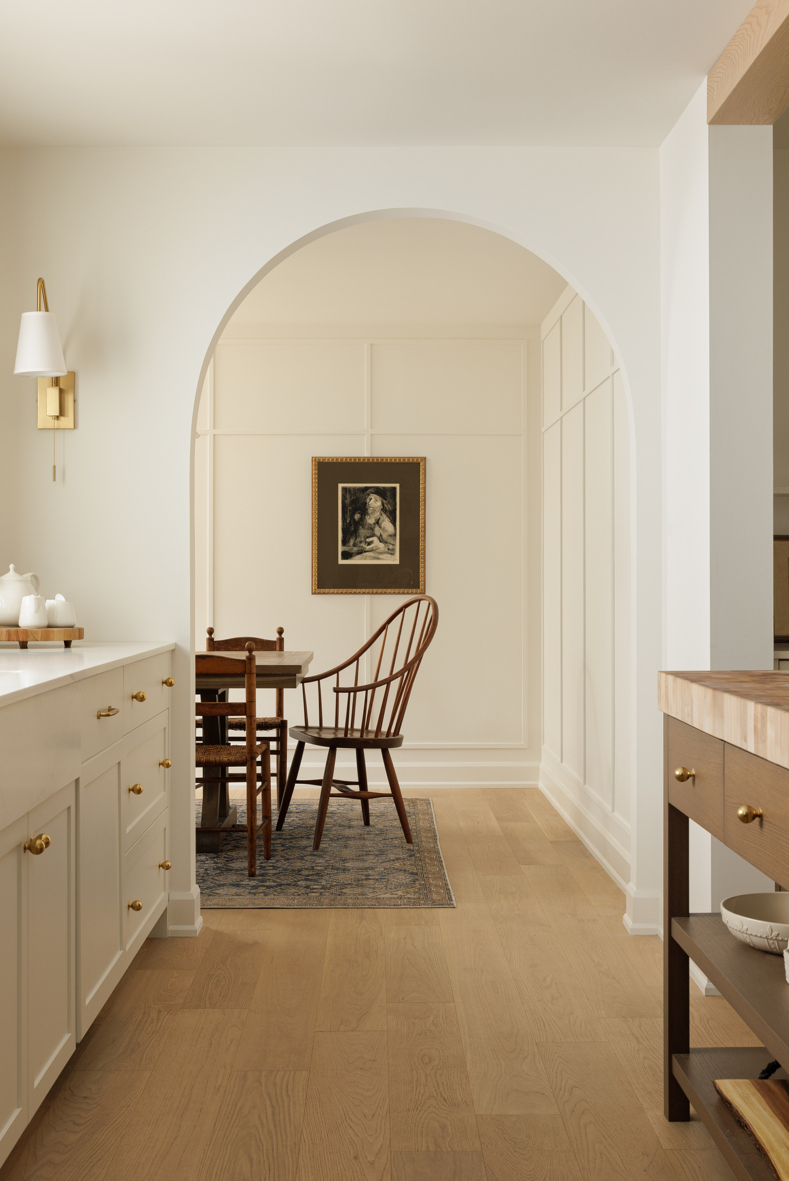
Opposite the arched entry to the great room is this arched entry to the dining room. New engineered hardwood floors in a prefinished white oak continue uninterrupted throughout the main floor.
Flooring: White Oaks Sandbar, Vintage Hardwood Flooring
Flooring: White Oaks Sandbar, Vintage Hardwood Flooring
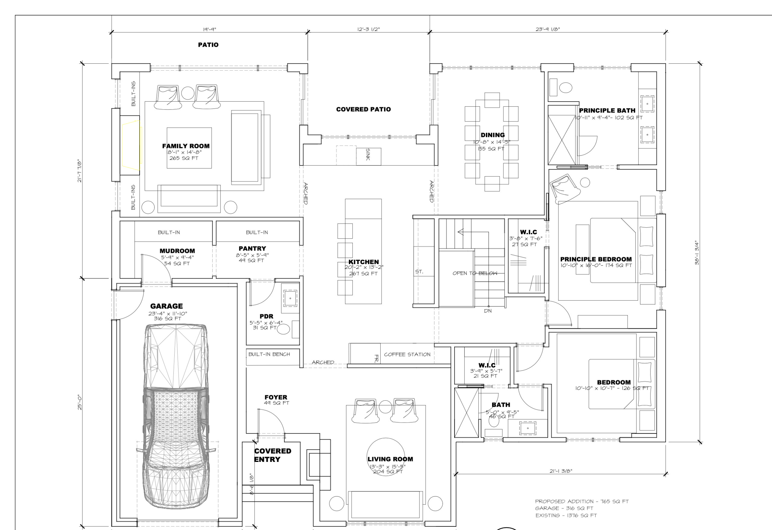
Floor plan: The kitchen sits in the center of the main floor. Groomes carefully considered the traffic patterns through it, because after entering the house from the front door or the garage, the homeowners need to pass through the kitchen to reach almost every other space in the house. The plan also illustrates how she designed the sight lines to the backyard from the great room, kitchen and dining room.
More on Houzz
Read more kitchen stories
Browse kitchen photos for ideas
Find design and remodeling pros
More on Houzz
Read more kitchen stories
Browse kitchen photos for ideas
Find design and remodeling pros
Sponsored

Fairfax County's Specialized, Comprehensive Renovations Firm
Sponsored

Virginia's Award Winning One Stop Kitchen & Bath Remodeling Resource
Kitchen at a Glance
Who lives here: A couple
Location: Burlington, Ontario
Size: 300 square feet (28 square meters)
Designer: Paige Groomes of Paige Elizabeth Interiors
Contractor: Jeff Grist of Craft & Trade Renovations
“This kitchen is really the central hub of the home,” Groomes says. Because every room connects off it, she had to think carefully about the sight lines from the kitchen into the surrounding rooms as well as the flow through it. (See floor plan at bottom.)
The homeowners were involved in the design process, but Groomes also had a lot of creative freedom. She says that learning what clients are drawn to early in the design process through inspiration photos allows her to ground the design in what they love. She determined that these clients wanted a transitional style — a mix of traditional and modern — with a neutral color palette, mixed materials, layered textures and focal lighting. They also had three must-have elements — a coffee station, a cutting board prep area built off the island and a large picture window above the kitchen sink.
Wall paint: White Dove, Benjamin Moore
Find a kitchen designer on Houzz