


Search results for "Multiple structures ideas" in Home Design Ideas
Reimagined as a quiet retreat on a mixed-use Mission block, this former munitions depot was transformed into a single-family residence by reworking existing forms. A bunker-like concrete structure was cut in half to form a covered patio that opens onto a new central courtyard. The residence behind was remodeled around a large central kitchen, with a combination skylight/hatch providing ample light and roof access. The multiple structures are tied together by untreated cedar siding, intended to gradually fade to grey to match the existing concrete and corrugated steel.
Designed to maximize function with minimal impact, the studio serves up adaptable square footage in a wrapping almost healthy enough to eat.
The open interior space organically transitions from personal to communal with the guidance of an angled roof plane. Beneath the tallest elevation, a sunny workspace awaits creative endeavors. The high ceiling provides room for big ideas in a small space, while a cluster of windows offers a glimpse of the structure’s soaring eave. Solid walls hugging the workspace add both privacy and anchors for wall-mounted storage. Towards the studio’s southern end, the ceiling plane slopes downward into a more intimate gathering space with playfully angled lines.
The building is as sustainable as it is versatile. Its all-wood construction includes interior paneling sourced locally from the Wood Mill of Maine. Lengths of eastern white pine span up to 16 feet to reach from floor to ceiling, creating visual warmth from a material that doubles as a natural insulator. Non-toxic wood fiber insulation, made from sawdust and wax, partners with triple-glazed windows to further insulate against extreme weather. During the winter, the interior temperature is able to reach 70 degrees without any heat on.
As it neared completion, the studio became a family project with Jesse, Betsy, and their kids working together to add the finishing touches. “Our whole life is a bit of an architectural experiment”, says Jesse, “but this has become an incredibly useful space.”
This is a little project we did for a friend a few years ago. Our client approached us after the south face of her house had deteriorated to the point that severe rot and mold had invaded the structure. She also wanted to give the front of her house a facelift and create some more curb appeal. On little projects like these, budget often dictates our design solution and our approach is to maximize value on behalf of our clients. We don't trying to win design awards with these small projects nor are we trying to get published. Our goal is to simply and elegantly solve the problem we are presented with at a price point that our client can afford.
There are several ideas we incorporated into this design solution. Foremost was to solve the water infiltration into the building envelope. The structure faces due south and takes a beating from all of the winter storms we get here in the Pacific Northwest. In the summer, harsh sun warps and cracks most siding materials. This solution entailed stripping the entire south facing facade down to the studs, tearing out all of the rotted lumber and reframing this wall to accept new windows. This wall was then insulated, sheathed, covered with a high performance building paper and then sided with a cementitious siding material.We added a cover at the front door to both protect the house and to announce the entry.
The element of time plays a large role in our designs and in this case we wanted to highlight the transition from the outer environment to protected interior of the home. Finally, with the addition of the minimal arbor we created a public space on the front of the house that allows for gathering, gives the house more visual interest and provides a public zone between the house and the street. This zone is literally a way for our client, who runs a business on the upper level of her home, to get out of her house and interact with the world. In short, this was a contextual solution that blends in well with its neighbors and promotes community through a classic front porch design. Our client spends a lot of time here in the summers chatting with neighbors, enjoying a glass of wine and watching the setting sun.
There are several ideas we incorporated into this desgn solution. Foremost was to solve the water infiltration into the building enevelope. The structure faces due south and takes a beating from all of the winter storms we get here in the Pacific Northwest. In the summer, harsh sun warps and cracks most siding materials. This solution entailed stripping the entire south facing facade down to the studs, tearing out all of the rotted lumber and refaming this wall to accept new windows. This wall was then insulated, sheathed, covered with a high performance building paper and then sided with a cementitious siding material.We added a cover at the front door to both protect the house and to announce the entry.
The element of time plays a large role in our designs and in this case we wanted to highlight the transiton from the outer environment to protected interior of the home. Finally, with the addition of the minimal arbor we created a public space on the front of the house that allows for gathering, gives the house more visual interest and provides a public zone between the house and the street. This zone is a literally way for out client, who runs a business on the upper level of her home, to get our her house and interact with the world. In short, this was a contextual solution that blends in well with its neighbors and promotes community through a classic front porch design. Our client spends a lot of time here in the summers chatting with neighbors, enjoying a glass of wine and watching the setting sun.
Find the right local pro for your project
Glencoe Residence Landscape. Brick Paver Driveway with Bluestone Motorcourt Border, Radiant Snow Melt Heat System, French Inspired Formal Entrance Landscape, Low Voltage Lighting, and Irrigation. Entire property Constructed by: Arrow. Designed by: Marco Romani, RLA - Landscape Architect.
Download our free ebook, Creating the Ideal Kitchen. DOWNLOAD NOW
Lakefront property in the northwest suburbs of Chicago is hard to come by, so when we were hired by this young family with exactly that, we were immediately inspired by not just the unusually large footprint of this 1950’s colonial revival but also the lovely views of the manmade lake it was sited on. The large 5-bedroom home was solidly stuck in the 1980’s, but we saw tons of potential. We started out by updating the existing staircase with a fresh coat of paint and adding new herringbone slate to the entry hall.
The powder room off the entryway also got a refresh - new flooring, new cabinets and fixtures. We ran the new slate right through into this space for some consistency. A fun wallpaper and shiplap trim add a welcoming feel and set the tone for the home.
Next, we tackled the kitchen. Located away from the rest of the first floor, the kitchen felt a little isolated, so we immediately began planning for how to better connect it to the rest of the first floor. We landed on removing the wall between the kitchen and dining room and designed a modified galley style space with separate cooking and clean up zones. The cooking zone consists of the refrigerator, prep sink and cooktop, along with a nice long run of prep space at the island. The cleanup side of the kitchen consists of the main sink and dishwasher. Both areas are situated so that the user can view the lake during prep work and cleanup!
One of the home’s main puzzles was how to incorporate the mudroom and area in front of the patio doors at the back of the house. We already had a breakfast table area, so the space by the patio doors was a bit of a no man’s land. We decided to separate the kitchen proper from what became the new mudroom with a large set of barn doors. That way you can quickly hide any mudroom messes but have easy access to the light coming in through the patio doors as well as the outdoor grilling station. We also love the impact the barn doors add to the overall space.
The homeowners’ first words to us were “it’s time to ditch the brown,” so we did! We chose a lovely blue pallet that reflects the home’s location on the lake which is also vibrant yet easy on the eye. Countertops are white quartz, and the natural oak floor works well with the other honey accents. The breakfast table was given a refresh with new chairs, chandelier and window treatments that frame the gorgeous views of the lake out the back.
We coordinated the slate mudroom flooring with that used in the home’s main entrance for a consistent feel. The storage area consists of open and closed storage to allow for some clutter control as needed.
Next on our “to do” list was revamping the dated brown bar area in the neighboring dining room. We eliminated the clutter by adding some closed cabinets and did some easy updates to help the space feel more current. One snag we ran into here was the discovery of a beam above the existing open shelving that had to be modified with a smaller structural beam to allow for our new design to work. This was an unexpected surprise, but in the end we think it was well worth it!
We kept the colors here a bit more muted to blend with the homeowner’s existing furnishings. Open shelving and polished nickel hardware add some simple detail to the new entertainment zone which also looks out onto the lake!
Next we tackled the upstairs starting with the homeowner’s son’s bath. The bath originally had both a tub shower and a separate shower, so we decided to swap out the shower for a new laundry area. This freed up some space downstairs in what used to be the mudroom/laundry room and is much more convenient for daily laundry needs.
We continued the blue palette here with navy cabinetry and the navy tile in the shower. Porcelain floor tile and chrome fixtures keep maintenance to a minimum while matte black mirrors and lighting add some depth the design. A low maintenance runner adds some warmth underfoot and ties the whole space together.
We added a pocket door to the bathroom to minimize interference with the door swings. The left door of the laundry closet is on a 180 degree hinge to allow for easy full access to the machines. Next we tackled the master bath which is an en suite arrangement. The original was typical of the 1980’s with the vanity outside of the bathroom, situated near the master closet. And the brown theme continued here with multiple shades of brown.
Our first move was to segment off the bath and the closet from the master bedroom. We created a short hall from the bedroom to the bathroom with his and hers walk-in closets on the left and right as well as a separate toilet closet outside of the main bathroom for privacy and flexibility.
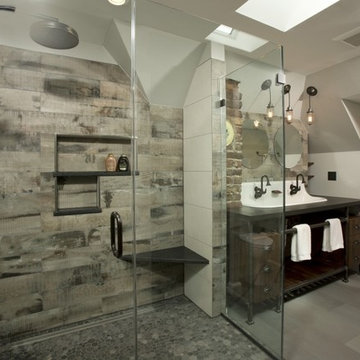
The original bathroom had a giant soaking tub with steps (dangerous!) as well as a small shower that did not work well for our homeowner who is 6’3”. With other bathtubs in the home, they decided to eliminate the tub and create an oversized shower which takes up the space where the old tub was located. The double vanity is on the opposite wall and a bench is located under the window for morning conversations and a place to set a couple of towels.
The pallet in here is light and airy with a mix of blond wood, creamy porcelain and marble tile, and brass accents. A simple roman shade adds some texture and it’s top-down mechanism allows for light and privacy.
This large whole house remodel gave our homeowners not only the ability to maximize the potential of their home but also created a lovely new frame from which to view their fabulous lake views.
Designed by: Susan Klimala, CKD, CBD
Photography by: Michael Kaskel
For more information on kitchen and bath design ideas go to: www.kitchenstudio-ge.com
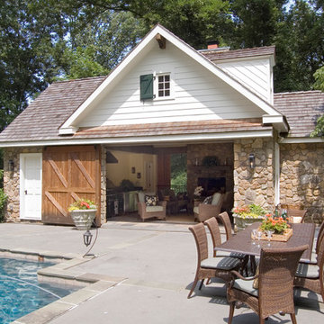
The local fieldstone blend covering the facade, the roof pitch, roofing materials, and architectural details of the new pool structure matches that of the main house. The rough hewn trusses in the hearth room mimic the structural components of the family room in the main house.
Sliding barn doors at the front & back of the poorhouse allow the structure to be fully opened or closed.
To provide access for cords of firewood to be delivered directly to the pool house, a cart path was cut through the woods from the driveway around the back of the house.
This project presented unique opportunities that are not often found in residential landscaping. The homeowners were not only restoring their 1840's era farmhouse, a piece of their family’s history, but also enlarging and updating the home for modern living. The landscape designers continued this idea by creating a space that is a modern day interpretation of an 1840s era farm rather then a strict recreation. The resulting design combines elements of farm living from that time, as well as acknowledging the property’s history as a horse farm, with staples of 21st century landscapes such as space for outdoor living, lighting, and newer plant varieties.
Guests approach from the main driveway which winds through the property and ends at the main barn. There is secondary gated driveway just for the homeowners. Connected to this main driveway is a narrower gravel lane which leads directly to the residence. The lane passes near fruit trees planted in broken rows to give the illusion that they are the remains of an orchard that once existed on the site. The lane widens at the entrance to the gardens where there is a hitching post built into the fence that surrounds the gardens and a watering trough. The widened section is intended as a place to park a golf cart or, in a nod to the home’s past, tie up horses before entering. The gravel lane passes between two stone pillars and then ends at a square gravel court edged in cobblestones. The gravel court transitions into a wide flagstone walk bordered with yew hedges and lavender leading to the front door.
Directly to the right, upon entering the gravel court, is located a gravel and cobblestone edged walk leading to a secondary entrance into the residence. The walk is gated where it connects with the gravel court to close it off so as not to confuse visitors and guests to the main residence and to emphasize the primary entrance. An area for a bench is provided along this walk to encourage stopping to view and enjoy the gardens.
On either side of the front door, gravel and cobblestone walks branch off into the garden spaces. The one on the right leads to a flagstone with cobblestone border patio space. Since the home has no designated backyard like most modern suburban homes the outdoor living space had to be placed in what would traditionally be thought of as the front of the house. The patio is separated from the entrance walk by the yew hedge and further enclosed by three Amelanchiers and a variety of plantings including modern cultivars of old fashioned plants such as Itea and Hydrangea. A third entrance, the original front door to the 1840’s era section, connects to the patio from the home’s kitchen, making the space ideal for outdoor dining.
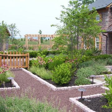
The gravel and cobblestone walk branching off to the left of the front door leads to the vegetable and perennial gardens. The idea for the vegetable garden was to recreate the tradition of a kitchen garden which would have been planted close to the residence for easy access. The vegetable garden is surrounded by mixed perennial beds along the inside of the wood picket fence which surrounds the entire garden space. Another area designated for a bench is provided here to encourage stopping and viewing. The home’s original smokehouse, completely restored and used as a garden shed, provides a strong architectural focal point to the vegetable garden. Behind the smokehouse is planted lilacs and other plants to give mass and balance to the corner and help screen the garden from the neighboring subdivision. At the rear corner of the garden a wood arbor was constructed to provide a structure on which to grow grapes or other vines should the homeowners choose to.
The landscape and gardens for this restored farmhouse and property are a thoughtfully designed and planned recreation of a historic landscape reinterpreted for modern living. The idea was to give a sense of timelessness when walking through the gardens as if they had been there for years but had possibly been updated and rejuvenated as lifestyles changed. The attention to materials and craftsmanship blend seamlessly with the residence and insure the gardens and landscape remain an integral part of the property. The farm has been in the homeowner’s family for many years and they are thrilled at the results and happy to see respect given to the home’s history and to its meticulous restoration.
Sponsored
Columbus, OH
Dave Fox Design Build Remodelers
Columbus Area's Luxury Design Build Firm | 17x Best of Houzz Winner!
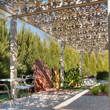
This shade arbor, located in The Woodlands, TX north of Houston, spans the entire length of the back yard. It combines a number of elements with custom structures that were constructed to emulate specific aspects of a Zen garden. The homeowner wanted a low-maintenance garden whose beauty could withstand the tough seasonal weather that strikes the area at various times of the year. He also desired a mood-altering aesthetic that would relax the senses and calm the mind. Most importantly, he wanted this meditative environment completely shielded from the outside world so he could find serenity in total privacy.
The most unique design element in this entire project is the roof of the shade arbor itself. It features a “negative space” leaf pattern that was designed in a software suite and cut out of the metal with a water jet cutter. Each form in the pattern is loosely suggestive of either a leaf, or a cluster of leaves.
These small, negative spaces cut from the metal are the source of the structure’ powerful visual and emotional impact. During the day, sunlight shines down and highlights columns, furniture, plantings, and gravel with a blend of dappling and shade that make you feel like you are sitting under the branches of a tree.
At night, the effects are even more brilliant. Skillfully concealed lights mounted on the trusses reflect off the steel in places, while in other places they penetrate the negative spaces, cascading brilliant patterns of ambient light down on vegetation, hardscape, and water alike.
The shade arbor shelters two gravel patios that are almost identical in space. The patio closest to the living room features a mini outdoor dining room, replete with tables and chairs. The patio is ornamented with a blend of ornamental grass, a small human figurine sculpture, and mid-level impact ground cover.
Gravel was chosen as the preferred hardscape material because of its Zen-like connotations. It is also remarkably soft to walk on, helping to set the mood for a relaxed afternoon in the dappled shade of gently filtered sunlight.
The second patio, spaced 15 feet away from the first, resides adjacent to the home at the opposite end of the shade arbor. Like its twin, it is also ornamented with ground cover borders, ornamental grasses, and a large urn identical to the first. Seating here is even more private and contemplative. Instead of a table and chairs, there is a large decorative concrete bench cut in the shape of a giant four-leaf clover.
Spanning the distance between these two patios, a bluestone walkway connects the two spaces. Along the way, its borders are punctuated in places by low-level ornamental grasses, a large flowering bush, another sculpture in the form of human faces, and foxtail ferns that spring up from a spread of river rock that punctuates the ends of the walkway.
The meditative quality of the shade arbor is reinforced by two special features. The first of these is a disappearing fountain that flows from the top of a large vertical stone embedded like a monolith in the other edges of the river rock. The drains and pumps to this fountain are carefully concealed underneath the covering of smooth stones, and the sound of the water is only barely perceptible, as if it is trying to force you to let go of your thoughts to hear it.
A large piece of core-10 steel, which is deliberately intended to rust quickly, rises up like an arced wall from behind the fountain stone. The dark color of the metal helps the casual viewer catch just a glimpse of light reflecting off the slow trickle of water that runs down the side of the stone into the river rock bed.
To complete the quiet moment that the shade arbor is intended to invoke, a thick wall of cypress trees rises up on all sides of the yard, completely shutting out the disturbances of the world with a comforting wall of living greenery that comforts the thoughts and emotions.
A young Mexican couple approached us to create a streamline modern and fresh home for their growing family. They expressed a desire for natural textures and finishes such as natural stone and a variety of woods to juxtapose against a clean linear white backdrop.
For the kid’s rooms we are staying within the modern and fresh feel of the house while bringing in pops of bright color such as lime green. We are looking to incorporate interactive features such as a chalkboard wall and fun unique kid size furniture.
The bathrooms are very linear and play with the concept of planes in the use of materials.They will be a study in contrasting and complementary textures established with tiles from resin inlaid with pebbles to a long porcelain tile that resembles wood grain.
This beautiful house is a 5 bedroom home located in Presidential Estates in Aventura, FL.
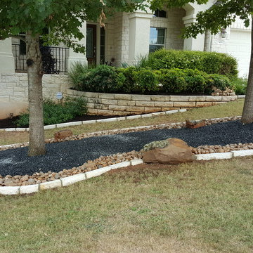
YardDoc designed and created multiple rock landscapes for customers in Austin, TX. These drought resistant landscapes liven up your yard with unique designs and individual beauty. While we craft every landscape to the yard and customer, we present examples here to inspire you.
We worked diligently to match our stonework to both the home’s exterior and the existing retaining wall. First, we installed low retaining barriers around the side garden and the two prominent trees in the front yard. In the garden by the porch, we mulched and left the existing plants as they were.
Inside our limestone barrier around the trees, we placed two types of river rock, giving it a swimming pond look. Then we placed decorative stones around and in the new structure. Both mulch and stones provide the added benefit of water retention during the dry months.
The Mazama house is located in the Methow Valley of Washington State, a secluded mountain valley on the eastern edge of the North Cascades, about 200 miles northeast of Seattle.
The house has been carefully placed in a copse of trees at the easterly end of a large meadow. Two major building volumes indicate the house organization. A grounded 2-story bedroom wing anchors a raised living pavilion that is lifted off the ground by a series of exposed steel columns. Seen from the access road, the large meadow in front of the house continues right under the main living space, making the living pavilion into a kind of bridge structure spanning over the meadow grass, with the house touching the ground lightly on six steel columns. The raised floor level provides enhanced views as well as keeping the main living level well above the 3-4 feet of winter snow accumulation that is typical for the upper Methow Valley.
To further emphasize the idea of lightness, the exposed wood structure of the living pavilion roof changes pitch along its length, so the roof warps upward at each end. The interior exposed wood beams appear like an unfolding fan as the roof pitch changes. The main interior bearing columns are steel with a tapered “V”-shape, recalling the lightness of a dancer.
The house reflects the continuing FINNE investigation into the idea of crafted modernism, with cast bronze inserts at the front door, variegated laser-cut steel railing panels, a curvilinear cast-glass kitchen counter, waterjet-cut aluminum light fixtures, and many custom furniture pieces. The house interior has been designed to be completely integral with the exterior. The living pavilion contains more than twelve pieces of custom furniture and lighting, creating a totality of the designed environment that recalls the idea of Gesamtkunstverk, as seen in the work of Josef Hoffman and the Viennese Secessionist movement in the early 20th century.
The house has been designed from the start as a sustainable structure, with 40% higher insulation values than required by code, radiant concrete slab heating, efficient natural ventilation, large amounts of natural lighting, water-conserving plumbing fixtures, and locally sourced materials. Windows have high-performance LowE insulated glazing and are equipped with concealed shades. A radiant hydronic heat system with exposed concrete floors allows lower operating temperatures and higher occupant comfort levels. The concrete slabs conserve heat and provide great warmth and comfort for the feet.
Deep roof overhangs, built-in shades and high operating clerestory windows are used to reduce heat gain in summer months. During the winter, the lower sun angle is able to penetrate into living spaces and passively warm the exposed concrete floor. Low VOC paints and stains have been used throughout the house. The high level of craft evident in the house reflects another key principle of sustainable design: build it well and make it last for many years!
Photo by Benjamin Benschneider
Conceived as a remodel and addition, the final design iteration for this home is uniquely multifaceted. Structural considerations required a more extensive tear down, however the clients wanted the entire remodel design kept intact, essentially recreating much of the existing home. The overall floor plan design centers on maximizing the views, while extensive glazing is carefully placed to frame and enhance them. The residence opens up to the outdoor living and views from multiple spaces and visually connects interior spaces in the inner court. The client, who also specializes in residential interiors, had a vision of ‘transitional’ style for the home, marrying clean and contemporary elements with touches of antique charm. Energy efficient materials along with reclaimed architectural wood details were seamlessly integrated, adding sustainable design elements to this transitional design. The architect and client collaboration strived to achieve modern, clean spaces playfully interjecting rustic elements throughout the home.
Greenbelt Homes
Glynis Wood Interiors
Photography by Bryant Hill
Sponsored
Over 300 locations across the U.S.
Schedule Your Free Consultation
Ferguson Bath, Kitchen & Lighting Gallery
Ferguson Bath, Kitchen & Lighting Gallery
The homeowners desired an outdoor space that felt more rustic than their refined interior spaces, but still related architecturally to their house. Cement plaster support arbor columns provide enough of visual tie to the existing house exterior. Oversized wood beams and rafter members provide a unique outdoor atmosphere. Structural bolts and hardware were minimized for a cleaner appearance. Structural connections and supports were engineered to meet California's stringent earthquake standards.
Ali Atri Photography
Free ebook, Creating the Ideal Kitchen. DOWNLOAD NOW
Our clients and their three teenage kids had outgrown the footprint of their existing home and felt they needed some space to spread out. They came in with a couple of sets of drawings from different architects that were not quite what they were looking for, so we set out to really listen and try to provide a design that would meet their objectives given what the space could offer.
We started by agreeing that a bump out was the best way to go and then decided on the size and the floor plan locations of the mudroom, powder room and butler pantry which were all part of the project. We also planned for an eat-in banquette that is neatly tucked into the corner and surrounded by windows providing a lovely spot for daily meals.
The kitchen itself is L-shaped with the refrigerator and range along one wall, and the new sink along the exterior wall with a large window overlooking the backyard. A large island, with seating for five, houses a prep sink and microwave. A new opening space between the kitchen and dining room includes a butler pantry/bar in one section and a large kitchen pantry in the other. Through the door to the left of the main sink is access to the new mudroom and powder room and existing attached garage.
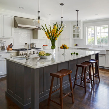
White inset cabinets, quartzite countertops, subway tile and nickel accents provide a traditional feel. The gray island is a needed contrast to the dark wood flooring. Last but not least, professional appliances provide the tools of the trade needed to make this one hardworking kitchen.
Designed by: Susan Klimala, CKD, CBD
Photography by: Mike Kaskel
For more information on kitchen and bath design ideas go to: www.kitchenstudio-ge.com
This contemporary aluminum pergola kit design by Brown Jordan Structures offers its exclusive Suncloth fabric providing protection from the suns rays while creating a beautiful outdoor room. A powder coated finish in Titanium and a low maintenance structural aluminum material provides a lifetime of enjoyment and use. Paired with Brown Jordan Furniture, this outdoor dining area is simple yet refined. With this easy to install Serenity-Solis pergola kit you will be ready to enjoy your patio and guests every day.
Unique "L" shaped support posts add a charming subtle accent.
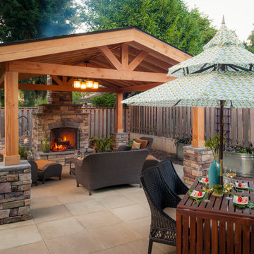
Gazebo, Covered Wood Structure, Outdoor Fireplace, Outdoor Living Space, Concrete Paver Hardscape, Ambient Lighting, Landscape Lighting, Outdoor Lighting,
Showing Results for "Multiple Structures Ideas"
Sponsored
Plain City, OH
Kuhns Contracting, Inc.
Central Ohio's Trusted Home Remodeler Specializing in Kitchens & Baths
Download our free ebook, Creating the Ideal Kitchen. DOWNLOAD NOW
Lakefront property in the northwest suburbs of Chicago is hard to come by, so when we were hired by this young family with exactly that, we were immediately inspired by not just the unusually large footprint of this 1950’s colonial revival but also the lovely views of the manmade lake it was sited on. The large 5-bedroom home was solidly stuck in the 1980’s, but we saw tons of potential. We started out by updating the existing staircase with a fresh coat of paint and adding new herringbone slate to the entry hall.
The powder room off the entryway also got a refresh - new flooring, new cabinets and fixtures. We ran the new slate right through into this space for some consistency. A fun wallpaper and shiplap trim add a welcoming feel and set the tone for the home.
Next, we tackled the kitchen. Located away from the rest of the first floor, the kitchen felt a little isolated, so we immediately began planning for how to better connect it to the rest of the first floor. We landed on removing the wall between the kitchen and dining room and designed a modified galley style space with separate cooking and clean up zones. The cooking zone consists of the refrigerator, prep sink and cooktop, along with a nice long run of prep space at the island. The cleanup side of the kitchen consists of the main sink and dishwasher. Both areas are situated so that the user can view the lake during prep work and cleanup!
One of the home’s main puzzles was how to incorporate the mudroom and area in front of the patio doors at the back of the house. We already had a breakfast table area, so the space by the patio doors was a bit of a no man’s land. We decided to separate the kitchen proper from what became the new mudroom with a large set of barn doors. That way you can quickly hide any mudroom messes but have easy access to the light coming in through the patio doors as well as the outdoor grilling station. We also love the impact the barn doors add to the overall space.
The homeowners’ first words to us were “it’s time to ditch the brown,” so we did! We chose a lovely blue pallet that reflects the home’s location on the lake which is also vibrant yet easy on the eye. Countertops are white quartz, and the natural oak floor works well with the other honey accents. The breakfast table was given a refresh with new chairs, chandelier and window treatments that frame the gorgeous views of the lake out the back.
We coordinated the slate mudroom flooring with that used in the home’s main entrance for a consistent feel. The storage area consists of open and closed storage to allow for some clutter control as needed.
Next on our “to do” list was revamping the dated brown bar area in the neighboring dining room. We eliminated the clutter by adding some closed cabinets and did some easy updates to help the space feel more current. One snag we ran into here was the discovery of a beam above the existing open shelving that had to be modified with a smaller structural beam to allow for our new design to work. This was an unexpected surprise, but in the end we think it was well worth it!
We kept the colors here a bit more muted to blend with the homeowner’s existing furnishings. Open shelving and polished nickel hardware add some simple detail to the new entertainment zone which also looks out onto the lake!
Next we tackled the upstairs starting with the homeowner’s son’s bath. The bath originally had both a tub shower and a separate shower, so we decided to swap out the shower for a new laundry area. This freed up some space downstairs in what used to be the mudroom/laundry room and is much more convenient for daily laundry needs.
We continued the blue palette here with navy cabinetry and the navy tile in the shower. Porcelain floor tile and chrome fixtures keep maintenance to a minimum while matte black mirrors and lighting add some depth the design. A low maintenance runner adds some warmth underfoot and ties the whole space together.
We added a pocket door to the bathroom to minimize interference with the door swings. The left door of the laundry closet is on a 180 degree hinge to allow for easy full access to the machines. Next we tackled the master bath which is an en suite arrangement. The original was typical of the 1980’s with the vanity outside of the bathroom, situated near the master closet. And the brown theme continued here with multiple shades of brown.
Our first move was to segment off the bath and the closet from the master bedroom. We created a short hall from the bedroom to the bathroom with his and hers walk-in closets on the left and right as well as a separate toilet closet outside of the main bathroom for privacy and flexibility.
The original bathroom had a giant soaking tub with steps (dangerous!) as well as a small shower that did not work well for our homeowner who is 6’3”. With other bathtubs in the home, they decided to eliminate the tub and create an oversized shower which takes up the space where the old tub was located. The double vanity is on the opposite wall and a bench is located under the window for morning conversations and a place to set a couple of towels.
The pallet in here is light and airy with a mix of blond wood, creamy porcelain and marble tile, and brass accents. A simple roman shade adds some texture and it’s top-down mechanism allows for light and privacy.
This large whole house remodel gave our homeowners not only the ability to maximize the potential of their home but also created a lovely new frame from which to view their fabulous lake views.
Designed by: Susan Klimala, CKD, CBD
Photography by: Michael Kaskel
For more information on kitchen and bath design ideas go to: www.kitchenstudio-ge.com
@kaushiklukka
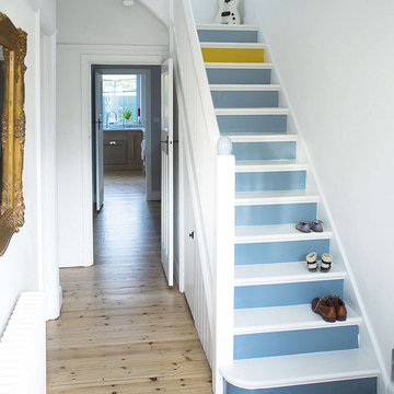
beautiful decors then this decorations is well considered. Being a part of house interior, small hallway ideas aren’t a bad designs. Make yourself comfortable and take a look to these small hall designs ideas which appears out as minimalistic interior designs and looks amazing with multiple light reflections. Deciding to change your hallway, then make sure you choose these small hallways decorating ideas for your home to keep its beauty on first priority.
1