


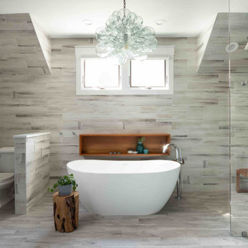
Search results for "70s style house bathroom ideas" in Home Design Ideas
Martinkovic Milford Architects services the San Francisco Bay Area. Learn more about our specialties and past projects at: www.martinkovicmilford.com/houzz
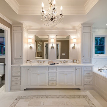
Master bath in new construction of traditional style home.
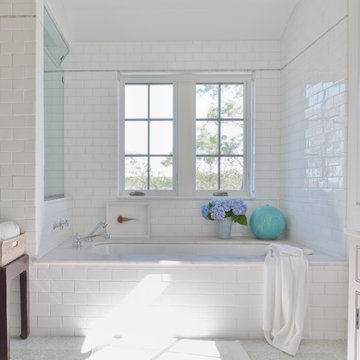
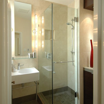
Bathroom - craftsman subway tile bathroom idea in Seattle with a pedestal sink
Bathroom - craftsman subway tile bathroom idea in Seattle with a pedestal sink
Find the right local pro for your project
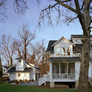
A simple one-story white clapboard 1920s cottage bungalow sat on a narrow straight street with many older homes, all of which meeting the street with a similar dignified approach. This house was the smallest of them all, built in 1922 as a weekend cottage, near the old East Falls Church rail station which provided direct access to Washington D.C. Its diminutive scale, low-pitched roof with the ridge parallel to the street, and lack of superfluous decoration characterized this cottage bungalow. Though the owners fell in love with the charm of the original house, their growing family presented an architectural dilemma: how do you significantly expand a charming little 1920’s Craftsman style house that you love without totally losing the integrity that made it so perfect?
The answer began to formulate after a review of the houses in the turn-of-the-century neighborhood; every older house was two stories tall, each built in a different style, each beautifully proportioned, each much larger than this cottage bungalow. Most of the neighborhood houses had been significantly renovated or expanded. Growing this one-story house would certainly not adversely affect the architectural character of the neighborhood. Given that, the house needed to maintain a diminutive scale in order to appear friendly and avoid a dominating presence.
The simplistic, crisp, honest materials and details of the little house, all painted white, would be saved and incorporated into a new house. Across the front of the house, the three public spaces would be saved, connected along an axis anchored on the left by the living room fireplace, with the dining room and the sitting room to the right. These three rooms are punctuated by thirteen windows, which for this house age and style, really suggests a more modern aesthetic.
Hoachlander Davis Photography
A simple one-story white clapboard 1920s cottage bungalow sat on a narrow straight street with many older homes, all of which meeting the street with a similar dignified approach. This house was the smallest of them all, built in 1922 as a weekend cottage, near the old East Falls Church rail station which provided direct access to Washington D.C. Its diminutive scale, low-pitched roof with the ridge parallel to the street, and lack of superfluous decoration characterized this cottage bungalow. Though the owners fell in love with the charm of the original house, their growing family presented an architectural dilemma: how do you significantly expand a charming little 1920’s Craftsman style house that you love without totally losing the integrity that made it so perfect?
The answer began to formulate after a review of the houses in the turn-of-the-century neighborhood; every older house was two stories tall, each built in a different style, each beautifully proportioned, each much larger than this cottage bungalow. Most of the neighborhood houses had been significantly renovated or expanded. Growing this one-story house would certainly not adversely affect the architectural character of the neighborhood. Given that, the house needed to maintain a diminutive scale in order to appear friendly and avoid a dominating presence.
The simplistic, crisp, honest materials and details of the little house, all painted white, would be saved and incorporated into a new house. Across the front of the house, the three public spaces would be saved, connected along an axis anchored on the left by the living room fireplace, with the dining room and the sitting room to the right. These three rooms are punctuated by thirteen windows, which for this house age and style, really suggests a more modern aesthetic.
Hoachlander Davis Photography.
Download our free ebook, Creating the Ideal Kitchen. DOWNLOAD NOW
Lakefront property in the northwest suburbs of Chicago is hard to come by, so when we were hired by this young family with exactly that, we were immediately inspired by not just the unusually large footprint of this 1950’s colonial revival but also the lovely views of the manmade lake it was sited on. The large 5-bedroom home was solidly stuck in the 1980’s, but we saw tons of potential. We started out by updating the existing staircase with a fresh coat of paint and adding new herringbone slate to the entry hall.
The powder room off the entryway also got a refresh - new flooring, new cabinets and fixtures. We ran the new slate right through into this space for some consistency. A fun wallpaper and shiplap trim add a welcoming feel and set the tone for the home.
Next, we tackled the kitchen. Located away from the rest of the first floor, the kitchen felt a little isolated, so we immediately began planning for how to better connect it to the rest of the first floor. We landed on removing the wall between the kitchen and dining room and designed a modified galley style space with separate cooking and clean up zones. The cooking zone consists of the refrigerator, prep sink and cooktop, along with a nice long run of prep space at the island. The cleanup side of the kitchen consists of the main sink and dishwasher. Both areas are situated so that the user can view the lake during prep work and cleanup!
One of the home’s main puzzles was how to incorporate the mudroom and area in front of the patio doors at the back of the house. We already had a breakfast table area, so the space by the patio doors was a bit of a no man’s land. We decided to separate the kitchen proper from what became the new mudroom with a large set of barn doors. That way you can quickly hide any mudroom messes but have easy access to the light coming in through the patio doors as well as the outdoor grilling station. We also love the impact the barn doors add to the overall space.
The homeowners’ first words to us were “it’s time to ditch the brown,” so we did! We chose a lovely blue pallet that reflects the home’s location on the lake which is also vibrant yet easy on the eye. Countertops are white quartz, and the natural oak floor works well with the other honey accents. The breakfast table was given a refresh with new chairs, chandelier and window treatments that frame the gorgeous views of the lake out the back.
We coordinated the slate mudroom flooring with that used in the home’s main entrance for a consistent feel. The storage area consists of open and closed storage to allow for some clutter control as needed.
Next on our “to do” list was revamping the dated brown bar area in the neighboring dining room. We eliminated the clutter by adding some closed cabinets and did some easy updates to help the space feel more current. One snag we ran into here was the discovery of a beam above the existing open shelving that had to be modified with a smaller structural beam to allow for our new design to work. This was an unexpected surprise, but in the end we think it was well worth it!
We kept the colors here a bit more muted to blend with the homeowner’s existing furnishings. Open shelving and polished nickel hardware add some simple detail to the new entertainment zone which also looks out onto the lake!
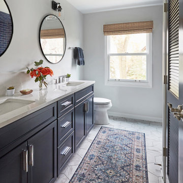
Next we tackled the upstairs starting with the homeowner’s son’s bath. The bath originally had both a tub shower and a separate shower, so we decided to swap out the shower for a new laundry area. This freed up some space downstairs in what used to be the mudroom/laundry room and is much more convenient for daily laundry needs.
We continued the blue palette here with navy cabinetry and the navy tile in the shower. Porcelain floor tile and chrome fixtures keep maintenance to a minimum while matte black mirrors and lighting add some depth the design. A low maintenance runner adds some warmth underfoot and ties the whole space together.
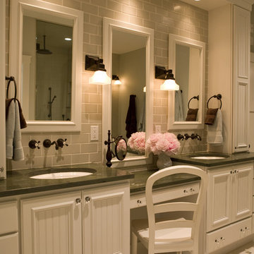
We added a pocket door to the bathroom to minimize interference with the door swings. The left door of the laundry closet is on a 180 degree hinge to allow for easy full access to the machines. Next we tackled the master bath which is an en suite arrangement. The original was typical of the 1980’s with the vanity outside of the bathroom, situated near the master closet. And the brown theme continued here with multiple shades of brown.
Our first move was to segment off the bath and the closet from the master bedroom. We created a short hall from the bedroom to the bathroom with his and hers walk-in closets on the left and right as well as a separate toilet closet outside of the main bathroom for privacy and flexibility.
The original bathroom had a giant soaking tub with steps (dangerous!) as well as a small shower that did not work well for our homeowner who is 6’3”. With other bathtubs in the home, they decided to eliminate the tub and create an oversized shower which takes up the space where the old tub was located. The double vanity is on the opposite wall and a bench is located under the window for morning conversations and a place to set a couple of towels.
The pallet in here is light and airy with a mix of blond wood, creamy porcelain and marble tile, and brass accents. A simple roman shade adds some texture and it’s top-down mechanism allows for light and privacy.
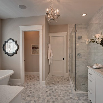
This large whole house remodel gave our homeowners not only the ability to maximize the potential of their home but also created a lovely new frame from which to view their fabulous lake views.
Designed by: Susan Klimala, CKD, CBD
Photography by: Michael Kaskel
For more information on kitchen and bath design ideas go to: www.kitchenstudio-ge.com
Originally designed by J. Merrill Brown in 1887, this Queen Anne style home sits proudly in Cambridge's Avon Hill Historic District. Past was blended with present in the restoration of this property to its original 19th century elegance. The design satisfied historical requirements with its attention to authentic detailsand materials; it also satisfied the wishes of the family who has been connected to the house through several generations.
Photo Credit: Peter Vanderwarker
Sponsored
Columbus, OH
Dave Fox Design Build Remodelers
Columbus Area's Luxury Design Build Firm | 17x Best of Houzz Winner!
This remodel of a mid century gem is located in the town of Lincoln, MA a hot bed of modernist homes inspired by Gropius’ own house built nearby in the 1940’s. By the time the house was built, modernism had evolved from the Gropius era, to incorporate the rural vibe of Lincoln with spectacular exposed wooden beams and deep overhangs.
The design rejects the traditional New England house with its enclosing wall and inward posture. The low pitched roofs, open floor plan, and large windows openings connect the house to nature to make the most of its rural setting. The bathroom floor and walls are white Thassos marble.
Photo by: Nat Rea Photography
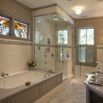
Master bathroom suite with slab and mosaic Calacatta Marble floors, slab counters and tiled walls. Crystal chandeliers and sconces highlighting custom painted inset cabinets.
Simple clean design...in this master bathroom renovation things were kept in the same place but in a very different interpretation. The shower is where the exiting one was, but the walls surrounding it were taken out, a curbless floor was installed with a sleek tile-over linear drain that really goes away. A free-standing bathtub is in the same location that the original drop in whirlpool tub lived prior to the renovation. The result is a clean, contemporary design with some interesting "bling" effects like the bubble chandelier and the mirror rounds mosaic tile located in the back of the niche.
Photography: Barry Halkin
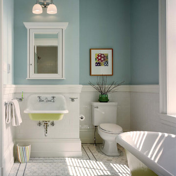
Elegant kids' subway tile claw-foot bathtub photo in Philadelphia with a wall-mount sink and blue walls
Elegant kids' subway tile claw-foot bathtub photo in Philadelphia with a wall-mount sink and blue walls
Transitional Design Condo Update in San Francisco, California Pacific Heights Neighborhood
The owners of this condo in Pacific Heights wanted to update their 60’s style kitchen and bathrooms yet strike a balance between ultra modern and conservative. To achieve this, we combined clean modern lines and contemporary fittings with warm natural stone and rich woods. In the kitchen, a distinctive effect is achieved by using quarter sawn cherry veneer on the shaker style cabinet doors with parallel grain run horizontally. Beautiful brown granite and custom stain compliment the oak floors we selected to provide continuity with the rest of the house. The master bath features a vanity designed with a wrap-over counter of thick granite, wenge wood veneers, Venetian plaster and a carefully coordinated variety of glass and stone tiles. In the guest bath a similar material palette is enlivened by inclusion of a wall hung toilet and an art niche.
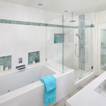
Example of a mid-sized beach style master white tile and ceramic tile marble floor, gray floor and double-sink bathroom design in San Francisco with shaker cabinets, blue cabinets, white walls, an undermount sink, quartz countertops, a hinged shower door, white countertops and a niche
Sponsored
Sunbury, OH
J.Holderby - Renovations
Franklin County's Leading General Contractors - 2X Best of Houzz!
A young Mexican couple approached us to create a streamline modern and fresh home for their growing family. They expressed a desire for natural textures and finishes such as natural stone and a variety of woods to juxtapose against a clean linear white backdrop.
For the kid’s rooms we are staying within the modern and fresh feel of the house while bringing in pops of bright color such as lime green. We are looking to incorporate interactive features such as a chalkboard wall and fun unique kid size furniture.
The bathrooms are very linear and play with the concept of planes in the use of materials.They will be a study in contrasting and complementary textures established with tiles from resin inlaid with pebbles to a long porcelain tile that resembles wood grain.
This beautiful house is a 5 bedroom home located in Presidential Estates in Aventura, FL.
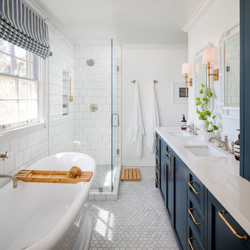
Girls bathroom remodel for two sisters from two small separate bathrooms originally to a new larger, "Jack and Jill" style bathroom for better flow. Cesarstone white counter tops, tub deck, and shower bench/curb. Wood look porcelain floor planking. White subway tile with glass bubble mosaic tile accents. Construction by JP Lindstrom, Inc. Bernard Andre Photography
Professionally Staged by Ambience at Home
http://ambiance-athome.com/
Professionally Photographed by SpaceCrafting
http://spacecrafting.com
Showing Results for "70S Style House Bathroom Ideas"
Sponsored
Columbus, OH
Hope Restoration & General Contracting
Columbus Design-Build, Kitchen & Bath Remodeling, Historic Renovations
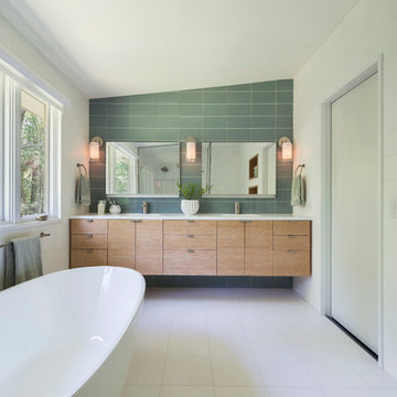
A Minimal Modern Spa Bathroom completed by Storybook Interiors of Grand Rapids, Michigan.
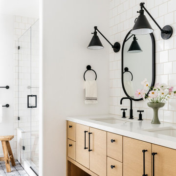
Inspiration for a mid-sized contemporary master gray tile and ceramic tile ceramic tile bathroom remodel in Grand Rapids with quartzite countertops, flat-panel cabinets, medium tone wood cabinets and a vessel sink
Inspiration for a mid-sized contemporary master gray tile and ceramic tile ceramic tile bathroom remodel in Grand Rapids with quartzite countertops, flat-panel cabinets, medium tone wood cabinets and a vessel sink
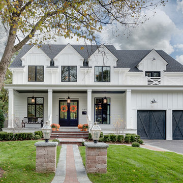
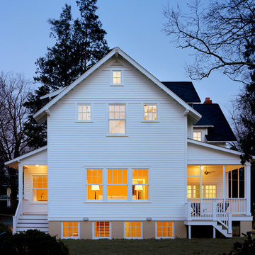
Picture Perfect House
Inspiration for a large farmhouse white two-story wood house exterior remodel in Chicago with a shingle roof
Inspiration for a large farmhouse white two-story wood house exterior remodel in Chicago with a shingle roof
This project was a joy to work on, as we married our firm’s modern design aesthetic with the client’s more traditional and rustic taste. We gave new life to all three bathrooms in her home, making better use of the space in the powder bathroom, optimizing the layout for a brother & sister to share a hall bath, and updating the primary bathroom with a large curbless walk-in shower and luxurious clawfoot tub. Though each bathroom has its own personality, we kept the palette cohesive throughout all three.
1