


Search results for "First floor addition" in Home Design Ideas
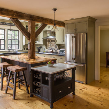
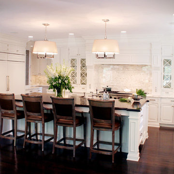
The Garvin-Weeks Farmstead in beautiful North Reading, built c1790, has enjoyed a first floor makeover complete with a new kitchen, family room and master suite. Particular attention was given to preserve the historic details of the house while modernizing and opening up the space for today’s lifestyle. The open concept farmhouse style kitchen is striking with its antique beams and rafters, handmade and hand planed cabinets, distressed floors, custom handmade soapstone farmer’s sink, marble counter tops, kitchen island comprised of reclaimed wood with a milk paint finish, all setting the stage for the elaborate custom painted tile work. Skylights above bathe the space in natural light. Walking through the warm family room gives one the sense of history and days gone by, culminating in a quintessential looking, but fabulously updated new England master bedroom and bath. A spectacular addition that feels and looks like it has always been there!
Photos by Eric Roth
Offering a beautiful view through a large window into the backyard, we knew we would highlight the window and design a new kitchen layout, around that window. The former kitchen felt closed in with super dark cabinets. Along with the homeowner, our team designed a light and airy kitchen, including a new pass through to the dining room. Closed off from the kitchen before, the pass through not only allows light to flow in from the beautiful bay window in the dining room, but if offers a functional countertop used for entertaining and serving guests.
Not pictured is a drop zone, located immediately when you enter from the mudroom. Drop zones are fantastic for everyday items like keys, wallets, dog gear and more. We added an additional opening to the living room, right off the kitchen as well as a wet bar strategically placed outside the ever day kitchen work zone. Wet bars are fantastic for holding entertainment dishware, barware and appetizers!
We finished the space with beautiful new hardwood floors throughout the entire first floor, except the tile in the mudroom.
Inspired by the surrounding landscape, the Craftsman/Prairie style is one of the few truly American architectural styles. It was developed around the turn of the century by a group of Midwestern architects and continues to be among the most comfortable of all American-designed architecture more than a century later, one of the main reasons it continues to attract architects and homeowners today. Oxbridge builds on that solid reputation, drawing from Craftsman/Prairie and classic Farmhouse styles. Its handsome Shingle-clad exterior includes interesting pitched rooflines, alternating rows of cedar shake siding, stone accents in the foundation and chimney and distinctive decorative brackets. Repeating triple windows add interest to the exterior while keeping interior spaces open and bright. Inside, the floor plan is equally impressive. Columns on the porch and a custom entry door with sidelights and decorative glass leads into a spacious 2,900-square-foot main floor, including a 19 by 24-foot living room with a period-inspired built-ins and a natural fireplace. While inspired by the past, the home lives for the present, with open rooms and plenty of storage throughout. Also included is a 27-foot-wide family-style kitchen with a large island and eat-in dining and a nearby dining room with a beadboard ceiling that leads out onto a relaxing 240-square-foot screen porch that takes full advantage of the nearby outdoors and a private 16 by 20-foot master suite with a sloped ceiling and relaxing personal sitting area. The first floor also includes a large walk-in closet, a home management area and pantry to help you stay organized and a first-floor laundry area. Upstairs, another 1,500 square feet awaits, with a built-ins and a window seat at the top of the stairs that nod to the home’s historic inspiration. Opt for three family bedrooms or use one of the three as a yoga room; the upper level also includes attic access, which offers another 500 square feet, perfect for crafts or a playroom. More space awaits in the lower level, where another 1,500 square feet (and an additional 1,000) include a recreation/family room with nine-foot ceilings, a wine cellar and home office.
Photographer: Jeff Garland
Find the right local pro for your project
This contemporary renovation makes no concession towards differentiating the old from the new. Rather than razing the entire residence an effort was made to conserve what elements could be worked with and added space where an expanded program required it. Clad with cedar, the addition contains a master suite on the first floor and two children’s rooms and playroom on the second floor. A small vegetated roof is located adjacent to the stairwell and is visible from the upper landing. Interiors throughout the house, both in new construction and in the existing renovation, were handled with great care to ensure an experience that is cohesive. Partition walls that once differentiated living, dining, and kitchen spaces, were removed and ceiling vaults expressed. A new kitchen island both defines and complements this singular space.
The parti is a modern addition to a suburban midcentury ranch house. Hence, the name “Modern with Ranch.”
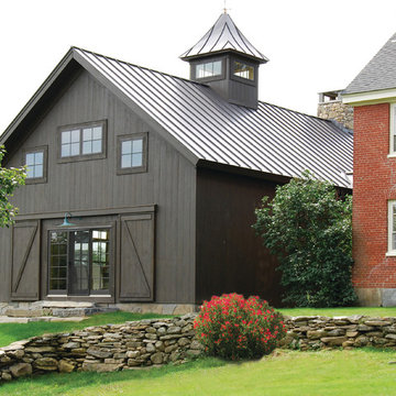
This barn addition was accomplished by dismantling an antique timber frame and resurrecting it alongside a beautiful 19th century farmhouse in Vermont.
What makes this property even more special, is that all native Vermont elements went into the build, from the original barn to locally harvested floors and cabinets, native river rock for the chimney and fireplace and local granite for the foundation. The stone walls on the grounds were all made from stones found on the property.
The addition is a multi-level design with 1821 sq foot of living space between the first floor and the loft. The open space solves the problems of small rooms in an old house.
The barn addition has ICFs (r23) and SIPs so the building is airtight and energy efficient.
It was very satisfying to take an old barn which was no longer being used and to recycle it to preserve it's history and give it a new life.
Tom Holdsworth Photography
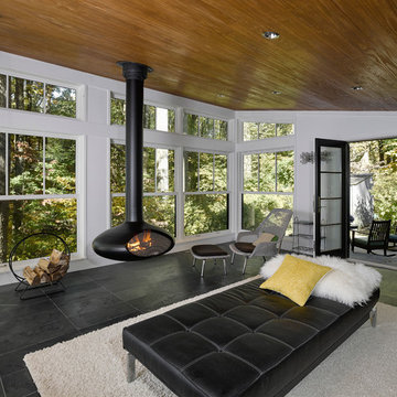
Our clients wanted to create a room that would bring them closer to the outdoors; a room filled with natural lighting; and a venue to spotlight a modern fireplace.
Early in the design process, our clients wanted to replace their existing, outdated, and rundown screen porch, but instead decided to build an all-season sun room. The space was intended as a quiet place to read, relax, and enjoy the view.
The sunroom addition extends from the existing house and is nestled into its heavily wooded surroundings. The roof of the new structure reaches toward the sky, enabling additional light and views.
The floor-to-ceiling magnum double-hung windows with transoms, occupy the rear and side-walls. The original brick, on the fourth wall remains exposed; and provides a perfect complement to the French doors that open to the dining room and create an optimum configuration for cross-ventilation.
To continue the design philosophy for this addition place seamlessly merged natural finishes from the interior to the exterior. The Brazilian black slate, on the sunroom floor, extends to the outdoor terrace; and the stained tongue and groove, installed on the ceiling, continues through to the exterior soffit.
The room's main attraction is the suspended metal fireplace; an authentic wood-burning heat source. Its shape is a modern orb with a commanding presence. Positioned at the center of the room, toward the rear, the orb adds to the majestic interior-exterior experience.
This is the client's third project with place architecture: design. Each endeavor has been a wonderful collaboration to successfully bring this 1960s ranch-house into twenty-first century living.
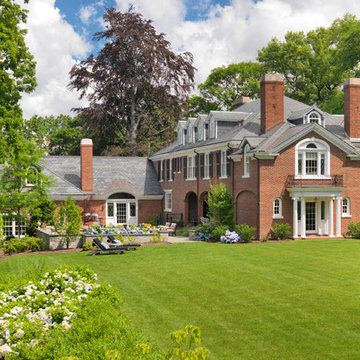
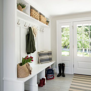
This stately Georgian home in West Newton Hill, Massachusetts was originally built in 1917 for John W. Weeks, a Boston financier who went on to become a U.S. Senator and U.S. Secretary of War. The home’s original architectural details include an elaborate 15-inch deep dentil soffit at the eaves, decorative leaded glass windows, custom marble windowsills, and a beautiful Monson slate roof. Although the owners loved the character of the original home, its formal layout did not suit the family’s lifestyle. The owners charged Meyer & Meyer with complete renovation of the home’s interior, including the design of two sympathetic additions. The first includes an office on the first floor with master bath above. The second and larger addition houses a family room, playroom, mudroom, and a three-car garage off of a new side entry.
Front exterior by Sam Gray. All others by Richard Mandelkorn.
Sponsored
Columbus, OH
Dave Fox Design Build Remodelers
Columbus Area's Luxury Design Build Firm | 17x Best of Houzz Winner!
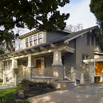
The Cleveland Park neighborhood of Washington, D.C boasts some of the most beautiful and well maintained bungalows of the late 19th century. Residential streets are distinguished by the most significant craftsman icon, the front porch.
Porter Street Bungalow was different. The stucco walls on the right and left side elevations were the first indication of an original bungalow form. Yet the swooping roof, so characteristic of the period, was terminated at the front by a first floor enclosure that had almost no penetrations and presented an unwelcoming face. Original timber beams buried within the enclosed mass provided the
only fenestration where they nudged through. The house,
known affectionately as ‘the bunker’, was in serious need of
a significant renovation and restoration.
A young couple purchased the house over 10 years ago as
a first home. As their family grew and professional lives
matured the inadequacies of the small rooms and out of date systems had to be addressed. The program called to significantly enlarge the house with a major new rear addition. The completed house had to fulfill all of the requirements of a modern house: a reconfigured larger living room, new shared kitchen and breakfast room and large family room on the first floor and three modified bedrooms and master suite on the second floor.
Front photo by Hoachlander Davis Photography.
All other photos by Prakash Patel.
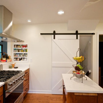
PBA was brought in to solve many issues throughout the first floor of this home, the most pressing of which was to create a larger and more functional kitchen. After examining several options, the decision was made to create a narrow addition to the side of the house which allowed the design to meet all of the clients objectives. The floor plan was also opened up to allow for entertaining, and a long corridor was enhanced with trim-work to visually break up the length of the corridor, including the creation of a focal point wall at the end of the corridor. Other renovations included a new mud room, and a guest bathroom and awkwardly proportioned music room were completely reconfigured to create a formal powder room, a significantly improved guest bathroom, and a more intimate music room / sitting room.
Photographer: Anne Gummerson
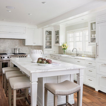
In the design stages many details were incorporated in this classic kitchen to give it dimension since the surround cabinets, counters and backsplash were white. Polished nickel plumbing, hardware and custom grilles on feature cabinets along with the island pendants add shine, while finer details such as inset doors, furniture kicks on non-working areas and lofty crown details add a layering effect in the millwork. Surround counters as well as 3" x 6" backsplash tile are Calacutta Gold stone, while island counter surface is walnut. Conveniences include a 60" Wolf range, a 36" Subzero refrigerator and freezer and two farmhouse sinks by Kallista. The kitchen also boasts two dishwashers (one in the island and one to the right of the sink cabinet under the window) and a coffee bar area with a built-in Miele. Photo by Pete Maric.
When my client had to move from her company office to work at home, she set up in the dining room. Despite her best efforts, this was not the long-term solution she was looking for. My client realized she needed a dedicated space not on the main floor of the home. On one hand, having your office space right next to the kitchen is handy. On the other hand, it made separating work and home life was not that easy.
The house was a ranch. In essence, the basement would run entire length of the home. As we came down the steps, we entered a time capsule. The house was built in the 1950’s. The walls were covered with original knotty pine paneling. There was a wood burning fireplace and considering this was a basement, high ceilings. In addition, there was everything her family could not store at their own homes. As we wound though the space, I though “wow this has potential”, Eventually, after walking through the laundry room we came to a small nicely lit room. This would be the office.
My client looked at me and asked what I thought. Undoubtedly, I said, this can be a great workspace, but do you really want to walk through this basement and laundry to get here? Without reservation, my client said where do we start?
Once the design was in place, we started the renovation. The knotty pine paneling had to go. Specifically, to add some insulation and control the dampness and humidity. The laundry room wall was relocated to create a hallway to the office.
At the far end of the room, we designated a workout zone. Weights, mats, exercise bike and television are at the ready for morning or afternoon workouts. The space can be concealed by a folding screen for party time. Doors to an old closet under the stairs were relocated to the workout area for hidden storage. Now we had nice wall for a beautiful console and mirror for storage and serving during parties.
In order to add architectural details, we covered the old ugly support columns with simple recessed millwork panels. This detail created a visual division between the bar area and the seating area in front of the fireplace. The old red brick on the fireplace surround was replaced with stack stone. A mantle was made from reclaimed wood. Additional reclaimed wood floating shelves left and right of the fireplace provides decorative display while maintaining a rustic element balancing the copper end table and leather swivel rocker.
We found an amazing rug which tied all of the colors together further defining the gathering space. Russet and burnt orange became the accent color unifying each space. With a bit of whimsy, a rather unusual light fixture which looks like roots from a tree growing through the ceiling is a conversation piece.
The office space is quite and removed from the main part of the basement. There is a desk large enough for multiple screens, a small bookcase holding office supplies and a comfortable chair for conference calls. Because working from home requires many online meetings, we added a shiplap wall painted in Hale Navy to contrast with the orange fabric on the chair. We finished the décor with a painting from my client’s father. This is the background online visitors will see.
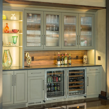
The last and best part of the renovation is the beautiful bar. My client is an avid collector of wine. She already had the EuroCave refrigerator, so I incorporated it into the design. The cabinets are painted Temptation Grey from Benjamin Moore. The counter tops are my favorite hard working quartzite Brown Fantasy. The backsplash is a combination of rustic wood and old tin ceiling like porcelain tiles. Together with the textures of the reclaimed wood and hide poofs balanced against the smooth finish of the cabinets, we created a comfortable luxury for relaxing.
There is ample storage for bottles, cans, glasses, and anything else you can think of for a great party. In addition to the wine storage, we incorporated a beverage refrigerator, an ice maker, and a sink. Floating shelves with integrated lighting illuminate the back bar. The raised height of the front bar provides the perfect wine tasting and paring spot. I especially love the pendant lights which look like wine glasses.
Finally, I selected carpet for the stairs and office. It is perfect for noise reduction. Meanwhile for the overall flooring, I specifically selected a high-performance vinyl plank floor. We often use this product as it is perfect to install on a concrete floor. It is soft to walk on, easy to clean and does not reduce the overall height of the space.
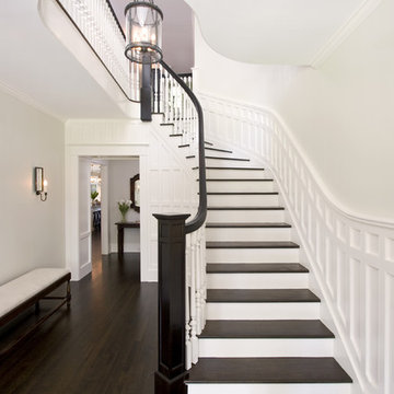
Clawson Architects designed the Main Entry/Stair Hall, flooding the space with natural light on both the first and second floors while enhancing views and circulation with more thoughtful space allocations and period details.
AIA Gold Medal Winner for Interior Architectural Element.
The unique design challenge in this early 20th century Georgian Colonial was the complete disconnect of the kitchen to the rest of the home. In order to enter the kitchen, you were required to walk through a formal space. The homeowners wanted to connect the kitchen and garage through an informal area, which resulted in building an addition off the rear of the garage. This new space integrated a laundry room, mudroom and informal entry into the re-designed kitchen. Additionally, 25” was taken out of the oversized formal dining room and added to the kitchen. This gave the extra room necessary to make significant changes to the layout and traffic pattern in the kitchen.
Beth Singer Photography
Sponsored
Delaware, OH
Buckeye Basements, Inc.
Central Ohio's Basement Finishing ExpertsBest Of Houzz '13-'21
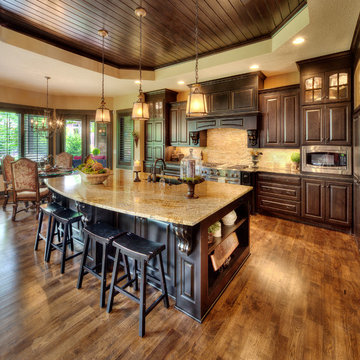
Large tuscan l-shaped kitchen photo in Kansas City with an undermount sink, raised-panel cabinets, dark wood cabinets, granite countertops, beige backsplash, stainless steel appliances and an island
The key to this project was to create a kitchen fitting of a residence with strong Industrial aesthetics. The PB Kitchen Design team managed to preserve the warmth and organic feel of the home’s architecture. The sturdy materials used to enrich the integrity of the design, never take away from the fact that this space is meant for hospitality. Functionally, the kitchen works equally well for quick family meals or large gatherings. But take a closer look at the use of texture and height. The vaulted ceiling and exposed trusses bring an additional element of awe to this already stunning kitchen.
Project specs: Cabinets by Quality Custom Cabinetry. 48" Wolf range. Sub Zero integrated refrigerator in stainless steel.
Project Accolades: First Place honors in the National Kitchen and Bath Association’s 2014 Design Competition
As seen in this photo, the front to back view offers homeowners and guests alike a direct view and access to the deck off the back of the house. In addition to holding access to the garage, this space holds two closets. One, the homeowners are using as a coat closest and the other, a pantry closet. You also see a custom built in unit with a bench and storage. There is also access to a powder room, a bathroom that was relocated from middle of the 1st floor layout. Relocating the bathroom allowed us to open up the floor plan, offering a view directly into and out of the playroom and dining room.
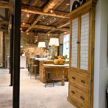
This project was a long labor of love. The clients adored this eclectic farm home from the moment they first opened the front door. They knew immediately as well that they would be making many careful changes to honor the integrity of its old architecture. The original part of the home is a log cabin built in the 1700’s. Several additions had been added over time. The dark, inefficient kitchen that was in place would not serve their lifestyle of entertaining and love of cooking well at all. Their wish list included large pro style appliances, lots of visible storage for collections of plates, silverware, and cookware, and a magazine-worthy end result in terms of aesthetics. After over two years into the design process with a wonderful plan in hand, construction began. Contractors experienced in historic preservation were an important part of the project. Local artisans were chosen for their expertise in metal work for one-of-a-kind pieces designed for this kitchen – pot rack, base for the antique butcher block, freestanding shelves, and wall shelves. Floor tile was hand chipped for an aged effect. Old barn wood planks and beams were used to create the ceiling. Local furniture makers were selected for their abilities to hand plane and hand finish custom antique reproduction pieces that became the island and armoire pantry. An additional cabinetry company manufactured the transitional style perimeter cabinetry. Three different edge details grace the thick marble tops which had to be scribed carefully to the stone wall. Cable lighting and lamps made from old concrete pillars were incorporated. The restored stone wall serves as a magnificent backdrop for the eye- catching hood and 60” range. Extra dishwasher and refrigerator drawers, an extra-large fireclay apron sink along with many accessories enhance the functionality of this two cook kitchen. The fabulous style and fun-loving personalities of the clients shine through in this wonderful kitchen. If you don’t believe us, “swing” through sometime and see for yourself! Matt Villano Photography
Showing Results for "First Floor Addition"
Sponsored
Plain City, OH
Kuhns Contracting, Inc.
Central Ohio's Trusted Home Remodeler Specializing in Kitchens & Baths
Kitchen Size: 14 Ft. x 15 1/2 Ft.
Island Size: 98" x 44"
Wood Floor: Stang-Lund Forde 5” walnut hard wax oil finish
Tile Backsplash: Here is a link to the exact tile and color: http://encoreceramics.com/product/silver-crackle-glaze/
•2014 MN ASID Awards: First Place Kitchens
•2013 Minnesota NKBA Awards: First Place Medium Kitchens
•Photography by Andrea Rugg
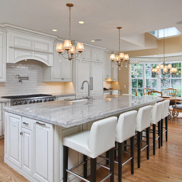
Kitchen Addition & Renovation, First Floor Renovation
Open concept kitchen - large traditional l-shaped light wood floor open concept kitchen idea in Philadelphia with an undermount sink, raised-panel cabinets, white cabinets, granite countertops, white backsplash, subway tile backsplash, stainless steel appliances and an island
Open concept kitchen - large traditional l-shaped light wood floor open concept kitchen idea in Philadelphia with an undermount sink, raised-panel cabinets, white cabinets, granite countertops, white backsplash, subway tile backsplash, stainless steel appliances and an island
Conceived as a remodel and addition, the final design iteration for this home is uniquely multifaceted. Structural considerations required a more extensive tear down, however the clients wanted the entire remodel design kept intact, essentially recreating much of the existing home. The overall floor plan design centers on maximizing the views, while extensive glazing is carefully placed to frame and enhance them. The residence opens up to the outdoor living and views from multiple spaces and visually connects interior spaces in the inner court. The client, who also specializes in residential interiors, had a vision of ‘transitional’ style for the home, marrying clean and contemporary elements with touches of antique charm. Energy efficient materials along with reclaimed architectural wood details were seamlessly integrated, adding sustainable design elements to this transitional design. The architect and client collaboration strived to achieve modern, clean spaces playfully interjecting rustic elements throughout the home.
Greenbelt Homes
Glynis Wood Interiors
Photography by Bryant Hill
1