


Search results for "Effectiveness examining" in Home Design Ideas
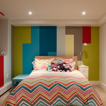
Kids' room - small contemporary gender-neutral light wood floor kids' room idea in Denver with multicolored walls
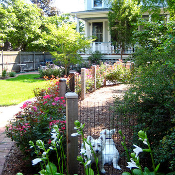
A dog run doesn't have to be a cage but separation is sometimes necessary especially with a multiple-dog household.
Photos by Pat Bernard
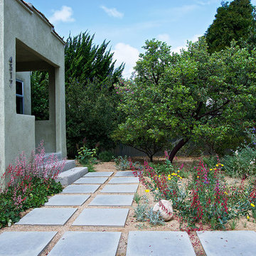
Design ideas for a traditional landscaping in Chicago.
Design ideas for a traditional landscaping in Chicago.
MEC Corporation was commissioned to design and supervise the complete rehabilitation of a landmark Turkish Revival townhouse from the 1870’s. Located on a charming street in Lahore the four floor building (plus sub-basement) was gutted to the original brick building envelope. MEC was responsible for the complete architectural, interior design and decorating of this home.
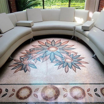
The floor has a customized marble mosaic pattern that gives a marvelous look. Hallmark of excellence in customization! | Have a custom mosaic idea? We can help, with our brilliant Italian-trained mosaicists and easy-to-install tiled masterpieces. Worldwide shipping available on the complete range of quality handcrafted marble & glass mosaic products. For inquires and more info, contact us: http://mecartworks.com
Find the right local pro for your project
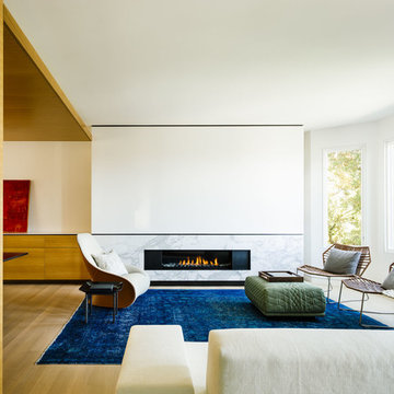
Living room - contemporary formal and open concept living room idea in San Francisco with white walls, a ribbon fireplace, a stone fireplace and no tv
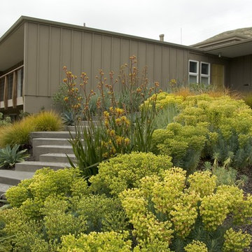
Photo of a mid-century modern landscaping in San Luis Obispo.
Interiors by SFA Design
Photography by Meghan Bierle-O'Brien
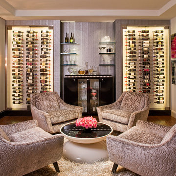
Large trendy dark wood floor and brown floor wine cellar photo in Los Angeles with storage racks
Large trendy dark wood floor and brown floor wine cellar photo in Los Angeles with storage racks
Tricia Shay Photography
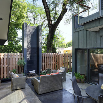
Example of a large trendy courtyard concrete patio design in Milwaukee with no cover
Example of a large trendy courtyard concrete patio design in Milwaukee with no cover
Sponsored
Columbus, OH
Dave Fox Design Build Remodelers
Columbus Area's Luxury Design Build Firm | 17x Best of Houzz Winner!
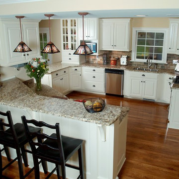
As part of a first floor renovation the kitchen was enlarged by removing several load bearing walls. The new kitchen is far more spacious meeting the needs of an active family. The custom cabinetry is topped with Giallo Napoleon granite. The backsplash is honed slate.
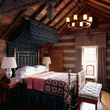
The interiors of this new hunting lodge were created with reclaimed materials and furnishing to evoke a rustic, yet luxurious 18th Century retreat. Photographs: Erik Kvalsvik
Master bathroom at home on Russell Rd. in Alexandria.
Photo by Greg Hadley
Example of a trendy subway tile bathroom design in DC Metro
Example of a trendy subway tile bathroom design in DC Metro
Don Pappageorge Photography
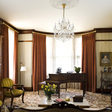
Example of a classic living room design in Other
Example of a classic living room design in Other
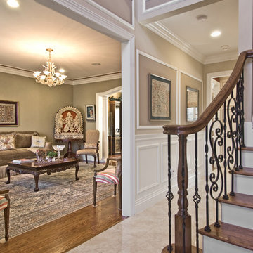
Originally designed by J. Merrill Brown in 1887, this Queen Anne style home sits proudly in Cambridge's Avon Hill Historic District. Past was blended with present in the restoration of this property to its original 19th century elegance. The design satisfied historical requirements with its attention to authentic detailsand materials; it also satisfied the wishes of the family who has been connected to the house through several generations.
Photo Credit: Peter Vanderwarker
Sponsored
Columbus, OH
Dave Fox Design Build Remodelers
Columbus Area's Luxury Design Build Firm | 17x Best of Houzz Winner!
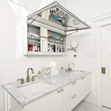
If you are looking for twice your normal bath experience, look no more. This master bath has plenty of room for two with double the storage, double the mirrors, sinks and faucets, and bathing is done two-way. The colors are warm and inviting, but it’s the subtle patterning that caught my eye. The overall effect is of a soft wash, yet on closer examination, the striations travel across the walls and criss-cross on the floor.
This expansive vanity was created with our homeowner’s needs in mind. Each “side” has a bank of drawers and under sink cabinet storage. A large undermount sink dips below the gorgeous stone counter top. Gently arching faucets in brushed nickel adorn each sink with a framed mirror above for reflection. Individual task lighting shine upon each sink and is reflected back into the room. For additional storage and to keep elbows from connecting, a large shared bank of drawers separate the two areas.
The vanities are rich with color and texture, from the swirling grain of the wood, to the raised panels and beading. The subtle beading is repeated on the drawers for a custom look. Our wood color is a deeper, more intense tone of the colors in our tiling.
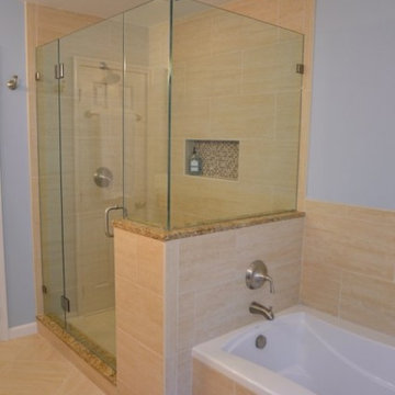
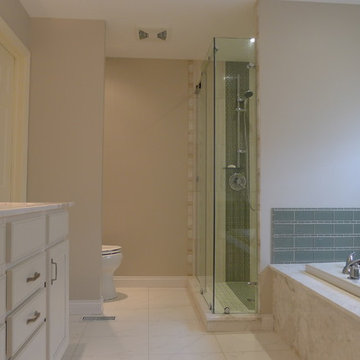
Whether in a hurry or needing to relax and unwind, this bath can do both. Despite having two substantial pieces in the same area, the open glass panel that separate leaves each feeling open and airy.
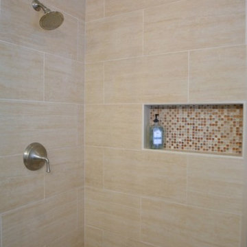
This tub was made for soaking. The sides and back gently mold into arm and neck support for a truly relaxing experience. The lineal movement in the tile backsplash lend a long and lean feeling. For easy reach, toiletries are stored in a niche with accent multicolored mosaics.
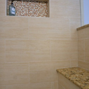
On the other side of the half wall a roomy shower awaits. The long tiles were installed in a brick pattern with striations of color wrapping the walls. The oversized tiles reduce the amount of grout, for a cleaner look. Here too we added a niche for maximum storage and a sprinkle more of the accenting mosaic. We capped the half wall and the generous bench with our vanity’s stone for a rich contrast.
We installed the tile up to the ceiling, which adds to the visual height of the room. We went with clean simple controls and showerhead, enhanced in a brushed nickel finish. So as to not obscure the view, we went frameless on our shower door and panels, using brushed nickel hinges and a simple handle.
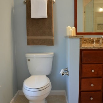
At the end of our vanity, a half wall adds backsplash on the vanity side and a bit of privacy on the other. A simple toilet in crisp white is out of sight but functional in its own “alcove”.
Despite all the patterning, there is nothing busy about the room. For the floor we decided to change things up, using a large square version of the wall tiles. To keep the room from feeling too long, we installed them on the diagonal and then criss-crossed the lines for a dramatic look.
This bath is twice as nice and ready to be shared!
http://www.designsbyskill.com/
http://www.rjkconstructioninc.com/
If you are looking for twice your normal bath experience, look no more. This master bath has plenty of room for two with double the storage, double the mirrors, sinks and faucets, and bathing is done two-way. The colors are warm and inviting, but it’s the subtle patterning that caught my eye. The overall effect is of a soft wash, yet on closer examination, the striations travel across the walls and criss-cross on the floor.
This expansive vanity was created with our homeowner’s needs in mind. Each “side” has a bank of drawers and under sink cabinet storage. A large undermount sink dips below the gorgeous stone counter top. Gently arching faucets in brushed nickel adorn each sink with a framed mirror above for reflection. Individual task lighting shine upon each sink and is reflected back into the room. For additional storage and to keep elbows from connecting, a large shared bank of drawers separate the two areas.
The vanities are rich with color and texture, from the swirling grain of the wood, to the raised panels and beading. The subtle beading is repeated on the drawers for a custom look. Our wood color is a deeper, more intense tone of the colors in our tiling.
Whether in a hurry or needing to relax and unwind, this bath can do both. Despite having two substantial pieces in the same area, the open glass panel that separate leaves each feeling open and airy.
This tub was made for soaking. The sides and back gently mold into arm and neck support for a truly relaxing experience. The lineal movement in the tile backsplash lend a long and lean feeling. For easy reach, toiletries are stored in a niche with accent multicolored mosaics.
On the other side of the half wall a roomy shower awaits. The long tiles were installed in a brick pattern with striations of color wrapping the walls. The oversized tiles reduce the amount of grout, for a cleaner look. Here too we added a niche for maximum storage and a sprinkle more of the accenting mosaic. We capped the half wall and the generous bench with our vanity’s stone for a rich contrast.
We installed the tile up to the ceiling, which adds to the visual height of the room. We went with clean simple controls and showerhead, enhanced in a brushed nickel finish. So as to not obscure the view, we went frameless on our shower door and panels, using brushed nickel hinges and a simple handle.
At the end of our vanity, a half wall adds backsplash on the vanity side and a bit of privacy on the other. A simple toilet in crisp white is out of sight but functional in its own “alcove”.
Despite all the patterning, there is nothing busy about the room. For the floor we decided to change things up, using a large square version of the wall tiles. To keep the room from feeling too long, we installed them on the diagonal and then criss-crossed the lines for a dramatic look.
This bath is twice as nice and ready to be shared!
http://www.designsbyskill.com/
http://www.rjkconstructioninc.com/
Sponsored
Over 300 locations across the U.S.
Schedule Your Free Consultation
Ferguson Bath, Kitchen & Lighting Gallery
Ferguson Bath, Kitchen & Lighting Gallery
This master bath remodel is a complete change from the original. I moved back the shower side wall and extended it back with a glass panel. The effect is now when you enter the bathroom you can see the shower and wonderful tiles. Because of a restricted space i went with a seamless roller sliding door system. The glass tiles form a waterfall effect on the main wall dropping down and continuing across the length of the floor. The bathtub surround uses the same tile mixed with it's subway partner. The beautiful marble was used for the tub deck, front apron and vanity top.

It's known as the PISA/TIMSS voyaging convoy. Every time worldwide tests results are discharged with association tables indicating champs and failures a gaggle of scientists, scholastics and grouped kindred explorers plummet on the most astounding performing nation or instruction framework to break down and write about "world's best practice".
The objective continues evolving
One issue with thusly of deduction is that nobody framework reliably beats the rest. In light of the 1995 and 1999 TIMSS (Trends in International Math and Science Study) results, Asian instruction frameworks in Singapore, Japan, South Korea and Taiwan overwhelmed. Accordingly, the emphasis was immovably on recognizing the reasons the Asian tigers were performing so well.
In the PISA (Program for International Student Assessment) 2000 results, Finland positioned first in education, fourth in arithmetic and third in science. Finland became the overwhelming focus and specialists and scholastics ran to Helsinki to find the reasons Finnish understudies performed at or close to the highest point of the table.
By 2012, at the end of the day, an alternate training framework turned into the focal point of consideration. Finland descended the PISA rankings as another champ, Shanghai, rose as first in arithmetic, science and perusing.
Apples aren't being contrasted with apples
A second issue when making correlations is that the spots we've recognized as examples of overcoming adversity are distinctive to Australia. City-states like Singapore and instruction frameworks in profoundly performing spots like Hong Kong and Shanghai have remarkable qualities that separate them from nations like Australia, England and the USA.
Contrasts in topography, the quantities of understudies and schools, the understudy cosmetics (as far as dialect, society and financial profile) and how schools, including educational modules and appraisal, are organized and oversaw significantly affect results.
Singapore, when contrasted with Australia, is little topographically, more homogenous as far as dialect and culture and utilizes instructive practices that have long been out of support in Australia. These incorporate gushing kids in view of their abilities, and high-chance, focused tests and examinations.
As noted in a paper titled How not to prevail upon PISA information: an unexpected examination, there are additionally social components clarifying solid execution that are troublesome, if not unimaginable, to exchange starting with one instruction framework then onto the next.
Evident cases incorporate the effect of Confucian qualities and morals that stretch appreciation for power (particularly instructors), the conviction that achievement is conceivable with inspiration, fixation and diligent work, and the thought that training is focal if one is to accomplish a superior life.
Confounding circumstances and end results
Befuddling what has driven these nations to achievement speaks to the third trouble in expecting that what seems to prompt accomplishment in one nation can without much of a stretch be exchanged to another.
To expect that everything we need to do in Australia to enhance test outcomes is to lessen the impact of the Australian Education Union, while being appealing to some, is both undemocratic and blameworthy of accepting circumstances and end results.
There are a few advantages of abroad correlations
PISA and TIMSS tests have been held for a long time. Thus, there is a decent arrangement of examination recognizing the attributes of more grounded performing instruction frameworks from which states and domains can learn.
The early ethnographic work recording Japanese and American classes nitty gritty in Harvard distribution The Teaching Gap uncovers how the lessons in Asian classrooms are more unequivocal, obviously organized and sound and there is a desire that all understudies, with the essential offer and applications, some assistance with canning succeed.
A later distribution by the Grattan Institute, Catching up: gaining from the best educational systems in East Asia, likewise distinguishes imperative lessons from fruitful Asian instruction frameworks.
Positive variables incorporate giving instructors more opportunity to work cooperatively and to tutor each other, guaranteeing that educator training, course readings and the educational modules are commonly steady and concentrate on enhancing classroom rehearse.
It ought to additionally be noticed that while Australian understudies don't perform in the top level in PISA and TIMSS tests, there is some reason for festivity. Understudies in the Australian Capital Territory perform well over the Australian normal and frequently coordinate the execution of top-performing abroad instruction frameworks.
As far as lifting the execution of understudies from distraught foundations it is additionally critical to take note of that Catholic schools, in light of an investigation of the 2009 PISA results completed by the Australian Council for Educational Research, accomplish a value rating surpassing that of Finland.
About the Author: Amy Parker writes too many academic papers for people who have troubles with it. She always gives needed advices, shows the examples of the papers and helps with writing at http://papersnetwork.net
If you are looking for twice your normal bath experience, look no more. This master bath has plenty of room for two with double the storage, double the mirrors, sinks and faucets, and bathing is done two-way. The colors are warm and inviting, but it’s the subtle patterning that caught my eye. The overall effect is of a soft wash, yet on closer examination, the striations travel across the walls and criss-cross on the floor.
This expansive vanity was created with our homeowner’s needs in mind. Each “side” has a bank of drawers and under sink cabinet storage. A large undermount sink dips below the gorgeous stone counter top. Gently arching faucets in brushed nickel adorn each sink with a framed mirror above for reflection. Individual task lighting shine upon each sink and is reflected back into the room. For additional storage and to keep elbows from connecting, a large shared bank of drawers separate the two areas.
The vanities are rich with color and texture, from the swirling grain of the wood, to the raised panels and beading. The subtle beading is repeated on the drawers for a custom look. Our wood color is a deeper, more intense tone of the colors in our tiling.
Whether in a hurry or needing to relax and unwind, this bath can do both. Despite having two substantial pieces in the same area, the open glass panel that separate leaves each feeling open and airy.
This tub was made for soaking. The sides and back gently mold into arm and neck support for a truly relaxing experience. The lineal movement in the tile backsplash lend a long and lean feeling. For easy reach, toiletries are stored in a niche with accent multicolored mosaics.
On the other side of the half wall a roomy shower awaits. The long tiles were installed in a brick pattern with striations of color wrapping the walls. The oversized tiles reduce the amount of grout, for a cleaner look. Here too we added a niche for maximum storage and a sprinkle more of the accenting mosaic. We capped the half wall and the generous bench with our vanity’s stone for a rich contrast.
We installed the tile up to the ceiling, which adds to the visual height of the room. We went with clean simple controls and showerhead, enhanced in a brushed nickel finish. So as to not obscure the view, we went frameless on our shower door and panels, using brushed nickel hinges and a simple handle.
At the end of our vanity, a half wall adds backsplash on the vanity side and a bit of privacy on the other. A simple toilet in crisp white is out of sight but functional in its own “alcove”.
Despite all the patterning, there is nothing busy about the room. For the floor we decided to change things up, using a large square version of the wall tiles. To keep the room from feeling too long, we installed them on the diagonal and then criss-crossed the lines for a dramatic look.
This bath is twice as nice and ready to be shared!
http://www.designsbyskill.com/
http://www.rjkconstructioninc.com/
1