


Search results for "Continually thinking" in Home Design Ideas
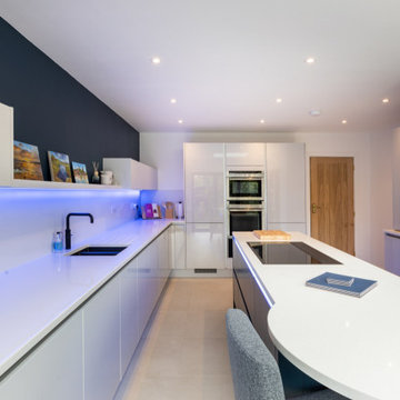
As part of an extension project, we were asked to create a contemporary open-plan kitchen that incorporated informal seating. With the room being quite long and narrow, the clients were also keen to ensure that the kitchen furniture didn’t overwhelm the space and make it feel cluttered or crowded.
At the outset, our customers didn’t think the kitchen would have room for an island or seating at an island, and we loved surprising them with our final design. We incorporated a slim island and a rounded breakfast bar with seating for three. With the two new sets of bi-fold doors onto the garden, the breakfast bar is the perfect place for a peaceful cup of coffee or a G&T at the end of the day.
Lift-up, shallow wall units were used instead of standard wall units, keeping everything easy to reach and not too dominating in the space.
This ultra-modern, true, handleless kitchen features the ever-popular Farrow and Ball Hague Blue in a matte finish on the island, which contrasts so well with the gloss Dove Grey on the main furniture run. To keep it sleek and minimalist, the worktops are Konigstone’s Cotton Star quartz, which is continued up the wall too, and not only looks fabulous but is the perfect splashback.
Keeping with the contemporary style, this kitchen features a Quooker Fusion tap in black and an 1810 Company sink, under-mounted, also in black. The hob is a Falmec Sintisi venting hob, and the wine cooler is by Caple. The NEFF ovens were from the original kitchen, but we added a deep warming drawer to complete this kitchen’s set-up.
Gres Experience
Colours and materials
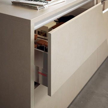
Low-thickness porcelain stoneware for cabinet doors, a striking solution
Low-thickness porcelain stoneware is made from a ceramic paste cooked at 1150 / 1250 C° and then cooled to room temperature (vitrification).
It is often used in modern environments for a contemporary look that is rather urban and industrial, but it can also be used to create more traditional, rustic atmospheres, country and ecological.
This striking solution can be applied to Scenery and LiberaMente kitchen models.
Why choosing porcelain stoneware in the kitchen?
Because stoneware is so strong: it's a material resistant to cuts, abrasions, water and temperature changes, it will not deform and it guarantees an exceptionally long life for surfaces.
Because it's widely used for flooring and washable work surfaces. This is why it is particularly well suited for use in the kitchen.
Because it's perfect for unprecedented combinations, playing on colours and workings. It offers sensations that reward touch and sight, thanks to the variations of robustness and lightness, continuity and intervals. It's a material that, in addition to its beauty, offers the wealth of possibilities for matching worktops and doors.
Gres adds value and, when combined with wooden stains, interprets timeless, versatile elegance.
"Open space" stoneware facing illuminates and underlines technological elements in glass and aluminium and ensures effective contrasts with the Vintage Oak finish. This detailed view of the bottom-hinged door shows off the edge-to-edge stoneware facing, which is recommended for those that prefer a persistent “affinity” between surfaces.
Symmetry and precision, these are the most evident geometrical aspects of this spacious composition that welcomes and surrounds you with its pleasant elements and essential accessories.
A minimalist combination of geometry, functionality and compositional freedom. “Family size” design that thinks ahead, expanding the possibilities of the space and interpreting it in a personal way.
Gres expands the perception of volumes of the wall cladding: from the extensive worktop for the processing, cooking and washing area, it moves in a balanced, elegant fashion to the wall units, the formal order of the design, guaranteed by a perfect alternation of dark and light and rectangular and square forms. The “unexpected” inclusion of the oak breakfast bar is a pleasant intrusion.
This composition shows how the stoneware can be fitted onto a door supported and surrounded by a light frame that gives the panels an interesting graphic effect.
Find the right local pro for your project
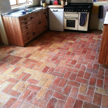
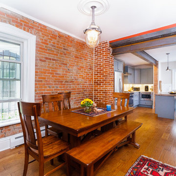
This brick floor, installed in the Kitchen of a property in in the town of Wrestlingworth was one of our toughest assignments so far; the floor was made from handmade Norfolk bricks which were laid approximately 20 years ago but had been subject to grease, general dirt and still had cement from the grouting present on top.
Although this wasn’t your typical tiled floor I knew we could achieve some fantastic results with the brick by using the right products and techniques.
My first instinct was to use Tile Doctor Pro Clean, a high alkaline product, to clean the bricks since it is highly versatile. It cleans most types of natural stone tile very effectively, and so I believed it would also work well on brick. I applied the product to the floor and left it to dwell for twenty minutes before scrubbing into the brick with a black scrubbing pad fitted to a low speed rotary machine.
As I anticipated this was successful in cleaning a large area of the floors, but a very greasy area by the range cooker and a lot of cement in thick patches remained. To resolve these problems I opted to cover the greasy area with Tile Doctor NanoTech HBU (Heavy Build-Up Remover) and left it for at least twenty minutes. This allowed the nano-sized cleaning particles to penetrate into the grease stains and dissolve them from within: something everyday cleaners can’t do. I then used another black scrubbing pad to fully remove the stains from the floor and the area thoroughly with clean water.
The improved the appearance of the floor a lot, but as a final step I went over the entire area using a steamer, along with more HBU Nanotech and handheld scrappers to manually remove stubborn marks and bits of paint. Dealing with the cement residue proved particularly difficult as some areas were an inch thick. To deal with these I used Tile Doctor Acid Gel – a blend of hydrochloric and phosphorus acids in gel form – to break them down as much as I could, before using scrappers to finally remove large clumps of cement.
After rinsing and extracting excess moisture from the floor I left it to dry for 10 days. Upon my return some areas of the floor were still too wet to seal even with continuous drying equipment in place. The floor needed to be fully dry in order to sealed, since moisture can negatively affect the sealer’s performance, so I spent time drying those areas with a heat gun.
Once satisfied that the floor was dried I sealed it using Tile Doctor Colour Grow. This is an impregnating sealer that I would typically use on unsealed porous stone such as Sandstone and Limestone since it is designed to penetrate into the pores of the stone to act as a barrier against ingrained dirt and stains. I decided that Colour Grow was the best fit for the brick, especially since it contains colour intensifying properties that would really accentuate the natural reddish and orange shades.
As you can see from the photographs this certainly did the trick, and the customer was very pleased with the new revitalised appearance of her floor. While brick wasn’t the easiest stone to work with – nor one that I normally encounter – I think you will agree we achieved an impressive transformation.
Andrew Evans
Bedfordshire Tile Doctor
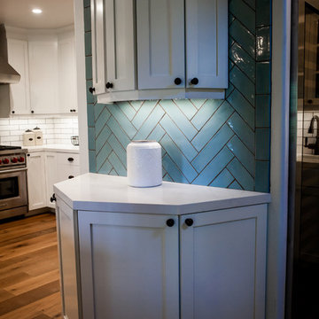
As soon as we walked into this beautiful Spanish Revival home, we knew our design had to be second to none. To bring a bit of modernism into a space so authentic without losing any charm and originality was going to be a challenge well worth taking. This home, “Cielito Lindo”, which means “Beautiful Little Heaven”, was designed by the famous architect Henry Jekel in 1928. We had the pleasure of renovating it, and we think Henry would be proud. Starting in the Kitchen we relocated the sink into the peninsula and opened it up for seating near the dining area for a broad continuous space. A 48” Wolf commercial range is surrounded by white shaker cabinets and white statuario, marble look, quartz countertops. The backsplash is made up of white 2x12 tiles set in both brick and herringbone patterns. Irregular edges give it that old world look, then matched with gray grout to duplicate look of cement. LED under cabinet lighting set on a dimmer switch sets whatever mood you are in. Oil rubbed bronze plumbing fixtures and hardware, all atop natural hardwood floors finish off this Peninsula Kitchen donning that Spanish Revival feel, with a fresh twist. Next we added a wet bar and passthrough using accenting light blue tiles matching the white tiles used throughout kitchen. Cool colors and old world touches, such as the custom leaded glass upper cabinet doors stylize the area. Of course, we added a bit of modernism with an oversized wine fridge, all directly off the game room. Like we said, Henry would be proud.
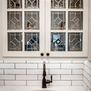
As soon as we walked into this beautiful Spanish Revival home, we knew our design had to be second to none. To bring a bit of modernism into a space so authentic without losing any charm and originality was going to be a challenge well worth taking. This home, “Cielito Lindo”, which means “Beautiful Little Heaven”, was designed by the famous architect Henry Jekel in 1928. We had the pleasure of renovating it, and we think Henry would be proud. Starting in the Kitchen we relocated the sink into the peninsula and opened it up for seating near the dining area for a broad continuous space. A 48” Wolf commercial range is surrounded by white shaker cabinets and white statuario, marble look, quartz countertops. The backsplash is made up of white 2x12 tiles set in both brick and herringbone patterns. Irregular edges give it that old world look, then matched with gray grout to duplicate look of cement. LED under cabinet lighting set on a dimmer switch sets whatever mood you are in. Oil rubbed bronze plumbing fixtures and hardware, all atop natural hardwood floors finish off this Peninsula Kitchen donning that Spanish Revival feel, with a fresh twist. Next we added a wet bar and passthrough using accenting light blue tiles matching the white tiles used throughout kitchen. Cool colors and old world touches, such as the custom leaded glass upper cabinet doors stylize the area. Of course, we added a bit of modernism with an oversized wine fridge, all directly off the game room. Like we said, Henry would be proud.

Sponsored
Columbus, OH
Dave Fox Design Build Remodelers
Columbus Area's Luxury Design Build Firm | 17x Best of Houzz Winner!
Mid-sized urban medium tone wood floor and brown floor enclosed dining room photo in Denver with brown walls and no fireplace
Brown Design Group http://www.bdgla.com
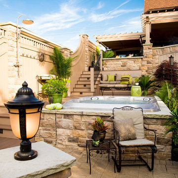
Project Entry: Tiered Living Garden
2014 PLNA Awards for Landscape Excellence Winner
Category: Residential $60,000-$120,000
Award Level: Gold
Photo Description:
This project exemplifies good design, craftsmanship, hard work and excellent communication between client and designer/contractor. In the first meeting the client told us “we would think she was crazy for wanting to do what she had in mind for her back yard”. We disagreed and brought her vision as an Art Teacher to life. We worked out several layouts and went over the possibilities before deciding on one to refine.
The project focused on utilizing the entire yard, and creating individual “use” spaces, that flowed to one another. A large concern for the project was neighboring views and creating privacy on this elevated site. An additional concern was site access and how limited it was. In order to access the site we could only use a 34” walkway along the left side of the house.
The use spaces were created by determine functions the client wished to have including outdoor cooking and dining, relaxing by a fire, sun bathing, refreshing in a swim spa, somewhere to garden, and somewhere to just hang out and listen to nature.
Being elevated from the site we knew we would have to create levels, in order to reduce the dis-connect from the top level to the garden area.
By creating a mid level we were able to accomplish a continueing space and accomplish a function space for sun bathing and spa area. The requset for a swim spa gave way to a semi built in spa for size and overall budget concerns, yet still allows for refreshing in the summer, and adds therapeutic benefit the rest of the year. This area alos features an outdoor shower, built in bench area, that additionally works as a spa cover hideaway that rolls in and out and plenty of room for lounge chairs.
The lowest level of the garden brings you the feel of hanging out in a much larger space with the sounds of the water feature and fine textured specimen plantings. It also provides space for gardening and storage in a custom built shed to tie in with the house and garden architecture.
The upper most space holds the most used function of the garden for cooking, dining, hanging out by the built in fire feature or sitting at the bar watching TV on the outdoor weather proof set. Amenities of the kitchen include 36” stainless steel grill, ice maker, refrigerator, bar sink, and various stainless steel storage areas. A built in outdoor TV is also located in this area as well as an exterior ceiling fan. The total kitchen space is covered by a custom built painted cellular vinyl pergola to look like cedar without the maintenance. A retractable cover and blinds were also installed to shade the cooking and entertaining area. Off the kitchen area is dining and living space also covered with a second pergola structure that ties in to the main one. This area also holds the fire feature to extend the season and provide interest from below.
All areas of the garden have zoned irrigation, and line and low voltage lighting. The color scheme was derived around the idea of natural tones that would blend with the house and allow garden plantings and accents to provide the pops of color. While the custom screening and plant material provide a sense of intimacy in this elevated site. The fine attention to details of use of materials on this site exemplifies our staffs craftsmanship, dedication, strong work ethic and wide range of skills.
Photo Credit: SkySight Photography
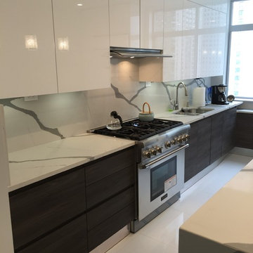
Absolutely stunning and sleek NYC apartment sees major style. Sleek white lacquer top cabinetry perfectly accents dark veneer wood lower cabinets. Gorgeous quartz countertop acts as backsplash as well as continues onto the island in a waterfall side style.
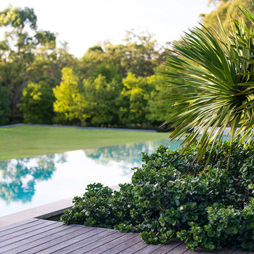
This coastal garden is located 4 hours north of Sydney. This garden has been an ongoing project for Secret Gardens over the last decade. The original brief was for a ‘mini botanic garden’ which proved a challenge on a site with little tree or vegetation cover and limited top soil. The plantings are 95% native, from the establishing rainforest where over 25 varieties of trees have been used to the drier areas where Callistemon, Kangaroo Paw and ornamental grasses have been used in large swathes.The result now is an established garden that will continue to evolve and provide great enjoyment for our clients.
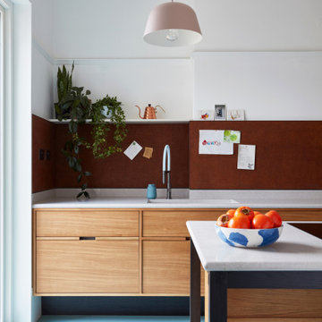
Our design process is set up to tease out what is unique about a project and a client so that we can create something peculiar to them. When we first went to see this client, we noticed that they used their fridge as a kind of notice board to put up pictures by the kids, reminders, lists, cards etc… with magnets onto the metal face of the old fridge. In their new kitchen they wanted integrated appliances and for things to be neat, but we felt these drawings and cards needed a place to be celebrated and we proposed a cork panel integrated into the cabinet fronts… the idea developed into a full band of cork, stained black to match the black front of the oven, to bind design together. It also acts as a bit of a sound absorber (important when you have 3yr old twins!) and sits over the splash back so that there is a lot of space to curate an evolving backdrop of things you might pin to it.
In this design, we wanted to design the island as big table in the middle of the room. The thing about thinking of an island like a piece of furniture in this way is that it allows light and views through and around; it all helps the island feel more delicate and elegant… and the room less taken up by island. The frame is made from solid oak and we stained it black to balance the composition with the stained cork.
The sink run is a set of floating drawers that project from the wall and the flooring continues under them - this is important because again, it makes the room feel more spacious. The full height cabinets are purposefully a calm, matt off white. We used Farrow and Ball ’School house white’… because its our favourite ‘white’ of course! All of the whitegoods are integrated into this full height run: oven, microwave, fridge, freezer, dishwasher and a gigantic pantry cupboard.
A sweet detail is the hand turned cabinet door knobs - The clients are music lovers and the knobs are enlarged versions of the volume knob from a 1970s record player.
Sponsored
Over 300 locations across the U.S.
Schedule Your Free Consultation
Ferguson Bath, Kitchen & Lighting Gallery
Ferguson Bath, Kitchen & Lighting Gallery
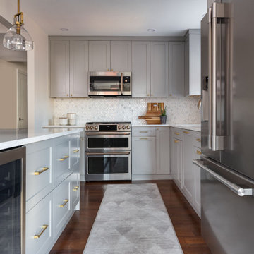
The focus for this kitchen was on additional storage, ease of navigation and family friendly surfaces.
Additional storage was accomplished by thinking vertically for storage as there was no additional square footage to use. Cabinets were installed all the way to the ceiling. Additionally, the island was reconfigured to maximize storage in that location.
The refrigerator was relocated, a beverage refrigerator was installed in the island and a snack storage was created for the kids adjacent to the beverage refrigerator. Additionally, relocating the refrigerator created a larger continuous work surface around the range and a bit more space between the range and sink. The island was key for daily family meals and fun kitchen activities i.e. weekend baking. Quartz countertop created a worry-free surface to withstand the daily wear and tear of normal family use.
After serving as a rental for some time, this home was ready to be reclaimed by its owner and her son.
Gutting “back to the studs” was an understatement for this one. This transformation involved replanning everything; including the roof, the HVAC system, the entire plumbing system, and relocating the side entrance and staircase to the back of the house. Only the subfloors, the exterior framing structure, and the brick remains from this original 1940’s-built bungalow.
When we’re renovating an old structure, we’re bound to find some surprises. This renovation did not disappoint! From basement to roof, we found more than a few, shall we say, potentially catastrophic surprises along the way.
Let’s start with the basement. The homeowner wanted to update the basement and make it a usable living space for her adult son as well as a spa with a sauna for her. This required bringing the 6 foot ceiling height up to code at 7 feet. To do this, we had to re-think the HVAC system that was in the basement ceiling. When we opened up the basement ceiling to remove the HVAC supply and return trunks, we discovered asbestos! The asbestos had to be removed before we could dismantle and remove the HVAC system.
For the main floor, when we were replanning the existing 2-bedroom layout to create two master bedrooms each with their own ensuites, we looked at the possibility of removing the main load-bearing wall. But our investigations led to the discovery that the load bearing wall was not lined up with the roof or the basement load points, so the load of the house was not continuous throughout. This was a disaster waiting to happen. And as we found out, this lack of alignment was causing major issues with the roof when we went to replace the shingles. We discovered portions of the roof truss in very poor condition, literally moments away from giving out. These were replaced and other truss components were fortified before we went on to re-shingle the roof and replace all the soffits and eavestroughs.
Once the structural and space planning elements were sorted out, we could turn our focus to helping this homeowner select the finishes she and her son wanted for their new spaces. She wanted white all the way, and he wanted bold colours. You will see these color choices reflected in their private bathrooms as well as in the upper kitchen and living area that she will mostly use, and the basement entertainment area that he will mostly use.
To round out the personalization of this made-new-again home, we converted the basement into an entertainment center with a bar for her son, and a sauna and third full bathroom with a jacuzzi tub for a spa-like feel for her.
Without having to build from scratch, this homeowner got the custom home of her dreams.
While you “can’t teach an old dog new tricks”, the sky’s the limit on how you can transform an old home into the home of your dreams. When your “old dog” needs some new tricks, we are the Renovator You Can Count On.
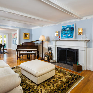
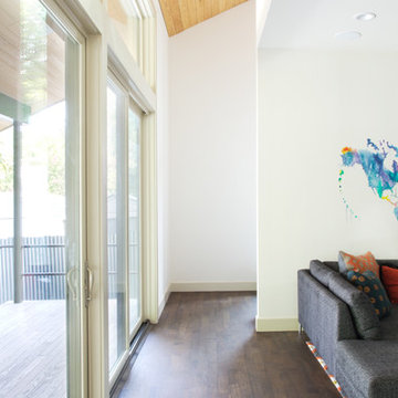
This elegant living room with custom fireplace surround and wainscoting offers an enclosed, cozy spot to play piano or enjoy a fire, yet it is still connected to the open dining room and adjacent family room and kitchen.
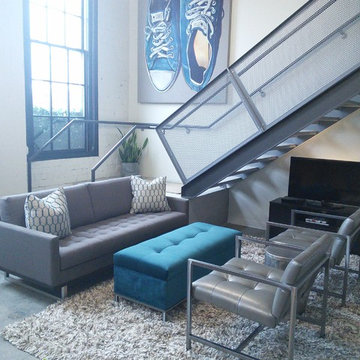
Laura Beeler: I recently took a call from a customer looking for a designer. The mission was to help him create a wonderful, new living space in his downtown Des Moines loft. Matt & I had an instant connection. Since he had been in by Design before, we quickly set up a house call. An additional challenge was time — he was hosting a big party in 4 weeks! We chose the Tristan sofa for it’s retro look. We love how it appears to “float” over the stainless sleigh base. (Light & airy pieces were important as we didn’t want to overpower the intimate space). We anchored the room with a deep pile, chunky shag rug and topped it with a large storage ottoman. The two George chairs can span the decades and certainly have a personality all their own. The repetition of the metal and tufting in all of the pieces gives continuity to the design – an important consideration when designing a space this eclectic. The open shelving offered more storage as well as giving a great silhouette against the original white brick wall. I think the end result suits him to a tee, whether he is relaxing or entertaining. The best part was that we had it all in place in the allotted time frame.
Showing Results for "Continually Thinking"
Sponsored
Columbus, OH
Dave Fox Design Build Remodelers
Columbus Area's Luxury Design Build Firm | 17x Best of Houzz Winner!
Yes, you read the title right. Small updates DO make a BIG difference. Whether it’s updating a color, finish, or even the smallest: changing out the hardware, these minor updates together can all make a big difference in the space. For our Flashback Friday Feature, we have a perfect example of how you can make some small updates to revamp the entire space! The best of all, we replaced the door and drawer fronts, and added a small cabinet (removing the soffit, making the cabinets go to the ceiling) making this space seem like it’s been outfitted with a brand new kitchen! If you ask us, that’s a great way of value engineering and getting the best value out of your dollars! To learn more about this project, continue reading below!
Cabinets
As mentioned above, we removed the existing cabinet door and drawer fronts and replaced them with a more updated shaker style door/drawer fronts supplied by Woodmont. We removed the soffits and added an extra cabinet on the cooktop wall, taking the cabinets to the ceiling. This small update provides additional storage, and gives the space a new look!
Countertops
Bye-bye laminate, and hello quartz! As our clients were starting to notice the wear-and-tear of their original laminate tops, they knew they wanted something durable and that could last. Well, what better to install than quartz? Providing our clients with something that’s not only easy to maintain, but also modern was exactly what they wanted in their updated kitchen!
Backsplash
The original backsplash was a plain white 4×4″ tile and left much to be desired. Having lived with this backsplash for years, our clients wanted something more exciting and eye-catching. I can safely say that this small update delivered! We installed an eye-popping glass tile in blues, browns, and whites from Hirsch Glass tile in the Gemstone Collection.
Hardware
You’d think hardware doesn’t make a huge difference in a space, but it does! It adds not only the feel of good quality but also adds some character to the space. Here we have installed Amerock Blackrock knobs and pulls in Satin Nickel.
Other Fixtures
To top off the functionality and usability of the space, we installed a new sink and faucet. The sink and faucet is something used every day, so having something of great quality is much appreciated especially when so frequently used. From Kohler, we have an under-mount castiron sink in Palermo Blue. From Blanco, we have a single-hole, and pull-out spray faucet.
Flooring
Last but not least, we installed cork flooring. The cork provides and soft and cushiony feel and is great on your feet!
This simple and clean, Mid-Century inspired walnut end table is the perfect piece to accent any bedroom or living room. Store your favorite books, vases or anything else you can think of on the bottom shelf. Remotes, or other itesm you want out of sight in the drawer. The drawer pull is a cut out, which follows the clean design of the piece. The base at the bottom creates the illusion that the piece hovering off of the ground, which adds to its aesthetic appeal.
Mitered edge joints highlight the continuous grain that flows from the top of the piece down the side. Contrasting maple dovetails add strength and demonstrate the precision and craftsmanship in the construction of this piece. Handmade in San Diego, California
Like all of our furniture, the solid hardwood and construction practices make it built to be enjoyed for generations.
Our clients asked us to design a guest house while thinking about the big picture which included a main house, a guest house, and a garage. We were in the middle of the design phase when they were transferred to Hong Kong. The project continued, as we worked long distance to iron out the details. The guest house/pool house then became home base for periodic visits while we worked on the main house and the garage. Eventually, they came home to their compound, and it feels like they never left.
140