
Search results for "Outdated kitchen" in Home Design Ideas
 DesignARC
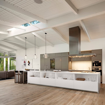
Inspired by DesignARC's Greenworth House, the owners of this 1960's single-story ranch house desired a fresh take on their out-dated, well-worn Montecito residence. Hailing from Toronto Canada, the couple is at ease in urban, loft-like spaces and looked to create a pared-down dwelling that could become their home.
Photo Credit: Jim Bartsch Photography
 TKS Design Group
Download our free ebook, Creating the Ideal Kitchen. DOWNLOAD NOW
Like many families with older children, this local Glen Ellyn couple wanted to expand the size of their kitchen while also creating a more open, airy feel for their main level. The home had plenty of space that included a formal living room, formal dining room, family room with eat-in area and kitchen with butler’s pantry. What it didn’t have, was an effortless flow between the areas used daily for cooking, eating and gathering.
Additionally, the kitchen had become outdated, feeling dark and dismal, despite the abundance of natural light. Our clients wanted a bright, cheerful interior that would inspire the family to congregate in this part of the house. No easy feat with teenagers.
An open floor plan design solved the issues with functionality and circulation, removing the walls that restricted flow and opening up the entry to the dining room. We also eliminated the rarely used butler’s pantry allowing us to expand the kitchen and add a large island for food prep and gathering. To create a sense of symmetry and consistency in the space, a clerestory window was added below the header and framed to match the existing adjacent entry from the living room.
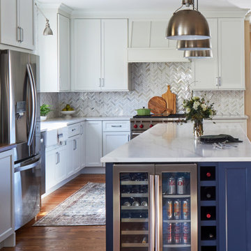
Inspired by the owner’s Scottish ancestry, the island cabinetry boasts a beautiful blue hue, paired with stools upholstered in a sprightly plaid. The built-in buffet area provides additional storage, topped with a beautiful wooden top stained to coordinate with the stunning tones of the flooring.
The owner’s opted for stainless steel appliances, inspiring the selection of brushed silver light fixtures and polished chrome hardware. Marble-look quartz offered a durable, lightly colored surface to reflect sunlight and enhance the cheer factor. According to this happy family, this uplifting space is now everyone’s favorite place to gather.
Designed by: Susan Klimala, CKBD
Photography by: Michael Kaskel
For more design inspiration go to: www.kitchenstudio-ge.com
 Rochelle Silberman Design
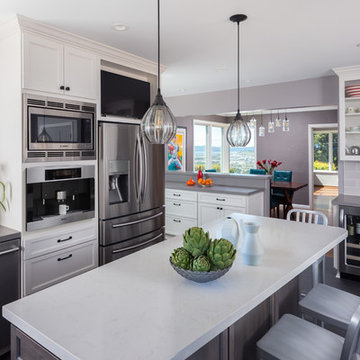
This traditional home contained an outdated kitchen, eating area, powder room, pantry and laundry area. The spaces were reconfigured so that the kitchen occupied all of the space. What was once an opening into an under utilized hallway, became a pantry closet. A full bathroom was tucked behind the pantry into space from the breezeway.
Find the right local pro for your project
 San Luis Kitchen Co.
The owners of a charming home in the hills west of Paso Robles recently decided to remodel their not-so-charming kitchen. Referred to San Luis Kitchen by several of their friends, the homeowners visited our showroom and soon decided we were the best people to design a kitchen fitting the style of their home. We were delighted to get to work on the project right away.
When we arrived at the house, we found a small, cramped and out-dated kitchen. The ceiling was low, the cabinets old fashioned and painted a stark dead white, and the best view in the house was neglected in a seldom-used breakfast nook (sequestered behind the kitchen peninsula). This kitchen was also handicapped by white tile counters with dark grout, odd-sized and cluttered cabinets, and small ‘desk’ tacked on to the side of the oven cabinet. Due to a marked lack of counter space & inadequate storage the homeowner had resorted to keeping her small appliances on a little cart parked in the corner and the garbage was just sitting by the wall in full view of everything! On the plus side, the kitchen opened into a nice dining room and had beautiful saltillo tile floors.
Mrs. Homeowner loves to entertain and often hosts dinner parties for her friends. She enjoys visiting with her guests in the kitchen while putting the finishing touches on the evening’s meal. Sadly, her small kitchen really limited her interactions with her guests – she often felt left out of the mix at her own parties! This savvy homeowner dreamed big – a new kitchen that would accommodate multiple workstations, have space for guests to gather but not be in the way, and maybe a prettier transition from the kitchen to the dining (wine service area or hutch?) – while managing the remodel budget by reusing some of her major appliances and keeping (patching as needed) her existing floors.
Responding to the homeowner’s stated wish list and the opportunities presented by the home's setting and existing architecture, the designers at San Luis Kitchen decided to expand the kitchen into the breakfast nook. This change allowed the work area to be reoriented to take advantage of the great view – we replaced the existing window and added another while moving the door to gain space. A second sink and set of refrigerator drawers (housing fresh fruits & veggies) were included for the convenience of this mainly vegetarian cook – her prep station. The clean-up area now boasts a farmhouse style single bowl sink – adding to the ‘cottage’ charm. We located a new gas cook-top between the two workstations for easy access from each. Also tucked in here is a pullout trash/recycle cabinet for convenience and additional drawers for storage.
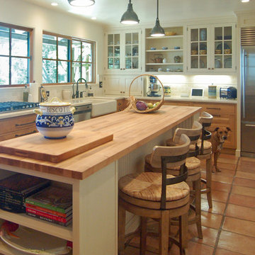
Running parallel to the work counter we added a long butcher-block island with easy-to-access open shelves for the avid cook and seating for friendly guests placed just right to take in the view. A counter-top garage is used to hide excess small appliances. Glass door cabinets and open shelves are now available to display the owners beautiful dishware. The microwave was placed inconspicuously on the end of the island facing the refrigerator – easy access for guests (and extraneous family members) to help themselves to drinks and snacks while staying out of the cook’s way.
We also moved the pantry storage away from the dining room (putting it on the far wall and closer to the work triangle) and added a furniture-like hutch in its place allowing the more formal dining area to flow seamlessly into the up-beat work area of the kitchen. This space is now also home (opposite wall) to an under counter wine refrigerator, a liquor cabinet and pretty glass door wall cabinet for stemware storage – meeting Mr. Homeowner’s desire for a bar service area.
And then the aesthetic: an old-world style country cottage theme. The homeowners wanted the kitchen to have a warm feel while still loving the look of white cabinetry. San Luis Kitchen melded country-casual knotty pine base cabinets with vintage hand-brushed creamy white wall cabinets to create the desired cottage look. We also added bead board and mullioned glass doors for charm, used an inset doorstyle on the cabinets for authenticity, and mixed stone and wood counters to create an eclectic nuance in the space. All in all, the happy homeowners now boast a charming county cottage kitchen with plenty of space for entertaining their guests while creating gourmet meals to feed them.
Credits:
Custom cabinetry by Wood-Mode Fine Custom Cabinetry
Contracting by Michael Pezzato of Lost Coast Construction
Stone counters by Pyramid M.T.M.
 Renovations Group Inc
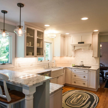
Our homeowner had dreamt about one day redoing her beyond outdated kitchen since they day her husband carried her over the threshold. Vinyl flooring used for a backsplash, dingy carpeting, laminate with no sheen left to speak of and mismatched cabinetry…. it was time to make it happen. A year’s worth of planning later, her time capsule became one dreamy kitchen.
Functionality reigns supreme in this small, but efficient kitchen where every cabinet has a story to tell and a place to store it. Countertop space to the right of the stove was an added necessity for function and safety. The raised snack bar is perfect for day to day meals and the lowered countertop was a must for this petite baker. A new lighting plan includes recessed lights, under-cabinet and accent lights, while new lighting fixtures reflect the client’s sense of style. Dingy brick patterned carpet was removed making way for new hardwood floors toothed in from the dining room.
An airy palette gained some weight with the use of larger details; the oversized hood, beefy turned posts, prominent apron front sink and a grouping of tall cabinets on the refrigerator wall. Glass cabinet fronts, shiny beveled subway tile, and granite countertops allow light to dance around the space.
Zachary Seib Photography
 Vela Interior Design
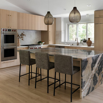
Modern kitchen with rift-cut white oak cabinetry and a natural stone island.
Inspiration for a mid-sized contemporary light wood floor and beige floor kitchen remodel in Minneapolis with a double-bowl sink, flat-panel cabinets, light wood cabinets, quartzite countertops, beige backsplash, quartz backsplash, stainless steel appliances, an island and beige countertops
Inspiration for a mid-sized contemporary light wood floor and beige floor kitchen remodel in Minneapolis with a double-bowl sink, flat-panel cabinets, light wood cabinets, quartzite countertops, beige backsplash, quartz backsplash, stainless steel appliances, an island and beige countertops
 Murphy Bros. Design | Build | Remodel
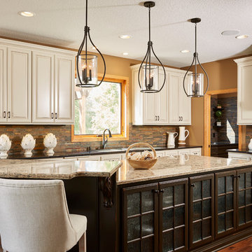
Example of a large classic medium tone wood floor kitchen design in Minneapolis with an undermount sink, raised-panel cabinets, beige cabinets, multicolored backsplash, matchstick tile backsplash, stainless steel appliances and an island
Sponsored
Columbus, OH

Hope Restoration & General Contracting
Columbus Design-Build, Kitchen & Bath Remodeling, Historic Renovations
 Advance Design Studio, Ltd.
After six years of living in their Huntley IL home, Chris and Meghan were tired of their dark, dingy, outdated kitchen and it was finally time for a long-anticipated change. “The kitchen is the place where we live, it’s where we do everything,” Meghan said. “It was important that it be a space where we wanted to be.” Meghan loves cooking and enjoys including their girls in healthy meal prepping, this led them to want a brighter, more enjoyable kitchen with increased functionality and improved storage.
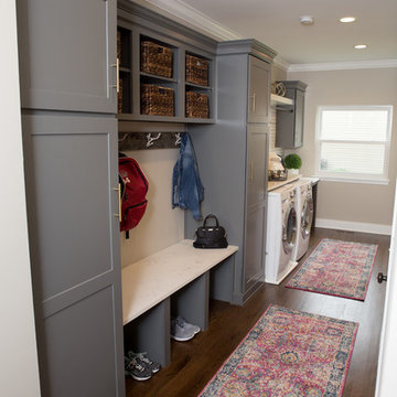
For Chris especially, the laundry room was an entirely dysfunctional eyesore. “We had a washer and a dryer, but it was all kind-of cobbled together!” Chris said. “There were always laundry piles everywhere, we weren’t really sure what we wanted to do in there, but it was time for us to make a change.” The mess of the space was stressful every time they walked in the door from the garage each day. Kids’ backpacks and shoes piled up haphazardly in the makeshift boot-bench closet left the family feeling disorganized and stressed. They needed space for folding clothes and locker cubbies to help keep the family organized.
Having known Christine and Todd in the Huntley community for years, Chris and Meghan were familiar with their work. “We already trusted them personally and having seen their projects for years we knew they did top notch work. After we reviewed the initial round of designs, we knew that hiring them was definitely the right choice,” Meghan and Chris said. Although Chris had done a lot of work in their home himself, the kitchen and laundry room renovation was such a large undertaking that he didn’t want to steal time away from his family to spend what would surely be many long weekends doing the job himself. “That would not have been a wise choice for us,” Chris laughed.
“Our designer, Michelle was very, very, easy to work with; anything we wanted to see or weren’t sure about, she went above and beyond to make this easy for us. She was easy to get hold of and always quick to respond,” the couple said. Michelle pulled ideas that mirrored the couple’s taste and style and was adept at directing the couple to limited choices that didn’t overwhelm them and kept the process moving. “I have a hard time making decisions. Michelle made the decision-making process so easy. I loved how she listened to what I liked and then presented three great options for me to choose from,” Meghan said.
The main objectives for the kitchen were better storage solutions, they wanted the space to reflect their lifestyle and taste, and they wanted it to last for years with low maintenance. One of the first steps in creating a more functional kitchen was relocating the refrigerator, creating an improved workflow for the busy family.
“We didn’t know that we could even move the refrigerator to a new location where it is now, that was something that we never would have thought of,” Chris said. “The new refrigerator location makes the kitchen feel so much bigger. We didn’t add any space, but our whole kitchen with the new design just seems like it’s so much larger than before!” Meghan said.
The perimeter mist colored cabinets helped warm and brighten the entire room, while the graphite colored cabinets on the island added contrast. Using this fresh, clean color palette satisfied the couple’s desire for a bright space that was the exact opposite of what they had before. Organization accessories were also added to the cabinets such as a spice drawer tray and roll outs to create hidden convenience.
“I absolutely love the hidden spices – it makes cooking so much more enjoyable!” Chris said. “And all the pull outs, and the double trash bin, who would think you could get so excited about organization!” the couple said in unison.
One thing they hated in their original kitchen was how dark the space felt. Added lighting on the ceiling with the new light fixtures combined with the lighter cabinetry colors throughout solved this problem. “Our new kitchen has this warm, almost cozy feeling that our old kitchen never had, it’s just a space that I love spending my time in now,” Meghan said. The light airy feeling was accentuated with the use of floating white shelves on either side of the decorative range hood. “We have so much cabinetry space, the new design is amazing we actually have more storage space than we will ever need,” Meghan said.
The island was extended to create more work surface and added space for stool seating. “The new island changes how we live. Now the kids can be in the kitchen with us, doing homework, eating breakfast, and the three of us have special dinners there when Chris is working late,” Meghan said.
The Carrara Marmi Quartz countertops were chosen because they are, not only beautiful, but are made from hard-working material that doesn’t require maintenance. The white subway tile backsplash that wraps to the ceiling behind the focal point cooktop range/hood compliments the crisp white countertops perfectly, while brushed brass hardware and light fixtures keep the design fresh and new.
The couple had a few fears at the beginning of the project, as most homeowners do. Their biggest fear was being out of their kitchen and laundry room for an extended time. The crew made it very easy for the family to work in a limited space keeping the washer and dryer hooked up the majority of the time, and also getting appliances working with minimal downtime.
“They above and beyond accommodated us to get us through the process,” Meghan said. “They did a great job making sure we were as comfortable as possible throughout the process,” Chris added.
“Our project manager DJ did a great job. He was very good at updating us on schedule changes, getting guys in as quickly as possible. Everyone that stepped in the house was nice and did great work,” said Chris. They thought Advance’s carpenter was phenomenal and were impressed when he took a conceptual idea from a photograph and worked with designer Michelle to create a one of a kind range/hood that has become the topic of conversation with friends and family who visit the new kitchen. “He was in our house literally every day for several weeks. He was easy to work with and good at what he did,” Meghan and Chris said.
The focal point of the kitchen; a hand-crafted, custom-built ventilation hood was clad with handpicked reclaimed barnwood. Advance Design’s carpenter built the framework and the cladding to create a one-of-a-kind design element that the couple loves.
“I think it was especially fun for him to create something unique from scratch, showcasing his talent in this area,” Meghan said. “I love that my kitchen is not like everyone else’s. I got to pick out the wood on my hood and watch it being built and was able to choose what pieces of wood went where on it. It’s totally unique.”
Red Oak flooring was toothed-in throughout the kitchen and the rest of the first floor anywhere changes were made. Then the whole floor was refinished to tone down the orange undertones in the existing floor stain, ultimately changing the color complexion of the entire first floor. The result is a completely new feeling to the entire home.
Renovating the laundry room was extremely important to Meghan and Chris, but they had trouble visualizing what the possibilities were for the seemingly small space. Michelle produced beautiful 3D illustrations that helped them envision the space in a whole new way.
“I must have told Michelle 100 times that I am a visual person, seeing the designs in 3D made it so easy to make decisions and see what we could really do with our space,” Meghan said.
A dividing wall and doorway were removed between the existing laundry room and hallway formerly containing a coat closet, providing space to design specialized graphite colored cabinetry matching the kitchen island to house custom storage cubbies for each family member. Adding the tall utility cabinetry in the new laundry area helped solve the storage issue, tucking away cleaning supplies, household items, and even the cat got its own cubby.
“I love how everything is now hidden in its own space. I can’t tell you how much I hated coming home and seeing everything sitting around on counters,” Chris said.
Electrical outlets were planned for the inside of utility cabinets, so devices could charge in hidden locations. Stacking the washer and dryer allowed for wider countertop space to provide a folding area and a special space for clothes to hang. “The way I do laundry has been completely transformed! I can actually fold clothes and hang them now right out of the washer and dryer,” Meghan said.
“The end result in the kitchen and the laundry/mud room was an updated light and bright space, with a smarter work flow that better meets the needs of this family,” Michelle said.
“I would totally recommend Advance Design,” Meghan said. “Sometimes I sit and just look at my kitchen and laundry room and think ‘Wow, I can’t believe I get to live here!’ It’s an understatement to say we love our new space.”
 Mosaik Design & Remodeling
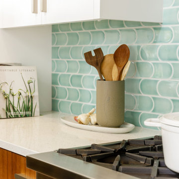
This outdated kitchen came with flowered wallpaper, narrow connections to Entry and Dining Room, outdated cabinetry and poor workflow. By opening up the ceiling to expose existing beams, widening both entrys and adding taller, angled windows, light now steams into this bright and cheery Mid Century Modern kitchen. The custom Pratt & Larson turquoise tiles add so much interest and tie into the new custom painted blue door. The walnut wood base cabinets add a warm, natural element. A cozy seating area for TV watching, reading and coffee looks out to the new clear cedar fence and landscape.
 Studio Sage Interiors
The original kitchen, although generous in size, was out of touch with our clients personal style. When a plumbing mishap caused significant damage to the space, the homeowners seized the opportunity to create the culinary workspace of their dreams.
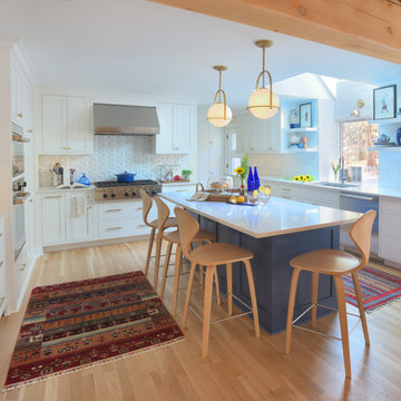
At the top of their wish list was a well designed kitchen, both aesthetically and functionally. State of the art appliances were selected based on the client's functional requirements and the optimal layout was tailored to family dinners and occasional entertaining. At the heart of the existing kitchen was a large and highly utilized island, keeping this was a high priority. An unused audio cabinet with outdated components was removed to create a much needed dry bar. The large refrigerator, and beverage fridge drawers were concealed behind custom made cabinetry panels and were positioned adjacent to the family seating area for easy access. Attributes such as spice storage, silver dividers and a tall pantry storage ensured everything had its place.
Sherwin Williams, indigo batik (as seen on the island) was carried through the home allowing a visual connection throughout the home while the bright white perimeter cabinets created lightness and dramatic contrast. Brass hardware and decorative lighting gave the space a hint of understated glamour while pulling the warm tones found in the lattice of veining in the cambria quartz countertop.
It is hard not to notice, however, the dramatic impact of the large ceramic, three dimensional, hexagon tiles that highlight the range wall. Companion subway tiles created continuity throughout the expansive kitchen, adorning the backsplash through the rest of the space.
 Synonymous
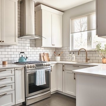
An outdated 1920's kitchen in Bayside Queens was turned into a refreshed, classic and timeless space that utilized the very limited space to its maximum capacity. The cabinets were once outdated and a dark brown that made the space look even smaller. Now, they are a bright white, accompanied by white subway tile, a light quartzite countertop and brushed brass hardware throughout. What made all the difference was the use of the dark porcelain floors as a great contrast to all the white. We were also diligent to keep the hold extractor a clear glass and stainless steel.
 Studio Dearborn
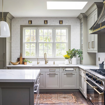
MULTIPLE AWARD WINNING KITCHEN. 2019 Westchester Home Design Awards Best Traditional Kitchen. Another 2019 Award Soon to be Announced. Houzz Kitchen of the Week January 2019. Kitchen design and cabinetry – Studio Dearborn. This historic colonial in Edgemont NY was home in the 1930s and 40s to the world famous Walter Winchell, gossip commentator. The home underwent a 2 year gut renovation with an addition and relocation of the kitchen, along with other extensive renovations. Cabinetry by Studio Dearborn/Schrocks of Walnut Creek in Rockport Gray; Bluestar range; custom hood; Quartzmaster engineered quartz countertops; Rejuvenation Pendants; Waterstone faucet; Equipe subway tile; Foundryman hardware. Photos, Adam Kane Macchia.
 Kitchen Solvers of Columbus
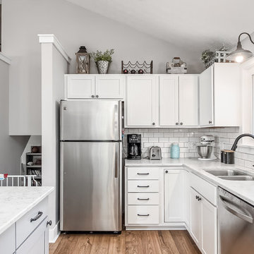
For this kitchen remodel, the homeowners wanted to give their old outdated kitchen a more updated look. They decided to reface their existing cabinets and went with a Shaker MDF Super Matte from Northern Contours.


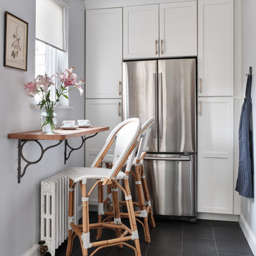 Synonymous
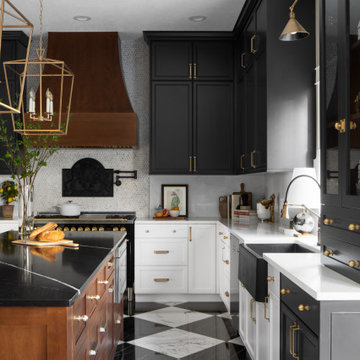
An outdated 1920's kitchen in Bayside Queens was turned into a refreshed, classic and timeless space that utilized the very limited space to its maximum capacity. The cabinets were once outdated and a dark brown that made the space look even smaller. Now, they are a bright white, accompanied by white subway tile, a light quartzite countertop and brushed brass hardware throughout. What made all the difference was the use of the dark porcelain floors as a great contrast to all the white. We were also diligent to keep the hold extractor a clear glass and stainless steel.
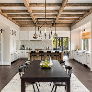
 RG Painting and Construction Inc.
Searching for a trusted kitchen remodel contractor in Santa Barbara? At RG Painting & Construction, Inc., we’re a licensed Santa Barbara general contractor with over 20 years of experience transforming outdated kitchens into stunning, functional, and highly customized spaces. As a full-service company, we specialize in everything from kitchen renovations, premium finishes and complete home remodels, all delivered with expert craftsmanship and efficient project management.
Whether you're planning a full kitchen redesign in Santa Barbara, need cabinet refinishing in Goleta, or want to upgrade your Montecito home with new countertops, lighting, and layout improvements, our team handles it all from demo to finish paint.
What sets us apart:
In-house licensed crews—no outsourcing
Seamless project management from demolition to finish
Expertise in custom finishes from our background as a top-rated Santa Barbara painting contractor
Deep knowledge of local building codes and permitting
Our kitchen remodeling services include:
Tile backsplash & flooring
Stone countertops
Lighting & electrical upgrades
Plumbing reconfiguration
Drywall, finish carpentry, and professional painting
Structural modifications and wall removal
We’re not just another contractor—we’re your one-stop shop for home remodeling in Santa Barbara, with the attention to detail and finish quality that only 20+ years of experience in both construction and painting can provide.
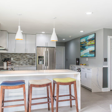
 RAJ Kitchen and Bath, LLC
This family throws some mean parties where large crowds usually sit at the poolside. There’s an entire section of this walk out second level that is dedicated to entertaining which also gives access to the pool in the backyard. This place comes alive at night with built in surround sounds and LED lights. There was just one issue. The kitchen.
The kitchen did not fit in. It was old, outdated, out-styled and nonfunctional. They knew the kitchen had to be address eventually but they just didn’t want to redo the kitchen. They wanted to revamp the kitchen, so they asked us to come in and look at the space to see how we can design this second floor kitchen in their New Rochelle home.
It was a small kitchen, strategically located where it could be the hub that the family wanted it to be. It held its own amongst everything that was in the open space like the big screen TV, fireplace and pool table. That is exactly what we did in the design and here is how we did it.
First, we got rid of the kitchen table and by doing so we created a peninsular. This eventually sets up the space for a couple of really cool pendant lights, some unique counter chairs and a wine cooler that was purchased before but never really had a home. We then turned our attention to the range and hood. This was not the main kitchen, so wall storage wasn’t the main goal here. We wanted to create a more open feel interaction while in the kitchen, hence we designed the free standing chimney hood alone to the left of the window.
We then looked at how we can make it more entertaining. We did that by adding a Wine rack on a buffet style type area. This wall was free and would have remained empty had we not find a way to add some more glitz.
Finally came the counter-top. Every detail was crucial because the view of the kitchen can be seen from when you enter the front door even if it was on the second floor walk out. The use of the space called for a waterfall edge counter-top and more importantly, the stone selection to further accentuate the effect. It was crucial that there was movement in the stone which connects to the 45 degree waterfall edge so it would be very dramatic.
Nothing was overlooked in this space. It had to be done this way if it was going to have a fighting chance to take command of its territory.
Have a look at some before and after photos on the left and see a brief video transformation of this lovely small kitchen.
See more photos and vidoe of this transformation on our website @ http://www.rajkitchenandbath.com/portfolio-items/kitchen-remodel-new-rochelle-ny-10801/
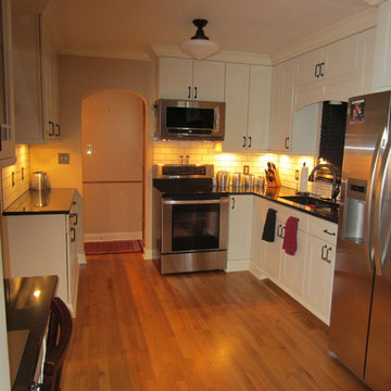

 Synonymous
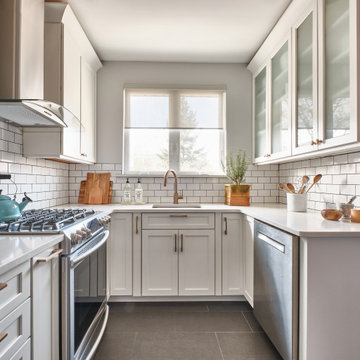
An outdated 1920's kitchen in Bayside Queens was turned into a refreshed, classic and timeless space that utilized the very limited space to its maximum capacity. The cabinets were once outdated and a dark brown that made the space look even smaller. Now, they are a bright white, accompanied by white subway tile, a light quartzite countertop and brushed brass hardware throughout. What made all the difference was the use of the dark porcelain floors as a great contrast to all the white. We were also diligent to keep the hold extractor a clear glass and stainless steel.
 Synonymous
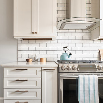
An outdated 1920's kitchen in Bayside Queens was turned into a refreshed, classic and timeless space that utilized the very limited space to its maximum capacity. The cabinets were once outdated and a dark brown that made the space look even smaller. Now, they are a bright white, accompanied by white subway tile, a light quartzite countertop and brushed brass hardware throughout. What made all the difference was the use of the dark porcelain floors as a great contrast to all the white. We were also diligent to keep the hold extractor a clear glass and stainless steel.
 Advance Design Studio, Ltd.
After six years of living in their Huntley IL home, Chris and Meghan were tired of their dark, dingy, outdated kitchen and it was finally time for a long-anticipated change. “The kitchen is the place where we live, it’s where we do everything,” Meghan said. “It was important that it be a space where we wanted to be.” Meghan loves cooking and enjoys including their girls in healthy meal prepping, this led them to want a brighter, more enjoyable kitchen with increased functionality and improved storage.
For Chris especially, the laundry room was an entirely dysfunctional eyesore. “We had a washer and a dryer, but it was all kind-of cobbled together!” Chris said. “There were always laundry piles everywhere, we weren’t really sure what we wanted to do in there, but it was time for us to make a change.” The mess of the space was stressful every time they walked in the door from the garage each day. Kids’ backpacks and shoes piled up haphazardly in the makeshift boot-bench closet left the family feeling disorganized and stressed. They needed space for folding clothes and locker cubbies to help keep the family organized.
Having known Christine and Todd in the Huntley community for years, Chris and Meghan were familiar with their work. “We already trusted them personally and having seen their projects for years we knew they did top notch work. After we reviewed the initial round of designs, we knew that hiring them was definitely the right choice,” Meghan and Chris said. Although Chris had done a lot of work in their home himself, the kitchen and laundry room renovation was such a large undertaking that he didn’t want to steal time away from his family to spend what would surely be many long weekends doing the job himself. “That would not have been a wise choice for us,” Chris laughed.
“Our designer, Michelle was very, very, easy to work with; anything we wanted to see or weren’t sure about, she went above and beyond to make this easy for us. She was easy to get hold of and always quick to respond,” the couple said. Michelle pulled ideas that mirrored the couple’s taste and style and was adept at directing the couple to limited choices that didn’t overwhelm them and kept the process moving. “I have a hard time making decisions. Michelle made the decision-making process so easy. I loved how she listened to what I liked and then presented three great options for me to choose from,” Meghan said.
The main objectives for the kitchen were better storage solutions, they wanted the space to reflect their lifestyle and taste, and they wanted it to last for years with low maintenance. One of the first steps in creating a more functional kitchen was relocating the refrigerator, creating an improved workflow for the busy family.
“We didn’t know that we could even move the refrigerator to a new location where it is now, that was something that we never would have thought of,” Chris said. “The new refrigerator location makes the kitchen feel so much bigger. We didn’t add any space, but our whole kitchen with the new design just seems like it’s so much larger than before!” Meghan said.
The perimeter mist colored cabinets helped warm and brighten the entire room, while the graphite colored cabinets on the island added contrast. Using this fresh, clean color palette satisfied the couple’s desire for a bright space that was the exact opposite of what they had before. Organization accessories were also added to the cabinets such as a spice drawer tray and roll outs to create hidden convenience.
“I absolutely love the hidden spices – it makes cooking so much more enjoyable!” Chris said. “And all the pull outs, and the double trash bin, who would think you could get so excited about organization!” the couple said in unison.
One thing they hated in their original kitchen was how dark the space felt. Added lighting on the ceiling with the new light fixtures combined with the lighter cabinetry colors throughout solved this problem. “Our new kitchen has this warm, almost cozy feeling that our old kitchen never had, it’s just a space that I love spending my time in now,” Meghan said. The light airy feeling was accentuated with the use of floating white shelves on either side of the decorative range hood. “We have so much cabinetry space, the new design is amazing we actually have more storage space than we will ever need,” Meghan said.
The island was extended to create more work surface and added space for stool seating. “The new island changes how we live. Now the kids can be in the kitchen with us, doing homework, eating breakfast, and the three of us have special dinners there when Chris is working late,” Meghan said.
The Carrara Marmi Quartz countertops were chosen because they are, not only beautiful, but are made from hard-working material that doesn’t require maintenance. The white subway tile backsplash that wraps to the ceiling behind the focal point cooktop range/hood compliments the crisp white countertops perfectly, while brushed brass hardware and light fixtures keep the design fresh and new.
The couple had a few fears at the beginning of the project, as most homeowners do. Their biggest fear was being out of their kitchen and laundry room for an extended time. The crew made it very easy for the family to work in a limited space keeping the washer and dryer hooked up the majority of the time, and also getting appliances working with minimal downtime.
“They above and beyond accommodated us to get us through the process,” Meghan said. “They did a great job making sure we were as comfortable as possible throughout the process,” Chris added.
“Our project manager DJ did a great job. He was very good at updating us on schedule changes, getting guys in as quickly as possible. Everyone that stepped in the house was nice and did great work,” said Chris. They thought Advance’s carpenter was phenomenal and were impressed when he took a conceptual idea from a photograph and worked with designer Michelle to create a one of a kind range/hood that has become the topic of conversation with friends and family who visit the new kitchen. “He was in our house literally every day for several weeks. He was easy to work with and good at what he did,” Meghan and Chris said.
The focal point of the kitchen; a hand-crafted, custom-built ventilation hood was clad with handpicked reclaimed barnwood. Advance Design’s carpenter built the framework and the cladding to create a one-of-a-kind design element that the couple loves.
“I think it was especially fun for him to create something unique from scratch, showcasing his talent in this area,” Meghan said. “I love that my kitchen is not like everyone else’s. I got to pick out the wood on my hood and watch it being built and was able to choose what pieces of wood went where on it. It’s totally unique.”
Red Oak flooring was toothed-in throughout the kitchen and the rest of the first floor anywhere changes were made. Then the whole floor was refinished to tone down the orange undertones in the existing floor stain, ultimately changing the color complexion of the entire first floor. The result is a completely new feeling to the entire home.
Renovating the laundry room was extremely important to Meghan and Chris, but they had trouble visualizing what the possibilities were for the seemingly small space. Michelle produced beautiful 3D illustrations that helped them envision the space in a whole new way.
“I must have told Michelle 100 times that I am a visual person, seeing the designs in 3D made it so easy to make decisions and see what we could really do with our space,” Meghan said.
A dividing wall and doorway were removed between the existing laundry room and hallway formerly containing a coat closet, providing space to design specialized graphite colored cabinetry matching the kitchen island to house custom storage cubbies for each family member. Adding the tall utility cabinetry in the new laundry area helped solve the storage issue, tucking away cleaning supplies, household items, and even the cat got its own cubby.
“I love how everything is now hidden in its own space. I can’t tell you how much I hated coming home and seeing everything sitting around on counters,” Chris said.
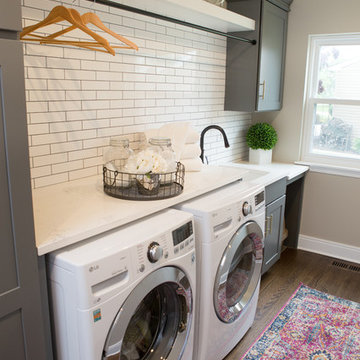
Electrical outlets were planned for the inside of utility cabinets, so devices could charge in hidden locations. Stacking the washer and dryer allowed for wider countertop space to provide a folding area and a special space for clothes to hang. “The way I do laundry has been completely transformed! I can actually fold clothes and hang them now right out of the washer and dryer,” Meghan said.
“The end result in the kitchen and the laundry/mud room was an updated light and bright space, with a smarter work flow that better meets the needs of this family,” Michelle said.
“I would totally recommend Advance Design,” Meghan said. “Sometimes I sit and just look at my kitchen and laundry room and think ‘Wow, I can’t believe I get to live here!’ It’s an understatement to say we love our new space.”
1