
Search results for "Graphing calculators" in Home Design Ideas

 Bioi. Design + Build
The inset cedar gables are patterned as a graphical reflection of the tree growth in the area over the past 100 years. A government report of tree growth that analyzed the tree rings of local trees provided a metric that could be reinterpreted as board widths. These were calculated and installed as the east and west gables; a contextual reference to the age of the farmstead on the new house.

 Cara Woodhouse Interiors LLC
Robert Granoff Photography
Kitchen - contemporary kitchen idea in New York with flat-panel cabinets, white cabinets and white appliances
Kitchen - contemporary kitchen idea in New York with flat-panel cabinets, white cabinets and white appliances

 LABLstudio
A West Village Bachelor pad bedroom, featuring a hand-painted geometric design that highlights the pre-war features of the space, like the picture moldings. Additionally, because the client wanted both a work space and a place to put his TV (the pre-war wall could not hold a wall mounted tv!), we designed a custom desk/console piece out of reclaimed wood and metal hairpin legs that served both purposes, and fit the space perfectly.
Photos by Matthew Williams
Find the right local pro for your project
 Lagom architectes
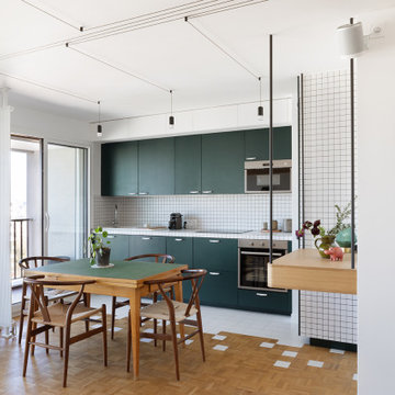
Inspiration for a mid-sized contemporary single-wall multicolored floor eat-in kitchen remodel in Paris with open cabinets, green cabinets, tile countertops, no island, white countertops, multicolored backsplash and stainless steel appliances

 Prime 1 Builders
This project won in the 2013 Builders Association of Metropolitan Pittsburgh Housing Excellence Award for Best Urban Renewal Renovation Project. The glass bowl was made in the glass studio owned by the owner which is adjacent to the residence. The mirror is a repurposed window. The door is repurposed from a boarding house.
George Mendel
 Schedio Spaces
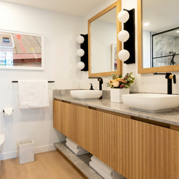
The bathroom I was tasked with redesigning initially had a very inefficient layout which only allowed for a single sink, an awkward corner shower and an odd bathtub with bulky tile surround.
The clients have a second bathroom that houses a generous bathtub, so for practicality’s sake they preferred a large walk-in shower for their ensuite.
I immediately understood that to maximize the floor plan I needed to relocate the entry to the adjacent wall and close the opening to the existing door. This gave me the opportunity to reorient the vanity direction, doubling it in size and allowing for two sinks and 90 inches of storage space. I deleted the previous bathtub and redirected the shower to this area, then increased its size by reframing a portion of the adjoining closet.
Keeping with the bathrooms high-end aesthetic direction, I designed a fluted vanity, hand built from solid white oak. I meticulously calculated the spacing so each flute fit seamlessly, resulting in a compelling textural element. The vanity and matching fluted toe kick were both adorned with natural grey marble, setting the stage for the most lavish towel storage and countertop. I opted for thin matte sinks with curved lines to compliment the flutes and bring an overall element of softness to the space.
In an effort to maximizing the already plentiful storage, I had hidden shelving framed into the walls and covered it with hand made mirrors that hinged for easy access. I balanced the pair of mirrors with modern light fixtures that added a contemporary punch and harmonized with the sleek mixed-metal faucets.
This ensuite oasis was polished off with graphic art, crisp linens and foreshadowed with a custom makeup vanity that utilized matching materials and flawless functionality. No detail of this space went unconsidered.

 User
Photo: Ten Ten Creative
Wet bar - transitional single-wall dark wood floor and brown floor wet bar idea in Dallas with shaker cabinets, black cabinets, black backsplash, subway tile backsplash and gray countertops
Wet bar - transitional single-wall dark wood floor and brown floor wet bar idea in Dallas with shaker cabinets, black cabinets, black backsplash, subway tile backsplash and gray countertops

 Ultra Wine Racks and Cellars
Mid-sized minimalist porcelain tile and beige floor wine cellar photo in Sacramento with display racks

 FMSProjects, Inc.
Latch hardware in upper cabinets.
Inspiration for a mid-sized craftsman u-shaped medium tone wood floor eat-in kitchen remodel in San Francisco with a single-bowl sink, shaker cabinets, white cabinets, quartz countertops, green backsplash, ceramic backsplash, stainless steel appliances and a peninsula
Inspiration for a mid-sized craftsman u-shaped medium tone wood floor eat-in kitchen remodel in San Francisco with a single-bowl sink, shaker cabinets, white cabinets, quartz countertops, green backsplash, ceramic backsplash, stainless steel appliances and a peninsula

 Dianne Davant and Associates
Master Bedroom with Red Bed Frame and custom drapery and bedding.
Bedroom - traditional master light wood floor bedroom idea in Charlotte
Bedroom - traditional master light wood floor bedroom idea in Charlotte

 Highland Builders LLC
Powder room with glam geometric wallpaper complimented with a vessel sink rustic vanity with riveted hardware. Counter top is quartz Viatera - Truffle. Mirror framed wall mirror.
Ryan Hainey




 Zelaya Properties LLC
We used: Custom cherry cabinetry in Arts & Crafts Shaker style by Kabinart in Boulder and Espresso stains. Liberty Hardware Venetian bronze 1-1/2" cabinet knobs. KitchenAid Architect II Series 22 CF counter-depth French door refrigerator. KitchenAid Architect Series II 27" convection single wall oven. KitchenAid 36" 6-burner dual fuel freestanding commercial-style range. KitchenAid Architect II Series 24" dishwasher. Sharp Insight Pro Series 24" built-in microwave drawer (Model #KB6524PS). Crystorama Solaris 12" wide pendant lights in English bronze. Granite countertops in Brown Fantasy. 3"x6" polished marble backsplash.
Paint colors:
Walls: Glidden Silver Cloud 30YY 63/024
Ceilings/Trims/Doors: Glidden Swan White GLC23
Robert B. Narod Photography


 Ferriss - Architectural Renderings
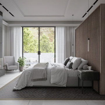
7 mistakes in bedroom design and ways to avoid them.
ERROR # 1 - Incorrect bed size.
This is a problem with any furniture in principle. When, according to the plan and ergonomic calculations, it becomes size to size, but in fact, it looks cumbersome, visually overflowing the space or, on the contrary, turns out to be too small and looks awkward.
How to avoid: Always be guided by the proportions of the size of the furniture in the room. Try to choose as big a bed as possible, but stay realistic. The main thing is that the width of the passageways in the bedroom should not be less than 70cm, and for comfortable movement, it is better to do everything 100cm.
ERROR # 2 - Poor lighting and switches.
Even in a small bedroom, you need multiple light sources. A single chandelier in the center of the ceiling is not enough, because it creates the effect of darkening the corners, and the room seems uncomfortable.
How to avoid: Hang a sconce over your headboard. Don't forget to light up the space next to the mirror and wardrobe. And be sure to place switches close to the bed so that you don't have to go to the other end of the room after an evening with a book in bed.
Do not forget about a sufficient number of outlets, this should be done even at the planning stage.
ERROR # 3 - Few storage locations
The fewer well-thought-out cabinets and shelving, the more things are visible. And the clutter spoils even the most stylish and expensive interior.
How to avoid: In addition to bedside tables, a chest of drawers (for storing small things) and a built-in wardrobe can be placed in a small bedroom: unlike a usual one, it takes up space from floor to ceiling, thereby accommodating more items. In addition, the built-in structure looks more solid and often merges with the walls, making the setting complete.
ERROR # 4 - Carpet of the wrong size.
The carpet in the bedroom is a great addition, and sometimes the final touch of the whole composition. But often people choose the wrong size or do not use it at all.
How to avoid: Choosing the right size can be guided by the unspoken rule, according to which the carpet should be 1 meter larger than the bed, both lengthwise and across. If the room is large, then it is recommended that the indentation of the carpet from the wall is 45-50 cm, if it is small, then 20-30 cm can be dispensed with.
ERROR # 5 Typical design.
If you buy a typical bed, bedside tables, and wardrobe from one manufacturer, then the interior will turn out to be formulaic and impersonal. No accessories and color schemes will help him.
How to avoid: The interior should reflect the character of its owner, and the person living in it will feel comfortable. Explore different collections of furniture and try to assemble a capsule in the same color scheme, but at the same time different in texture and shape.
ERROR # 6 Empty walls.
Even if the bedroom is a room for relaxation, it would be a mistake to make a space out of it that is intended solely for sleeping. Ascetic furnishings, unadorned walls, boring furniture, and bed linen - all this does not improve the mood at all, but, on the contrary, creates a gloomy mood.
How to avoid: The walls in the bedroom are a blank slate that you can transform into something original, beautiful, and unique to your liking. Even if you just paint one of the walls in a contrasting color, and decorate the other with several photos from the Internet, printed and inserted into frames, you can transform the atmosphere of the room as a whole.
ERROR # 7 Too dark interior.
One should not be deceived by the beauty of the thick dark tones of interior paint. It has long been known that dark blue, burgundy, blueberry, chocolate, and black for the bedroom should not be used in large quantities, since such an environment will have a tangible effect and interfere with a vigorous awakening in the morning.
How to avoid: If you like a rich range, try choosing derived shades a few tones lighter, for example, instead of black or graphite, choose gray-brown, dove-gray for the walls, and blue can be replaced with cornflower blue or azure.
Don't forget to combine dark tones with lots of whites, creams, complementing shimmery accessories, and vibrant décor.
https://www.ferriss.co/
#ferriss #We_bring_objects_to_life #3drendering #architecture #San_Francisco


 Leicht Westchester-Greenwich
Example of a minimalist u-shaped concrete floor home design design in New York with an integrated sink, flat-panel cabinets, dark wood cabinets, quartzite countertops, stainless steel appliances and an island

 Stained Glass Denver
The stained glass panels for the doors were designed in prairie style fashion. This look was made popular in the early 1900’s by famous architect Frank Lloyd Wright. Wright was known for creating designs that took the entire room into account as opposed to focusing on one aspect. The geometric shapes and thick leaded lines that you see here were very typical of his designs. Though prairie styles originated nearly one hundred years ago, they continue to remain popular today among art enthusiasts and have a powerful influence on modern architecture.
You too can bring the look of Frank Lloyd Wright artwork into your home with prairie style stained glass from Stained Glass Denver. We work with local artisans that are very talented in creating a wide range of stained glass designs. Not only can stained glass enhance the physical appearance of your home, but it can also increase its resale value and provide your family with privacy. To learn more about what we can do for your home, just contact our office. We look forward to working with you on your next home improvement project.

 Ward Jewell Architect AIA
Placed on a large site with the Santa Monica Mountains Conservancy at the rear boundary, this one story residence presents a modest, composed public façade to the street while opening to the rear yard with two wings surrounding a large loggia or “outdoor living room.” With its thick walls, overhangs, and ample cross ventilation, the project demonstrates the simple idea that a building should respond carefully to its environment.
Laura Hull Photography
1