
Search results for "Justice extra" in Home Design Ideas
 Beauty Justice
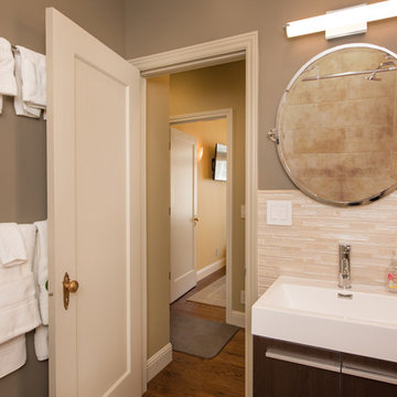
Utilized every inch in this small bathroom. Placed glass tiles behind sink which has accent detail to complement shower porcelain tiles on opposite wall. Used porcelain tiles in large shower which has dual shower heads. Floating sink provides extra space and makes for easy cleaning.
 Tracy Berman Interiors
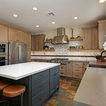
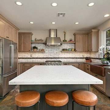
The inspiration for this kitchen started with the flooring. It had a lot of character and needed the right cabinets and accessories to do it justice. The old layout didn't use the space correctly and left a lot of opportunity for extra storage. The cabinets were not tall enough fo the space and the hood was crowded by cabinets. Now the layout adds additional storage and function. The hood is surrounded by tile and floating shelves to create a focal point. The apron front hammered copper sink helps connect the copper colors in the floor to the overall design. To create a rustic feel knotty alder was used. The 3x12 tile has a worn, old world feel to continue the style. The mosaic inset accents the copper, grey and cream pattern from the floor. The hardware on the cabinets is hammered matte black. The faucet is also matte black. The wine cabinet and wine fridge help to transition the space from kitchen to entertaining. A new dining table and chairs and new barstools help finish off the space.
 Weil Friedman Architects
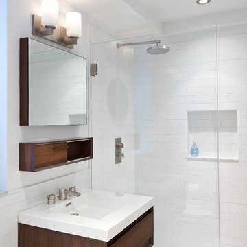
This sleek bathroom creates a serene and bright feeling by keeping things simple. The Wetstyle floating vanity is paired with matching wall cabinet and medicine for a simple unified focal point. Simple white subway tiles and trim are paired with Carrara marble mosaic floors for a bright timeless look.
Find the right local pro for your project
 Don Justice Cabinet Makers
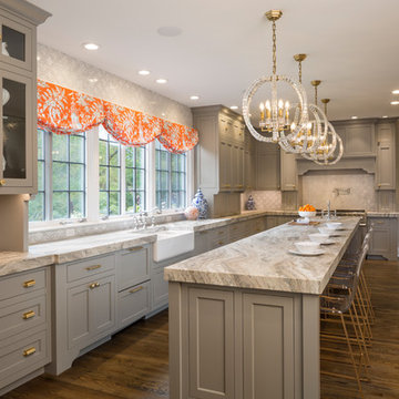
Traditional kitchen in a soft grey color palette. Photo by Josh Beeman.
Enclosed kitchen - traditional l-shaped dark wood floor and brown floor enclosed kitchen idea in Cincinnati with recessed-panel cabinets, stainless steel appliances, a farmhouse sink, gray cabinets, white backsplash, mosaic tile backsplash, an island and gray countertops
Enclosed kitchen - traditional l-shaped dark wood floor and brown floor enclosed kitchen idea in Cincinnati with recessed-panel cabinets, stainless steel appliances, a farmhouse sink, gray cabinets, white backsplash, mosaic tile backsplash, an island and gray countertops
 Kerstin Hellmann Architecture
Shawn-Paul Luchin Photography
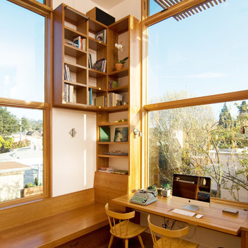
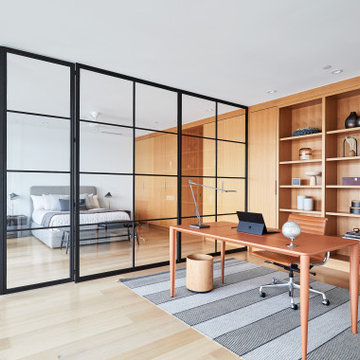
Example of a mid-sized trendy built-in desk medium tone wood floor home office design in San Francisco with white walls
Example of a mid-sized trendy built-in desk medium tone wood floor home office design in San Francisco with white walls
 Robert Thomas Homes
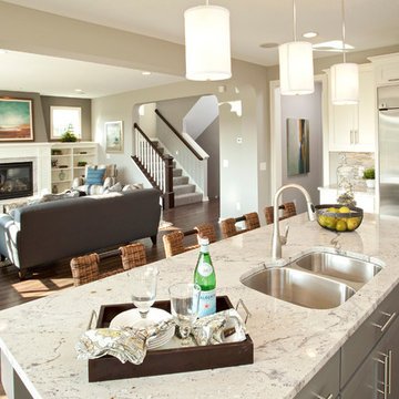
This home is built by Robert Thomas Homes located in Minnesota. Our showcase models are professionally staged. Please contact Ambiance at Home for information on furniture - 952.440.6757
 Tracy Berman Interiors
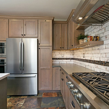
The inspiration for this kitchen started with the flooring. It had a lot of character and needed the right cabinets and accessories to do it justice. The old layout didn't use the space correctly and left a lot of opportunity for extra storage. The cabinets were not tall enough fo the space and the hood was crowded by cabinets. Now the layout adds additional storage and function. The hood is surrounded by tile and floating shelves to create a focal point. The apron front hammered copper sink helps connect the copper colors in the floor to the overall design. To create a rustic feel knotty alder was used. The 3x12 tile has a worn, old world feel to continue the style. The mosaic inset accents the copper, grey and cream pattern from the floor. The hardware on the cabinets is hammered matte black. The faucet is also matte black. The wine cabinet and wine fridge help to transition the space from kitchen to entertaining. A new dining table and chairs and new barstools help finish off the space.
Sponsored
Columbus, OH

HomeCraft Remodeling
Custom Craftsmanship & Build Solutions in Franklin County, Ohio
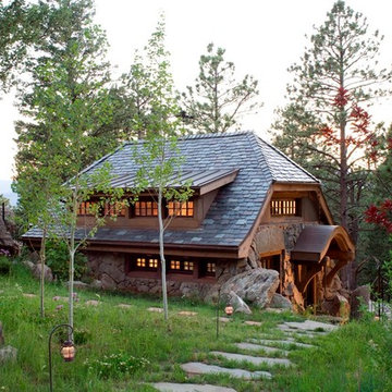
 TKP Architects
This award-winning and intimate cottage was rebuilt on the site of a deteriorating outbuilding. Doubling as a custom jewelry studio and guest retreat, the cottage’s timeless design was inspired by old National Parks rough-stone shelters that the owners had fallen in love with. A single living space boasts custom built-ins for jewelry work, a Murphy bed for overnight guests, and a stone fireplace for warmth and relaxation. A cozy loft nestles behind rustic timber trusses above. Expansive sliding glass doors open to an outdoor living terrace overlooking a serene wooded meadow.
Photos by: Emily Minton Redfield
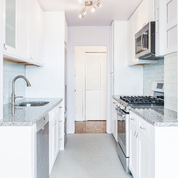
 RAJ Kitchen and Bath, LLC
**Check out the video of this transformation on our website**
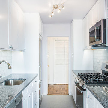
This small kitchen was way too small for this 2 bedrooms, 2 bathrooms apartment. Not only was it a very small kitchen, but the physical location of it made it very difficult to make it any bigger. There wasn't much that could have been done without incurring astronomical cost, which would get little or no return on the investment. The client wanted a kitchen that can be optimized in its current location to add a ton of value for resale.
This was difficult to do, because there was no moving of any mechanical around in the kitchen and even if we wanted to, the management of the building would not allow. For those of you who live in condos, co-ops or apartment building, you know how difficult it is to rework these foot prints. When we showed up, we saw the problems, but we also saw a huge opportunity where we can achieve those goals in the small space. This was accomplished by making some key changes and to incorporate some new things that was not possible when this kitchen was built years ago.
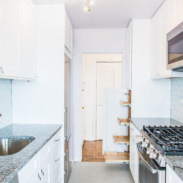
The crucial part of the design that would drive the entire new layout, was selecting the only appliance; that was the Refrigerator. Once we nailed down that refrigerator, we then proceeded to design the kitchen around it. We moved it to the other side of the wall where the sink was so that we can tap into the water line from the sink plumbing. It was crucial that it stays exactly 24" deep, not an inch more because we had to keep the entry as open as possible. Also, it was going to be directly in front of another big storage unit - The pantry. It is not ideal in most cases, but we needed the rest of the space to ramp up the design and open feel towards the side where all of the activities would take place, which happend to be the dining room and the view.
Once all that was figured out, we re-positioned the sink, dishwasher and the range and proceeded to wrap the cabinets around the columns to integrate them into the space. Thirty- six inches cabinets height was used so that they can be installed higher towards the ceiling height to give more room rather than the standard 18" required height between the counter tops. This was done to make the room feel a lot bigger than it really was. Not to mention, we also didn't want the faucet to be buried under the cabinets so that was also a necessary design detail for the space.
We then lowered both knee walls so that the counter top can sit on top of them, by removing that stop point that would have otherwise defined the kitchen area. This allowed us to pick up that extra footprint into the room for added prep space and enabled us to create the illusion of a kitchen that is looking longer than it really is. Every inch mattered when designing this kitchen and we made a conscious decision to use every one of that inch.
White cabinets were selected to do just what white cabinets are design to do; make a small or dark room appear bigger, brighter and more open. In this kitchen, this was amplified the more because of the kitchen location. It was perfect! We knew we did justice to the space because while we were there taking some photos, a few potential buyers walked in and went straight for the kitchen! They said its design just to fit the apartment.
Pantry roll out shelving, Double recycle bin, fancy handles, LED lighting, Quartz counter top, beautiful backslash tiles and grey linen floors finished off the kitchen which looked over a beautiful view of the George Washington Bridge from the top of this lovely 4th floor apartment.
Credit to Masterpiece Tile and Marble (Annmarie on the selection of Tiles and countertop and Val on the Construction to complete this project).
Davor Kokic Photography
 Don Justice Cabinet Makers
Photos by George Paxton.
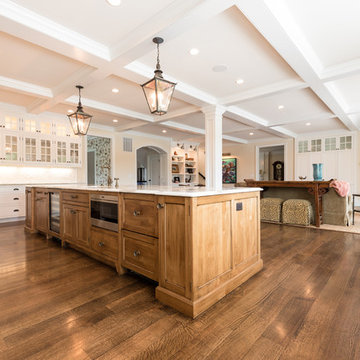
Eat-in kitchen - huge farmhouse single-wall dark wood floor and brown floor eat-in kitchen idea in Cincinnati with an undermount sink, shaker cabinets, white cabinets, granite countertops, beige backsplash, subway tile backsplash, paneled appliances and an island
Eat-in kitchen - huge farmhouse single-wall dark wood floor and brown floor eat-in kitchen idea in Cincinnati with an undermount sink, shaker cabinets, white cabinets, granite countertops, beige backsplash, subway tile backsplash, paneled appliances and an island
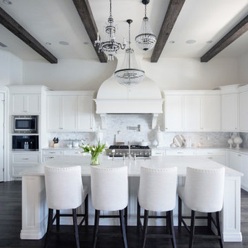
 Marquis Fine Cabinetry
Project Number: MS959
Design/Manufacturer/Installer: Marquis Fine Cabinetry
Collection: Classico
Finishes: Frosty White
Features: Hardware Pull (Belcastel), Hardware Knob (Belcastel), Exposed Cabinets, Trash Bay Pullout, Under Cabinet Lighting, Adjustable Legs/Soft Close (Standard)
Cabinet/Drawer Extra Options: Spice Rack Pullout, Tray Insert, Trash Bay Pullout
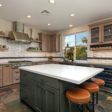 Tracy Berman Interiors
The inspiration for this kitchen started with the flooring. It had a lot of character and needed the right cabinets and accessories to do it justice. The old layout didn't use the space correctly and left a lot of opportunity for extra storage. The cabinets were not tall enough fo the space and the hood was crowded by cabinets. Now the layout adds additional storage and function. The hood is surrounded by tile and floating shelves to create a focal point. The apron front hammered copper sink helps connect the copper colors in the floor to the overall design. To create a rustic feel knotty alder was used. The 3x12 tile has a worn, old world feel to continue the style. The mosaic inset accents the copper, grey and cream pattern from the floor. The hardware on the cabinets is hammered matte black. The faucet is also matte black. The wine cabinet and wine fridge help to transition the space from kitchen to entertaining. A new dining table and chairs and new barstools help finish off the space.
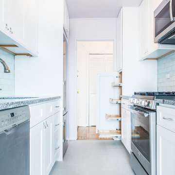 RAJ Kitchen and Bath, LLC
**Check out the video of this transformation on our website**
This small kitchen was way too small for this 2 bedrooms, 2 bathrooms apartment. Not only was it a very small kitchen, but the physical location of it made it very difficult to make it any bigger. There wasn't much that could have been done without incurring astronomical cost, which would get little or no return on the investment. The client wanted a kitchen that can be optimized in its current location to add a ton of value for resale.
This was difficult to do, because there was no moving of any mechanical around in the kitchen and even if we wanted to, the management of the building would not allow. For those of you who live in condos, co-ops or apartment building, you know how difficult it is to rework these foot prints. When we showed up, we saw the problems, but we also saw a huge opportunity where we can achieve those goals in the small space. This was accomplished by making some key changes and to incorporate some new things that was not possible when this kitchen was built years ago.
The crucial part of the design that would drive the entire new layout, was selecting the only appliance; that was the Refrigerator. Once we nailed down that refrigerator, we then proceeded to design the kitchen around it. We moved it to the other side of the wall where the sink was so that we can tap into the water line from the sink plumbing. It was crucial that it stays exactly 24" deep, not an inch more because we had to keep the entry as open as possible. Also, it was going to be directly in front of another big storage unit - The pantry. It is not ideal in most cases, but we needed the rest of the space to ramp up the design and open feel towards the side where all of the activities would take place, which happend to be the dining room and the view.
Once all that was figured out, we re-positioned the sink, dishwasher and the range and proceeded to wrap the cabinets around the columns to integrate them into the space. Thirty- six inches cabinets height was used so that they can be installed higher towards the ceiling height to give more room rather than the standard 18" required height between the counter tops. This was done to make the room feel a lot bigger than it really was. Not to mention, we also didn't want the faucet to be buried under the cabinets so that was also a necessary design detail for the space.
We then lowered both knee walls so that the counter top can sit on top of them, by removing that stop point that would have otherwise defined the kitchen area. This allowed us to pick up that extra footprint into the room for added prep space and enabled us to create the illusion of a kitchen that is looking longer than it really is. Every inch mattered when designing this kitchen and we made a conscious decision to use every one of that inch.
White cabinets were selected to do just what white cabinets are design to do; make a small or dark room appear bigger, brighter and more open. In this kitchen, this was amplified the more because of the kitchen location. It was perfect! We knew we did justice to the space because while we were there taking some photos, a few potential buyers walked in and went straight for the kitchen! They said its design just to fit the apartment.
Pantry roll out shelving, Double recycle bin, fancy handles, LED lighting, Quartz counter top, beautiful backslash tiles and grey linen floors finished off the kitchen which looked over a beautiful view of the George Washington Bridge from the top of this lovely 4th floor apartment.
Credit to Masterpiece Tile and Marble (Annmarie on the selection of Tiles and countertop and Val on the Construction to complete this project).
Davor Kokic Photography
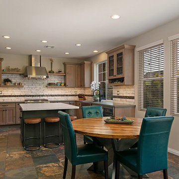 Tracy Berman Interiors
The inspiration for this kitchen started with the flooring. It had a lot of character and needed the right cabinets and accessories to do it justice. The old layout didn't use the space correctly and left a lot of opportunity for extra storage. The cabinets were not tall enough fo the space and the hood was crowded by cabinets. Now the layout adds additional storage and function. The hood is surrounded by tile and floating shelves to create a focal point. The apron front hammered copper sink helps connect the copper colors in the floor to the overall design. To create a rustic feel knotty alder was used. The 3x12 tile has a worn, old world feel to continue the style. The mosaic inset accents the copper, grey and cream pattern from the floor. The hardware on the cabinets is hammered matte black. The faucet is also matte black. The wine cabinet and wine fridge help to transition the space from kitchen to entertaining. A new dining table and chairs and new barstools help finish off the space.
 RAJ Kitchen and Bath, LLC
**Check out the video of this transformation on our website**
This small kitchen was way too small for this 2 bedrooms, 2 bathrooms apartment. Not only was it a very small kitchen, but the physical location of it made it very difficult to make it any bigger. There wasn't much that could have been done without incurring astronomical cost, which would get little or no return on the investment. The client wanted a kitchen that can be optimized in its current location to add a ton of value for resale.
This was difficult to do, because there was no moving of any mechanical around in the kitchen and even if we wanted to, the management of the building would not allow. For those of you who live in condos, co-ops or apartment building, you know how difficult it is to rework these foot prints. When we showed up, we saw the problems, but we also saw a huge opportunity where we can achieve those goals in the small space. This was accomplished by making some key changes and to incorporate some new things that was not possible when this kitchen was built years ago.
The crucial part of the design that would drive the entire new layout, was selecting the only appliance; that was the Refrigerator. Once we nailed down that refrigerator, we then proceeded to design the kitchen around it. We moved it to the other side of the wall where the sink was so that we can tap into the water line from the sink plumbing. It was crucial that it stays exactly 24" deep, not an inch more because we had to keep the entry as open as possible. Also, it was going to be directly in front of another big storage unit - The pantry. It is not ideal in most cases, but we needed the rest of the space to ramp up the design and open feel towards the side where all of the activities would take place, which happend to be the dining room and the view.
Once all that was figured out, we re-positioned the sink, dishwasher and the range and proceeded to wrap the cabinets around the columns to integrate them into the space. Thirty- six inches cabinets height was used so that they can be installed higher towards the ceiling height to give more room rather than the standard 18" required height between the counter tops. This was done to make the room feel a lot bigger than it really was. Not to mention, we also didn't want the faucet to be buried under the cabinets so that was also a necessary design detail for the space.
We then lowered both knee walls so that the counter top can sit on top of them, by removing that stop point that would have otherwise defined the kitchen area. This allowed us to pick up that extra footprint into the room for added prep space and enabled us to create the illusion of a kitchen that is looking longer than it really is. Every inch mattered when designing this kitchen and we made a conscious decision to use every one of that inch.
White cabinets were selected to do just what white cabinets are design to do; make a small or dark room appear bigger, brighter and more open. In this kitchen, this was amplified the more because of the kitchen location. It was perfect! We knew we did justice to the space because while we were there taking some photos, a few potential buyers walked in and went straight for the kitchen! They said its design just to fit the apartment.
Pantry roll out shelving, Double recycle bin, fancy handles, LED lighting, Quartz counter top, beautiful backslash tiles and grey linen floors finished off the kitchen which looked over a beautiful view of the George Washington Bridge from the top of this lovely 4th floor apartment.
Credit to Masterpiece Tile and Marble (Annmarie on the selection of Tiles and countertop and Val on the Construction to complete this project).
Davor Kokic Photography
 Tracy Berman Interiors
The inspiration for this kitchen started with the flooring. It had a lot of character and needed the right cabinets and accessories to do it justice. The old layout didn't use the space correctly and left a lot of opportunity for extra storage. The cabinets were not tall enough fo the space and the hood was crowded by cabinets. Now the layout adds additional storage and function. The hood is surrounded by tile and floating shelves to create a focal point. The apron front hammered copper sink helps connect the copper colors in the floor to the overall design. To create a rustic feel knotty alder was used. The 3x12 tile has a worn, old world feel to continue the style. The mosaic inset accents the copper, grey and cream pattern from the floor. The hardware on the cabinets is hammered matte black. The faucet is also matte black. The wine cabinet and wine fridge help to transition the space from kitchen to entertaining. A new dining table and chairs and new barstools help finish off the space.
 RAJ Kitchen and Bath, LLC
**Check out the video of this transformation on our website**
This small kitchen was way too small for this 2 bedrooms, 2 bathrooms apartment. Not only was it a very small kitchen, but the physical location of it made it very difficult to make it any bigger. There wasn't much that could have been done without incurring astronomical cost, which would get little or no return on the investment. The client wanted a kitchen that can be optimized in its current location to add a ton of value for resale.
This was difficult to do, because there was no moving of any mechanical around in the kitchen and even if we wanted to, the management of the building would not allow. For those of you who live in condos, co-ops or apartment building, you know how difficult it is to rework these foot prints. When we showed up, we saw the problems, but we also saw a huge opportunity where we can achieve those goals in the small space. This was accomplished by making some key changes and to incorporate some new things that was not possible when this kitchen was built years ago.
The crucial part of the design that would drive the entire new layout, was selecting the only appliance; that was the Refrigerator. Once we nailed down that refrigerator, we then proceeded to design the kitchen around it. We moved it to the other side of the wall where the sink was so that we can tap into the water line from the sink plumbing. It was crucial that it stays exactly 24" deep, not an inch more because we had to keep the entry as open as possible. Also, it was going to be directly in front of another big storage unit - The pantry. It is not ideal in most cases, but we needed the rest of the space to ramp up the design and open feel towards the side where all of the activities would take place, which happend to be the dining room and the view.
Once all that was figured out, we re-positioned the sink, dishwasher and the range and proceeded to wrap the cabinets around the columns to integrate them into the space. Thirty- six inches cabinets height was used so that they can be installed higher towards the ceiling height to give more room rather than the standard 18" required height between the counter tops. This was done to make the room feel a lot bigger than it really was. Not to mention, we also didn't want the faucet to be buried under the cabinets so that was also a necessary design detail for the space.
We then lowered both knee walls so that the counter top can sit on top of them, by removing that stop point that would have otherwise defined the kitchen area. This allowed us to pick up that extra footprint into the room for added prep space and enabled us to create the illusion of a kitchen that is looking longer than it really is. Every inch mattered when designing this kitchen and we made a conscious decision to use every one of that inch.
White cabinets were selected to do just what white cabinets are design to do; make a small or dark room appear bigger, brighter and more open. In this kitchen, this was amplified the more because of the kitchen location. It was perfect! We knew we did justice to the space because while we were there taking some photos, a few potential buyers walked in and went straight for the kitchen! They said its design just to fit the apartment.
Pantry roll out shelving, Double recycle bin, fancy handles, LED lighting, Quartz counter top, beautiful backslash tiles and grey linen floors finished off the kitchen which looked over a beautiful view of the George Washington Bridge from the top of this lovely 4th floor apartment.
Credit to Masterpiece Tile and Marble (Annmarie on the selection of Tiles and countertop and Val on the Construction to complete this project).
Davor Kokic Photography
 Homework Remodels
 With education being key to our remodel process, our designer discussed lighting elements, space planning, cabinet options and finish materials with our homeowners. To begin, she talked about under cabinet and above cabinet lighting options. They also discussed the popularity and functionality of LED lights for task, decorative and ambient lighting scenes. Eavesdropping on our conversation, one of the brothers chimed in on how often they had to change the recessed ceiling fixtures. That comment from the brother led our designer to increase our scope of work to add dimmable LED can lights in the color frequency close to daylight. Now it was time to complete the finish selections.
Product selection had to go quickly, as the homeowner was only able to dedicate one long weekend to shop. With this goal in mind, our designer made choosing plumbing products and decorative lighting an online event. Then they went to an appliance showroom and granite/tile showroom to make the final choices. Our designer made sure they found a gorgeous set of slabs for the granite above the cooktop, since it was a key factor for the client and her mother.
With all the selections made, final space plan drawings and the electrical layout complete, the client met with our designer to sign off on all the paperwork and move forward with their new kitchen. The key improvements incorporated into the final design were:
LED can lights, under cabinet and above cabinet lights all on dimmers.
Accessible items for wheelchair use with a touch-free faucet and microwave drawer .
Extra deep counter space and seating at the island.
Additional storage cabinets under the seating area of the island.
Decreased traffic flow issues by adjusting refrigerator/freezer location and double oven cabinet.
Plug strips under the wall cabinets to eliminate backsplash outlets.
An expansive granite slab backsplash centered on the cooktop area.
Our project manager started the job with rough electrical and rough plumbing, as the homeowner had enlisted the assistance of a family friend to remove the kitchen cabinets and re-install them in her garage. The plumbing was straight forward with the gas line already in place and the sink location staying in the island. The electrician wired for the new under-cabinet and above cabinet LED strip lights. The sconce locations were adjusted for the new bar top location, as were a row of can lights to accommodate for an even pour of ambient light throughout the space. The new LED can lights are a hit, as none have needed to be changed out.
Our project manager specializes in trim carpentry so he did the cabinet install to keep our schedule on time. The cabinets went in smoothly except for the custom refrigerator panel. One of the panels needed to be remade three times, as each time it was produced the manufacturer’s quality control caught a defect. Our project manager worked closely with manufacturer and homeowner to keep everyone in the loop waiting patiently on its arrival.
When it came time for the quartzite installation, we worked closely with our fabricator at cut layout to create the focal point at the hood. His team did an excellent job with the installation. The sink area was a surprise. They went above and beyond in framing the sink with the similar vein to the hood backsplash. Upon installation, the tile backsplash just did not do justice to the amazing quartzite. Discussion with the family and pictures sent to the homeowner lead to a decision to call the fabricator to see how much quartzite might be left. He had just enough to complete the island and beverage center. In the end, the backsplash worked out beautifully in all stone.
We met our schedule for the end date of the project and the wheelchair-bound sister was able to move in. For this large Italian family, big meals with lots of family and friends in the new wonderful hub/kitchen is now a part of their happy life. Mission accomplished.
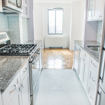 RAJ Kitchen and Bath, LLC
**Check out the video of this transformation on our website**
This small kitchen was way too small for this 2 bedrooms, 2 bathrooms apartment. Not only was it a very small kitchen, but the physical location of it made it very difficult to make it any bigger. There wasn't much that could have been done without incurring astronomical cost, which would get little or no return on the investment. The client wanted a kitchen that can be optimized in its current location to add a ton of value for resale.
This was difficult to do, because there was no moving of any mechanical around in the kitchen and even if we wanted to, the management of the building would not allow. For those of you who live in condos, co-ops or apartment building, you know how difficult it is to rework these foot prints. When we showed up, we saw the problems, but we also saw a huge opportunity where we can achieve those goals in the small space. This was accomplished by making some key changes and to incorporate some new things that was not possible when this kitchen was built years ago.
The crucial part of the design that would drive the entire new layout, was selecting the only appliance; that was the Refrigerator. Once we nailed down that refrigerator, we then proceeded to design the kitchen around it. We moved it to the other side of the wall where the sink was so that we can tap into the water line from the sink plumbing. It was crucial that it stays exactly 24" deep, not an inch more because we had to keep the entry as open as possible. Also, it was going to be directly in front of another big storage unit - The pantry. It is not ideal in most cases, but we needed the rest of the space to ramp up the design and open feel towards the side where all of the activities would take place, which happend to be the dining room and the view.
Once all that was figured out, we re-positioned the sink, dishwasher and the range and proceeded to wrap the cabinets around the columns to integrate them into the space. Thirty- six inches cabinets height was used so that they can be installed higher towards the ceiling height to give more room rather than the standard 18" required height between the counter tops. This was done to make the room feel a lot bigger than it really was. Not to mention, we also didn't want the faucet to be buried under the cabinets so that was also a necessary design detail for the space.
We then lowered both knee walls so that the counter top can sit on top of them, by removing that stop point that would have otherwise defined the kitchen area. This allowed us to pick up that extra footprint into the room for added prep space and enabled us to create the illusion of a kitchen that is looking longer than it really is. Every inch mattered when designing this kitchen and we made a conscious decision to use every one of that inch.
White cabinets were selected to do just what white cabinets are design to do; make a small or dark room appear bigger, brighter and more open. In this kitchen, this was amplified the more because of the kitchen location. It was perfect! We knew we did justice to the space because while we were there taking some photos, a few potential buyers walked in and went straight for the kitchen! They said its design just to fit the apartment.
Pantry roll out shelving, Double recycle bin, fancy handles, LED lighting, Quartz counter top, beautiful backslash tiles and grey linen floors finished off the kitchen which looked over a beautiful view of the George Washington Bridge from the top of this lovely 4th floor apartment.
Credit to Masterpiece Tile and Marble (Annmarie on the selection of Tiles and countertop and Val on the Construction to complete this project).
Davor Kokic Photography
1