
Search results for "Quick gains" in Home Design Ideas
 FineLine Kitchens, Inc.
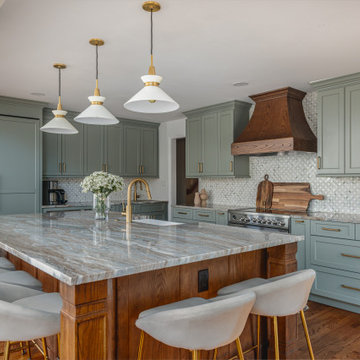
Hi everyone, I'm Sarah and Ogun we are here with fine line kitchens. So we are a couple working together. I do the interior design and remodeling of the space material selection meeting with the clients. And I handled operations outside, you know meaning all the construction work that is taking place the inside. The houses that we work in. I handle all the aspects of the construction, so today's project is very special. We're in Vienna and the client had a very big family. It's a family of seven that lives here. So we had a few aspects that we needed to keep in mind while designing this one. Having everybody be able to sit on the island. So we wanted plenty of seating all the way around. We didn't want anybody standing or anything like that. So what we did is we maximize the space. The center island is the biggest part of the kitchen. We use a natural stone to kind of give it a beautiful texture versus quartz. It's kind of standard white or kind of fabricated, so I wanted something very natural. We did this because I took my inspiration from the outside, so the inspiration if you look at the view right in front of me is there are so many greens there's a lot of brass accents and I wanted to bring this. Into this kitchen while designing it for my clients. She is very warm very. She wanted a very homey, comfy kind of look for the kitchen. So that's what we did today. As you can see, the cabinets are sage green, very light, so I still think it's a neutral, but it's a lighter color that again brings the outside in and we combine that with the oak right behind me so it's a slightly warm oak. It's not very dark. It's not very light. It's a medium brown and the same color went on the island. To kind of tie these two in and the backsplash, my favorite part is where you can see a little bit of design. It is, in my opinion still classic, but includes a pattern so the outside part is as we said in the beginning, is handled by my husband. I'd like him to speak a little bit about that. Thanks, Sarah, I want to talk to you guys a little bit about the construction part of this project. Originally this kitchen was located mostly in this area. They had their stove there sing. It was more of a peninsula layout in Sarah's and the customer vision they wanted. They wanted to get rid of the peninsula and they want to be able to have a huge island that can at least sit seven people because they're familiar with seven. So we wanted to make sure that we can achieve this design and bring it to life so that they can be happy with this layout. Some of the challenges we had, the house, the home being, you know, old home. There were a lot of you know the older electrical and plumbing that had to be replaced. We had to relocate the stove from here to this area. Over here we had put a nice foot fan that we had to relocate all the ductwork and the plumbing. Was being on the peninsula area. We had to relocate it to the center islands. So we achieved all this and kind of like bring it to bring in this kitchen up to date it looks beautiful. That's true, so yes, the old layout did not function for my clients because everything was kind of gathered on one side of the kitchen. So there was like a peninsula right there. So the end of this island kind of continued straight. And that was just the L shape. Kind of where everything was and there used to be another big table here, so they were using only kind of half of the space. So like I said at the beginning, our vision was to kind of feed everybody at the island, create some symmetry. 'cause I love that. So as you can see behind me, this is kind of the focal point symmetrical. Everything is kind of even we wanted to also panel the fridge here so it mimics the pantry and another size. So when you're looking at it, it is bringing again that symmetry back again. I hope you enjoyed this kitchen and this video and I'll see you soon. So how do you think this project turned out? It's nice. I like the color. I think it turned out nice. It's kind of like a little bit different color than what we always do. So I realize. Are you giving me a little bit of credit here that I did something different? Are you proud? I'm so proud of you. Other than that I like it. That they have kind of like a two sink. So if this was our kitchen, if we ever like you can have your own. I can have mine if we ever get into a fight then this can be like my own kitchen. Why are we gonna bring in a fight right now? So I'm cooking anyway. You're grilling most of the time, So what are you even talking about? My kitchen? That's my kitchen. You can just take the small sink. That's fine. It's always good to have your own space right there, so anyways. Thank you guys for watching. We hope to see you soon and if you have any questions please click the link below. It'll lead you to our website, house, YouTube and all of the social media is so nice to have you guys. We'll see you soon. Thanks bye bye-bye.

 Kimberlee Marie Interiors
Our clients wanted to modernize their 1980's home, focusing on reimagining the main floor. We used warm palettes, natural elements, and clean lines while maximizing natural light and preserving key architectural features to create a welcoming, functional space.
We completely reimagined the kitchen to enhance flow and gain additional cabinet space. Features include a center island with bar stools that also doubles as a casual dining area, a functional layout, and ample storage.
 ONE eleven ltd.
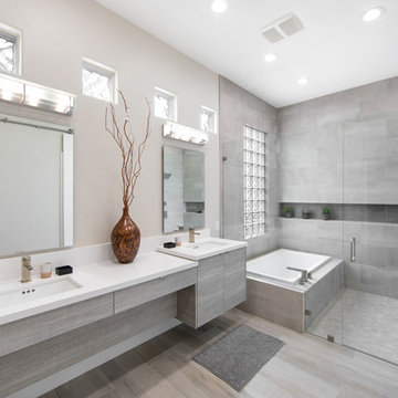
We developed a design that fully met the desires of a spacious, airy, light filled home incorporating Universal Design features that blend seamlessly adding beauty to the Minimalist Scandinavian concept.
Find the right local pro for your project
 Armitage Interiors - Home Design & Renovation
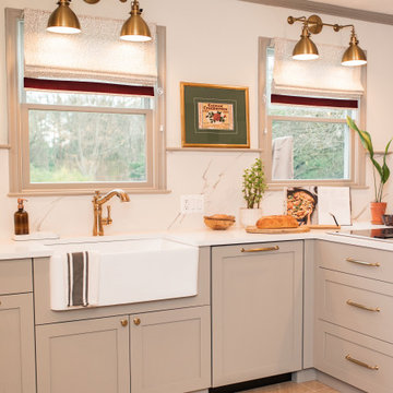
When we arrived at this kitchen in Solebury it was dated and closed in. A center peninsula divided the space and a wall at the end separated a tiny dining room. We completely redesigned the layout by removing the wall between the kitchen and dining room and adding a window to gain some natural light.
The homeowners loved the rich cranberry color but struggled to integrate it without overwhelming the space with red. The window treatments and floor to ceiling pantry gave us the perfect opportunity to accent the color palette throughout the room. Some open shelving and a chair rail along the top of the backsplash allow for decoration and keep the counters clutter free.
This quickly became one of our favorite kitchen renovations simply because of the dramatic changes we were able to make
 Armitage Interiors - Home Design & Renovation
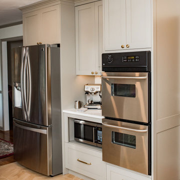
When we arrived at this kitchen in Solebury it was dated and closed in. A center peninsula divided the space and a wall at the end separated a tiny dining room. We completely redesigned the layout by removing the wall between the kitchen and dining room and adding a window to gain some natural light.
The homeowners loved the rich cranberry color but struggled to integrate it without overwhelming the space with red. The window treatments and floor to ceiling pantry gave us the perfect opportunity to accent the color palette throughout the room. Some open shelving and a chair rail along the top of the backsplash allow for decoration and keep the counters clutter free.
This quickly became one of our favorite kitchen renovations simply because of the dramatic changes we were able to make

 Armitage Interiors - Home Design & Renovation
When we arrived at this kitchen in Solebury it was dated and closed in. A center peninsula divided the space and a wall at the end separated a tiny dining room. We completely redesigned the layout by removing the wall between the kitchen and dining room and adding a window to gain some natural light.
The homeowners loved the rich cranberry color but struggled to integrate it without overwhelming the space with red. The window treatments and floor to ceiling pantry gave us the perfect opportunity to accent the color palette throughout the room. Some open shelving and a chair rail along the top of the backsplash allow for decoration and keep the counters clutter free.
This quickly became one of our favorite kitchen renovations simply because of the dramatic changes we were able to make

 Armitage Interiors - Home Design & Renovation
When we arrived at this kitchen in Solebury it was dated and closed in. A center peninsula divided the space and a wall at the end separated a tiny dining room. We completely redesigned the layout by removing the wall between the kitchen and dining room and adding a window to gain some natural light.
The homeowners loved the rich cranberry color but struggled to integrate it without overwhelming the space with red. The window treatments and floor to ceiling pantry gave us the perfect opportunity to accent the color palette throughout the room. Some open shelving and a chair rail along the top of the backsplash allow for decoration and keep the counters clutter free.
This quickly became one of our favorite kitchen renovations simply because of the dramatic changes we were able to make
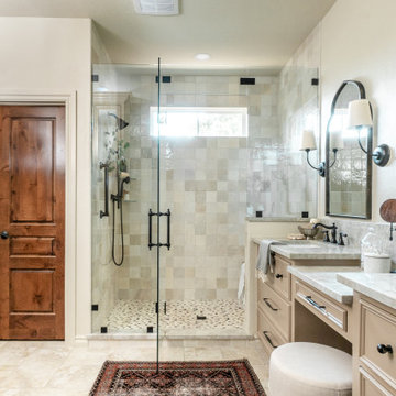
 Kirby Home Designs
Example of a transitional master beige tile and white tile beige floor and double-sink alcove shower design in Oklahoma City with recessed-panel cabinets, beige cabinets, white walls, an undermount sink, marble countertops, a hinged shower door, gray countertops and a built-in vanity
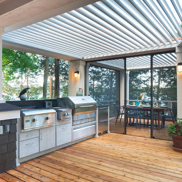

 FINNE Architects
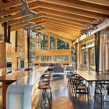
The Mazama house is located in the Methow Valley of Washington State, a secluded mountain valley on the eastern edge of the North Cascades, about 200 miles northeast of Seattle.
The house has been carefully placed in a copse of trees at the easterly end of a large meadow. Two major building volumes indicate the house organization. A grounded 2-story bedroom wing anchors a raised living pavilion that is lifted off the ground by a series of exposed steel columns. Seen from the access road, the large meadow in front of the house continues right under the main living space, making the living pavilion into a kind of bridge structure spanning over the meadow grass, with the house touching the ground lightly on six steel columns. The raised floor level provides enhanced views as well as keeping the main living level well above the 3-4 feet of winter snow accumulation that is typical for the upper Methow Valley.
To further emphasize the idea of lightness, the exposed wood structure of the living pavilion roof changes pitch along its length, so the roof warps upward at each end. The interior exposed wood beams appear like an unfolding fan as the roof pitch changes. The main interior bearing columns are steel with a tapered “V”-shape, recalling the lightness of a dancer.
The house reflects the continuing FINNE investigation into the idea of crafted modernism, with cast bronze inserts at the front door, variegated laser-cut steel railing panels, a curvilinear cast-glass kitchen counter, waterjet-cut aluminum light fixtures, and many custom furniture pieces. The house interior has been designed to be completely integral with the exterior. The living pavilion contains more than twelve pieces of custom furniture and lighting, creating a totality of the designed environment that recalls the idea of Gesamtkunstverk, as seen in the work of Josef Hoffman and the Viennese Secessionist movement in the early 20th century.
The house has been designed from the start as a sustainable structure, with 40% higher insulation values than required by code, radiant concrete slab heating, efficient natural ventilation, large amounts of natural lighting, water-conserving plumbing fixtures, and locally sourced materials. Windows have high-performance LowE insulated glazing and are equipped with concealed shades. A radiant hydronic heat system with exposed concrete floors allows lower operating temperatures and higher occupant comfort levels. The concrete slabs conserve heat and provide great warmth and comfort for the feet.
Deep roof overhangs, built-in shades and high operating clerestory windows are used to reduce heat gain in summer months. During the winter, the lower sun angle is able to penetrate into living spaces and passively warm the exposed concrete floor. Low VOC paints and stains have been used throughout the house. The high level of craft evident in the house reflects another key principle of sustainable design: build it well and make it last for many years!
Photo by Benjamin Benschneider
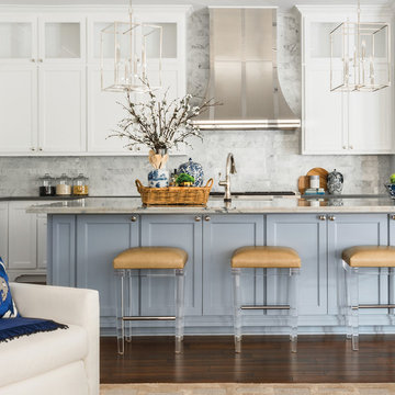
 MMI Design
This existing client reached out to MMI Design for help shortly after the flood waters of Harvey subsided. Her home was ravaged by 5 feet of water throughout the first floor. What had been this client's long-term dream renovation became a reality, turning the nightmare of Harvey's wrath into one of the loveliest homes designed to date by MMI. We led the team to transform this home into a showplace. Our work included a complete redesign of her kitchen and family room, master bathroom, two powders, butler's pantry, and a large living room. MMI designed all millwork and cabinetry, adjusted the floor plans in various rooms, and assisted the client with all material specifications and furnishings selections. Returning these clients to their beautiful '"new" home is one of MMI's proudest moments!
 User
User http://mollywinnphotography.com
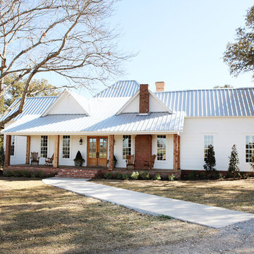
Example of a mid-sized farmhouse white one-story exterior home design in Austin
Example of a mid-sized farmhouse white one-story exterior home design in Austin
 Leib Designs
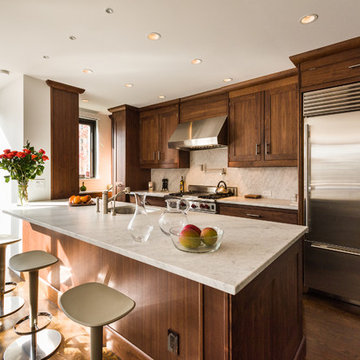
The kitchen was created in collaboration with Smallbone of Devizes. The electronic stove from Wolf has a stainless steel finish and allows residents to choose from ten different cooking modes with even temperatures and airflow throughout. The available dual fuel ranges are natural or LP gas. The refrigerator is a product of Sub-Zero and is built into the surrounding cabinetry. To ensure freshness of food and water, the refrigerator features an air purification system, that reduces stench, odors, bacteria and viruses. The residents will be accustom to cleaning without error, with the help of their fully integrated dishwasher from Miele.
 Casa Smith Designs, LLC
Mark Pinkerton, vi360 Photography
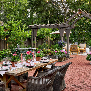
Huge elegant backyard brick patio photo in San Francisco with no cover
Huge elegant backyard brick patio photo in San Francisco with no cover
 Blejer Architecture
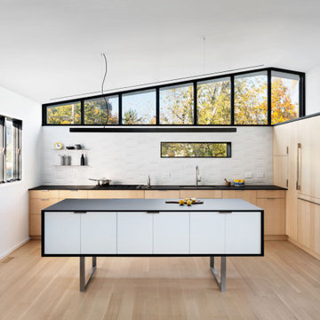
Trendy light wood floor and vaulted ceiling kitchen photo in New York with an undermount sink, flat-panel cabinets, light wood cabinets, laminate countertops, white backsplash, ceramic backsplash, black appliances, an island and black countertops
 Kaplan Thompson Architects
Brett Winter Lemon Photography
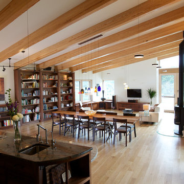
Family room - contemporary open concept light wood floor family room idea in Portland Maine with white walls
Family room - contemporary open concept light wood floor family room idea in Portland Maine with white walls
 Hsu McCullough
Dining Room. Photo byClark Dugger
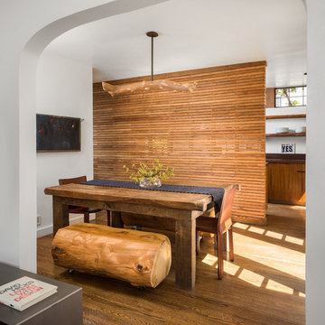
Kitchen/dining room combo - small contemporary medium tone wood floor and brown floor kitchen/dining room combo idea in Los Angeles with white walls and no fireplace
Kitchen/dining room combo - small contemporary medium tone wood floor and brown floor kitchen/dining room combo idea in Los Angeles with white walls and no fireplace
 Design Harmony
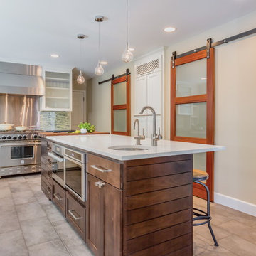
Transitional l-shaped kitchen photo in Seattle with an undermount sink, shaker cabinets, white cabinets, quartz countertops, green backsplash, matchstick tile backsplash, stainless steel appliances and an island
1