
Search results for "Resolving trigonometric" in Home Design Ideas

 User
New custom estate home situated on two and a half, full walk-street lots in the Sand Section of Manhattan Beach, CA.
Inspiration for a large mediterranean rooftop balcony remodel in Los Angeles with no cover
Inspiration for a large mediterranean rooftop balcony remodel in Los Angeles with no cover

 Noz Design
Colin Price Photography
Open concept kitchen - large eclectic l-shaped medium tone wood floor open concept kitchen idea in San Francisco with an undermount sink, shaker cabinets, blue cabinets, quartz countertops, blue backsplash, ceramic backsplash, stainless steel appliances, an island and white countertops
Open concept kitchen - large eclectic l-shaped medium tone wood floor open concept kitchen idea in San Francisco with an undermount sink, shaker cabinets, blue cabinets, quartz countertops, blue backsplash, ceramic backsplash, stainless steel appliances, an island and white countertops

 Grove Park Construction
Inspiration for a coastal master gray floor bathroom remodel in Nashville with shaker cabinets, black cabinets, white walls and an undermount sink
Find the right local pro for your project

 Robert Nichol and sons
The aspiration was to create a graphic from that was in oppo.
Large contemporary two-story wood flat roof idea in Melbourne
Large contemporary two-story wood flat roof idea in Melbourne

 Sub-Zero, Wolf, and Cove
Style meets substance in kitchens designed with Sub-Zero refrigeration, Wolf cooking, and Cove dishwashing. Cook creatively in contemporary spaces built to your exact tastes, and entertain elegantly with thoughtfully crafted products that integrate seamlessly into your home.
 Luce Spaces LLC
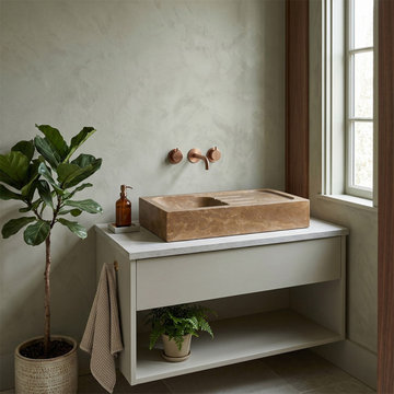
Noce Brown Travertine carries a depth of warm ochre and umber tonality that intensifies under a honed, partially filled surface — a finish that balances tactile authenticity with the clean geometric discipline this 36-inch rectangular vessel sink demands. Milled from a single monolithic block, the basin integrates a precision-sloped fluted drainboard in one continuous plane, eliminating joints and reinforcing the visual weight that defines large-format natural stone vessel sinks at this scale. The result is a functional architectural object — dimensionally resolved, materially uncompromising — designed for pairing with wall-mount faucets in spaces where surface and structure are held to the same standard. Configured with zero faucet holes for wall-mount or counter-mount installations.
 Luce Spaces LLC
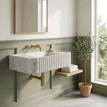
Carrara White Marble Fluted Wall-Mount Sink (28")
A masterful translation of geology into built form. This 28" wall-mount basin pairs the characteristic grey veining of premium Carrara marble with a precisely executed fluted exterior profile. The vertical ribbing generates a rhythm of light and shadow, giving the solid stone volume a striking geometric presence against a flat wall plane.
Finished with a honed surface to temper reflectivity and engineered with a solid deck for wall-mount faucet configurations, it acts as a fully resolved architectural element rather than a simple replicated object.
For current availability, technical specifications, and direct ordering of this 28" fluted model, visit our LUCE SPACES official website
 Luce Spaces LLC
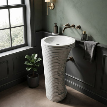
Carrara White marble reaches architectural maturity in this freestanding sculptural pedestal sink. Carved as a single 36-inch asymmetrical mass, the exterior resolves two opposing surface languages: closely spaced horizontal ribs machined to geometric exactness, and a hand-chiseled, partially filled rock texture. The interior basin is brought to a honed matte finish, drawing the stone's precise grey veining into sharp relief. Configured without faucet holes, this floor-mount fixture is engineered to read as a self-contained sculptural volume, its textural duality calibrated for minimalist and bespoke interiors.
Architectural Specifications:
• Material: Premium Carrara White Marble from Turkey
• Form: Asymmetrical Sculptural Pedestal with Round Basin
• Dimensions: 16" L x 16" W x 36" H
• Configuration: 0 Faucet Holes (Designed for wall-mount or freestanding faucets)
• Installation: Freestanding / Floor-Mount
• Finish: Honed Basin / Asymmetrical Ribbed and Hand-Chiseled Exterior Profile
• Design Language: Sculptural luxury, Textural duality, Organic modernism`
 Luce Spaces LLC
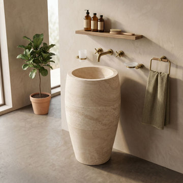
Troia Light Travertine develops its characteristic warm, pale tonality through millennia of sedimentary compression. Constructed from three solid blocks and resolved into a monumental amphora-profile form, this freestanding sink contrasts smooth honed planes with a combed, ribbed center band. The expertly partially filled voids are preserved throughout, allowing the stone's authentic cellular texture to read as material fact against the geometric precision of the overall silhouette.
Architectural Specifications:
• Material: Premium Troia Light Travertine (Constructed from 3 solid blocks)
• Form: Freestanding Pedestal Sink with curved, amphora-like profile
• Dimensions: 16" Diameter x 33.5" Total Height
• Configuration: 0 Faucet Holes (Designed for wall-mount or floor-mount brassware)
• Installation: Freestanding / Floor-mount
• Finish: Multi-Textured (Honed top/bottom, Combed/Ribbed center band, Partially Filled)
• Design Language: Classical resonance, Tactile contrast, Warm earthy luxury
 Murray Lampert Design, Build, Remodel
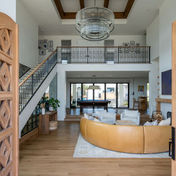
This Point Loma custom home is a complete ground-up design-build by Murray Lampert with more than 51 years of residential craftsmanship. The project blends California contemporary architecture with warm, organic materials to create a home that feels both striking and deeply livable.
From the street, the home makes an immediate statement. The white stucco facade is broken by vertical cedar siding panels that frame bold black casement windows, giving the exterior a layered, textural quality. The centerpiece of the entry is a set of hand-carved arched double doors in natural wood, fitted with a geometric diamond pattern that announces the home's design sensibility before you even step inside.
The interior is anchored by a dramatic double-height great room where craftsmanship details stack on one another: a two-tiered glass rod chandelier suspended over a curved honey leather sectional, a custom geometric iron staircase railing that doubles as art, and a glass-enclosed wine cellar tucked beneath the stair, functional, architectural, and luminous all at once. The fireplace wall is a study in warmth white penny tile surround, a hand-hewn white oak beam mantel, and flanking built-in cabinetry and shelving that frame the space without overpowering it.
The kitchen carries the same commitment to quality: white shaker cabinetry, a fully panel-front built-in refrigerator, and brushed brass hardware throughout. Every finish decision reinforces the same palette, white, warm wood, and brass. Clean and considered.
This home reflects what Murray Lampert does best: integrating design and construction under one roof so that every detail is resolved before the first nail is driven, and the finished result looks exactly like the vision.
 Crystal Kitchen + Bath
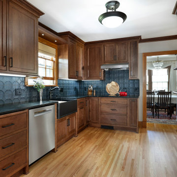
The goal for this 1939 Tudor-style story-and-a-half home was to create a kitchen that offered the conveniences, storage, and performance of a modern workspace while preserving the warmth, craftsmanship, and vintage charm that made the home special. The client, an avid home cook, wanted the room to feel as though it had always belonged to the house, with thoughtful upgrades that respected the original architecture rather than competing with it. Just as important, she needed a more efficient layout with enough storage for small appliances, so everyday cooking would no longer require carrying items up from the lower level.
Several existing conditions shaped the design approach. The kitchen retained original, amber-stained birch woodwork that the client wished to keep, and the compact footprint was interrupted by six doorways and two windows, none of which were to be moved, altered, or replaced. A previous flooring update had left the door casings undercut too short, creating visible gaps where the casing met the floor. The existing vintage 40-inch range also lacked proper ventilation, yet the client wished to accommodate a refrigerator, dishwasher, cooktop, double ovens, built-in microwave, and effective venting above the cooktop into the new kitchen layout.
To honor the original millwork, beaded inset-style cherry cabinetry was selected in a soft, hand-rubbed finish that will deepen over time and develop a natural patina. Charcoal-gray soapstone countertops complement the cabinetry while reinforcing the historic character of the home with an organic, timeworn texture. The former breakfast nook was transformed into a butler’s pantry, adding valuable base cabinet storage and expanded work surfaces for frequently used small appliances. Also in the butler’s pantry, a single upper cabinet was paired with open shelves to give an open, airy feeling while adding character and practical storage. A classic single-bowl apron-front workstation sink contributes both period-appropriate character and practical prep and cleanup function.
Because the home’s openings were such a defining feature, the design worked within the existing architecture instead of altering it. Custom plinth blocks were created for each doorway to extend the original casing gracefully down to the new natural red oak flooring, resolving the earlier construction issue while adding a detail that feels authentic to the age of the house. Despite the number of door and window openings, the new layout provides a significantly more functional, built-in kitchen with an improved work triangle for serious cooking.
Appliance placement was carefully planned to deliver the requested performance without overwhelming the small room. Three cooking functions (double ovens & microwave) were consolidated into one location with a GE Café double oven featuring Advantium Technology, while the client’s compact 31-inch refrigerator was reused to preserve space. A sleek 30-inch induction cooktop provides efficient cooking, and a Vent-A-Hood ARS ductless vent hood supplies needed ventilation without requiring a duct run to the exterior.
The finish palette balances richness, texture, and historical sensitivity. A deeply textured navy backsplash tile adds depth and dramatic shadow play against the soapstone, while wallpaper in the back entry echoes the tile’s geometric pattern to visually connect the adjoining spaces. Oil-rubbed bronze cabinet hardware and light fixtures enhance the warmth of the cherry cabinetry and complete the antique-inspired feel.
Lighting was layered to make the compact kitchen brighter, more useful, and more inviting. Vintage-style semi-flush ceiling fixtures establish the overall tone, while dimmable puck lights highlight select areas and undercabinet task lighting keeps work surfaces well illuminated.
The completed kitchen now feels both highly functional and deeply rooted in the home’s history. Rich cherry cabinetry, velvety soapstone, natural red oak flooring, navy tile, bronze accents, and carefully preserved birch trim work together to create a warm, cohesive space that celebrates timeless craftsmanship. By increasing storage, improving workflow, integrating modern appliances, and respecting the Tudor home’s original character, the design achieves the client’s vision: a kitchen that feels personal, practical, historically appropriate, and as though it has always been there.
 Neumann & Rudy Architecture
## Spatial Composition & Architectural Volume
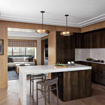
This is a kitchen conceived less as a service zone than as a precisely calibrated architectural volume, resolved through an L-configuration of full-height cabinetry that terminates against a monolithic island set on an intentional diagonal to the orthogonal grid of the herringbone flooring. The island's waterfall treatment — a slab returning to the floor in a single unbroken plane — functions as both a peninsular counter and a piece of quasi-sculptural infrastructure, its overhang generating a shallow banquette-adjacent seating zone without resorting to a conventional breakfast bar. Above, a coffered soffit executed in flush drywall with a continuous cove-lit reveal establishes a datum line that both compresses and defines the working core, while the adjacent tray ceiling reads as a distinct volume, spatially decoupling the kitchen from the living room beyond. That threshold is the composition's most disciplined gesture: a wide cased opening framed in mitered rift-cut oak paneling, its architrave articulated as a shadow-gapped reveal rather than applied trim, drawing a deep enfilade sightline through to the window wall, its Roman shades, and the mid-rise cityscape beyond. Millwork here performs structurally as well as visually — the oak-clad pilasters and the fluted, hand-carved textural panel at right operate as pseudo-columnar elements, organizing the plan into legible bays.
## Materiality, Color & Texture
The palette is constructed on a deliberate dialectic between two wood registers. The envelope employs a pale, quarter-sawn white oak with a honeyed, faintly amber undertone, its figure suppressed and its finish matte, functioning as a luminous neutral ground. Against this, the cabinetry deploys a deeply fumed or ebonized ash — likely a heavily lacquered, open-grain veneer — where the cathedral figuring is exaggerated into near-graphic striation and the high-gloss sheen produces a lacquered, almost Art Deco lustre. This contrast of value (blonde against bitter chocolate) and of sheen (matte against specular) is the project's principal tension. Mediating between them is the stone: a white quartzite or dolomitic marble with soft grey-taupe veining and a distinctly warm, cream-adjacent field, book-matched across the full-height backsplash and repeated on the island slab, its subtly honed surface refusing the glare of a polished finish. Metallic accents are restrained and consistently warm — satin brass on the pendant canopies and stool footrails, blackened bronze on the hardware, glazing frames, and the stools' slender tubular frames. Textiles introduce a low-frequency counterpoint: nubby bouclé upholstery on the sectional, a striated woven sheer at left, ikat-patterned cushions, and a tonal blue-grey geometric rug that supplies the only chromatic departure from the room's ochre-to-espresso spectrum.
## Lighting, Atmosphere & Style Profile
The lighting scheme is layered with unusual rigor. Daylight is admitted obliquely, filtered through the plaid-toned Roman shades of the adjacent living room, so the kitchen receives it secondhand — soft, directional, and already warmed. Artificial light works in three tiers: the recessed cove uplighting that grazes the soffit and dissolves the ceiling's edges; concealed under-cabinet illumination that renders the stone backsplash as a glowing plane; and the pair of spun-brass disc pendants suspended on slender blackened stems, whose downward-facing diffusers deliver a controlled pool of task light while their polished undersides register as small suns in the composition. The absence of visible downlight clutter is notable and disciplined. The resulting atmosphere is enveloping and low-glare — cosseting rather than clinical — with a distinctly residential, almost salon-like decorum reinforced by the framed genre painting hung casually on the oak paneling, a curatorial gesture that domesticates the kitchen decisively. Stylistically, the project reads as **Warm Modernist Luxe**, drawing on the vocabulary of high-craft European cabinetry and mid-century Milanese interiors: the grain-forward veneers, brass discs, and slender bronze seating carry a whisper of 1970s Italian sophistication, while the flush detailing, shadow-gap reveals, and rigorous suppression of ornament situate it firmly in contemporary practice. It is tailored rather than austere — a demonstration that minimalist discipline and material sensuality need not be adversaries.

 Michael Nash Design, Build & Homes
2011 NARI CAPITAL COTY FINALIST AWARD WINNER
Project Scope--
The owners of this 1990’s colonial home were seeking to convert the existing space-constricted builder-grade kitchen into a generously-apportioned Tuscan-style country kitchen with lots of natural light, high-end appointments and a warmly textured interior design concept. Among other features they sought a mid-room island that would house critical appliances, complete the work triangle and provide dining counter space for three. They also wanted to include a professional-grade gas range.
Challenges--
Situated between dining room and family room, the existing kitchen was small and poorly planned. The sink faced a blank wall and the appliances were inadequate for the owner’s gourmet cooking ambitions.
To create the desired footprint, the contractor, Michael Nash Design, Build & Homes, created a plan that called for consolidating square footage in several rooms adjacent to the kitchen. This entailed removing two load bearing walls– one between the kitchen and dining room, a second separating the kitchen and family room– and shifting loads to newly installed structural supports carefully concealed within the resultant “open” floor plan.
To accommodate new appliances (and work efficiencies) called for by this radically altered space plan, the design located the new professional gas range and other key features in the footprint formerly occupied by the breakfast room, a change that takes advantage of opportunities for a higher cathedral ceiling, better natural lighting and greater space.
Solutions--
With this space plan resolved, the design team could now eliminate a picture window on the west elevation, designing a new elevation to accommodate a stucco cooktop flanked by a pair of custom Palladium windows. A side elevation slider was replaced with a French door.
Infrastructure considerations included introducing gas lines needed for the 48” Viking cooktop range and re-routing plumbing. The 5’ x 9’ granite-surfaced custom designed island includes the primary kitchen sink, a dishwasher, microwave and dining overhang that provided seating for up to four.
On another wall, the design called for installing ceiling flush “beaded” display pantries with open bookcases, and routed-in plumbing for a water fountain, a faucet and an ice-making machine.
Glazed maple and cherry cabinetry increased available storage by over 50%. A recessed space was also created for a built-in vertical wine rack. Style-appropriate terra cotta tiling with mosaic bordering detailing extends into the home’s foyer. Other finishing work elements include crown molding with rounded turn posts and corbels.
 Dale Cohen Designstudio
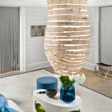
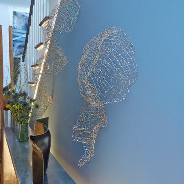
Dale was chosen to participate in the 2013 Hampton Designer Showhouse, sponsored by Traditional Home Magazine, because she has built a reputation for precise, elegant, and livable design work in Manhattan. The challenge of the showhouse, essentially a blank canvas with an imaginary client, was not beyond her. The room she was given is the Terrace Level Lounge; she chose a program to embrace a burgeoning art collection, and devise areas of repose to enjoy the work. And Ms. Cohen’s early training as a painter and photographer clearly are clearly a great asset in this particular room. Her method is to analyze the room as an architectural proposition. A Yale Architectural School graduate, she is able to cast a few intelligent moves to make the room a stage rather than a hallway. Creating a platform for her creative collaboration and designing the Monumental Lantern with artist John Houshmand.
The seating areas are a series of compressed compositions with shapes and forms of chairs, a Minotti sofa, a Valerie Goodman Gallery coffee table, and the Holland and Sherry geometric throw pillows that evoke the early modernist paintings of Jean Arp. Accented by ceiling panels covered in a Maharam wallpaper. Her next big move was enrolling the work of artist and furniture maker John Houshmand. Ms. Cohen thrives on creative collaboration and designing the Monumental Lantern that with Houshmand, that she boldly placed in one entire corner of the room. Few designers would welcome a giant rough sawn luminaire but Ms. Cohen’s early apprenticeship with Richard Serra is evident in this wonderful juxtaposition of scale. Ms. Cohen’s reputation as a brave designer has been established with the inclusion of Houshmand’s piece.
Ms. Cohen’s method is to analyze the room as an architectural proposition. A Yale Architectural School graduate, she is able to cast a few intelligent moves to make the room a stage rather than a hallway. The stairway was divided into two events, one behind a scrim and the other revealed. This gave the sitting area a theatrical backdrop as well as choreographing a Hollywood-style entrance for the visitor walking down the stairs. In fact Ms. Cohen uses a series of fabric backdrops throughout the space to denote different spatial conditions.
The color palette, if said aloud, is the prototypical Hamptons beach house cheery; though Ms. Cohen’s take is altogether different. With a sea blue as her base, she treats the envelope of the space with tinted whites and grays, and just as you are comfortable with this resolve she infuses the space with drops of chartreuse. The optic shock of an electric green is a sign of strength in Ms. Cohen’s tool box. The result is a perfect balance of whimsy and sophistication.
Whimsy, bravery, and compositional sophistication will not be evident or sufficient without Ms. Cohen’s razor sharp rigor. Her attention to detail is what makes one want to sit in the Fritz Hansen chair, under the reading light, with cashmere throw at its side. Ms. Cohen’s embrace of the luxury of detail is what makes for valuable moments in the design world and what sets her work apart.
 Dale Cohen Designstudio
Dale was chosen to participate in the 2013 Hampton Designer Showhouse, sponsored by Traditional Home Magazine, because she has built a reputation for precise, elegant, and livable design work in Manhattan. The challenge of the showhouse, essentially a blank canvas with an imaginary client, was not beyond her. The room she was given is the Terrace Level Lounge; she chose a program to embrace a burgeoning art collection, and devise areas of repose to enjoy the work. And Ms. Cohen’s early training as a painter and photographer clearly are clearly a great asset in this particular room. Her method is to analyze the room as an architectural proposition. A Yale Architectural School graduate, she is able to cast a few intelligent moves to make the room a stage rather than a hallway. Creating a platform for her creative collaboration and designing the Monumental Lantern with artist John Houshmand.
The seating areas are a series of compressed compositions with shapes and forms of chairs, a Minotti sofa, a Valerie Goodman Gallery coffee table, and the Holland and Sherry geometric throw pillows that evoke the early modernist paintings of Jean Arp. Accented by ceiling panels covered in a Maharam wallpaper. Her next big move was enrolling the work of artist and furniture maker John Houshmand. Ms. Cohen thrives on creative collaboration and designing the Monumental Lantern that with Houshmand, that she boldly placed in one entire corner of the room. Few designers would welcome a giant rough sawn luminaire but Ms. Cohen’s early apprenticeship with Richard Serra is evident in this wonderful juxtaposition of scale. Ms. Cohen’s reputation as a brave designer has been established with the inclusion of Houshmand’s piece.
Ms. Cohen’s method is to analyze the room as an architectural proposition. A Yale Architectural School graduate, she is able to cast a few intelligent moves to make the room a stage rather than a hallway. The stairway was divided into two events, one behind a scrim and the other revealed. This gave the sitting area a theatrical backdrop as well as choreographing a Hollywood-style entrance for the visitor walking down the stairs. In fact Ms. Cohen uses a series of fabric backdrops throughout the space to denote different spatial conditions.
The color palette, if said aloud, is the prototypical Hamptons beach house cheery; though Ms. Cohen’s take is altogether different. With a sea blue as her base, she treats the envelope of the space with tinted whites and grays, and just as you are comfortable with this resolve she infuses the space with drops of chartreuse. The optic shock of an electric green is a sign of strength in Ms. Cohen’s tool box. The result is a perfect balance of whimsy and sophistication.
Whimsy, bravery, and compositional sophistication will not be evident or sufficient without Ms. Cohen’s razor sharp rigor. Her attention to detail is what makes one want to sit in the Fritz Hansen chair, under the reading light, with cashmere throw at its side. Ms. Cohen’s embrace of the luxury of detail is what makes for valuable moments in the design world and what sets her work apart.
 Crystal Kitchen + Bath
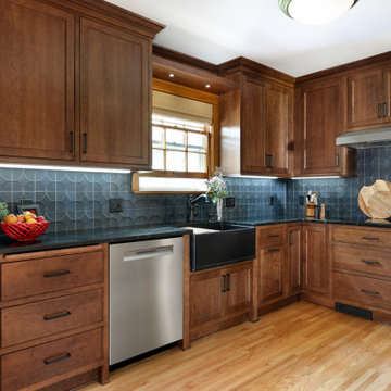
The goal for this 1939 Tudor-style story-and-a-half home was to create a kitchen that offered the conveniences, storage, and performance of a modern workspace while preserving the warmth, craftsmanship, and vintage charm that made the home special. The client, an avid home cook, wanted the room to feel as though it had always belonged to the house, with thoughtful upgrades that respected the original architecture rather than competing with it. Just as important, she needed a more efficient layout with enough storage for small appliances, so everyday cooking would no longer require carrying items up from the lower level.
Several existing conditions shaped the design approach. The kitchen retained original, amber-stained birch woodwork that the client wished to keep, and the compact footprint was interrupted by six doorways and two windows, none of which were to be moved, altered, or replaced. A previous flooring update had left the door casings undercut too short, creating visible gaps where the casing met the floor. The existing vintage 40-inch range also lacked proper ventilation, yet the client wished to accommodate a refrigerator, dishwasher, cooktop, double ovens, built-in microwave, and effective venting above the cooktop into the new kitchen layout.
To honor the original millwork, beaded inset-style cherry cabinetry was selected in a soft, hand-rubbed finish that will deepen over time and develop a natural patina. Charcoal-gray soapstone countertops complement the cabinetry while reinforcing the historic character of the home with an organic, timeworn texture. The former breakfast nook was transformed into a butler’s pantry, adding valuable base cabinet storage and expanded work surfaces for frequently used small appliances. Also in the butler’s pantry, a single upper cabinet was paired with open shelves to give an open, airy feeling while adding character and practical storage. A classic single-bowl apron-front workstation sink contributes both period-appropriate character and practical prep and cleanup function.
Because the home’s openings were such a defining feature, the design worked within the existing architecture instead of altering it. Custom plinth blocks were created for each doorway to extend the original casing gracefully down to the new natural red oak flooring, resolving the earlier construction issue while adding a detail that feels authentic to the age of the house. Despite the number of door and window openings, the new layout provides a significantly more functional, built-in kitchen with an improved work triangle for serious cooking.
Appliance placement was carefully planned to deliver the requested performance without overwhelming the small room. Three cooking functions (double ovens & microwave) were consolidated into one location with a GE Café double oven featuring Advantium Technology, while the client’s compact 31-inch refrigerator was reused to preserve space. A sleek 30-inch induction cooktop provides efficient cooking, and a Vent-A-Hood ARS ductless vent hood supplies needed ventilation without requiring a duct run to the exterior.
The finish palette balances richness, texture, and historical sensitivity. A deeply textured navy backsplash tile adds depth and dramatic shadow play against the soapstone, while wallpaper in the back entry echoes the tile’s geometric pattern to visually connect the adjoining spaces. Oil-rubbed bronze cabinet hardware and light fixtures enhance the warmth of the cherry cabinetry and complete the antique-inspired feel.
Lighting was layered to make the compact kitchen brighter, more useful, and more inviting. Vintage-style semi-flush ceiling fixtures establish the overall tone, while dimmable puck lights highlight select areas and undercabinet task lighting keeps work surfaces well illuminated.
The completed kitchen now feels both highly functional and deeply rooted in the home’s history. Rich cherry cabinetry, velvety soapstone, natural red oak flooring, navy tile, bronze accents, and carefully preserved birch trim work together to create a warm, cohesive space that celebrates timeless craftsmanship. By increasing storage, improving workflow, integrating modern appliances, and respecting the Tudor home’s original character, the design achieves the client’s vision: a kitchen that feels personal, practical, historically appropriate, and as though it has always been there.
 Crystal Kitchen + Bath
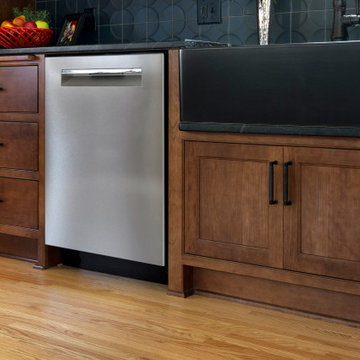
The goal for this 1939 Tudor-style story-and-a-half home was to create a kitchen that offered the conveniences, storage, and performance of a modern workspace while preserving the warmth, craftsmanship, and vintage charm that made the home special. The client, an avid home cook, wanted the room to feel as though it had always belonged to the house, with thoughtful upgrades that respected the original architecture rather than competing with it. Just as important, she needed a more efficient layout with enough storage for small appliances, so everyday cooking would no longer require carrying items up from the lower level.
Several existing conditions shaped the design approach. The kitchen retained original, amber-stained birch woodwork that the client wished to keep, and the compact footprint was interrupted by six doorways and two windows, none of which were to be moved, altered, or replaced. A previous flooring update had left the door casings undercut too short, creating visible gaps where the casing met the floor. The existing vintage 40-inch range also lacked proper ventilation, yet the client wished to accommodate a refrigerator, dishwasher, cooktop, double ovens, built-in microwave, and effective venting above the cooktop into the new kitchen layout.
To honor the original millwork, beaded inset-style cherry cabinetry was selected in a soft, hand-rubbed finish that will deepen over time and develop a natural patina. Charcoal-gray soapstone countertops complement the cabinetry while reinforcing the historic character of the home with an organic, timeworn texture. The former breakfast nook was transformed into a butler’s pantry, adding valuable base cabinet storage and expanded work surfaces for frequently used small appliances. Also in the butler’s pantry, a single upper cabinet was paired with open shelves to give an open, airy feeling while adding character and practical storage. A classic single-bowl apron-front workstation sink contributes both period-appropriate character and practical prep and cleanup function.
Because the home’s openings were such a defining feature, the design worked within the existing architecture instead of altering it. Custom plinth blocks were created for each doorway to extend the original casing gracefully down to the new natural red oak flooring, resolving the earlier construction issue while adding a detail that feels authentic to the age of the house. Despite the number of door and window openings, the new layout provides a significantly more functional, built-in kitchen with an improved work triangle for serious cooking.
Appliance placement was carefully planned to deliver the requested performance without overwhelming the small room. Three cooking functions (double ovens & microwave) were consolidated into one location with a GE Café double oven featuring Advantium Technology, while the client’s compact 31-inch refrigerator was reused to preserve space. A sleek 30-inch induction cooktop provides efficient cooking, and a Vent-A-Hood ARS ductless vent hood supplies needed ventilation without requiring a duct run to the exterior.
The finish palette balances richness, texture, and historical sensitivity. A deeply textured navy backsplash tile adds depth and dramatic shadow play against the soapstone, while wallpaper in the back entry echoes the tile’s geometric pattern to visually connect the adjoining spaces. Oil-rubbed bronze cabinet hardware and light fixtures enhance the warmth of the cherry cabinetry and complete the antique-inspired feel.
Lighting was layered to make the compact kitchen brighter, more useful, and more inviting. Vintage-style semi-flush ceiling fixtures establish the overall tone, while dimmable puck lights highlight select areas and undercabinet task lighting keeps work surfaces well illuminated.
The completed kitchen now feels both highly functional and deeply rooted in the home’s history. Rich cherry cabinetry, velvety soapstone, natural red oak flooring, navy tile, bronze accents, and carefully preserved birch trim work together to create a warm, cohesive space that celebrates timeless craftsmanship. By increasing storage, improving workflow, integrating modern appliances, and respecting the Tudor home’s original character, the design achieves the client’s vision: a kitchen that feels personal, practical, historically appropriate, and as though it has always been there.
1