
Search results for "Shine travel" in Home Design Ideas
 Wolf & Wing Interior Design
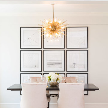
Inspiration for a mid-sized transitional light wood floor dining room remodel in New York with beige walls and no fireplace
 The Brooklyn Studio
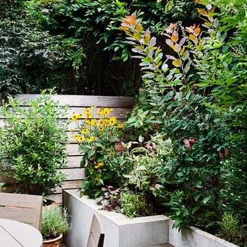
This residence was a complete gut renovation of a 4-story row house in Park Slope, and included a new rear extension and penthouse addition. The owners wished to create a warm, family home using a modern language that would act as a clean canvas to feature rich textiles and items from their world travels. As with most Brooklyn row houses, the existing house suffered from a lack of natural light and connection to exterior spaces, an issue that Principal Brendan Coburn is acutely aware of from his experience re-imagining historic structures in the New York area. The resulting architecture is designed around moments featuring natural light and views to the exterior, of both the private garden and the sky, throughout the house, and a stripped-down language of detailing and finishes allows for the concept of the modern-natural to shine.
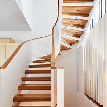
Upon entering the home, the kitchen and dining space draw you in with views beyond through the large glazed opening at the rear of the house. An extension was built to allow for a large sunken living room that provides a family gathering space connected to the kitchen and dining room, but remains distinctly separate, with a strong visual connection to the rear garden. The open sculptural stair tower was designed to function like that of a traditional row house stair, but with a smaller footprint. By extending it up past the original roof level into the new penthouse, the stair becomes an atmospheric shaft for the spaces surrounding the core. All types of weather – sunshine, rain, lightning, can be sensed throughout the home through this unifying vertical environment. The stair space also strives to foster family communication, making open living spaces visible between floors. At the upper-most level, a free-form bench sits suspended over the stair, just by the new roof deck, which provides at-ease entertaining. Oak was used throughout the home as a unifying material element. As one travels upwards within the house, the oak finishes are bleached to further degrees as a nod to how light enters the home.
The owners worked with CWB to add their own personality to the project. The meter of a white oak and blackened steel stair screen was designed by the family to read “I love you” in Morse Code, and tile was selected throughout to reference places that hold special significance to the family. To support the owners’ comfort, the architectural design engages passive house technologies to reduce energy use, while increasing air quality within the home – a strategy which aims to respect the environment while providing a refuge from the harsh elements of urban living.
This project was published by Wendy Goodman as her Space of the Week, part of New York Magazine’s Design Hunting on The Cut.
Photography by Kevin Kunstadt
 Bayview Builders
David Burroughs
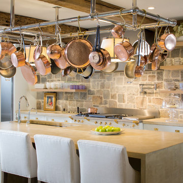
Mountain style galley kitchen photo in Baltimore with an undermount sink, shaker cabinets, white cabinets, stone tile backsplash and an island
Mountain style galley kitchen photo in Baltimore with an undermount sink, shaker cabinets, white cabinets, stone tile backsplash and an island
Find the right local pro for your project

 The Brooklyn Studio
This residence was a complete gut renovation of a 4-story row house in Park Slope, and included a new rear extension and penthouse addition. The owners wished to create a warm, family home using a modern language that would act as a clean canvas to feature rich textiles and items from their world travels. As with most Brooklyn row houses, the existing house suffered from a lack of natural light and connection to exterior spaces, an issue that Principal Brendan Coburn is acutely aware of from his experience re-imagining historic structures in the New York area. The resulting architecture is designed around moments featuring natural light and views to the exterior, of both the private garden and the sky, throughout the house, and a stripped-down language of detailing and finishes allows for the concept of the modern-natural to shine.
Upon entering the home, the kitchen and dining space draw you in with views beyond through the large glazed opening at the rear of the house. An extension was built to allow for a large sunken living room that provides a family gathering space connected to the kitchen and dining room, but remains distinctly separate, with a strong visual connection to the rear garden. The open sculptural stair tower was designed to function like that of a traditional row house stair, but with a smaller footprint. By extending it up past the original roof level into the new penthouse, the stair becomes an atmospheric shaft for the spaces surrounding the core. All types of weather – sunshine, rain, lightning, can be sensed throughout the home through this unifying vertical environment. The stair space also strives to foster family communication, making open living spaces visible between floors. At the upper-most level, a free-form bench sits suspended over the stair, just by the new roof deck, which provides at-ease entertaining. Oak was used throughout the home as a unifying material element. As one travels upwards within the house, the oak finishes are bleached to further degrees as a nod to how light enters the home.
The owners worked with CWB to add their own personality to the project. The meter of a white oak and blackened steel stair screen was designed by the family to read “I love you” in Morse Code, and tile was selected throughout to reference places that hold special significance to the family. To support the owners’ comfort, the architectural design engages passive house technologies to reduce energy use, while increasing air quality within the home – a strategy which aims to respect the environment while providing a refuge from the harsh elements of urban living.
This project was published by Wendy Goodman as her Space of the Week, part of New York Magazine’s Design Hunting on The Cut.
Photography by Kevin Kunstadt

 Common Bond Design
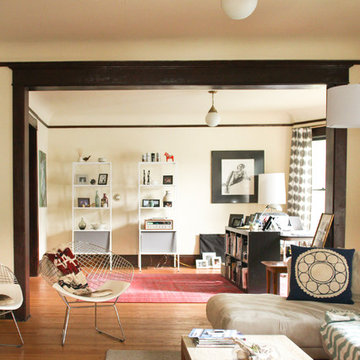
Irving Place Residence. New York, NY. Photography by Biz Jones.
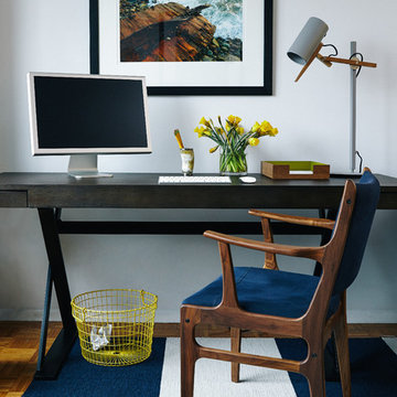
Inspiration for a mid-century modern freestanding desk home office remodel in New York with white walls
Inspiration for a mid-century modern freestanding desk home office remodel in New York with white walls
 Wild Child
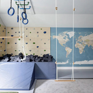
This foam pit playroom was made for a family with three active kids who homeschool—so it was important to create a space where they could burn off energy and build strength, rain or shine! The room features a large 5' x 8' foam pit, an awesome monkey bar and ninja course, and a cargo net tunnel that leads to a closet converted into a cool cargo net-floored fort. Plus, there’s an indoor basketball hoop and swings galore—endless fun! To top it off, we added a map mural that adds a sense of adventure and wonder to the space. It’s the perfect playroom for learning, growing, and playing, all in one place.
 Architectural Squared
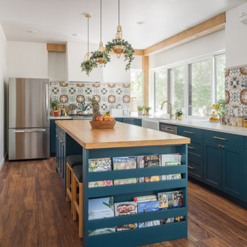
Inspiration for a mid-sized southwestern l-shaped medium tone wood floor and exposed beam eat-in kitchen remodel in Other with a farmhouse sink, shaker cabinets, blue cabinets, wood countertops, multicolored backsplash, ceramic backsplash, stainless steel appliances, an island and white countertops
 LuxeMark Company
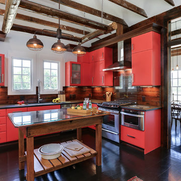
This homeowner has long since moved away from his family farm but still visits often and thought it was time to fix up this little house that had been neglected for years. He brought home ideas and objects he was drawn to from travels around the world and allowed a team of us to help bring them together in this old family home that housed many generations through the years. What it grew into is not your typical 150 year old NC farm house but the essence is still there and shines through in the original wood and beams in the ceiling and on some of the walls, old flooring, re-purposed objects from the farm and the collection of cherished finds from his travels.
Photos by Tad Davis Photography
 LuxeMark Company
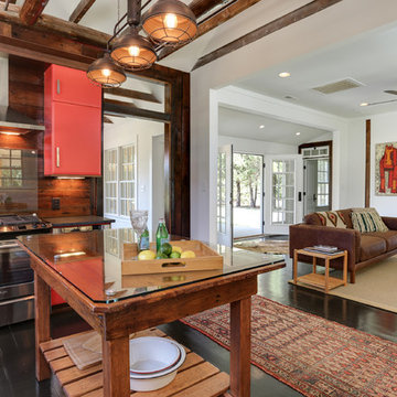
This homeowner has long since moved away from his family farm but still visits often and thought it was time to fix up this little house that had been neglected for years. He brought home ideas and objects he was drawn to from travels around the world and allowed a team of us to help bring them together in this old family home that housed many generations through the years. What it grew into is not your typical 150 year old NC farm house but the essence is still there and shines through in the original wood and beams in the ceiling and on some of the walls, old flooring, re-purposed objects from the farm and the collection of cherished finds from his travels.
Photos by Tad Davis Photography
 Corine Maggio Design
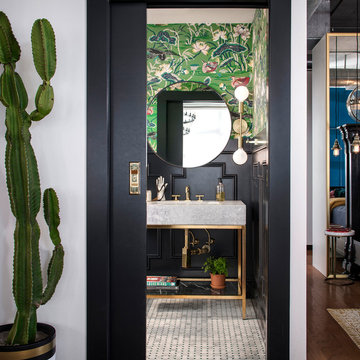
These young hip professional clients love to travel and wanted a home where they could showcase the items that they've collected abroad. Their fun and vibrant personalities are expressed in every inch of the space, which was personalized down to the smallest details. Just like they are up for adventure in life, they were up for for adventure in the design and the outcome was truly one-of-kind.
Photo by Chipper Hatter
 Wild Child
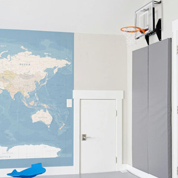
This foam pit playroom was made for a family with three active kids who homeschool—so it was important to create a space where they could burn off energy and build strength, rain or shine! The room features a large 5' x 8' foam pit, an awesome monkey bar and ninja course, and a cargo net tunnel that leads to a closet converted into a cool cargo net-floored fort. Plus, there’s an indoor basketball hoop and swings galore—endless fun! To top it off, we added a map mural that adds a sense of adventure and wonder to the space. It’s the perfect playroom for learning, growing, and playing, all in one place.
 Horn & Co. (Previously JHLA)
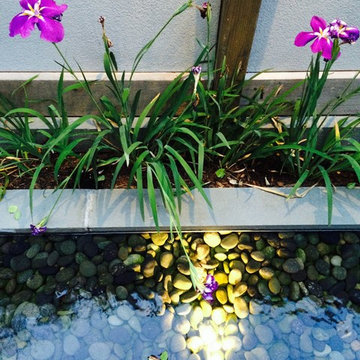
Our clients on this project were inspired by their travels to Asia and wanted to mimic this aesthetic at their DC property. We designed a water feature that effectively masks adjacent traffic noise and maintains a small footprint.
 Simply Stunning Spaces
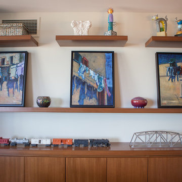
This was a unique project for us at City Front Terrace in the harbor of Downtown San Diego. We had a blast with our clients here as they had some very unique and personal items they had collected from their travels over many years. Some furniture pieces they wanted to hold on to but were open to repurposing. We were able to find a way to combine both HIS and HER design preferences and needs into one cohesive plan that kept all of their favorite pieces and made them SHINE!
 InnovationLand
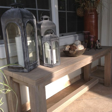
Outdoor furniture from Restoration Hardware really made this Houston outdoor living space design project shine.
“It really went well,” says Wayne Franks, owner of Outdoor Homescapes of Houston. “It's not a huge space, but moving the existing two columns about four feet and bringing the roof out only three feet made all the difference in the world.”
“This particular client wanted a larger space to entertain,” says senior designer Lisha Maxey, who served as an outdoor furniture consultant while managing construction for the project.
The original space, Lisha explains, had two oddly placed columns blocking a clear view of the beautiful pool area from inside the home. “We removed those columns and gave her three more feet of roof, which extended her living area while also giving her the view she wanted.”
Since the client - a woman in her mid-50s with grown children who visit frequently - only wanted a small outdoor kitchen island with a 30-inch RCS grill Outdoor Homescapes closed up a French door that led from the master bedroom (which she never used) and created a new stucco wall for the kitchen.
“I would definitely call the style of this space ‘transitional,” says Lisha. The client is a very eclectic world traveler and a collector of art, yet wanted her outdoor living space to feel like a warm, homey living room once we placed the furniture and décor. In the end, her finishes centered around rustic stone, detailed columns and furniture leaning towards the contemporary.”
Much of the warmth in the space, she says, comes from the colors of the dry-stacked Sunset Canyon ledgestone. “It looks just like it sounds – like the sun setting in a deep canyon!”
“The columns are unique – decorative and fluted,” adds Wayne.
The client, who’d received five free hours of outdoor furniture consultation as part of an ongoing promotion, also wanted Lisha to help her select, buy and help place furnishings.
“I believe that now - more than ever - consumers are looking for turn-key operations in any type of service industry - a ‘one-stop-shop,’ so to speak,” says Lisha. “It gives us a more personal touch with the client, as well as an edge in the industry in terms of selling our designs, as the client is reassured that we’ll work with them in every aspect to give them the outdoor living space of their dreams.”
The client ended up choosing the Biscayne collection – including a chair that rocks and swivels - from Restoration Hardware. They also went with a lower, unique teak coffee table from the Belvedere collection.
“We mixed wicker with teak for an equally soft and hard look and added pops of color to bring out the beautiful art collection inside,” says Lisha. “The neutral gray wicker, by the way, was the perfect match for the distressed teak coffee table and credenza. The grays of the Key West granite countertop also echoed this color palette.”
For the fabric, Lisha helped keep it neutral with a Mocha linen and popped the color with royal blue throw pillows matching the area rug: “To make the space truly her own, we added some unique copper pots from her collection and a few items she's collected abroad.”
 Simply Stunning Spaces
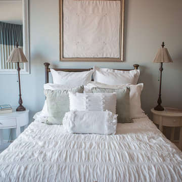
This was a unique project for us at City Front Terrace in the harbor of Downtown San Diego. We had a blast with our clients here as they had some very unique and personal items they had collected from their travels over many years. Some furniture pieces they wanted to hold on to but were open to repurposing. We were able to find a way to combine both HIS and HER design preferences and needs into one cohesive plan that kept all of their favorite pieces and made them SHINE!
 Simply Stunning Spaces
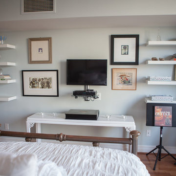
This was a unique project for us at City Front Terrace in the harbor of Downtown San Diego. We had a blast with our clients here as they had some very unique and personal items they had collected from their travels over many years. Some furniture pieces they wanted to hold on to but were open to repurposing. We were able to find a way to combine both HIS and HER design preferences and needs into one cohesive plan that kept all of their favorite pieces and made them SHINE!
 Simply Stunning Spaces
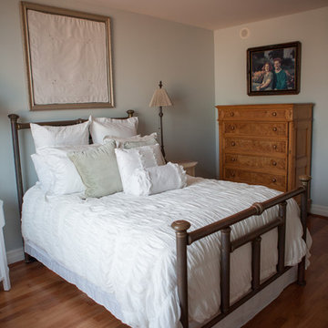
This was a unique project for us at City Front Terrace in the harbor of Downtown San Diego. We had a blast with our clients here as they had some very unique and personal items they had collected from their travels over many years. Some furniture pieces they wanted to hold on to but were open to repurposing. We were able to find a way to combine both HIS and HER design preferences and needs into one cohesive plan that kept all of their favorite pieces and made them SHINE!
 The Brooklyn Studio
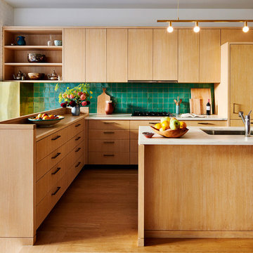
This residence was a complete gut renovation of a 4-story row house in Park Slope, and included a new rear extension and penthouse addition. The owners wished to create a warm, family home using a modern language that would act as a clean canvas to feature rich textiles and items from their world travels. As with most Brooklyn row houses, the existing house suffered from a lack of natural light and connection to exterior spaces, an issue that Principal Brendan Coburn is acutely aware of from his experience re-imagining historic structures in the New York area. The resulting architecture is designed around moments featuring natural light and views to the exterior, of both the private garden and the sky, throughout the house, and a stripped-down language of detailing and finishes allows for the concept of the modern-natural to shine.
Upon entering the home, the kitchen and dining space draw you in with views beyond through the large glazed opening at the rear of the house. An extension was built to allow for a large sunken living room that provides a family gathering space connected to the kitchen and dining room, but remains distinctly separate, with a strong visual connection to the rear garden. The open sculptural stair tower was designed to function like that of a traditional row house stair, but with a smaller footprint. By extending it up past the original roof level into the new penthouse, the stair becomes an atmospheric shaft for the spaces surrounding the core. All types of weather – sunshine, rain, lightning, can be sensed throughout the home through this unifying vertical environment. The stair space also strives to foster family communication, making open living spaces visible between floors. At the upper-most level, a free-form bench sits suspended over the stair, just by the new roof deck, which provides at-ease entertaining. Oak was used throughout the home as a unifying material element. As one travels upwards within the house, the oak finishes are bleached to further degrees as a nod to how light enters the home.
The owners worked with CWB to add their own personality to the project. The meter of a white oak and blackened steel stair screen was designed by the family to read “I love you” in Morse Code, and tile was selected throughout to reference places that hold special significance to the family. To support the owners’ comfort, the architectural design engages passive house technologies to reduce energy use, while increasing air quality within the home – a strategy which aims to respect the environment while providing a refuge from the harsh elements of urban living.
This project was published by Wendy Goodman as her Space of the Week, part of New York Magazine’s Design Hunting on The Cut.
Photography by Kevin Kunstadt
1