Software
Houzz Logo Print
rickster88

This or that?

12 years ago
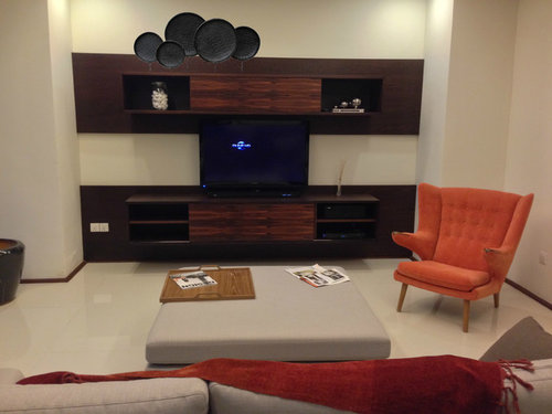
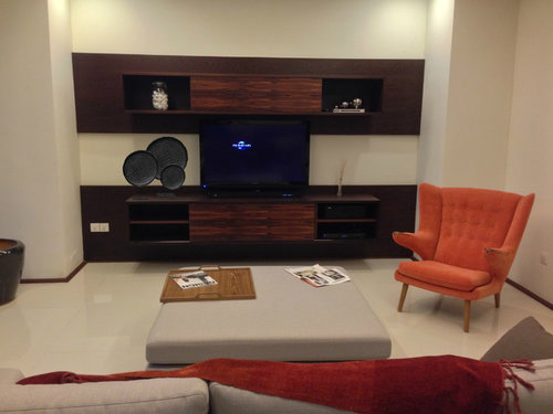
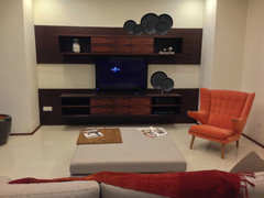
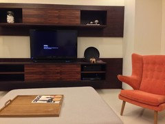
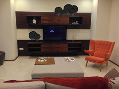
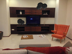
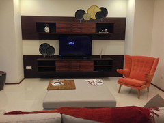
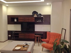
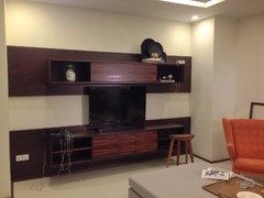
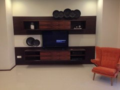
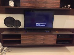
I'm planning to get some rattan winnowing trays and spray paint them black and put them on stands. Which setup looks better? The trays on top or the trays on the bottom shelf?

Thanks

Comments (28)

  • 12 years ago
    If these trays will complete your decor for this room, I'd suggest placing them on top as to sweep the energy up. Clustered by the TV, the trays seem to weigh down all of your belongings, and the beauty of them is lost.
  • 12 years ago
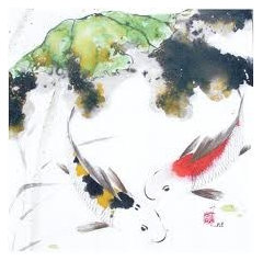
    I agree - top works better. But also thinking, candlesticks or something thin and tall on the other end - or some sort of artwork - perhaps some sumi-e with some color in it - see attached.
  • 12 years ago
    And one or two or three more… Love sumi-e!
  • PRO
    12 years ago
    I agree, they are more successful on top but there needs to be something on the bottom or next to it to make it feel more anchored. They kind of look like they're just floating around.
  • 12 years ago
    Cool! Alright I'll start the art work using black lacquer and chip or sand it through at some edges to give it a worn antique look.

    Do you think having 5 trays above or three should do? On one hand I feel 5 is too powering, but on the other hand I feel 3 feels like it's flying around in bits especially since I have one jar with white stone and the other side with the small metal spheres.
    I can't decide :(

    Oh and I think I want to take this piece to be as far as rustic or oriental as possible. I don't want it to become too oriental so I think the next piece I'm thinking of is more modern or contemporary. I don't think a photo suits because I feel that a photo will distract the eye from the TV, no?

    I'll definitely post a picture of the finished product.
  • 12 years ago
    Going against what everybody else said, but I think it looks better at the bottom as is. But I agree, if you do put it on top, you would need to figure out how to anchor it.
  • 12 years ago
    I like how the round shapes work in the square space on the bottom!
  • PRO
    12 years ago
    last modified: 12 years ago
    I like the top. Becomes asymmetrical. I like that. Softens the group. Use 5 of them.
    You see harsh horizontal lines when they are on the bottom. Visually is more rigid on the bottom.
  • PRO
    12 years ago
    last modified: 12 years ago
    I would like to vote for top works. I think it may look a bit busy at the bottom with a TV. It's better to let the TV take the canter stage, and the trays can place a good job for decoration at the top.
  • 12 years ago
    All right, thus is just a guy talking but, I like the top much better.
    In fact I wouldn't do them at all if you even thought about putting them on the bottom.
    But, all that being said, I'm just a guy. Straight at that!!!
  • 12 years ago
    5 on top.
  • 12 years ago
    how about three on the bottom and two on the top
  • 12 years ago
    To me, the room seems more 'balanced' with them at the bottom.
  • 12 years ago
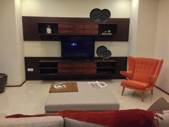
    I tried marywashington's advice on photoshop and the results are as shown in the picture. What do you think? I went a bit further and stuck 5 on top and 3 at the bottom.

    I started trial painting one tray and it still requires a few more coats of lacquer and some rough edges to have that aged look and lastly the stands. What do you think?

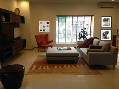
    Ailina, this piece will not complete the decor of my room. though it will complete the decor of the TV cabinet. I'm still considering a few more pictures to be placed elsewhere in the room. A rough idea of the room will look like the attached picture
  • 12 years ago
    rickster, now that I've seen your vision for decor on the adjacent wall (nice, by the way, especially framed piece on the left), I'm even more enthusiastic about the top placement.

    What seems to click most naturally for me is 5 on top left plus 1 large tray (with your added figurine) on bottom right.

    Many people seem to like the top-right placement. For me, it throws off the flow, but maybe that's just me? How do the placements make you feel? Does one feel more natural than another?
  • 12 years ago
    Updated opinion: Considering the placement of your chair, I like marywashington's suggestion -- 3 (or 5) top right, 2 (or 1 large with figurine) bottom left.
    rickster88 thanked Ailina
  • 12 years ago
    I tried the two variations. 3 on top and 2 on the bottom left as well as 5 on top and 2 on the bottom left. The figurine was not meant to be part of the decor, more just to prop up the rattan tray until I get the stands.

    I somehow prefer the 5 on top and 2 on the bottom left. It looks fuller, complete and does not make it look like I left it there because I had no where to put the trays. I also think that 5 makes a statement. And I don't think 1 on its own at the bottom left looks good. The layered effect really brings out the piece. Don't you think?
  • 12 years ago
    Actually the only reason why I put it at the top-right position was because the entrance to the living room and most of the viewing angles of the living room from the open space living/dining is from the left. Having it at the top-left position blocks some of the rattan trays and I can't have them angled towards the left because it seems unnatural or rather "fake". At the top-right I can have them angled towards the view from the dining/entrance and bring out the beauty in the pieces. I think everyone is right about having the bottom piece on the left because the orange chair is on the right.
  • 12 years ago
    It might be nice to add a splash of orange to a small piece- even if its just a jagged line- it would give it a punch.
  • 12 years ago
    Agreed, 5 looks full. I like asquithoatley's suggestion to add a splash of color. Curious to see what the jury says!
  • 12 years ago
    asquithoatley, do you mean a splash of orange on the rattan trays itself or some other object that is orange? I can't imagine what.

    I've already bought the remaining 6 rattan trays and will work on it on the weekends to give it a coat of lacquer. I'll put up a picture of the finished product
  • 12 years ago
    I'd like to see some of them left natural for added interest.
  • 12 years ago
    I like the natural ones thrown in to break up all the black. But you could paint a jagged line of orange on one of the trays or dip one side in the orange paint and let it drip down the tray - wouldnt hurt to experiment!
  • 12 years ago
    Phew! I only have one last rattan tray to paint. I decided against leaving one or two of the trays unfinished. It becomes distracting and no colour from the room picks that colour up.

    I kind of like how it's all gloss black. It's rather soothing and calming and it goes well with the AV set.

    I'm still trying to decide on the height of the trays. It seems to me that there is no one standard height in museum stands and it feels strange to go with a generic height. I think this piece needs to blend in with it's surrounding. Like I noticed the top shelf needs to be lower, whereas the bottom shelf needs to be higher. Have I got the heights right? And I haven't figured out if I need to have them at varying heights or would the depth take care of that? I wonder what museum curators have to say about that.

    So far I've only spent under a 100 dollars on this and I can see this looking like its worth more than that.
  • 12 years ago
    Hi!
    I got custom stands on my rattan trays! What do you guys think? I like how it's soothing and toned.
  • 12 years ago
    No comments? :(
  • 12 years ago
    Perfection, rickster!