Software
Houzz Logo Print
amyfamyf

Houzzers help!

11 years ago
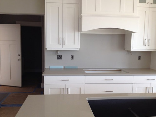
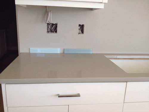
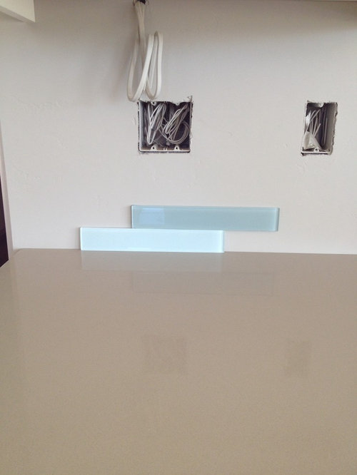
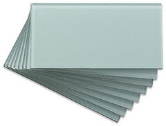
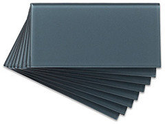
I've got to finalize my backsplash today. What do you think? The crystal blue on the left or the green on the right?

Comments (60)

  • 11 years ago
    Yes, I must admit, the blue tile is gorgeous. I like it with white grout. And you're right...a white backsplash would make for a lot of white. BTW...your kitchen is looking great. Love the white shaker cabinets! Go with your heart on the tile.
  • 11 years ago
    I hear how hard this decision is for you and totally appreciate the comments on both sides of the fence. I have never written a response except for when I think I recognize a color and the designer has not responded to the color question. I too happen to be ordering my backsplash tile in the next day or two and have a white kitchen as well and LOVE blues but have decided to go with a very neutral but rich crystal like ceramic. I painted the walls Ludlow Blue by farrow and ball to get my blue fix and the adjacent dining room will have blue and white wallpaper above white wainscotting. That being said I LOVE your inspiration photos and in particular the upper left hand corner tile. In their own way blues and greens are neutral being the color of the sky and much of the plant world! You can not go wrong- your kitchen is LOVELY and will be gorgeous!
  • 11 years ago
    Crystal blue but a larger tile, not the busy little ones.
  • 11 years ago
    last modified: 11 years ago
    Oh, I forgot too mention, If you end up going with the blue or green and not a neutral I love the look of the blue and green with the white grout:-) as in your upper left hand inspiration photo. I agree that the smaller tiles may appear less calming then the larger ones.
  • 11 years ago
    I agree to go with what you want - you aren't choosing anything wacky anyway. I do want to point out that your inspirational pictures don't have the same tiles as the two you are trying to choose between: they are all classic subway dimensions (which I think is 3 x 5 or 6, but it definitely isn't 2 x 6 or 2 x 12). And I may be going blind, but the first one at least isn't glass but looks like crackle glaze with the handmade edges....the last one is definitely glass, but I can't really tell with the other two.

    This is a long winded way of saying, if these are your inspirational pictures, then neither the little blue or green ones will make you happy. Keep looking!
  • 11 years ago
    Are you in the States? If so, look at this range: http://www.completetile.com/products/ceramic/vermeere_ceramics/ceramic_tile

    I think the one called "Mediterranean Blue Crackle" might be what you are looking for, otherwise "Sage Green Crackle", but there are other lovely ones here if neither of these seems right to you.
  • 11 years ago
    green goes with more colors than blue. think of all the flower colors with green leaves.
  • 11 years ago
    last modified: 11 years ago
    I'm siding with mjjk. Just a heads up...that's exactly how I did my bathroom & I've never regretted it. Be sure to seal the grout...twice. Then again every couple years...just in the area near stove & sink. Where you'd have most messes & cleanup.

    The grey won't end up looking dirty like a white will....

    But....then I noticed those green ones you posted. (4 inpirational pics) Lotsa love there too! Very nice!
  • 11 years ago
    The darker sample is better. Have you exhausted the options? There may be some that are closer to your inspiration.
  • 11 years ago
    I prefer the lighter of the two, but I see a possible problem with your wall color once the tiles are installed. I chose similar cabinets & counters in my old home's kitchen remodel, but went all gray floor & backsplash, but STILL the gray on the walls picked up a slight blue hue. Your gray walls may pick up on the green or blue and look a lot different then they do now!
  • PRO
    11 years ago
    I am on the fence on this one since I prefer just the white subway tiles with the type of cabinets you have however, the Crystal blue may be very nice as well. It will brighten the kitchen.
  • 11 years ago
    Maybe I am missing something or perhaps I am color blind. I actually like them both TOGETHER. Some people are suggesting white for resale purposes. If that is the case maybe you can do a mix of 2/3 white intermixed with 1/6 of green and 1/6 of blue. From the photos you posted the two colors look great together. (BTW--I am one of those annoying people who go to the tile store, select the tiles I like and them place them on the floor in interesting patterns and them take pics with my phone. Then I upload them on the computer, enlarge them and think about them for a week) That is how I did my bathroom. I ended up with a style different from the one I thought I wanted. The pattern I have was a result of me "playing around" in the store! Good luck!
  • 11 years ago
    Also, I forgot to ask what kind of accessories you plan on using. Perhaps you might want to shop around first to see what colors the accessories you like come in. Just a thought.
  • 11 years ago
    Get what you love and never mind what buyers would like IF you sell the house. I used Apple Martini (A bright green) on my kitchen counters in my newly purchased condo when I completely redid the entire kitchen.The backsplash and cabinets were white. I also did a white ceiling and a green strip around the tray ceiling. The contractors kept saying, "are you sure". I said YES.As circumstances came about, I had to sell the condo. I sold it in 2 hours.Do what makes you fell happy when you are working in the kitchen. If you like it, so will some buyer some day. JMHO.
  • PRO
    11 years ago
    Get what you love. For me neutral is overrated and forgettable
  • 11 years ago
    where should we put the living room withe TV and where should we put the dinning table?
    originaly the 2 first pictures were ment for tbe dinning table because they are right next to the kitchen.
  • PRO
    11 years ago
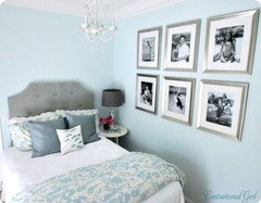
    I would say the crystal blue. You can accessorize with green and silverish kitchen decor. Nice soft colors.
    Although this is a BEDROOM lol, you get the idea of the color scheme I found online.
  • PRO
    11 years ago
    The darker green is more soft looking. That is the one we would choose!

    Best of Luck,

    www.northcountytileandstone.com
  • 11 years ago
    Don't listen to the "neutral" arguments -- your kitchen is already overwhelmingly white and grey, and a backsplash isn't forever! I love the color on the left because it feels like its brightness would make you happy every time you came into the kitchen, but honestly, the one on the right looks closer to your dream pictures. I doubt you'll go wrong with either one -- they'll just lead you in different directions when you get to subsequent decisions. (One way to help distinguish might be to try some paint chips with one or the other and see how the totality feels.) Exciting times!
  • 11 years ago
    last modified: 11 years ago
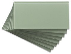
    Glass tiles are a great way to freshen up your kitchen backsplash! These are some of the colors we offer through www.backsplashideas.com!
  • PRO
    11 years ago
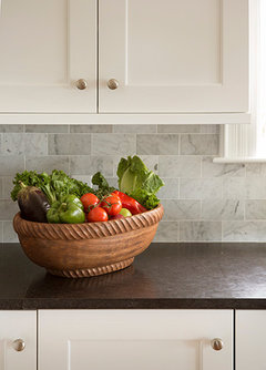
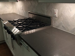
    What about a classic marble backsplash? This is a timeless option if you are wanting to play with neutral options as well.
    Kennebunkport Maine · More Info
  • 11 years ago
    did you select your backsplash yet?
  • PRO
    11 years ago
    I love both choices you've narrowed it down to!! It's hard for me to say because I really like both of them but I'm going to say the green.. I think it will be a little more sophisticated than the crystal blue, something you'll appreciate long term. Good luck!!
  • PRO
    11 years ago
    The one on the right is more neutral and would have more longevity. I don't think you have to only go with beige, taupe and greige for more permanent design choices-it gets a little boring having everything be beige! The color on the right is soft enough that it wouldn't draw the eye like an intense color would plus you could use several other colors with it as an accent-coral would be amazing!!! I say go for it!!
  • PRO
    11 years ago
    The color on the right is softer and has more depth. It adds a richness that looks great with the cabinets and the countertop you have.
  • 11 years ago
    You can't go wrong by using subway tiles and keeping it neutral, such as in the second photo mick50 posted. You can always accessorize with color. The blue and green tiles you posted are really pretty, but my eye would be pulled to the backsplash in your kitchen...unless that's what you're aiming to do. The green tile color looks a bit softer to me than the blue. Something to blend with your countertops might be a better choice, such as in the photo Ladd Suydam Contracting posted.
  • 11 years ago
    I am with the color lovers on this one! Do what you love or you will always regret it. It is not that hard to change out tile if you tire of the color. I think the color will add a real "wow" factor. I am sure either color would look nice---JUST NO NEUTRALS!
  • 11 years ago
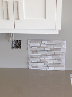
    Ok so here is what we've been thinking the past couple days. The green started feeling too green and dark and we really leaned towards the blue. We almost finalized it last night with our builder and than this morning I woke up and panicked and thought maybe the blue was all wrong. (Although I do love it.) I frantically went to another tile place and found this one. It's goes so well with the counter. Not one I would have ever picked on its own but once I got it in the house, I think I'm starting to like it. What do you think?
  • 11 years ago
    My screen shows a great color blend with your counters. My choice would be subway tiles in the same tones...just a more subtle look without so much pattern going on. However, if you want the glass tiles those look like a perfect match.
  • 11 years ago
    My mom has this exact tile (the new option) in a bathroom and it is very nice. I usually don't like this type of mosaic but with a light grout it's very subtle and it does look like a great match to your counter. That being said there are so many beautiful tile options out there - I would do something that really speaks to you (or that is very simple and neutral) and try to resist the urge to just be done (although I've been there and I know how you feel). I do like something that mixes some stone over the glass. I know people use glass in the kitchen but somethjg about blue glass feels bathroom to me. If you did a blue or green I'd lean towards a tile that has a richer crackled or fired finish.
  • 11 years ago
    last modified: 11 years ago
    If you are going the neutral route, instead I might consider marble in a classic herringbone pattern. Walls are almost like a piece of art.[houzz=
    Kitchen Renovation in Oakton, VA · More Info
  • 11 years ago
    I love the new tile you picked! It blends everything very well.

    Another thing you can do is go to a paint store, color match your blue tile. And paint the area where you want to put the tile.
    Live with it for a week and see if you like it.

    You don't seem to have a huge space to tile so go with what you like! And if in a few years you change your mind, so be it!
  • 11 years ago
    go with your heart. make the tiles blue. how many lives do you have anyway? you want blue and blue it is. very nice your original idea. things. tastes. products change. you cannot stop change. dont go with a tile with the thought that you will use for many years. this is your time. . go with the blue. it is original. and very chique.
  • 11 years ago
    I am a bore who just renovated with white cabinets and white subway tile. In theory all the colors work together. Do you have pictures of the whole room, whats the floor like, and does it open to any other rooms? If there is a lot of tile area this might get busy (again I am not a risk taker) and if it opens to another room does the color scheme work (another reason I was a bore...my kitchen opens to dining room and didn't want rooms to clash).
  • 11 years ago
    It seems the blue (that was the lighter one in your photos, correct?) is more like your inspiration photos and the tile you just found has nothing in common with any of those photos. The inspiration is sweet and pretty and cheerful- and honestly they (in particular the one that appears ceramic) are classic and timeless- your new tile has a modern neutral vibe...so different...make yourself happy with your colors and try not worry about neutrality (easy for me to say:-)!). That all being said I notice a theme running through the commentary which is people suggesting that you use a more classic and traditional subway such as a 3X6 whether it is in your favorite color or a neutral. I have to agree with that.
    Unless you LOVE the new neutral that you brought home it is a trend over the last few years and perhaps will be dated shortly -all the cut pieces are more contemporary then your kitchen appears to be and once again nothing like your inspiration. Love your inspiration photos and take it you do too. Did you take those photos to the store with you? Perhaps you can try to get help in a tile store to get your look with the photos. It should not be too hard for any tile store to help you to achieve.
  • 11 years ago
    I prefer a subway size tile in any color ( or non-color) over the trendy style that you just brought home.
  • 11 years ago
    I am still about the color....just saying. The new one just seems too safe. Just my opinion.
  • 11 years ago
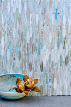
    Hi---I like the new tile, it's not as WOW like the blue, but I like that it picks up the color of the counter. Here's a blue tile, with a mix of the blue and green, plus white and the counter color. Thought it might be interesting in your space... Hope this is helpful... :)
    [houzz=
    Light Blue Glass Kitchen Backsplash · More Info
    ]
  • 11 years ago
    My goodness. If the area you are tiling is just the stove area pictured please have fun with it.

    The cost of installation runs between ~$5.00 to $ 15.00 per square foot not counting the tile.

    That wall would be about ~$150.00 to ~250.00 including a not crazy expensive tile.

    In a few years when and if you want to change it - doing so will be a drop in the bucket for a new look. Enjoy, experiment and learn your style. When it's time for a new style then move on with enthusiasm.

    Design is a funny thing. This summer I attended a garden party. An interesting phenomenon occurred as almost every female there was wearing a black shirt and white pants or skirt.

    I arrived in color. Resistance is not futile.

    I have never regretted a design choice, even my more outlandish ones. Sometimes you just need to get it out of your system like those funky boots you bought on a whim. Sometimes the choices you make put a smile on your face when you enter that room. Some of those choices, admittedly, you will be happy to see go and some you will forever be nostalgic for as you move through your choices in the future.
  • 11 years ago
    If you had patterned granite, I'd say that that mosaic was too much, but with the solid cabinets and counter, it might bring a nice amount of life while staying relatively subtle. I like that tile too (have a sample at home for some future project). However, trust your heart -- if you still love the ice blue, go for it! :)
  • 11 years ago
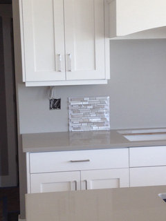
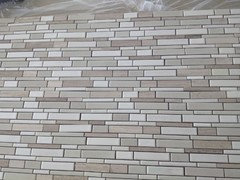
    Here is a little update. We decided on the neutral glazed ceramic tile and our tiler came in to install it today. He says it's very unevenly spaced compared to other mosaics he's done. Here is a picture of it laying on our counter. If you look close there are some imperfections and wider gaps in some areas. The tiler says with a light colored grout a lot of that will get hidden. It's not terrible and we have really grown to love this tile. Should we go ahead and do it?
  • 11 years ago
    If you like it we do too! It blends everything well
    But you don't seem 100% sure.
    Why don't you do the paint trick first? It will take you 15 min or less. That way there will be no doubt in your mind when you choose one tile!
    You've got to get the "what if" out of your system.
  • 11 years ago
    We love the tile. We are over our first question of which one. We decided we would rather be classy and traditional than trendy and fun. Our question now is if we should go ahead and lay the tile although it has some imperfections, such as bigger gaps and bumps. It's a tile from Lowes. The reviews did say it was hard to install. Does our picture of it laying on the counter look ok? That's how it will look on the wall. I think only the imperfections show if you look at it close and really study it.
  • 11 years ago
    You could always instal some on a board & grout to make sure you like it.
  • 11 years ago
    Yes there are a lot of imperfections. It's not much about the spacing. It's that the piece that comes next to the brown one at the bottom of your last picture right in the middle, is another brown but in a different length. The pattern is not great.

    You could look for the same tile in a tile store.
  • 11 years ago
    If you are the kind of personality that these little differences is going to bother you, then don't do it. On the other hand, if not, then go for it. No one is going to stand there and study it like you are now. Only you will know and it will all blend in - in the end.
    The problem is when we are doing something like this, we zero in on that particular item, but its the overall look that is what comes together.
  • 11 years ago
    Hi---looks good Amy... I think you made the right choice. As for the spacing, I've seen much worse, trust me, it will be less visible once grouted. Looking forward to seeing photos. Good Luck! :)
  • 11 years ago
    It's true that laid on the counter you see all the imperfections more.
    When they will be laid vertically with the grout and all it won't be noticeable.
    The most important thing is that it makes YOU happy! So go for it!
  • 11 years ago
    I love it. Be sure to show us the final pictures -- I really think this is going to pull your kitchen together!
  • 11 years ago
    I agree with keeping the palette more neutral for the kitchen. You can always change out the color with accessories. Use the tile you like in a guest bathroom.