Software
Houzz Logo Print
southcypress

New Hudson, Michigan Kitchen Remodel Before and After

11 years ago
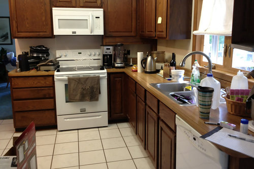
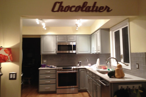
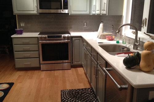
When Jeanne was left with her parents retirement home of 35 years, the kitchen had become cramped and outdated. She decided that she wanted to overhaul the kitchen to bring it up to speed with current styles while also giving it a more open feel.

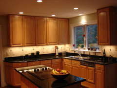
The previous kitchen featured natural wood cabinets, white appliances, and a tile floor.

Jeanne replaced the old white appliances with sleek new stainless steel ones that match wonderfully with the grey cabinets and backsplash. She also installed new hardwood floors, and to top it all off, she installed a brand new white Carrara quartz countertop. It really is quite the transformation!

To see a full blog post including a complete project sheet visit: http://renovation1500.com/new-hudson-kitchen-renovation/

Comments (54)

  • 11 years ago
    Very nice!!!
    South Cypress thanked Kelly Abercrombie
  • 11 years ago
    indeed
    South Cypress thanked fitri Jr
  • PRO
    11 years ago
    Congratulations on a great job bringing this kitchen to current trends!
  • 11 years ago
    These are the kind of updates I love to see! Drastic transformation without an entire demolition. Looks fantastic!
    South Cypress thanked Tory Bolander
  • 11 years ago
    sorry, it looks like it belongs in a restaurant, or a prison, but then I always think that with stainless
  • PRO
    11 years ago
    Had they swapped out the panel doors for plain front ones, installed under cabinet lights along with a few recessed can lights and some open shelves (next to the window); I think they would have gotten a more contemporary look (they seemed to be going for) without any major demo work or huge increases to their budget..... I do love the new flooring, I think that was a very smart choice!
  • 11 years ago
    Beautiful revitalisation. The colours are nice and the updates are practical and doable. Have you done any updates to other rooms in the home?
    South Cypress thanked dannielleb
  • PRO
    11 years ago
    Danielle, We agree about the colors! This is actually a clients home, so this is the only room we were a part of!
  • PRO
    11 years ago
    Stamps Design Services. Those are good ways to redo a space as well! This project didn't involve too much demo work; Jeanne just decided she wanted to overhaul everything, as this kitchen had been the same for 35+ years! We think it turned out well!
  • PRO
    11 years ago
    Very nice. Good job!
    South Cypress thanked Solar-screen-shades.com
  • 11 years ago
    I think the overall look of the project would have been much improved with some good staging. The remodel looked unfinished. That being said, much improvement without a lot of demo work
  • PRO
    11 years ago
    Agreed!
  • 11 years ago
    Looks very dark, even with the upgrade.
  • 11 years ago
    Is there texture on the ceiling? I am having the popcorn texture removed and am not sure if I want texture or totally smooth.
    South Cypress thanked mandolindesign
  • PRO
    11 years ago
    mandolindesign: There is no texture on the ceiling!
  • PRO
    11 years ago
    Wow! Doesn't even look like the same kitchen. Beautiful work!
    South Cypress thanked Brown Bros. Masonry
  • PRO
    11 years ago
    Agreed! She completely changed the color palette of the space!
  • PRO
    11 years ago
    small changes changed the look of the kitchen, good work!
    South Cypress thanked OTM Designs & Remodeling Inc.
  • 11 years ago
    Really nice change/upgrade. Like all the colour choices. Very small detail that I always notice.....plastic, labelled, soap dispenser by the sink. Check out the bath section for a modern style glass one in the colour of the tile. With a funnel it takes so little time to fill and adds some class.
    South Cypress thanked grandmajim
  • PRO
    11 years ago
    grandmajim: That's a great small detail to pay attention to! Thanks!
  • PRO
    11 years ago
    This looks awesome! Loving the retro modern feel!
    South Cypress thanked Arley Wholesale, Inc.
  • PRO
    11 years ago
    Agreed! The subway tile looks great! :)
  • 11 years ago
    This is my kind of remodel and photos. Unlike the usual staged professional photos, I can actually see how it would function for me and my family.
    The "Chocolatier" is delightful.
  • 11 years ago
    Really like it but Where did all the stuff on the countertop go
  • 11 years ago
    last modified: 11 years ago
    The "old white appliances" don't look all that old to me. Hope those were donated to a repurposing shop. The stark colors along with the stainless appliances give it a new look, but also pose another problem--it has no warmth. Consider bringing in some warm colors in the form of pottery, larger rugs, and wall color, etc.
  • 11 years ago
    Sorry, but to me it looks like they spent time and money for blah. There's no "music" to the room. Probably would add some color and texture with accessories but these pictures sure don't show anything to get excited about. Admittedly, I am an emotional designer and react to the feel of a space but this feels cold and dull.
  • 11 years ago
    last modified: 11 years ago
    Nice color for the cabinets, and I like the countertop and backsplash. Don't see why the white appliances couldn't have been saved though, they would have worked just fine in this space. It's a shame that the tile floor had to be trashed as well. Maybe a colorful area rug would have made it liveable.
  • 11 years ago
    Chuckle, chuckle...although the transformation is very nice, the "sleeker/neater" look could have easily - and much more cheaply - been created by just removing all the clutter from the countertops and sink! Truly, a simple fix!
  • 11 years ago
    Nice!
  • PRO
    11 years ago
    We think the "Chocloatier" sign is a great touch as well!
  • 11 years ago
    Just because appliances are white doesn't make them old or outdated. I just bought a brand new stove and fridge in white last week from Home Depot.
  • 11 years ago
    Just a little too much gray, there's even stainless steel switch plate covers. It can be so overwhelming to choose all those projects, but a little less gray for so much of kitchen would have spiced it up. Looks like they found a backsplash they loved and picked all the rest to match.
  • 11 years ago
    I would have kept the tile floor, put in some recessed lights instead of the tract lights. I find the grey and then the yellow walls miss matched.The yellow is to country in style and the grey more contempo to modern.
  • 11 years ago
    Beautiful!
    South Cypress thanked queencad
  • PRO
    11 years ago
    agreed queencad!
  • 11 years ago
    very nice job...maybe you should get a built in dish soap dispenser, they are worth it no more soap bottles on the counter!
    South Cypress thanked panes
  • PRO
    11 years ago
    Great suggestion!
  • 11 years ago
    An old oil cruet works well for dish soap on the counter top.
  • 11 years ago
    Good job well done on a budget. What is up with the negative feedback? This is a persoń´s home and obviously is proud of the work done if showing it on Houzz. Maybe some of you might not like gray, I happen to think that the warmth of the harwood floor balances it all out. Also, sometimes when photographing tight spaces you cannot get the complete feel of the room or maybe the person has simply not had time to complete the finishing touches. Please everybody, just be courteous with your comments and make them constructive instead.
    South Cypress thanked notabene1
  • PRO
    11 years ago
    Very nice looking kitchen, and the tile work looks lovely.
  • 11 years ago
    With built in soap dispensers you have to reach way into the under sink cupboard, remove container, fill it, attach container again. Not for me. Maybe there are newer ones out that can be filled from the top???
  • PRO
    11 years ago
    Great transformation !
  • 10 years ago

    I would have liked to see a warmer grey. glad the tile is gone. love the floors. did the same at my house. much warmer on the feet. but that wall colour needs something done with it. makes it all look a bit frumpy, like they ran out of ideas..

  • PRO
    9 years ago

    Hope you are still enjoying your beautiful renovation!

  • PRO
    9 years ago

    well done!

  • PRO
    9 years ago

    Great job! It looks fantastic!

  • 8 years ago

    This is the exact layout of my kitchen. Awesome inspiration for me.

  • PRO
    8 years ago

    Nicely done!

  • 4 years ago

    Looks like a quality paint job on the cabinets, not refacing? Always curious as to how folks approach the refresh to their oak/wood stained cabinets...looking for a good thread on before and afters of profesionally painted cabinets, thanks!

  • 4 years ago

    This thread is 7years old so obsolete...what might be worthy of a look is how this paint job held up. Was it professionally done? It never says and painted oak is not my favorite which these pictures don't really show. Seems like over kill on the hardware....where is this kitchen now???!!!