Software
Houzz Logo Print
ayeymg

Need backsplash ideas

11 years ago
last modified: 11 years ago
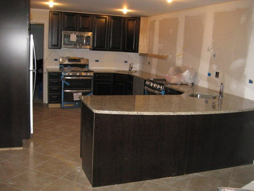
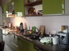
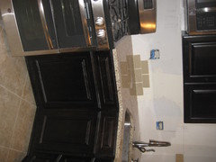
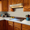
Here is a pic of the kitchen not quite finished yet, the wall on the right will have upper cabinets all the way to the end of the peninsula so that wall and the far back wall is where the backsplash tile is needed. (cherry chocolate cabients, giallo ornamental granite, 18" porcelain tile, stainless appliances) I'm looking for something classic and not super busy looking. any suggestions? i'll post a pic of what i'm thinking of soon but please let me know if you have any other ideas! thanks!

Comments (57)

  • 11 years ago
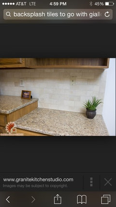
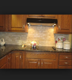
    @ameymg. Go with your gut. I remodeled my kitchen and used this backsplash idea complete with one diamond made into a mosaic above the sink. Too many is overdone I think. The travertine and glass tiles is beautiful when well done and is very elegant. By the way, I sold my house on the first showing for MORE than the realtor wanted to list it. The kitchen cinched the deal according to the new owners. If you are living in it, go with what you love, forget what everyone's "style" or opinion may be.
  • 11 years ago
    Rather then covering the backsplash with something I painted İt washable.
  • 11 years ago
    I will be the naysayer and agree that the tumbled travertine with dark cabinets and granite can be a dated 90s look. I think those combos were very popular for a while. I think the glass tile is more updated and I would chose a consistent shape over the busier mosaics. If you want to be a little more unique you can try a larger format or elongated subway tile shape.
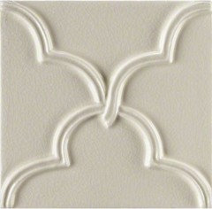
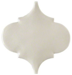
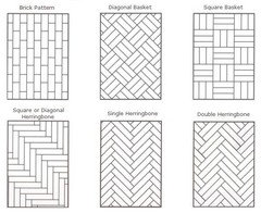
    Or try a ceramic tile in a color pulled from the counter and you could arrange in a different pattern like herringbone or use an arabesque or scalloped shape tile. (Have seen both at lowes).
  • 11 years ago
    I would paint for now and wait to choose a back splash until I have lived with the kitchen for awhile. It can be a very costly mistake,I don't particularly like your choices or anyone else's ,right now .lacks a bit of colour and originality.The beginning choices you made are really great, I am sure that it will come to you more readily when you have more time to reflect on the finishing touch.good luck.
  • 11 years ago
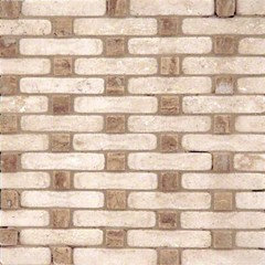
    Is the glass tile like dclostboy suggested ever done with an accent? I've never seen it so I'm guessing not...? Also my floor is very matte, so one opinion i got was to do something matte like travertine instead of shiny since the granite is already shiny and its next to the granite...? Is that correct? In which case I would to want to do glass tile?
  • 11 years ago
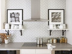
    Nice kitchen ayeymg! I do think your original idea is a bit dated. I would avoid all accents (stripes, diamonds, etc.). I also think your travertine choice is too pink for your granite color. I simply love newzealand's first example. Please take your time with this decision. Backsplash choices can make or break a kitchen, IMO. I think a matte or glass tile would work (considering the floor and shiny granite), whichever you can find the perfect color. Finding the perfect color can be a bit more difficult when the floor is tile rather than wood since you need to coordinate with the granite but also the floor.
  • 11 years ago
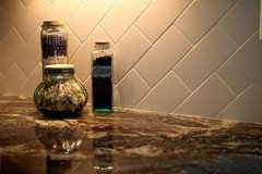
    is the glass tile a sheer glass?
  • 11 years ago
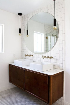
    I'm hoping you'll head off to the tile store and get any sample that might work, glass or matte, and lean them against the wall and take good pics, so we can help vote. You've made very nice choices so far and it's all working together - so just one more good choice and you're done. But, the further along in the process, the harder the choices since there are more elements in place that all need to tie together perfectly.
  • 11 years ago
    IMO natural stone is timeless. Agree with finding the color of stone that doesn't contain reds bc they do look pink when installed.

    The other options are fresh new trends but they seem to go "out of style" when they reach saturation in the design world.
  • 11 years ago
    last modified: 11 years ago
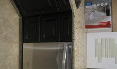
    here is a picture of the cabinet pulls..they are nicer in person :) but to give you an idea of the style.
  • 11 years ago
    last modified: 11 years ago
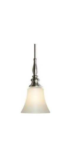
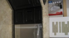
    and here are the pendant lights for over the peninsula
  • 11 years ago
    You can accent subway with stripes, but think that will detract from your granite.
  • 11 years ago
    Ayeymg, love the glass tiles you posted just above!
  • 11 years ago
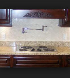
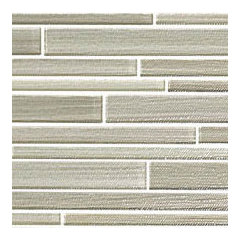
    Hi, tried to find out what the tiles where in my first pic, it didn't say, but it is under majestichomesandremodeling.com
    I hope that helps. Perhaps if you could email them that pic, they will be able to tell you
  • 11 years ago
    I do like your second choice of the glass tiles, it will stand out more if that's what you want
  • PRO
    11 years ago
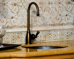
    Take a look at my backsplash page for some ideas
    Good luck to you
  • 11 years ago
    We used a glass and stone combination.....I am super happy with the look.
  • 11 years ago
    i've ordered some 3x6 glass tile i hope to post pics for opinions once i get it. can anyone tell me if the 3x6 one color glass tile is considered a more classic/timeless look or is it more of a current style that i can expect to go out of style in a few years?
  • 11 years ago
    I like the glass tile too.....consider ease of cleaning.....will it show dirt or water spots? I would think it would make the kitchen look brighter since it would reflect more light. Looking forward to seeing the sample!
  • 11 years ago
    Looking forward to seeing the pics of the samples you ordered!
  • PRO
    11 years ago
    last modified: 11 years ago
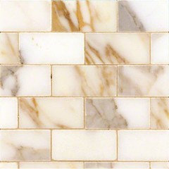
    Here are some other classic tile ideas.
  • 11 years ago
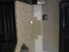
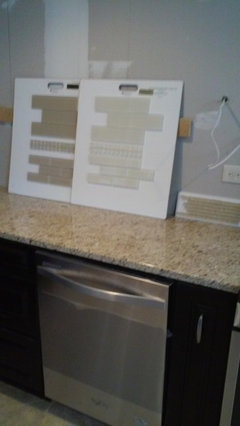
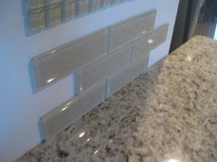
    Here is the sample i received today. looking for opinions, esp abt the following: I'm thinking i should go lighter, like more of a cream color? and is this too sleek of a look for the rest of the style? also what about a 4x12 tile, is that too contemporary? or would that be an option?
  • 11 years ago
    I agree, more of a cream color would be a bit better, but this one is pretty nice. It does have just a bit of olive undertones that aren't perfect with the floor so I think you're on the right track thinking a bit lighter color. I do not think it's too sleek of a look and I also think a 4x12 would be a fine choice. I think either size would be fine. I think you're headed in a very good direction, just haven't found the perfect color yet.
  • 11 years ago
    Agrees cream color would stand the testified time.
  • 11 years ago
    I have a very similar color counter with dark cabinets, so I appreciate the challenge you are facing. It looks to me that the sample you have blends too much with the counter. I think you need a little definition between the two surfaces.....a lighter color or maybe a ribbon accent above the second row of subway tile.
  • 11 years ago
    three new samples. the one on the right is half frosted
  • 11 years ago
    Those all look interesting. Could you take more pics, some close up and some far enough away so the floor also is in the pic. Try to get natural light and no flash.
  • PRO
    11 years ago
    last modified: 11 years ago
    All three tile colors look nice with the granite (as per photo). The darker and lighter one would give you some contrast, where the one on the right would just blend in.

    Subway tiles were once popular back in the first part of last century. It started around 1904 when ceramic subway tiles were installed in the New York City's subterranean train station. With every trend, it comes and goes and the subway look is no different. Just like the yearly predetermined colors predictions, so goes the tile trends. Subway tile have been popular for awhile and is in it's last stages of life, as history has shown us and kitchen and bath industry is predicting.

    When working with my clients, I recommend going with whatever they like the most. What might be in fashion today, certainly won't be in a few years. It is your home, so go with what you like the most.
  • 11 years ago
    Wyland: in regards to subway being on it's way out, what is on the way in? Ann: I will try to take more pics tomorrow. thanks everyone!
  • PRO
    11 years ago
    I think subway tile has a long life it still is one of the best answers where there is a busy granite and simple works best they have been around forever which is more than can be said for many other "in " things. I think simplicity never goes out of style.
  • 11 years ago
    last modified: 11 years ago
    Subway is classic and classic never goes out of style. My 100+year old house has original subway tile and still looks fresh and contemporary. I like the light ones as they help pull in the floor best. The darker ones have a little more depth and make the cabinet color look richer. You won't be wrong going with either. As someone else said, the right answer is the one you like best :)
  • 11 years ago
    The lightest colored tiles (center board) seem to pick up the movement in the floor. If it was my choice I would use the smaller tiles on the bottom of that sample board. They are more subtle. That would be my choice.
  • 11 years ago
    Also, consider laying it in a herringbone pattern. It will speak to the diagonal floor tiles as well as get you away from the subway style uncertainty (personally tired of it... Overdone!).
  • PRO
    11 years ago
    last modified: 11 years ago
    To answer your question. Contrary to popular belief, after researching and reading in leading design industry magazine over the last few months, this is what they are predicting for 2015 and beyond. As a professional interior designer, with close to 30 years experience, I got to tell you they are typically right on with their predictions. Europeans are the trend setters, the United States is typically a few years behind them before we catch up.

    Natural materials and porcelain made to look like them, such as stone, wood, metal and glass, dominate modern and classic interior design 2015 trends. Modern tile designs vary dramatically and available in numerous different types, sizes, colors, textures, styles and prices.

    Mosaic tiles will be offered in more complicated tile patterns to plain colors made into unusual shapes and textures. They come in a wide choice of styles, sizes and shapes and can create endless compositions. Many of the stick or pencil mosaics will be laid vertical, instead of horizontal.

    Tile trends of 2015 beyond are a mixture of larger scaled tiles for floors and wall for a clean sleek look, elongated random sized tiles, faux wood plank tiles, with metal and glass is still popular with some fresh new textured looks. Tile layouts made into designs with patterns; like herringbone, basket weaves, hourglass, hexagons or many numerous shapes.

    The subway look you will still see it in more colors in more elongated sizes like 4x8, 4x10, 6x12, breaking away from typical white tile in the 3x6 size. Subway tiles will be installed in straight laid, lined up rather than subway brick laid look.

    Trend 2015- Here are some examples; Many come in array of color combinations light and muted, to bright to dark and bold. More to follow.
  • PRO
    11 years ago
    last modified: 11 years ago
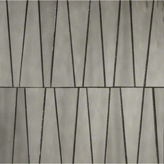
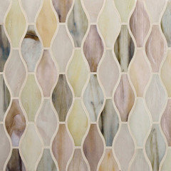
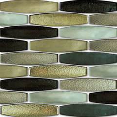
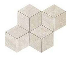
    Trend 2015- Shapes and Textures tiles: Many come in array of color combinations light and muted, to bright to dark and bold.
  • PRO
    11 years ago
    last modified: 11 years ago
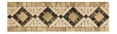
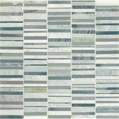
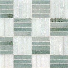
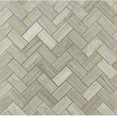
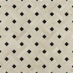
    Trend 2015- Mosaic patterns: Many come in array of color combinations light and muted, to bright to dark and bold.
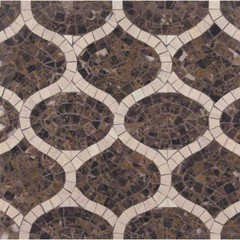
    * I could see the top left mosaic in your kitchen. However, the reverse of it, with the lighter background and darker brown ribbons.
  • PRO
    11 years ago
    last modified: 11 years ago
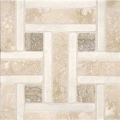
    Trend 2015- Mosaic patterns- herringbone, basket weaves, etc. Many come in array of color combinations light and muted, to bright to dark and bold.
  • 11 years ago
    IMO a mosiac backsplash or other busy backsplash is wasted unless it's the focal point. Your backsplash will be background, strictly under the cabinets and broken up by outlets and all the stuff that ends up on the counter. Let your cabinets, counter and accessories shine.
  • 11 years ago
    i think my fav is the lighter smaller subway (they are actually a 2x6). i'll try to take pics tomorrow
  • 11 years ago
    i am really not into those 2015 trends. i def need to like what i'm putting in, i wont put it in just bec its the latest style, i need to really like it!
  • 11 years ago
    Wyland...Ann sacks has been doing everything you've shown for the past 10 years.
  • PRO
    11 years ago
    Some people can choose to play it safe, go with something simple and plain, which is certainly okay. However, this is Houzz where people come to find new and exciting ideas, not the same old, same old cookie cutter style. Frankly, the only thing I hear people suggesting are the passe’ and over-saturated subway tiles or 1x1 glass tiles. How boring and sad, that everyone’s home will be looking the same. I guess that is why my clients choose to hire a professional, like myself, they want to move forward to discover new and innovative ideas for their homes. My client’s want their homes to be a reflection of their own personal style and tastes, not looking like their next door neighbor's home. You know what, that is certainly okay too.

    Consider changing it up with a more creative layout.
  • 11 years ago
    i thought about running them vertical, but the rest of my kitchen is not modern, it's more traditional, so i'm thinking it would go better with a more traditional layout of tile? (none of the other layouts appeal to me bec i like a simpler look, they look too busy for the look i want.)
  • 11 years ago
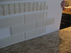
    here are closer pictures, still no great lighting...wondering if i should look for a tile that is between these two colors?
  • 11 years ago
    I vote for the middle colored tiles. Large to medium in scale otherwise they may look too striped.
  • 11 years ago
    Now with your latest pics I think I like the third pic you posted of four. Color looks nice.
  • 11 years ago
    last modified: 11 years ago
    The lower left looks great with your counter and cabinets. I really think you have this in hand.
  • 11 years ago
    I think both of those are really good. I agree, you have this in hand! I don't think you need to go in between - they're both very good.
  • 11 years ago
    so there are only two color samples here, (with two pics of each) it's weird the lower left one is the dark one, but in that lighting it looks much lighter...i wish it was that color in real life and i would pick that one since its kinda in the middle. i know i can go with either of these...i have another week or so to decide since we are waiting for a reorder of some of the wall cabinets...