Software
Houzz Logo Print
soukouma

Why?

14 years ago
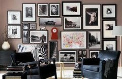
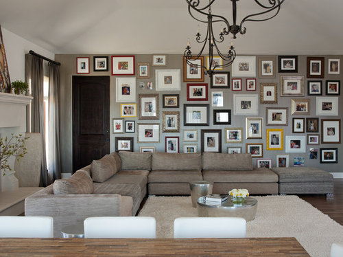
Great space but who ever decor this space needs to step back and see the whole picture, it's over loaded and crowded with pictures.
Los Gatos Residence · More Info

Comments (25)

  • PRO
    14 years ago
    Perhaps in your eyes, but not in the eyes of others. The simplicity of the room makes up for the vast array of pictures on the wall.
  • 14 years ago
    Just realized that this is the room with the sofa in front of the fireplace which received so many comments/questions recently. It may not be your style but it is certainly thought provoking.
  • 14 years ago
    It's over loaded and too busy. I know people have lots of pictures that they like to display but you have o know hen is too much.
  • 14 years ago
    I guess it's good. The room doesnt have any vocal points except those pictures. So it's fine, every room needs a vocal point.
  • PRO
    14 years ago
    I agree with Carolyn , ruthmand and Kevin, every input favouring this room Décor , you have to have it in you to Appreciate others work and Ideas if we Lack them , and a nice story on the wall makes it so Chic , I'd say tha'ts an ART !
  • 14 years ago
    It takes away from the sophistication of the room,nice furniture,white rug...and then 3 yellow picture frames!?..No!...Raised art in 3 pcs across that wall with update scones as dividers....maybe some invisible shelving....even a book case with a couple curly willow branch arrangements on both sides. ..... They now have sites you can go to for wall images,Quotes,backdrops,trees,flowers,etc...... to fill an oversize wall like this one.
  • 14 years ago
    I Agree with Vikrant and I love gallery walls but for me this wall needs a place to rest the eye Like a clock the frames seem too similar in size or something but the idea is great but something about it is a miss for me, perhaps seeing the whole room would help.
  • 14 years ago
    I like gallery walls, but I also like to enjoy the pictures. The problem for me with this wall is that you can't even see the little ones up by the ceiling. Basically, they are all too small and the frames might as well be empty. :-) The other problem is that some of them are hanging crooked. That's hard to prevent and correct with so many pictures. It has potential, but needs tweaking to work for me.
  • 14 years ago
    Ya think?!!!!
  • 14 years ago
    I love the wall of pictures but maybe she or he could of use a same frame color either all white or black or mix in good taste then it would work.
  • 14 years ago
    I love gallery walls. There are good gallery walls and bad gallery walls. This just happens to be a bad one!
  • 14 years ago
    last modified: 14 years ago
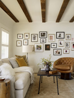
    The odd and yellow/red/brown/black frames do not bother me at all as the simplicity of the room, plus earthy color scheme make up for it and everything works well together. I also love the idea of having a wall covered in framed pictures but on this occasion I must say that it looks a bit overcrowded. My suggestion would be to rearrange a bit and hang about 10-15 of them in the center of the wall, including large, medium and small frames. I think that would be the best but.... I'm not an expert though :D

    Something like this, for instance:
    [houzz=
    San Anselmo Living Room · More Info
    ]
  • 14 years ago
    Gallery walls are a great idea, but the idea is that you should be able to see the pictures! There should be nothing hung above eye level, and why put pictures BEHIND the sofa and over the door frame? At least keep the pictures in the body of the room. The whole thing is really jarring to the eye in such a beautifully done room!

    All I can see here is a lot of dusting of something nobody will look at.
  • 14 years ago
    I think this room in itself is beautiful! And I also love photo walls. I think I would of made it a bit more cohesive in frame choices though. I also think because none of them are really hanging straight it is throwing the whole wall off to the eye! Over all well done room.
  • 14 years ago
    It took a lot of patience to do it. I'm sure they don't want to undo all the work they put into it due to a few other people's opinions. I do think the room is working far under its potential.
  • PRO
    14 years ago
    I like the gallery wall but I think the reason it's a little distracting is the disparate frames. I would do elegant, single color frames. And to someone's point above, they don't have to be all brown or black or silver. If you wanted a powerful statement, I would've bought white frames and painted them a color - like yellow or red or something and done them all the same. I would avoid the large mats that don't allow you to focus on the picture. And the fact that the frames aren't leveled is distracting as well. Gotta say I love the chandeliers and the sectional!
  • 13 years ago
    I immediately thought this room with the wall of pictures was an ingenious work of art. It's a perfect complement to the neutral palette. Thank you!
  • 13 years ago
    Way too many pictures and as one person says behind the sofa?
  • 13 years ago
    I have no problems with the photo wall but a different photo of the same room showed the BACK of the other end of the sectional facing the fireplace on the left. That is probably more thought provoking than the photo wall.
  • PRO
    13 years ago
    This is design and function at a high level. Incorporating a real home, real family, real lifestyle. Bravo!
  • 13 years ago
    This is what I don't want for my gallery wall. I want featured art not a cluttered mess. Know when, where, and how to simplify.
  • 13 years ago
    I like it. I even consider my tastes bordering on the minimalistic and I still like it. Were the density of the pictures not so consistent, it would be horrible, but as it is, such an unrelenting patchwork of images and frames over neutral tones, the effect is almost sublime. The graphic nature of each wall relies on the arrangement of the frames rather than the specific image, yet the images offer texture from afar, and subject when approached. It's not a "gallery wall" at all. There isn't proper lighting. There is no attempt made to showcase any specific image. To compare it to a gallery wall is missing the point. I bet this is a great place to daydream as a guest.
  • 13 years ago
    The room is beautiful, however the gallery effect is atrociously ill-conceived, with crooked disparate spacing of the artwork and framing. Sometimes the client needs to listen to the designer--I'm not sure that was the case here.
  • PRO
    13 years ago
    I just think the pieces should be removed from over the door. All else looks nice,
Sponsored
Bella Casa LLC
Average rating: 5 out of 5 stars17 Reviews
The Leading Interior Design Studio in Franklin County