Software
Houzz Logo Print
sarahandbray

1880's Folk Victorian (?) Paint Scheme? White, dark green, and ???

14 years ago
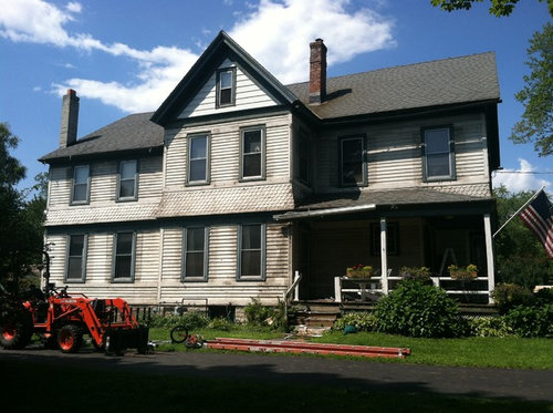
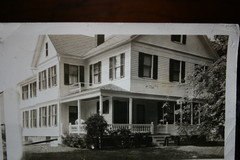
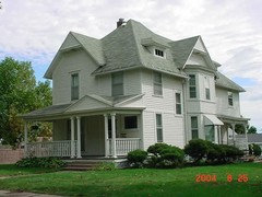
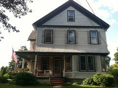
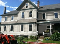
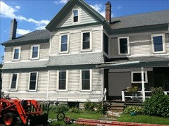
This is my husband's grandfather's house--supposedly 1871 but many people on old house forums think it's more 1880's-1890's.
We just took off aluminum siding circa 1952 and have revealed these lovely details. Planning on painting starting mid-Sept. so need help with colors ASAP! In the 1940's it was entirely white, with dark green louvered shutters on each window.

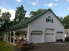
Not really interested in a crazy, 7-color traditional Victorian (dark!) palatte since we just put up a large white with green shutters/roof Morton building behind our house in 2006.

Basically, working from the dark green and white palatte (and perhaps light yellow? medium yellow? maybe deep red thrown in?), how would you paint this? What would be white? What would be green? And if a third accent color, what would it be and where?

So confused! Been all over the Internet searching--found a section of paint under the old paint that shows a medium yellow similar to BM Hawthorne yellow. What do you think? Other ideas?

Sarah--just south of Albany, NY

Comments (50)

  • 14 years ago
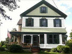
    Attaching family photo of the house in 1940's
    (I should also mention that the attic gables do not have the aluminum removed yet but we know from this earlier photo that that is scalloping as well)
  • 14 years ago
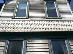
    And one more of the siding up close...a few boards being replaced and other holes patched, but this shows the bandboard/scalloping/trim/etc.
  • 14 years ago
    I'm not a big fan of the five-hundred-color Victorians either. My instinct is to stick with the white body, the green trim around windows and doors. Add accent color with plantings, flower boxes/containers/pots, and on the front door.

    The gable where the aluminum still is in the top picture: Was that trimmed out in green? I see that it is not in the old picture. I would probably go with just white.

    This is a beautiful home with lots of potential. I love that you're bringing it back to its roots!

    Front door accent color ideas:
    - Tomato (inspired by the tractor)
    - Light yellow that you find on dahlias http://7art-screensavers.com/wallpapers/flowers-9/sml/7art-00263_light-yellow-dahlia-flower.jpg
    - Classic, subdued dark green to match trim

    My ideas aren't exactly in keeping with Victorian style, but I think that's okay. This home reads more like a farm house to me. I think it's just gorgeous!
  • 14 years ago
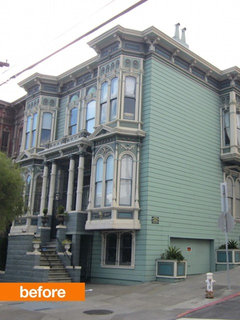
    There is (or at least there was!) a Victorian home in San Francisco that has every board painted a different color. Don't do that, ok?

    I would stick with white, dark green and light green. Very classy color combination. Add more color with plantings, beautiful flowers and shrubs.

    That is one big house - how many people will be painting, and how long do you all think it will take? I'm just being nosy!
  • 14 years ago
    It's pretty big for an old house...3200sf. on the main two levels...full basement/full walk-up attic...10ft. ceilings, etc.
    We are DIY people inherently, and have done a lot to the interior of the home ourselves...but we are having a professional painter come in 2 weeks. We both have full-time jobs and this project IS a full-time job! Sheesh! He estimated with 3-4 people working 6ish days/week, it would be 3-4 weeks.

    The other color I LOVE in this house is that deep burgandy/cranberry historic red color. Thinking of new storm doors in that color and new window flower boxes the same color. Also, we never did exterior lighting on the garage and could do those barn-style lights in the dark red as well. Front porch/railing getting replaced in October.

    The painter thought we should add a third color as well--he suggested light green, too. I just don't know where that would go. Also, while I like some light greens, I hate any that look "minty." What dark, shutter green and light green would go together? And what surfaces would get what color?

    Thanks for all of the help!
    Sarah
  • 14 years ago
    Sarah, I would be very careful adding any red to the green and white color scheme you have going, unless you want it to look eternally Christmas-y! That is a real risk.

    There are many shades of light green if you don't like mint. How about sage? That's very popular these days. Go to Behr.com, click on Find Your Color, then Preview and Coordinate Colors. There's quite a few greens that you may like; if not, there's a billion other colors to choose from also.

    I'd love to know your final choice, if you don't mind telling me?
  • 14 years ago
    What a gorgeous house! I can see this in Weston Flax (HC-5) for the body, White Dove (OC-17) for the trim, Yorktowne Green (HC-133) for shutters and door.

    Or another favorite scheme of mine is Hunter Green (2041-10) for the upper body, Copley Grey ((HC-104)for the window casement and front door and White Dove (OC-17) for the lower body. I would do the upper shuters in white and the lower shutters in green.
  • PRO
    14 years ago
    last modified: 14 years ago
    http://mnkyimages.com/wp-content/uploads/2012/01/Exterior-Paint-Color-Schemes.jpg I've not seen this color combination before and I really love it. I would paint the front door in the red only. If you like it, I'll research the actual colors for you.
  • 14 years ago
    Gorgeous colors, Karen and beautiful house sarahandbray!

    I came across this one and had to share - especially in light of your question regarding which greens would work together (non- minty in nature!) The colors are by Benjamin Moore. It only features white as an accent, but I thought you might appreciate the greens:

    High Park (greyed sagey green)
    Garden Path (lighter version of High Park)
    Bordeaux Red
    Brilliant White
  • 14 years ago
    Thank you, everyone! You are all so helpful and these are great ideas!
    I especially love the colors in the last photo--just not sure which part of our house I want to focus on for the color scheme--the farmhouse look? Or the Victorian look?
    With the gi-normous white steel Morton Building out back with traditional dark green shutters and dark green steel roof, I somehow feel committed to something that is going to blend with it. The garage is only 50 ft. from the back of the house.
    Then again, there are so many bits to the architecture of this house, I feel like they are "lost" in plain white...
    Agh! I hate decisions :(
  • 14 years ago
    Sherwin williams have a color visualizer that is pretty good. If you want to stick with a white body, I would keep the green to some acents to avoid the christmas all year long-house effect. I would stay away from red and instead add yellow and a dusty blue such as Sea Pine from BM. A monochromatic effect by using a range of whites from almost beige to stark white might be very interesting.
    Good luck it is a gorgeous house
  • 14 years ago
    Love your house! Are you going to replace the railing on the porch that is present in the 1940's photography? It really looks nice.
  • PRO
    14 years ago
    Check out oldhousecolors.com for some info about historic paint colors. I like a grayish green, like a sage color to go with a dark green. I like to mix my own colors, so I would start with a large board to be my palette and mix colors with a white base and adding drops of green, black, and brown until I got a color I liked. Then I would mix up a reasonable amount of that color (a pint at least) and paint some sample boards either directly on the house or on some good sized pieces of plywood or drywall. Use two coats to make sure you get the true color. You don't need good paint for this - old paint laying around, garage sale cans, freebies from your friends, flat, semi, gloss (just don't mix oil and latex) just find the color you like. Then, you can take your sample board or the remaining paint to the store and have it matched exactly.

    I would want to see at least three colors, if not four; perhaps two base colors, a trim color and an accent color. You could use two very similar colors for the body, with the clamshell shingles painted in a different color than the clapboard siding.

    Please pay as much attention to the products used and the prep work as to the colors themselves. I don't know if you are trying to remove all the old paint, or just scraping off what is flaking. If you have lots of layers of paint, be sure to use an oil based primer to spot prime unless you are using oil-base paint
  • 14 years ago
    Check out the book aout the victorian colour schemes..
    "painted ladies..." Fantastic ideas for beautiful houses like your
  • 14 years ago
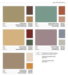
    Here are some palettes from Sherwin Williams that are a little more subtle.
  • 14 years ago
    I think rusy historic red would be wonderful on the body with hunter green trim and it won't look Christmasy at all but traditional and gorgeous. Try it on one of the paint programs. I love the house and want to build one just like it!
  • 14 years ago
    if you paint the main body of the house in a lighter green, accent with the dark green and white it would still blend with the building. you could also tone down the building by doing some landscaping around it if the layout permits. I think the integrity of the house far outweighs the Morton building
  • 14 years ago
    I like Charmean Neithart colors suggested. I know when I did my 1910 house, Sherwin Williams said to choose at least 4 colors.
  • 14 years ago
    last modified: 14 years ago
    Our house was built in 1880 and had only been painted white until we bought it six years ago. We used three different colors to bring our house back to life. Whatever you choose will look awesome!
  • 14 years ago
    Sarah, I disagree with the idea that you shouldn't use dark red. If you love it, go for it. You could minimize the possible Christmasy look by limiting the red to a minor role, or choosing a burgundy red, and by using a green that is not the typical bright Christmas green. One of my favorite houses when I lived in Indiana was done in white, dark green, and red. Remember that those also the colors of a strawberry plant that has both blossoms and fruit on it.

    I definitely do suggest you try out colors on boards before you commit. It's a lot cheaper to pay for trial containers, or even quarts, than it is to have to repaint. When you try them out, keep the proportions about the same--in other words, if the main body of the house is going to be white, paint a wider section of board white, a narrow one the green, and a very narrow one the red. And I second what Linda said about using two coats--in fact, if you're using red, I'd do three.

    Show us the picture when it's done! I think it's going to be awesome.
  • 14 years ago
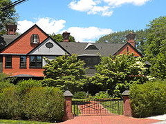
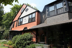
    Hi Sarah, The scalloped shingles are also on my house so I wanted to share these pictures of this strong deep orange, combined with a dark brown and black color. This house was built in 1863.

    That said, I also love the idea of a charcoal grey combined with butter and black. This is such a fun decision you get to make.
  • 14 years ago
    Wow, wow, wow! Never have I ever gotten such great design advice! I knew I liked Houzz to browse, but this is just great feedback!
    I love all of the ideas and have been toying with the Sherwin-Williams color program (quite cool and easier than BM, I might add! Tried that one, too!)
    Hard part is that we don't have shutters on the windows now but do plan on having shutters all the way around the house. So that's the extra component that's missing...though I'm sure I can make "pretend" shutters by adding a new field in the program.
    Painter suggested using a third color...but not sure how keen he will be if I suggest 4 or 5! I also want to make life relatively easy on me for touch ups. Like I've said, we are 95% DIY people, so this is a rare "treat" to have a professional come in!

    So far, my absolutes are only dark green shutters--such as SW Hunt Club. I know I may be too "matchy" and that's "bad," but I'm pretty married to that idea.
    I will upload a pic tomorrow I did with the program that has the thick, wide frieze boards in that same dark green, clapboard in white. But gables and skirting (?) where the scallops are in a light grayish/greenish color. I didn't think I would like it, but I did. Also, I'll have to show you the front of the house--more cute little scallops right above the 2nd floor windows on the front. Begging to stand out, I think!
    My question here is...can I find a color that is gray enough that I can use on our new porch decking AND the scalloping? Throw on 3 dark red (not Christmas-Y red) storm doors and some dark red rocking chairs and call it a day??
    More suggestions or fun with Photoshop always welcome!! Thanks for all the visual examples too--those always help!
    Sarah
  • 14 years ago
    I love love love scallops and YES they certainly beg to be shown-off!
  • PRO
    14 years ago
    last modified: 14 years ago
    How about a Red & White ?
  • 14 years ago
    I think I'm afraid of red as anything other than an accent. Worried about coverage, fading and getting sick of it. Plus, we have an outbuilding that's already an orangey-red and I would have to reprint that pronto!
    I will post pics in a bit of the mock-up I did, the front of the house, barn/garage, and wood shed next to house. Maybe this will help with some inspiration!
    LOVE all the ideas!
    (any idea why I can't "attach images" right from my iPhone on here?)
    Sarah
  • 14 years ago
    One more photo of a combination of colors using grays and greens that I think looks attractive:
    AA Trueline Construction Services Inc. · More Info
  • 14 years ago
    Beautiful home. Color combo: SW 6370, SW 6132, and SW 6475 (this color has a hint more blue than the Hunt Club). I agree 7 colors would be a bit much, but to do less than 3-4 would be such a missed opportunity... Good Luck!~Natalie
  • 14 years ago
    Natalie--did you mean a gold, bronze and a dark green? The first two colors are gold/yellow when I looked them up.
  • 14 years ago
    Sarah - if you did just stick to two colors like the green and white but still want a pop, a primary/bright door can add just a special something without getting crazy. We just moved from a redwood home accented by white and it was a bit dull. We painted the prominent garden gate lapis blue and all of a sudden it made a huge difference. So I guess I'm saying the scallops, the porch, and the front door are all opportunities to make a Victorian statement without being a nauseating rainbow.
  • 14 years ago
    I love the idea of a bright door, and we do have wonderful original doors--half window, chunky with great moulding, etc. Right now, they are wood color with stain that needs to be redone.
    The problem is, I like having a storm door. Right now, we have those typical 1950's aluminum colored storm doors on all three door and the same on all 41 windows. That is getting replaced right after the paint job. (more recycling $$--yay!)
    So I'm kind of limited to whatever storm door colors I can get from the major manufacturers (any suggestions there are great as well!). We are in the Northeast and even with the storm doors, the doorways get drafty come January.
    I'll post a bunch of other pictures now that I've downloaded, to see if that helps resolve anything.
    (I HATE decisions...can you tell?)
    -Sarah
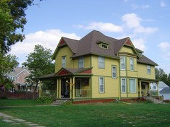
    The yellow house below was one that I think looks similar in style/size to our house and I don't mind the yellow/green color combo on that...but when I did any yellow in the SW paint simulator, I HATED it. Ugh. Too "cutesy" or something...
  • 14 years ago
    Front of our house (remember, top gable will be those half-rounds/scalloping, too)
  • 14 years ago
    Yes, that is exactly what I meant. You had mentioned yellow so I came up with colors (SW 6370 6132) . Red is gorgeous, but paired with that hue of green might scream CHRISTMAS. If you prefer red over gold colors, then change your (teal) green to more of a (khaki) green and balance both with a (green)grey. Check SW 6601, SW 6153, and SW6169 for that combo.
  • 14 years ago
    Morton building garage out behind our house...very visible from street view...pardon the mess at the moment!
  • 14 years ago
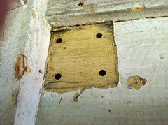
    And look what I found under the aluminum siding...and clearly, something that was under there before it was painted white. Looks very similar to the ever-popular BM Hawthorne Yellow
  • 14 years ago
    I like this color combo too...but not sure if I would get sick of a light green painted on all the clapboard and all the scalloping...this house is much smaller, so I feel like it looks better on that?
  • 14 years ago
    Here's my pathetic attempt at coloring the house with the SW paint program...
  • 14 years ago
    Sarah, what kind of emotion are you shooting for? Calm oasis? Energized & recharged? Nod to history/family continuity? I tend to pick my colors based on what I'm trying to accomplish.
  • 14 years ago
    OK, got a little lazy on the front, so don't mind the little mess-ups (and I can only have 5 fields...so the door doesn't get a different color on this one).
    What do you think?
    3 colors--Extra White (SW 7006), Rookwood Green (2809) and Recycled Glass (7747)
  • 14 years ago
    Hmmm...what am I trying to accomplish...
    Classy, timeless, elegant, traditional, calm, respectful, nod to the Victorian era but simple like the country/suburban setting we are in. Not fussy. Stately? We are pretty normal people (high school teachers) and relatively subdued ourselves. This isn't a historic district and there are only 3-4 homes in this area similar to ours. Most of the neighborhood is a mix of 1950-60's modest ranches and 1920-40's simple bungalows. Working class area. That being said, the other two Victorians up the street are pretty bright and well-taken care of--one is white with deep orange shutters and the other is sort of a light olive green with darker green trim and deep red accents. Love it, but I think it's too dark for me.

    This may sound weird, but with every modification we do to the house, I like to try to imagine if the original owners would like it. I know the name of the original family and some stories about different uses of the basement rooms, attic rooms, etc., but I like to imagine them standing here giving their stamp of approval!

    Does that help?
    I am terrible at this stuff! Thanks for all the help!

    Anyone want to throw more SW colors at me and I will pop them into the program--I have 5 fields right now:
    Clapboard
    Shutters
    Frieze/window trim
    Bandboard
    Scalloping
  • 14 years ago
    Try this:
    Clapboard - white
    Shutters - darker green but not too foresty
    Window trim - white
    scalloping- celedon green (more like a lemongrass color)
    bandboard - white
  • 14 years ago
    I think the porch should be darker green, to match the shutters. I'm not sure what is included in the bandboard field and the clapboard field.
  • 14 years ago
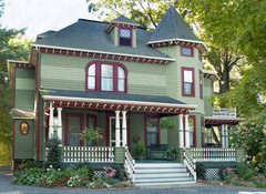
    Here is a Victorian in a similar color scheme - you could pick and choose the colors you like, but you can get an idea of how they are distributed.
  • 14 years ago
    last modified: 14 years ago
    Sarahandbray - I think your rendition looks really good. I really think some yellow would be the finishing touch. Try it on the inner window trim and the door and see how it looks. Your doing a great job. The fact that you are thinking this through so thoroughly is definitely going to result in something you can be proud of. And, no, it's not weird to wonder what the original owners would have liked. I found myself staring at your photos and asking the house the same thing!
  • 14 years ago
    Sarah, The first HGTV Greenhouse was painted in Yellow, White and Grey and it was a home much like yours as I recall. I loved the combination so much that I used it on my own farmhouse. What if you incorporated the Hawthorn yellow or Standish White (BM) on the main body of the house, use a light gray on the scallops since they look a little like a small roof. The grey helps tone down the yellow quite nicely. Paint all trim (windows, the cross boards that separate each section between clap board, scallops, windows etc., eaves and soffits and of course all the porch trim in white. Then use the forest green in just the shutters that you plan to add. Porch floor a deeper grey than the scallops and porch ceiling in a pale baby blue to keep the ghouls away. :) If you still want a pop of color you can do your doors in the burgandy / cranberry color that you like. Six colors but three of them in small doses. If not, try Googling "green Victorian houses" for more ideas.

    Also for the screen/storm door may I suggest a door that is self storing (glass slides into bottom of door to reveal the screen during the summer. Look for one where the divider is in the middle of the door as opposed to higher or lower than that so that when it's closed against your inner door the window of the inner door is fully exposed. The screen door window should frame the window of your inner door in other words. It's a shame we have to put screens over those old beautiful doors but to help hide the fact that you have a screen door on there, you can paint it to match whatever color you choose for your inner door, at least it won't be so obvious that way. Good luck, your home is wonderful!
  • 14 years ago
    Sarah, Try this link for a very pretty picture of a yellow Victorian and just imagine a light grey (scallops) inserted between the yellow sections. http://www.flickr.com/photos/11563235@N07/2813143678/
  • 12 years ago
    What a GORGEOUS home! Check this combination out;

    6a00e553756ca88833016768440fe1970b-800wi.jpg
  • 12 years ago
    Post from Sept. 2012....
  • 8 years ago
    Please add a finished photo of the exterior. I have to remove our aluminum siding on our 1890 folk as well. I’d love to see the after for some encouragement. Thanks so much
  • 2 years ago

    Shannon Kerstner start your own thread to get feedback.