Software
Houzz Logo Print
joann_yurchesyn

What Color will Work with this Trim??

13 years ago
last modified: 13 years ago
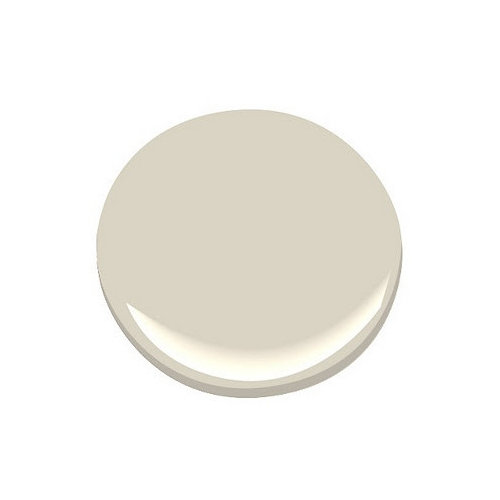
We just bought a lovely custom home, open concept with incredible potential. We love practically everything about it, except the paint colors. At present the colors throughout are overly dark jewel tones with a dark creamy trim (Benjamin Moore OC-8 Elephant Tusk). We love fresh sophisticated neutrals but the problem is the trim color. We do not want to paint it due to the extreme expense. What neutral wall colors will truly work with this dark trim other than Cloud White???

Comments (14)

  • 13 years ago
    I just went thru the same dilemma. I chose HC- 170 Stonington gray. very soft, nice contrast and sophisticated.
  • 13 years ago
    Thanks so much!! I will get the color sample from Benjamin Moore. I've been thinking that I'll try some cool whites and super cool grays to get the effect of a white trim with a neutral, only in reverse position!
  • 13 years ago
    you're welcome!
  • 13 years ago
    #1577 Inner Balance - Benjamin Moore
  • 13 years ago
    Consider Sherwin Williams Amazing Gray. A soft gray with taupe undertones. Love it.
  • PRO
    13 years ago
    Paint names are so off the wall. Just look for a warm white or a very light cream color. Cream (light yellow) and gray are traditional Reniassance colors--look at Florence buildings for example.
  • 13 years ago
    Taupe, some shades of gray, or a deeper shade of the same hue as the trim could all work.
  • PRO
    13 years ago
    Going from deep walls to a lighter color requires priming the walls. That way the new, lighter color will be correct. Once you prime, you will see the hue quality of elephant tusk. The dark jewel tone walls trick the eye into thinking tusk is lighter, and you probably haven't noticed tusk is a putty color with kakhi green undertones. An off white color like cloud white, will be overpowered by tusk and its hue will be more noticable. So my advice is prime first, get a sense of what youre dealing with, and make your decision after that.
  • PRO
    13 years ago
    Just to further illustrate how a dark color can overpower an off white (even strong off whites) look at this old question.
    If you know OC-48 Hazy skies, you'd never guess it was the answer to this question.
    https://www.houzz.com/discussions/did-you-use-a-bright-white-for-the-trim-or-is-it-an-off-shade-dsvw-vd~132247
  • 13 years ago
    last modified: 13 years ago
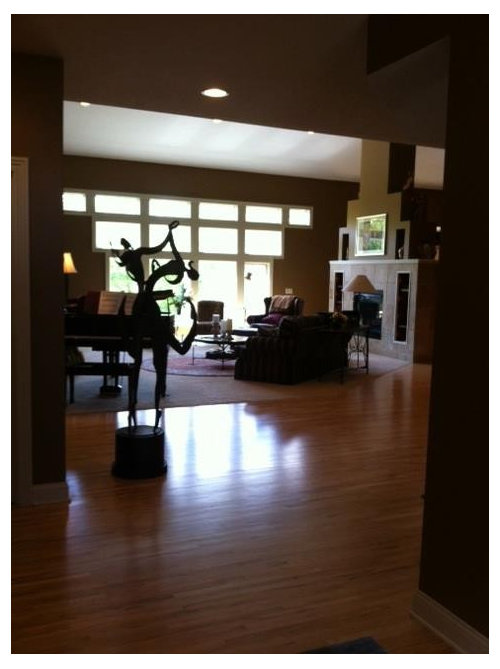
    Thank you all so much for your insight. I completely agree that the deep pigments make the Elephant Tusk appear a creamy off white. It's a real optical illusion. Once I examined it on white card stock, it was a different story altogether. I know the effect I'm after here. I want the trim to look less putty and more like a warm creamy white, and as for walls, I'm happy with anything as long as the color is fresh and modern w/the trim, and brings out the beauty (we have 18 ft walls on the main floor so there's a lot of potential for color!!). Again, many thanks!! Chroma Design, is priming imperative or can we do three coats if needed??
  • PRO
    13 years ago
    Yes, priming is imperative when going from a dark color like yours to a light color. Three finish coats can still render the color wrong.
    I was looking a colors for you last night. I wanted to see them in the day time. No light wall color will make elephant tusk seem like a warm cream. So this is really about managing ET by pairing it smartly.
    I think cloud white is too light and the tone of elephant tusk will be too noticable. So my first inclination was to go slightly dark then ET, in the same family but with a gray tone.. Simpatico colors like these will make the walls and trim blend. But not too much that you loose the look of the trim. So you'll notice the walls by virtue of the surface area. For that I selected OC-32 tapestry beige.
    Second approach was to go with a wall color with the exact same value, close in family yet more to gray. But nothing too steely or cold. At its essence, there has to be a creamy component. For that I selected OC-14 natural cream.
    Stonington gray, as someone suggested, is a third route. This gray has a blue undertone and paired with ET may bring out pastel qualities in ET. A varient on that is HC-172 edgecomb gray. It's cool, but less blue undertone. It's more washed out stone and just slightly darker than ET.
    All of my selections a in the context of your desire for fresh sophisticated neutrals.
    I hope this helps.
  • 13 years ago
    Awesome response! Thanks for helping me out. About the priming, .... what about a paint and primer in one for the first coat. Would that work the same?? This is not a simple house to paint. One more thing. The ceiling in here is ceiling white. Should I consider painting the vaulted ceiling the same color as the trim or a variant thereof? (Trim is warm, ceiling is cold). The trim looks incredibly awful with the stark white above I think. Do I need to do something about this? ... just not sure.
  • PRO
    13 years ago
    last modified: 13 years ago
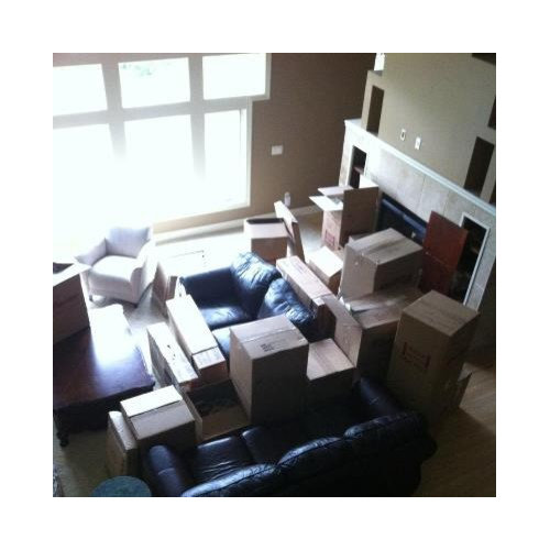
    Your ceiling color should be determined after you have selected a wall color. This way, you can select a ceiling color that relates to the walls. Leaving it pure white is also an option. For example, with cloud white leaving the ceiling white may be best bescuae the walls are so light. If you do something like stoning ton gray or edgecomb gray, your ceiling color would have a similar hue like OC-23 classic gray. With tapestry beige or natural cream, a creamier ceiling color like OC-9 ballet white or OC-18 dove wing might be best.
    A paint and primer combo should have the hiding properties needed to block out the dark exisitng color and render the correct top coat color. The Aura line from BM is excellent and should do fine. It is more costly but will save you time and labor that should justify the added materials cost.
Sponsored
Wannemacher Interiors
Average rating: 5 out of 5 stars26 Reviews
Customized Award-Winning Interior Design Solutions in Franklin Cnty OH