

Ceiling Color for Weimaraner??
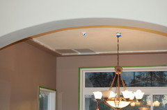
We just painted our living room (Bleeker Beige), entryway (Manchester Tan) and the drywall beam that is 20 feet up a color matched version of Weimaraner. I LOVED the look and decided to paint my dining room Weimaraner but the actual Benjamin Moore one. Since my living room ceilings are so high (no clashing issue) I thought I would have fun in my dining room and paint the ceiling. I painted the ceiling Bleeker Beige (to tie it together)but it doesn't look good at all. The color matched version on the beam looks great with it but the actual Weimaraner has a red undertone to it. So know I need to find another ceiling paint color. The other thing I need to figure out is how to paint an archway leading to the kitchen from the dining room. It has a 2 inch drywall/bullnose frame out surrounding it. I don't love it but it is there and I am not sure if I should paint it the Weimaraner and not highlight it at all or paint it the same color as the window trim.
As far as the ceiling goes it isn't just a flat ceiling, it has an accent that comes out from the wall about 6 inches and goes up 2 inches. It frames the middle section of the ceiling.. so this is another thing should I paint the flat part and the framed part the same or different? I am thinking of just using Swiss Coffee for the ceiling (what is in the rest of the house) but at the same time hoped for something with a little pop. I would really appreciate suggestions and hope my descriptions made sense.. Thank you!
Comments (28)
 14 years ago
I don't know what Weimeramer looks like, but ttod has a black ceiling and it looks fabulous. She has posted pics of it.
It's very hard to visualize without pics. Can you post a pic?
 14 years ago
The Ben Moore website shows it with White Vanilla 2017-70.
Here is a link that might be useful: Ben Moore's suggested pairing
Related Professionals
Richmond Interior Designers & Decorators · Moline Interior Designers & Decorators · Ogden Interior Designers & Decorators · Clarksdale Kitchen & Bathroom Designers · Sacramento Kitchen & Bathroom Designers · Pueblo Kitchen & Bathroom Designers · Bismarck Kitchen & Bathroom Designers · Pullman Kitchen & Bathroom Designers · Chatham Kitchen & Bathroom Designers · Edmonton Kitchen & Bathroom Designers · Albany Furniture & Accessories · Richmond Furniture & Accessories · Shreveport Furniture & Accessories · Saint Joseph Furniture & Accessories · Knoxville Furniture & Accessories- PRO14 years ago
This is a website I found on this forum. Maybe it can help.
I have the same color woodwork, and have been trying for month to find a color in the gray family I like.
http://www.favoritepaintcolorsblog.com/ - 14 years ago
First thing I would do is check your light bulbs if it was lights on that was causing the purple clash. My blue dining room looked great with natural light and went purple when we turned the lights on. I changed to a brighter white Reveal bulb and that really helped. Later we changed the fixture and now have krypton bulbs and they look great! If you are using regular incandescent bulbs, they have a warm light and add red to the colors, especially at night when there is no daylight to balance it.
The color matched version you put on the beam is also on a different texture surface, a different elevation and getting very different light. I learned with a recent project that the more color saturation in the paint, the greater the difference those things will make in how the color looks -- and that was from the same paint can. I wouldn't worry about that beam -- it looks great and is separated from the dining room so you have that break.
You can always do a ceiling in a lighter version of the same color. My kitchen ceiling is some of the leftover wall paint mixed into a gallon of white -- maybe 20%, and it looks great.
I just painted Wish on my bedroom walls and love it. I have a Weimeraner chip here with it and they look good together. Have you looked at that one? Do you want more of a tonal variation or a contrasting color?
mommy2nk
Original Author14 years agoI think I am lacking color with my walls being bleeker beige and Manchester Tan that I think I would love a pop of color to add visual interest.. You see it from the entrance so I don't think it should be crazy.. I think I want it to be a contrasting color. Part of me is even thinking about changeing the wall color all together but I do really like the color. I just picked up paint chips from Ben Moore and found a color called Wasabi.. I was thinking may just painting the 6x2 ceiling accent Weimeraner and then the middle ceiling the Wasabi, but I don't know. The color Visualizer says Gingerbread man goes nice and the chip looks great but I don't think I want to go orange.. I also picked up dark colors.. I am so confused!!
- 14 years ago
I think all the colors from the Affinity deck work together. So, I would start there.
How daring are you? Wenge is a dark color in that deck. Want something a little more different? What about Kalamata?
- 14 years ago
I like Wenge -- that would be very dramatic, but I would look at the pigments that go into it. It might make the tendency to pull purple worse. Kalamata would seem to be even more so. They look good, but not sure that's a direction the OP would like based on the purple comment.
I was looking for color clues in the photos and found beige, black and cream and a tiny bit of oak and stainless in the kitchen. Do you have a favorite color that isn't beige, brown or black? If so, I'd take a cue there and see if you can find something in that family that works well.
I'll be honest and tell you that based on the way I see Wasabi on my computer monitor and the color chip I have of Weimeraner, I don't see those working well together.
I do have a Weimeraner chip here that I've been looking at for my living room. I looked at it with the Wish (another Affinity color) I just painted in another room and like that combination and possibly Eternity (another Affinity -- more gray) for a softer look.
If you want more color contrast, I looked at Weimeraner with the Historic Colors chart I have here and liked it with some of those. Since you seem to have green and gold undertones in your selections, and looking at the green, black and oak in the adjoining room, I'm thinking the dark greens, like Lafayette Green and Narragansett Green, might be good. You could do something like Georgian Brick if you want a warmer color, but I don't really like the golds or anything yellow I've looked at with it.
I would probably treat that accent you are talking about like a crown and paint it the same color as the trim. It could also be an accent color that compliments the wall and ceiling colors, but part of what I can't tell is what happens on the kitchen side of that arch? Does a trim or accent color have a neat place to end or does that wrap into the kitchen? The ceiling is easy, but the arch might not be.
mommy2nk
Original Author14 years agoThank you to everyone for helping me out on this! I pulled out a couple of dark samples that I had and put those up but didn't like the dark contrast at all.
Lascatx- I thought maybe it was the lighting too especially since this morning it looked more grayish taupe but then the sun started to show through and it pulled a bit purple again. I have to say Weimaraner is a very strange color. I know all colors change with lighting and time of day but this color really changes. One minute I love it and then next I am questioning my choice. The other thing is the paint chip really does not represent it well. It shows none of the red that comes through.
I had a couple of sample pots of dark paints and put them up but I didn't like the dark and I know I wouldn't like purple.
So far the colors in my house besides the beige's are Palladian Blue (love it!) in my craftroom and it is accented with orange, green and white. Behr's Nurture is in my Master Bedroom accented with linen, ivory, and bluish-green bedding. My kid's rooms are Purple (the teen picked it out!) My son's is a nautical them with navy and white stripes, dark power blue, and a pirate mural. My little girl's room is a princess themed room. When I have gone to look at model homes the thing that I noticed most is that they were full of color but the walls were very neutral. The color came from the home decor. I was always drawn to the houses that had turquoise, greens, white and had a light feel to it. We just bought our house and much of our furniture is hand me downs, or just cheapy stuff. We will slowly start buying our good furniture.
Our house does have the oak but we will be putting in dark wood floors and a white kitchen (eventually).
The accent on the archway is only in the dining room, from the kitchen it just looks like a normal drywalled archway. I painted the archway then same color as the wall, and I think I like that. I also painted the flat portion of the ceiling a white color but it looks to stark. So, I will need to play around with it a bit more. If this was just a plain brown, gray or taupe I don't think i would be struggling so much.- 14 years ago
I have looked at the Affinity colors but painting the Wish was the first one I have used. I think BM paints have more layering in the undertones or something that creates more life to the colors than others I have used. I was nearly matching a color when we did wall repair in my dining room, but wanted it just a tad darker because I felt like the color may have faded over the course of about 9 years. Looked good when it was done, but when we hung the same pictures back in the same places, I just said, "Wow!" The walls and the pictures all looked more alive. Whatever it is, I think it also gives more color movement in different lighting, especially in the Affinity colors. Wish definitely changes with the light.
I was just about to call it a night and saw this thread had another reply, so I'm sitting here in not the best light. Seems like you have a lot of blue in the house (even purple is a pinky-blue ;) ). I don't have any Affinity blue shades here, but I like a lot of the Historic Colors blues with Weimeraner. Van Deusen Blue, Philipsburg Blue, Van Courtland Blue, possibly Templeton Gray, Knoxville Gray and even Yarmouth Blue or Buxton Blue (paler blue-green). The darker shades will give you the kind of drama you can get away with in your dining room without going over the top, while the lighter shades could have a soft elegance as long as you avoid a bedroom-y look.
I can sympathize. I recently painted the tray ceiling in my bedroom because I was getting a new crystal chandelier and I wanted it to be set off against the pale blue. It was hard enough to get the blue right for a ceiling (not too pale, not too dark, not purple or lavender, not sweet baby blue, not gray....) much less 3 different levels and angles of light. Finally go it -- then the wall color didn't look right and I had to start over there. That is where I painted the Wish.
I really like the Wish and the Eternity with the Weimeraner. Eternity is more to the gray side and in certain light looks a bit blue -- which you might like since you have a lot of blue in your house. You seem to have an idea in mind and I may not be thinking in at all the same direction. Hope I haven't made things worse. When you get your wall and ceiling colors, figuring out the trim will be easier. Something like Wish or a creamier color for the trim and a blue/gray on the ceiling, or do a darker trim and a lighter ceiling. have fun and try not to stress -- it will come to you.
- 14 years ago
Wait, did someone say blue?
What about painting it a pale blue? Constellation is in the Affinity deck. That might be beautiful.
Bee
- 14 years ago
i painted ours BM grey wisp and it looks nice... not perfect, but went with the color scheme in the room...

mommy2nk
Original Author14 years agoBusyBee3, I saw your picture and was curious what color the ceiling was. I actually was looking at Gray Wisp yesterday. Tell me your thoughts on this paint color, does it pull red and purple to you? Lascatx you mentioned with the blue avoiding it looking bedroom-y, how do I do that? I looked at the samples you mentioned and those colors were very pretty but I think to dark for the ceiling. I picked up two samples Tranquility and Pashmina, I haven't gotten them up just yet. The paint guy today said something that I didn't know and wasn't explained when I bought the Weimaraner. He said that Affinity colors are formulated to be used with the Aura and Natura(sp?) paints although they have formulas for the other paints. He printed up the formula for an Aura can and then for another Ben can. The formulas were different. I am curious if most people use the Aura, which is every expensive or if they use one of the other Ben. Moore.. I don't know how dramatically the changing of the paint type would change the color if at all. I really am wanting to love this color and have it work mainly because I just don't want to start the whole process over. I put up many samples Palladian Blue, Oyster Bay, Svelte Sage, Retreat, and Saybrook Sage amoungst others.. I am just don't know what to do!!
mommy2nk
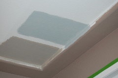
Original Author14 years agoWell, I put the two samples up on the wall and I like Pashmina but not with Weimaraner. I do like Tranquility a lot but I worry it might look more bedroomish then dining room. Here is are a couple of pictures, Pashmina is the brown color and Tranquility is a bluish gray. Should I just scrap the whole idea of color on the ceiling?
From Living room:
Different angle:
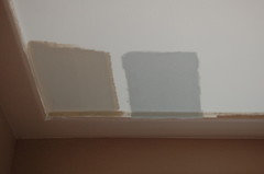
- 14 years ago
I like the idea of the blue color up there. One thing I've learned about blue is go lighter than what you think or else it will be "too much". I still think if you go to the Affinity colors and find the lightest blue you can, you might find a winner.
Or even try Gray Wisp as suggested above. It really is more of a blue than a gray.
mommy2nk
Original Author14 years agoI have a paint chip of gray wisp and it is very very close to Tranquility (an affinity color) which is what I sampled in the picture. I found a picture of a bedroom done in Tranquility and a something Lodge from Ben Moore. I think I am going to just go for it, but what do you suggest as far as how to paint the tray ceiling, should the whole thing be the blue? Right now the 6 x 2 portion is Weimaraner, leaving just the flat portion to be painted. Just curious what the best design would be, thank you for all your help!!
- 14 years ago
I was trying to reply earlier and my computer decided to freeze up. I will try again.....
My bedroom is similar to Busybee3's and I thought I'd show you another variation on the theme. I repainted the tray ceiling to have the blue behind the new chandelier (my touch of whimsy -- so unlike anything I've done, but I love it). I'd always wanted to have the center blue, but we brought it down on the entire tray. These are the walls that are painted in Wish -- it would probably look darker and bring out the gray on the ceiling because the light angles are different. The ceiling here is Lily White plus (added one shot of black at the store and then Oxford Gray, the darkest color on that strip, from a sample pot at home to make it more gray and less sweet baby blue. The Beacon Grey (you just see a corner of on the far right of the strip below) went dark and a bit purple on the ceiling. You would have never guessed from that strip.
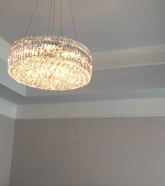
Keep in mind that Weimeraner has a lot of red in it. You keep going towards yellow and green (more yellow) undertones in the colors you are looking at. That really brings out the red in Weimeraner sometimes looking pinkish or a bit purple. The yellow tones in your adjoining areas and oak (floors are oak too?) may be part of what is causing conflict here too. I think you need more blue. Not a blue paint necessarily, but a color with more blue in it whether it is a blue, gray, green, even a red. Look at these ideas.
Here is Weimeraner with Wish as an accent color and a blue gray (these are the darkest shades from the strip on my ceiling but you've already seen a lighter variation on my walls and ceiling). Not my pick, but a reference point. Another shade of a grey blue could be great.
{{!gwi}}And this is a deeper blue as well as a red with a bit of blue.
{{!gwi}}and then a gray and a blue green (Knoxville Gray and Yarmouth Blue)
{{!gwi}}
I like all four of these. And more, but I would try to find a direction adn then hone in on the perfect color.If you don't paint the ceiling accent white, cream or a lighter color (I put Wish in the middle so you could see 3 colors together), I would paint it as part of the ceiling. Painting it s part of the wall brings the sides of the room in visually and you rarely want to make a room feel smaller.
Sorry for such a long post and a long time trying to get it to you. Hope it helps you in some way.
- 14 years ago
weimaraner is an interesting color... definitely has a purplish tone in certain lights... (and in order to have that purpley tone, there's gotta be reds-) but, it's deep enough that it doesn't have a 'pinky' look which i really don't care for (wish and even pashmina took on a pinky look in my rooms)... i have dark cherry furniture, that blueish green which you see in the curtains, and chocolate brown as the main colors in the room.
i did not want my ceiling to be a pastel blue and it's tough for alot of these colors not to seem baby blue up on the walls even though on the card they seem quite gray... i am quite happy with the grey wisp on the ceiling-- when the curtains are open and the blinds are up, it definitely washes out a bit(and i wish i had gone with a sl deeper color) and in certain light it loses almost all of the greenish tone-but, in that room i do prefer it being bluer than greener, so even that's ok!
i don't like your sample of the pashmina either with the weim---if you wanted it sortof the same tone of weim, i'd probably do weim on the ceiling too-otherwise, i'd go much lighter than the pashmina or get into a different fam of color. or maybe something like barren plain or nimbus to get more gray (less red) in there...(i haven't sampled either of those colors.)
i like the 2nd pic of the tranquility where it looks more toned/grayed down-the 1st pic is what happened to alot of colors in our bedroom-all of the gray disappeared! - 14 years ago
Interesting. Wish is not pink at all in my home, and Pashima tends to go green. My ceiling issue was going as grey as possible without DH saying all he saw was gray. The rug reflects more blue onto it, and then it looks even bluer with the flash. I needed to avoid the green and lavender tendencies too.
Doing Weimeraner on the ceiling would be an option, but I think I'd have the accent in a contrasting color or you will lose that detail. mommy2nk
Original Author14 years agoLascatx, I love your chandelier!! It is beautiful and I think both your's and Busybee's rooms are beautiful. From the pictures I really like the Blue and Wish together.
I don't like the Pashmina with the Weimeraner at all but I do like the Tranquility color. I compared gray wisp to Tranquility and Gray Wisp has a slight greener tone and Tranquility is bluer but very slight difference. I have a Sherwin Williams fan deck and I like Rain I am going to get that sample which is a lot more bluish then Tranquility is. I really do think Tranquility is the winner but I think I should put a color with a tad more blue just to see the difference. I know blue is going to be it but just have to find the right shade, I certainly don't want the baby boy blue look..
You guys are so very helpful, I REALLY appreciate it!!
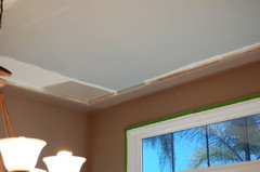
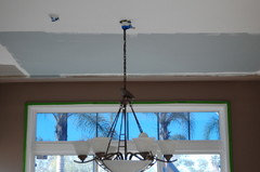
Here are pictures of my ceiling with more of the Tranquility painted on:
With Lights:
With out lights:

 14 years ago
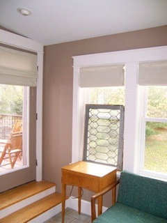
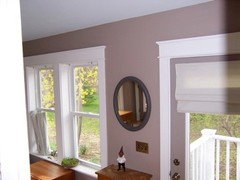
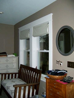
I haven't perused the other posts in detail, but I used a 25% mix of Palladian Blue in my Weimaraner mudroom, and am constantly getting compliments on it. (just fyi the trim is Soft Chamois.) You know how difficult it is to photograph this color, so here it is at various times of day:
 14 years ago
I have the the Affinity color Constellation AF540 on the ceilings of 4 of my rooms. In the bathroom I have Wish on the walls and constellation on the ceiling. Love it. I also have Constellation with Grasshopper, Hush and Pittsfield buff. It looks rather light on the paint chip but it really isn't. I have it here with the fan deck and it looks good with Weimeraner.
I think Wish would look nice also
mommy2nk
Original Author14 years agoWell, we went with Tranquility by Benjamin Moore which is bluish gray color. So far I am really happy with it. It is so differnt to walk in that room and see this blue ceiling but I like it. I think it goes really well with the Weimaraner and I don't know how but it seems to really tone down the reddish/purple hue that was coming out at certain times. I had a birthday party for my daughter's 18th birthday last night and several of my family LOVED the walls. They kept asking what the color was. I would tell them and then ask what they thought about the blue ceiling and every single one said "what blue ceiling?". They didn't even really notice it being blue until I pointed it out to them. I am actually glad about that because it means it is suttle and not in your face. I have to say the more I look at the walls, the more I love them. This color (Weimaraner) is pretty amazing!The room itself is incomplete (changing the light, painting the trim, curtains and so on) but I wanted to post pictures of the ceiling. Thank you for all your help.
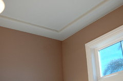
{{!gwi}}
{{!gwi}}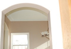
- 14 years ago
Looks good! Isn't it funny how colors change as you go and then almost every time you look at them for a while? Your pictures look like they could be 3 different colors and I feel the same way about my bedroom ceiling. Sometimes it is grey, sometimes blue and sometimes I want to repaint it. Definitely love the wall color and the chandelier though, and am going to finish the room and live with them all together for a bit and see how it goes.
Now, wanna help me pick a color for our gameroom? While looking for our bedroom, we found a wall unit and a leather recliner sofa at an outlet store and got incredible deals and made an unplanned purchase. I didn't realize how tough the boys had been on the walls. Wish I had painted first!
mommy2nk
Original Author14 years agoI have the family room/kitchen, my bathrooms and my laundry room left to paint. I can't believe how hard paint is to pick out. I really like the look of your room with Wish, I may need to get a sample of that. There are no windows in two of the bathrooms and the laundry so I am going to have a hard time with colors for those rooms. Speaking of being hard on walls, now that they are freshly painted I notice it more. There are little kid marks on a few walls and it has only been 1 week. Goodness!! Well, I can't wait to see what you choose for your gameroom.
- 14 years ago
I haven't even gone upstairs with the paint ships yet -- may get a chance to start looking at what I already have to get a starting point tomorrow.
 11 years ago
I actually have a friend who recently painted her livingroom/kitchen in the BM Weimaraner. She painted her ceilings (as well as the kitchen cabinets) BM Mascarpone. (Side note: both the weimaraner and mascarpone are in the affinity collection, supposed to go together) - I know this is a little late in the game for a comment, but I just saw this, and when the original post was made she had not yet used these paint colors, either. Hope things went well/go well.






mommy2nkOriginal Author