Software
Houzz Logo Print
eagertopaint

window treatment question

16 years ago
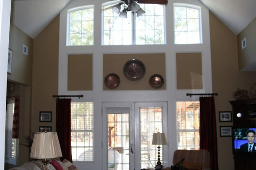
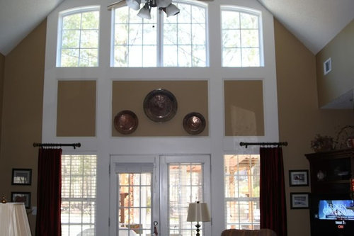
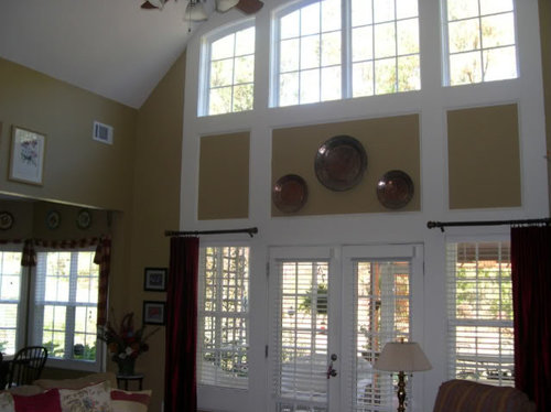
I am wondering what is the best way to treat these windows. I presently have the single panels on each window, as I don't really want to cover the windows but add some color and softness to the window area...Would longer panels look better that go all the way up to below the top windows? Valances? If you look closely, there is a lot of wood work around the windows....Any help would be greatly appreciated..

Comments (45)

  • 16 years ago

    It would make a bold statement and look great I think if you had draperies that went from the bottom of the upper set of windows. I would probably have ones that could close if you ever wanted to do so. Lovely, lovely space.

  • 16 years ago

    Because the wall is sooooooooo tall, I definitely think the panels would look better w/more length. As cyn427 suggests, right under the upper set of windows would look perfect. I would paint the outer insets on either side of the larger one white, as not to detract from the draperies. Keep the larger inset as your focal point. ;o)

  • 16 years ago

    Thank you Patty cakes and cyn427. That is exactly what I needed to hear. It gives me the inspiration I needed to go ahead and do this....Any ideas of what type fabric? Solid? Plaids, bold checks, embroidered silk and should I stay with the present color panels or should I get a totally different color? Thanks for your help.

  • PRO
    16 years ago

    {{!gwi}}

    I'm not sure of the color you should use because I cannot see your entire space. However, I think the red (is that what you currently have?) may be too strong for that space. Also, I'd use white rods/rings to match the trim, or as in the picture, no hardware. The above idea is a box pleated panel and would have to be board mounted, or could hang from a small hidden rod.
    I also think you could swag the top portion to cover the tan boxes between the windows. I didn't take out your old window treatments, so you may see the hardware poking out from behind the new ones!

  • 16 years ago

    Sallymo's 'rendition' is perfect! As for color, I kind of like the golden-brown color she used. I see you have a lot of red in the house, but feel the panels might be *too* much red. ;o)

  • 16 years ago

    Yes, yes, hang them high! It will look great! Love the coppery brown color too. Beautiful room!

  • 16 years ago

    Thank you all so much for your advice and especially to Sally Mo for your rendition of what the longer panels would look like...I have to say that I have never thought of using the coppery golden brown color, but I have to say that I love it.... I am attaching a few more photos of my room to give you a little more of an idea of what it looks like...As you can see, i have a very busy carpet that I purchased overseas some years ago. It sometimes can be hard to work with.... Many thanks!

  • 16 years ago

    Boy, you guys are good! The mock up looks so nice!!

  • 16 years ago

    Have you ever considered painting out the boxes in the middle in the trim color (white), first adding some additional trim moulding to create panels there? I am not crazy about the boxes with the wall color in the middle - it makes the area feel choppy. Then hang drapery, in a rich deep blue, as sallymo suggested from below the top windows.

  • PRO
    16 years ago

    I thought the same thing les mentioned---paint out the boxes in the trim paint. I am afraid that if you do the treatment in the mock-up that you'll end up with little triangles of the wall color showing on the outside boxes because it'll be difficult to swag the panel just perfectly.

  • 16 years ago

    Great information. I have often thought that the boxes make the area look choppy as well, but wondered how they would look painted white... A rich deep blue sounds pretty for the drapery panel color.... My dining room is blue which I love the wall color with gold panels in there, so perhaps this would help to bring it all together... photo of dining room is attached... thanks to all for your help.

  • 16 years ago

    It already looks good but will look even better with the longer panels and painting the boxes white. Especially the bottom boxes near the floor. They will make the windows and doors look more uniform.

  • 16 years ago

    Another vote for painting the boxes white. I love the idea of using the DR blue for curtains. Also love the rug.

    You didn't ask....but I don't love the short rods in the DR. Is there a functional reason for them? They just seem truncated to me.

  • 16 years ago

    amysrq, just wanted to do something different with the window treatments hardware. The panels do not need to be closed for privacy but are there only to add color to the room...I have seen the short rods used elsewhere and liked them.... Thanks!

  • 16 years ago

    Thank you for handling my critique so graciously. In the end, it's what we like for our own homes -- nothing else matters! I still have circa 1997 tab-top panels on tension rods in the room I'm sitting in right now! pathetic....

  • 16 years ago

    I so appreciate everyone's help...Now that I have decided that I need the longer panels, I am wondering if I should go with a solid color, or should I have the type panels where there is a print such as a paisley, plaid etc for about 1/3 of the way down from the top and than a solid at the bottom...I guess you would marry the two of them together with a trim.. Would this be too much since the area seems choppy with all the woodwork? I am leaning toward blue for the color, but really like the warm coppery brown. Any thoughts are greatly appreciated.

  • 16 years ago

    Trying to bump up. Thanks

  • 16 years ago

    Looking at the room again, if you can afford to do it, I would also add trim around the wall opening to the kitchen.

    Add trim inside those boxes above the doors before you paint them, to give them the same look as the panels in your DR and LR.

    As for the drapery, I wouldn't chop them up by using different fabrics in sections. I think you have enough going on with all the windows and doors. However, you might consider doing the panels in a print of some kind, and then banding them in the blue.

    This is an old favorite that has been used on this site by others. I could see it easily working in your room, with a thick blue banding:

    glidwell regal

  • 16 years ago

    les917, thanks so much for your help. I will definitely consider adding the trim.
    I wondered if doing the panels in a print would be too much since the carpet is so busy. I have seen the fabric that you suggested and think it is beautiful and often wondered if I could use it....I love that! Makes me thrilled to think that someone else thinks that it would work. Thanks.

  • 16 years ago

    I don't see the carpet as that busy - the design is relatively small in proportion to the size of the rug and the space.

  • 16 years ago

    Hi Eagertopaint....I have no window treatment recommendations for you because I possess no talent in that arena, but I do love 'Sallymo's' interpretation. I just wanted to tell you that your room is gorgeous and an inspiration for our Decatur Buff. I also remember loving your blue dining room and its furniture when I first visited this site. Your home is beautiful, warm, and welcoming, and just wait until you get those lush curtains hung....!!!!

  • 16 years ago

    Ditto Begoniagirl...LOVELY home!

  • 16 years ago

    Thanks to all of you for your help. I will post pictures of the panels one day whenever I get them hung. Just still have to make a decision as to exactly what I want as far as color and if i really want a print or not....big decision! I have learned so much from this forum. It is so great to be able to inspire and learn from each other.

  • 16 years ago

    Your home is beautiful.
    Love the idea to add moulding & paint the squares the same as the trim. In fact, I would love to see a pic after that is done & see if you really need drapes.

    I have used the pheasant fabric Les linked to above. I think it would look great with your rug. It would also look wonderful on your kitchen windows as drapes!

    Smiles:)

  • PRO
    16 years ago

    {{!gwi}}

    Here's the fabric linked above.

  • 16 years ago

    Scoobyruby, thank you for your help. If you have pictures of the glidwell regal fabric used in your home and don't mind sharing them, I would love to see how you used it and how it looks...it indeed is a beautiful fabric.

    SallyMo, thank you for another rendition using that fabric. Wow! Can't believe how it looks. I can see that it wouldn't be too busy in the room with my rug...

    Just wondering if I could use the same fabric in the kitchen as well, or should i pick it up in the pillows on the sofa??? Many thanks!!
    Yu all have been a big help.

  • 16 years ago

    Scooby - You have the Glidwell one? I thought you has the Wilderness Royal? They actually look the same on my monitor.

    At any rate, I like the whole pheasant fabric mock up on your windows too!

    I copied Scooby. :)
    {{!gwi}}

  • 16 years ago

    Very pretty bathroom. Is the only difference between the glidwell regal and autumn wilderness the background color? Both are very pretty.

  • 16 years ago

    Thanks! I'm thinking it must be the background.

    Bumping this up.

  • 16 years ago

    I have ordered samples of the glidwell regal and a few others that have some of the colors suggested above, and can hardly wait for them to arrive...

  • 16 years ago

    Hi! I ordered some samples of fabric this week and am wondering which ones of these you like or dislike and think would work as the long panels in the living room.
    Thanks so much for your help!

  • 16 years ago

    I think the first one feels kind of Southwestern to me, so not really the look you have going in the room.

    I like the second one, but it seems better suited to upholstery - at least from the look of it.

    I like the third one (surprise, eh? LOL) because the scale seems good and I would like to see the blue brought out in the room, and it works well with the area rug.

    Not crazy about the 4th one - I think the scale is too small, and it will end up reading like a solid.

    Like the last one as well, reminiscent of the Gildwell pattern in #3.

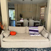
    In the couch pix, I also see a floral. Pretty, but changes the feel of the room to a much more feminine, casual space.

  • 16 years ago

    With your sofa and rug, from what I can tell of the colors, I like the 3rd best and the 2nd next. Not crazy about the 4th pattern.

  • 16 years ago

    Thank you les917 and tryingtodecorate...Always great to get someone elses input... As for the pillows, I think I will probably have to change them depending on what I end up with for the panels... I am wondering if the 4th pattern would not be too dark...Thanks for your help.

  • 16 years ago

    #2 (kitty almost standing on it) almost matches your pillows, same colors just different flowers? Not sure if I like the light background with your wall color though. I like #3 best.

  • 16 years ago

    Thank you ajsmama, that one does seem to have all the colors I need. Just not sure about the peacocks in it.. They are so pretty though.

  • 16 years ago

    #3 is pretty, no doubt, but the repeat is such that when the fabric is pleated, the resulting image will compete with your rug. I'd prefer #2 or the last one.

  • 16 years ago

    I don't see peacocks? The #3 I was talking about is on the same cushion as the cat and the fabric with the light background. I don't know about pleats and repeats though.

  • 16 years ago

    Sorry ajsmama, I got your post confused with another persons post...I am thinking that the one you mentioned is too light as well for the wall color.. I have lots of thinking to do before making the big decision... I will let you all know what I choose. Thanks for everyones help.

  • 16 years ago

    I vote for #2.

  • 16 years ago

    Wow, I seriously LOVE #2. Hmm, I think I may see if I can go hunt that fabric up and redo the small benches in my foyer.

  • 16 years ago

    I personally would go with a solid or a small print . The picture posted with the pattern drapery is only showing the window and not the rest of the room so it is deceiving. I think the patterned fabric is too much on those big windows. I would choose a color close to the wall color but deeper shade...those are big windows and already a big focal point the in room, they dont need much more attention.

  • 16 years ago

    My daughter likes the small checked one above, but I think it is too pastel looking for the room...I do like Sally Mo's first rendition with the deeper golden brown... roseabby those are big windows..Any links or ideas for the fabric colors that you are suggesting? Thanks to all of you so much...

  • 16 years ago

    I dont have any particular fabric I could suggest to you while I like the deep brown I think a bronze color would look fantastic according to the colors I see on my monitor. If it works, it would tie in beautifuly with the blue in your dining room too.

  • 16 years ago

    Eagertopaint, I didn't see the new pics you posted until today, and in all honesty, think a print on such a long panels could be too much print as well as tiring of the draperies quickly. Before I built my home a year ago, I went thru many model homes, and did see window treatments w/pattern, but the pattern was usually more subdued and not so prominent, and if so, was usually a valance. IMO, a solid would be the way to go, but that's just *my* opinion. The printed draperies seem to take over your beautiful room. ;o(