Software
Houzz Logo Print
flatcoat2004

Exterior paint colour selection

18 years ago
Hello,

My contractor is getting ready to paint the exterior of my little Victorian cottage, this week they are priming and patching, so I only have a few days to finalise my paint selections.

Let me preface this by saying that it has to be blue :-)... I adore blue exteriors. I love the blue of well-worn jeans, faded.

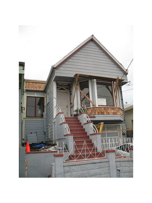
The house is slowly being improved from a very dilapidated state. Current colour scheme is pale blue-grey (battleship grey, I think), with white trim and dark red accents. I would like to deepen the blue, and soften the trim colours a little ... slightly yellow cream and burgundy. The roof is dark grey, and to give you a flavour of the streescape, the neighbouring houses (which are CLOSE) are kermit green, tan, barn red, and beige).

Here is the poor little house ...


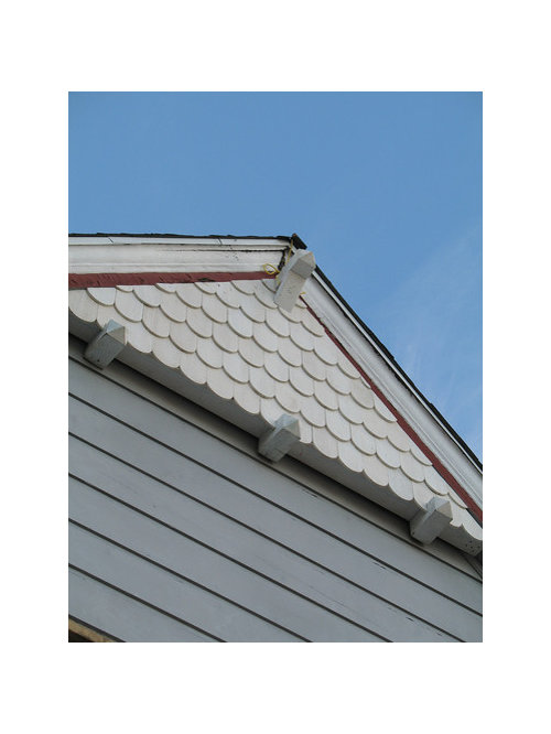
The cedar fishscale shingles are all new, and a new gable ornament was just installed, I only have a photo taken from right below ...

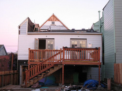
Here is the back of the house ...

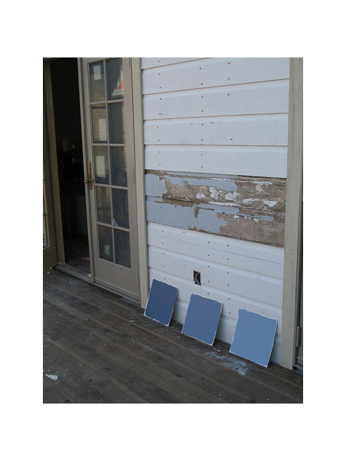
Here are some options I have painted sample boards for ...

from left to right they are Blue Heron, Stratford Blue and Harlequin Blue (all Ben Moore).

I was thinking of Montgomery White for trim, and a standard burgundy for accent.

Suggestions/comments would be hugely appreciated !

Comments (53)

  • 18 years ago

    I think the question to ask yourself is what look are you trying to achieve? Do you want a traditional, classic look, or perhaps something a bit modern and edgy? Does whimsical suit you? Or are you more inclined to be conservative? How do you feel about the Kermit Green? Do you like it, or does it make you say "Yuck" amidst the other, more understated house colors? How do you want to fit in to the neighborhood...or not?

    What I think of Montgomery White is that it is beautiful and it is very yellow. That could work for you and maybe it won't. I think you have to settle on a blue first and go from there...

  • 18 years ago

    I'm looking at my fandeck and the ones that catch my attention are Nimbus Gray, James River Gray and Smokestack Gray.

    Laurie

  • 18 years ago

    I just found the ones you mentioned. I think Van Deuson and Newburyport Blue are too dark. Buxton Blue is pretty, but I like Van Courtland Blue the best.

    Laurie

  • 18 years ago

    I like Van Courtland Blue too out of the ones you mentioned. You might try BM Winter Lake from BM Preview line. It's a beautiful color. If you want to go a little more subtle you might try New Hope Gray.

  • 18 years ago

    Thanks everyone for your ideas !

    Amy, excellent questions. The Kermit Green house butting up to mine is nice from the front (a more muted green) but badly matched and too bright on the rear. While I am not super conservative, I like things that are on the verge of whimsical, I suspect. For example, when the new owners of the house opposite (a VERY large house) painted it barn red (from pale beige) I was at first kind of offended. But it has grown on me and now I really like it.

    The neighbourhood is NOT one that couldn't embrace something different. This is San Francisco. You should see some of the psychedelic paintwork around here :-)

    So I went down to Ben Moore, and msrose I agree that Van Deuson and Newburyport are too dark. I brought home Buxton Blue and Van Courtland blue samples, here is a photo in fading light ...

    I'll defer judgement until it dries properly and I view it in full daylight, but I am leaning towards Buxton Blue I think. Van Courtland seems too much like the current colour, and I really want to make it different. Make it really "mine" if you know what I mean.

    This might help ... here is a house that I love.

    I'm thinking that this looks closer to Buxton Blue ?

    paddytc, I'll look for Winter Lake on my next trip to the store, thanks for the pointer !

    And I took a new picture today of the front of the house, showing the new gable decoration in place. She is only half-primed, so it feels like I'm showing you a picture of a lady with her petticoats flying up :-). She will look better soon though, if only I can pick this darn colour !

  • 18 years ago

    Your inspiration pic is gorgeous. Can you ask them what their paint and colors are? You also have to consider the size and layout of your particular house, and what else is around it in the neighborhood.

  • 18 years ago

    Is that Buxton or Buckland? :-) In the fading light, it looks quite dark, more like Buckland Blue. I will be interested to see how it looks in bright light.

    Another question....what will be painted? The stairs? Railings? Garage door? Have you thought about how that will all play out?

    I had a feeling you might lean toward whimsical, but I didn't want to say that. I think the original purple-leaning blues would have made for a fun and fresh combo. But, your inspiration house is a bit more subdued.

    Again, I have to tell you, the house is cute cute cute!

  • 18 years ago

    Wow amy, you are GOOD ! You are quite right, I went to check the sample pot and it is indeed Buckland Blue, not Buxton !

    Me, whimsical ? (tee hee !) Well, maybe a tiny bit :-)

    Squirrelheaven, do people do that ? Just knock on doors and ask "what's your paint colour ?". Oh if only I were brave enough to do that !

    Thanks for your compliments for my humble little house. She is looking better every day.

  • 18 years ago

    lol, I went around with a level recently. Like I didn't look too crazy. They're siding my community (gag). Can't even get the stuff on straight.

    Here is a blue (mixed) similar to your neighbor's house. Then moving to a purple undertone. Right on to periwinkle ;))

    Are you planning on any trimming along the front? I just slapped a few pieces of moulding across, as it really makes a difference.

    Maybe a whimsical door color -- even red like your neighbors!

    {{!gwi}}

  • 18 years ago

    flatcoat - I can't tell you how many times I've knocked on someone's door to find out the name of a plant they were growing in their yard. If I can do that, you can ask about a paint color :)

    Laurie

  • 18 years ago

    Do you have a sample card of Jamestown Blue? It's a little more vibrant than Van Courtland Blue, but not as much as Buckland Blue?

    Laurie

  • 18 years ago

    Oh well, I'd forgotten the 'has to be blue part.' I'm sure others will enjoy seeing a bunch of colors though : ) Sorry, I forgot the lower level when in the blue-greens. It's not supposed to be two-toned : ]

    Maybe you're planning on some moulding across the top -- anyway, this dental from your inspiration house looks great!

    {{!gwi}}

    {{!gwi}}

  • 18 years ago

    I walked outside one day to find my neighbors with paint chips up against my house.

    I think if you ask the owners of your inspiration color, they will be flattered.

  • 18 years ago

    I agree with Kelly (as usual...) that after we spend so much time sweating over our color choices, to have someone ask is highly flattering.

    Of course, context does matter. I want to see Kermit! ;-)

  • 18 years ago

    I love it in the blue from your inspiration house! What a pretty home!!!!!!!

  • 18 years ago

    When we first moved into our house, the paint colors were new in the area. I can't tell you how many people stopped and asked for the colors. I finally had to put a piece of paper on the hall table so I could tell people what to buy. I was very flattered.

  • 18 years ago

    OK I'll see if I can muster up the courage to go knock on that house's door and ask what their colour is.

    This morning I put a second coat on my small test patches of Buckland Blue and Van Courtland Blue, will post pics when they dry. And I put up patches of my previous favourites, Stratford blue and Blue Heron. Um, I'm glad I did. I think Amy used the word "electric" ... you weren't kidding ! I laughed as soon as I saw the paint coming out of the pot. It's so weird, it looked much more muted indoors ! They were a little more psychedelic than I was aiming for ;-)

  • 18 years ago

    OK, I'm baaaaack !

    Unfortunately no-one was home at my inspiration house today. Will try again tomorrow.

    I revisited the Ben Moore Historical Collection, and brought home a few more sample pots. Here is the collection of patches I now have on my back wall ...

    Top left - Hemlock (looks greener than in photo)
    Middle left - Buckland Blue
    Bottom left - Philipsburg Blue
    Top right - van Courtland Blue
    Middle right - Stratford Blue (looks purpler than in photo)
    Bottom right - Blue Heron (looks MUCH purpler than in photo)

    At the moment, I am really liking Philipsburg Blue, with Buckland Blue running second. It seems that Philipsburg Blue leans slightly towards the purple that I was originally draw to, while being more greyed down. Tomorrow when the Ben Moore store opens, I'll also get some Jamestown blue to check that also. I need to decide tomorrow or by Tuesday at the latest. I kind of got surprised by how fast this colour decision came upon me, I'm feeling rather unprepared.

    Oh, you wanna see Kermit ? I kind of feel bad showing you the entire house, but here is the wall right on my property line next to my new deck ...

    Hmm, in truth it reads much greener than that IRL.

    Wow squirrelheaven, thanks for all that photoshopping ! It's so neat to see her in different dresses ! I agree that she needs something to embellish the bottom part of the gable, there is actually a simple rectangluar frieze just around the corner that I might get the carpenter to reproduce on the front, so it 'wraps'. You can see it here ...

    Thank you all for your help.

  • 18 years ago

    ok, see that now wrapping around the house. I like the purplish colors and ones that aren't too dark. I'd consider what looks good with the aqua next door too. But the purples and blues look nice with that, as do your terra colored steps.

    Just curious! A squirlish trait : ) How's the neighbor-to-neighbor noise in a place like that?

  • 18 years ago

    I like the Philipsburg Blue, too! (And the dog.)

  • 18 years ago

    Squirrelheaven - oh, well, you know ... you get used to it. After years of apartment living, actually having a detached house made it SO much quieter, even though the exterior walls are butted up against each other. Almost all San Francisco lots are 25' wide, that's the way they carved up the city 100+ years ago, so building up to the property line and living right next to your neighbours is pretty much the norm. The only place I struggle with it is in the yard, I have a fabulously large yard by SF standards, but there is practically no privacy. I can see into at least four yards, and of course that means at least four sets of neighbours can see into mine. Except when I hide behind one particular tree. All surrecptitious gardening activity is performed behind that one tree :-)

    Sometimes I think of moving elsewhere, but I love this city with all it's weirdness.

  • 18 years ago

    Of course, I don't know if it's showing up accurate on my monitor, but I like Philipsburg Blue and van Courtland Blue. I still can't wait to find out what you inspiration house used.

    Laurie

  • 18 years ago

    So you're actually detached. They look connected, like rows. I would love to have more privacy, too, but this place is sooo much better than the couple of apartments I had lived in before (stacked). Maybe moreso because I'm on an end, too. These were just cheaply built two-story rental apartments before their conversion to 'townhomes.' So there's nothing special about the buffering : )

  • 18 years ago

    Yep, detached houses with about an inch between the exterior walls. Crazy. Makes it a complete bear to replace the siding (if needed), and goodness knows what's in between the walls of the two houses, or even what the siding looks like !

    Thankfully most houses around here of this era have old-growth redwood siding, that stuff seems pretty much rot-proof.

    Before the remodel, I could occasionally hear slight noises from inside the Kermit house. When all the interior walls were down, I could actually hear their plumbing, their pipes aren't strapped properly so they make that buzzing/humming noise. But when the walls were properly insulated and drywalled, no more sound. Whew.

    The closeness makes for interesting property line issues. My contractor doesn't work in SF much, and when he re-roofed the house, he hung regular gutters. But technically that gutter is not on my property, since my exterior wall is on the property line. So down the gutter must come ;-( It also can complicate foundation work A LOT ! You can't build a regular inverted-T shaped foundation, it has to be bigger and inverted-L shaped so it's only on your property.

    Yep, space is a luxury that not many have here. I was in Berkeley and Oakland over the weekend, admiring all the houses that you could actually walk around ! :-) I can only imagine how much easier that would make yardwork, dealing with construction debris etc. Much less a house you could actually DRIVE around. OMG, I can't believe such things exist !

    LOL !

  • 18 years ago

    omg, never thought about residing those houses that are so close together. What do they do. lol, nope, wouldn't want to think of what's in between them. Hard to believe the gutter has to come off. Are you saying your neighbor wants the gutter down 'cause you're an inch or two on his side, lol. Good grief. Neighbors can get weird about things.

  • 18 years ago

    Can't you get an easement for the gutter?

    I think the Phillipsburg Blue will look better with the Classic Burgundy. Less "pop" on the body of the house, more "pop" for the trim work. (I know I'm not supposed to use the "p" word here!)

    It is funny how these things seem to take forever and then Wham! you need to make a paint decision!

  • 18 years ago

    A couple more blue colors.

    BM winter lake


    BM Old Blue Jeans


  • 18 years ago

    Beautiful rooms paddy. Can you try to resize the pics, please? Thx! :-)

  • 18 years ago

    Sorry I never can tell if my photos are resized. What size do I put them in.

  • 18 years ago

    If you go into your album and click on the photo you want to resize, there will be a drop down menu for Resize. Choose Message Board. I am curious to know if this will work now that you have posted them. It should, because what you've inserted is a link, not an actual photo, I believe. Not sure what will happen. We'll learn together!

    Once they're resized, you should post on the Blues Gallery, if you haven't already.

  • 18 years ago

    As usual I was browsing the 'net and came acros a pic of a house that reminded me of yours in a way. It had a blue similar to your inspiration photo. This is Cabot Slate Grey. Thought I'd share.
    {{!gwi}}

  • 18 years ago

    On their site the slate grey looks way dark! They have some other great blues too!

    Here is a link that might be useful: cabot

  • 18 years ago

    flatcoat - Just curious to know what the latest is? Did you talk to the neighbor yet? Did you make a decision on the paint color?

    Laurie

  • 18 years ago

    Just wanted to "pop" in (sorry couldn't resist) to say I love the burnt orange door squirrel used, definitely do that with the blue bodice, and white and burgundy trim. Gives the color scheme a bit of "oomph", we can all use a bit of that.

  • 18 years ago

    flatcoat - Where are you?

  • 18 years ago

    LOL ! Wellllllll .... it's been quite a week. But I have learned several lessons.

    Philipsberg Blue looked awful. It was very bright and tended toward teal for some reason. Luckily they only painted half the front of the house before I came home and stopped them. Classic Burgundy was way bright against it. All I could think of was "Yankee Doodle Dandy" when I saw it :-) When I have emotionally recovered I might post a photo as a "how not to co-ordinate exterior colours" lesson !

    Which led to much tossing and turning that night deciding what to do, and a trip to the paint store at 6am next day. So now the house is Nantucket Fog, which I like better. A little more baby-blue than I wanted, but them's the breaks. The current trim color (Navajo White) looks too white against it, I should have gone with Monterey White. And I think a brown-grey would help tone it down also, I amthinking of that for the masonry (stairs etc). Galveston gray maybe ?

    Ugh. This has been an expensive lesson. I should not have let the builder rush me into making decisions :-(

  • 18 years ago

    Uh-oh, sorry to hear all this. Looks like you're less whimsical than you thought! ;-) You'll get used to the Navajo White being bright, I bet. I think you would have found the Montgomery White very yellow. Perhaps a greyed down white would have been better.

    Galveston Gray looks good with the Nantucket. Or you could go with something a little warmer like Mesa Verde Tan

  • 18 years ago

    What? No pictures?

    Laurie

  • 18 years ago

    A tip to avoid the expensive lessons next time... the paint consultant I worked with had me paint 4 foot x 8 foot sheets of plywood with a sample of the body colors that I was considering. I propped them up in front of the house and left them there for a couple of days so that I could see what the colors looked like at different times of day. Sooo much more real than looking at little swatches or even the small sample boards you posted.

    It definitely affected my decision. The grey I liked looked awful, and the beige I liked looked too pink in the morning. I ended choosing a sage that was my third choice when looking at paint chips, but just looked great when I saw it bigger.

    When I chose the body color, I painted the shutter and trim colors on the sample boards too so that I could really see what it would look like.

    It was really a great system and the house ended up exactly the way I wanted.

  • 18 years ago

    Before I had my house painted, I actually painted huge portions directly on the house. (In the back yard so it wouldn't drive the neighbors crazy.)

    So sorry that the color didn't work out, Flatcoat. That sucks.

  • 18 years ago

    Ah well, you live and learn, right ? :-) The major lesson for me is "Don't let the contractor rush you into making decisions". And also "just because it's a historical colour doesn't mean that it's nice". LOL !

    No pictures of the front yet because it's not finished. A few photos of the back (I think only one coat so far though).

    Rear gable detail ...

    Competing with Kermit ...

    Neighbour on other side ...

    At this point I don't love it but I don't completely hate it. We'll see how the front turns out, but I am more or less resigned to repainting the trim at some point.

    I can kind of laugh about it now ;-) And next time I will most likely call a designer or colour consultant I think. I was planning to use the one at my Ben Moore store, but when I went in there to ask I was told that she no longer worked there and they had no replacement. Argh.

    If this is the worst that ever happens to me, I'll be pretty happy I think.

  • 18 years ago

    Good perspective there! :-)

    I like it! I imagine it is a huge change, and so much color from where you were that it might be shocking to you at first. It's pretty. It looks like an historical home. I know it's not the color you were going for exactly, but it's a cheerful and well dressed house! I hope you like it more when the front is done and you've had some time to get used to it!

  • 18 years ago

    I think what may be throwing you is viewing your blue against a vivid sky blue day.

    I like it. It says, "I am blue" without screaming it.

  • 18 years ago

    I like it. It will get richer with the second coat. I think it balances very nicely with the two neighboring houses and that is good.

    Trim doesn't bother me at all...but I like the crispness of bright white. You might have found that a knocked-back white would look dingy over time. This white may evolve into something more pleasing for you.

    If it's any consolation, I don't think there's anything harder than picking exterior colors. The 4x8 scheme that mdoats suggested is something I've never heard before, but it really makes sense.

  • 18 years ago

    No comment on the color as it's so small to see and not the front of the house : )

    Can you do the front of the house a similar but more toned down blue, like the Winter Lake looks above? Why not! You can't see the back/sides can you? They all look different in varying light anyway : ) Then you'd just have to worry about repainting the back later if it bothered you.

    Don't let your contractor rush you! : )

  • 18 years ago

    Hi Flatcoat -

    The colors you're playing with are all colors I considered -- well at least Buckland Blue, Van Courtland blue, phillipsburg blue... etc

    I ended up with Province Blue [bm] -- I love it, it took some getting used to but I do love it. It's cheerful and bright without being electric. If I could figure out how to post a picture in my message I would do it.

    Good Luck!

  • 18 years ago

    Well, here she is. Not finished yet, but you get the idea. You know ....

    I think I kinda like it.

    It's not perfect and not what I was aiming for, but I think it has a certain charm. I don't rule out re-doing the trim before too long, but I quite like the Nantucket Fog pale blue, and the Georgian Brick red. The beige and white I am not crazy about (stupidly I let the carpenter pick them when I was in a hurry. Lesson learned.) The stairs, stair caps and iron railings aren't done yet.

    And importantly, it looks good with the dog :-)

    Now that I look back at the "before" photos, she looks so much more cheerful and happy. I like the simple frieze that the carpenter put up today, running right over the top of the front windows, it makes her look less "frowny".

  • 18 years ago

    Yes, the house does go perfectly with the dog! I think it's all looking good.

  • 18 years ago

    looks great! love all of the colors together!

  • 18 years ago

    I love the house. It looks really good with the new colors. The frieze that you had put up really make it look special. I am just wondering why you did not do all the cedar parts in the dark blue like you have on the very top.
    The house looks so happy to come home to.