Software
Houzz Logo Print
malhgold_gw

Help Choosing Range Hood Style-Again!

17 years ago

I think I asked this question months ago, but I can't find the post anymore, so sorry if this is redundant. Also, I wasn't even sure up until a couple of weeks ago if we were moving ahead with this, but we are and I'm now looking for fresh eyes.

Here's my layout, give or take(the open shelving will be reworked). Am leaning towards a stainless steel pro hood(not the triangular shape in this rendering, but more of the squarish Pro look shown in rendering under inspiration photos), which will be 48" or 54". My ceilings are 8' high and we enter the kitchen from openings on either side of those stainless pantry cabs behind the island. I am concerned that it will be a big hunk of stainless on the wall and won't have much "personality". However, the style I'm going for is sort of Industrial Modern, so it's not a very fussy look. I am considering stainless counters on the range wall, if that affects your opinion.

In this rendering, the frig is straight ahead, open pantry area on the left and opening to our Great Room is to the right of the frig.

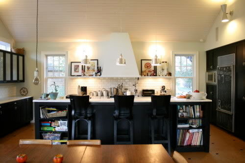
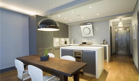
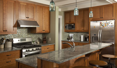
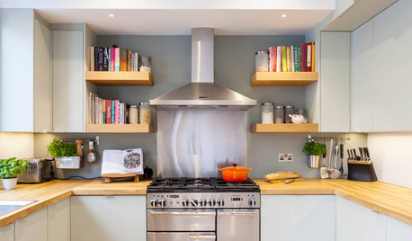
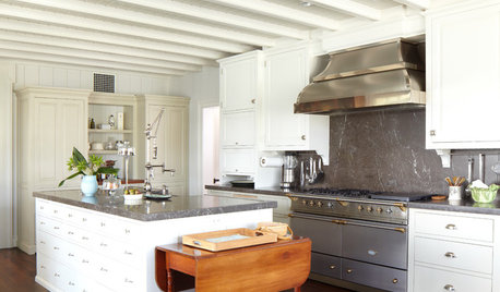
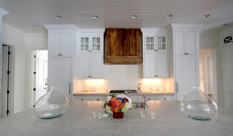
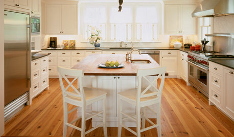
Here are some of my inspiration photos. I'm looking for opinions on shape and finish. I've thought about a custom hood painted the wall color so it blends. Thought about a white metal hood.


I actually like the square shape of this one, but afraid it will look like a big box sticking out of the wall.


Or somthing like this in stainless with bands.


As you can see, I'm ALL over the place on this. Any help you can give would be greatly appreciate.

Comments (10)

  • 17 years ago

    I like the last one pictured but would depend on what kind of range your getting.

  • 17 years ago

    Well, not being a really good person at this type of decision (my disclaimer), I'll still wow you with my opinion on the matter.

    All of the inspiration photos that have that big hood appear to have at least 9' ceilings, which makes me really wonder if that big hood is going to overpower things on an 8' ceiling. The windows definitely help offset the giganormity, so that's a plus.

    The other thing I'd say is that if you have your heart set on SS, that last one, the copper, won't do it for you. If you want SS, go with SS.

    My favs are pic #3 & pic #4. One disappears & one stands out. If you have a great view out those windows, #4 might be the one to choose, otherwise I'd say #3.

    Best wishes!

  • 17 years ago

    I agree with sdionnemoore in that I'm concerned about the height of your ceiling, the sparseness of that wall and the potential for a hood looking out-of-place and / or overwhelming .... Can you tell us more what you're now planning for that wall? One window above your sink and ...?

    I also can't remember your range and backsplash material; I think those would both influence my choices. I think if you have a stainless backsplash behind your range, esp. from the range all the way up into the hood, that might make a visual difference. Hmm ....

    For what I know of your space I am most drawn to the photo with the black island and the chalkboard paneled fridge -- that hood sorta disappears but still makes an architectural statement. But, I'm not sure if the interesting lighting and the shelves running off the hood are unduly influencing me.

    I'm really drawn to the big square hood but think with 8' ceilings it'll feel like something you had to work around rather than a design choice. I also think the stainless cabs in that photo really help that hood work, if that makes sense.

    The copper hood with stainless bands (which you could have done all-stainless) is pretty, but in an old-school way. I think it's counter to your Industrial Modern vision.

  • 17 years ago

    As of now, that wall was only going to be the 1 window(36" X 36") and the range hood. I am considering counter to ceiling backsplash in white tile, but haven't nailed that down. There will not be any uppers on that wall. Would the wall work better with the range centered and a window on either side....here I go again!

    The range is a 48" stainless Blue Star.

    I believe Vicnsb's ceilings are 8'. She has a 48" range with a custom hood. She does have cabs on either side. Here is the link(hope she doesn't mind!!!). Maybe it will help provide some inspiration.

    Here is a link that might be useful: Vicnsb's 48

  • 17 years ago

    First of all--please yourself! I think I hear an undercurrent of "I like this but I don't think it'll work so I like that".

    Your big issue is that you're going for a stark palette but still want lovely rather than, um, stark. If you do a stainless hood with stainless counters and stainless range and white tiles to the ceiling it might get to be a bit off balance. The first of your inspiration photos has dark down, light up, and a line of medium (the counters and cooktop) in the middle. The white hood on white wall works.

    The square shape in the third picture is nice. See Gizmonike's hoods. But it does look a little stuck on wall--this is counteracted wtih the molding at the bottom, the busy backsplash, and the colorful clutter. On the other hand, with your 8' ceilings it will have different proportions.

    The math: 36" high counters + 30" clearance = 66" which means you have approximately 30" left for the height of the hood, or two and a half feet.

    A boxy hood of 48" x 30" (4' x 2.5'), or more likely 54" x 30" (4.5' x 2.5'), is going to have a different visual impact than the one in the picture. It's going to be elongated and rectangular, rather than tall and square. This will actually look less stark.

    If the top picture is your true inspiration (and it's gorgeous), my own choice is that kind of hood. Simple, clean, pyramidal, white. You have a shorter wall but also a smaller range so it should scale down well and still give you a similar visual impact.

    The big difference is that the converging lines draw the eye up on the pyramidal one, while the angular lines draw the eyes sideways on the rectangular one.

  • 17 years ago

    malhgold -- thank you for reminding me!

    Don't start from scratch (re: windows, etc.).

    I know this is subjective, but I am in love with the idea of your doing tiles countertop to ceiling.

    Based on that and really looking again at your inspiration photos, in my mind's eye I think a hood shape akin to your first rendering will work best with a) your Industrial Modern aesthetic and b) your ceiling height. I think you can you go with either stainless or white (to match your tile), as we've seen beautifully done in two of your inspiration photos. The stainless will work because it'll be part of a whole: the range, the counter (although that's a horizontal surface, so not as much impact as the range itself), and then the hood. The white will also work because of the color blending with the surrounding tile but the different material and shape giving your eye something (subtle) to see. The white also won't compete with the view out your window.

    But at the end of the day it's that shape, seen in your first rendering and the two white hood pictures, to which I'm drawn for your kitchen.

  • 17 years ago

    mal
    Congrats on remodel/continuing remod -

    I'm a little confused w/your design is it the 1st pic or the pic after the Box out of the wall one which shows 2 windows? I only read your orig post - so as to not taint my op

    Also what type of range - dimensions, finish
    What are the overall dimensions of the room?

    In most of the inspiration pics there is symmetry on the range wall - In your 1st computer gen design you don't show symmetry - I think that will effect your design/decision/final affect - If you choose what you relate as "box" or hunk of metal - it would make one side of range wall heavy - out of sync and not balanced - In that scenario I would opt for something more subdued - not sticking out, honking sort of speak - the white one is "quiet" & I think ss counters and a big ss hood would overwhelm the space

    If your design is the rendering where it is symmetrical - I think you have more options - meaning the box, or hunk would work for your application -

    I also think the overall room dimensions dictate what type of hood & size. I huge hood in a small kitchen, to me, looks out of place - I'm sure we have all made the mistake of oversized furniture for a space - that is kind of what I mean about hood size

    hope that helps

    Any pics of existing space w/dimensions may help render so more opinions

  • 17 years ago

    I am so happy for you.

    I like the very simple constructed white hoods with a liner. For a 48" hood and an 8' ceiling, it makes me feel insecure because of the potential for it to appear squat and fat. I'm quite sure that you have better taste than I.

    So, I think I'm saying to get some duct tape and cardboard and make one to tape up on the wall. Remember its around 24-27" deep. If it feels in scale to you, perfect! If not, you can reshape the cardboard top into any number of forms.

    I'm liking Master or Concord with the faber Pro Magnum with the reduced size hood cover as a backup.

  • 17 years ago

    Thanks for the support and kind words. I guess I am sort of feeling that if the range stays off center, I am better off with a white hood that will sort of blend into the wall and not make the space seem so lopsided. I do think I have many more hood options if the hood is centered. Just not sure if it's the best use of the overall space.

    Here is a link to the off center hood rendering so you can see the size of the room. The overall kitchen is 18' long by 13.5' wide. Open to the left of the kitchen is a family room that is 16' X 13.5'.

    Here's the range off center and centered with the same triangular hood and centered with a Pro hood for comparison purposes.


  • 17 years ago

    I love the inspiration pics with the light hoods that match the
    walls. Having 8 ft. ceilings and a 48 hood with liner I don't feel
    that its overwhelming in my small space...you have a much larger
    area. I did not feel it necessary to go wider than 48 and it all works
    great. I love the idea of the counter to ceiling tiles, it was absolutely
    the way I wanted to go and with the 8 ft. ceilings it looks great. I think
    that first pic is perfect, it seems to be the one you have had from the
    start maybe...its an awesome look.
    vic