Software
Houzz Logo Print
creekylis

Is this grouping 'dated'? Do I need to replace?

15 years ago

Hi, All!

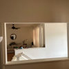
Do I need to replace this wall grouping? I have had it in 2 houses and for 11+ years. It hangs over the back of my sectional. (Note: ignore the room's reflection in the mirror---I am in the middle of painting my base molding and every piece of furniture is pulled about 3' away from the walls right now.)

The only change I have made to this grouping is that the frames of the two outer botanicals with the iron work used to be an olive green. I dry brushed them a deep red just yesterday to better match my new, deep-red TV stand.

In case you can't tell, the rest of the frames are flat black. The leaves in the top center are actual pressed burning-bush leaves from our old house and are deep red. The other botanicals are prints and are, of course, green.

I can't decide if these are truly "dated" or if I'm just tired of them. THOUGHTS???

{{!gwi}}

{{!gwi}}

Sorry the pics are so dark....cell phone shot. :(

Comments (24)

  • 15 years ago

    Not dated. IMHO, botanicals are NEVER dated. You're just tired of them. :) I love your burning bush one.
    Dee

  • 15 years ago

    I don't think they're dated either. If anything, I'd prefer the outer frames without the scroll work.

  • 15 years ago

    Thanks for your quick replies. msrose...I debated about leaving the iron off those too---I was able to remove them when I painted, but it leaves (4) 1/4" holes across the top and bottom of both pieces. The iron also sort of ties to the others' frame colors I thought. Thanks for your comment--I might try changing that.

    Lis

  • 15 years ago

    I think they are very pretty and certainly not dated. But, if you are tired of them, maybe it's time to find something else that will make you smile.

  • 15 years ago

    I don't think they are dated either. But, I agree with msrose about the scroll work. I like them but not in this grouping. Can you change those botanicals out to black frames and use the scroll frames with different pictures in them in another part of your house?

  • 15 years ago

    Well great minds think alike sometimes? My first reaction was not dated. Then I looked again and thought, still not dated but the scroll frames maybe do speak to a more defined date. The plain black frames seem timeless, though as we all know that probably means that they are more current now. (so hold onto the scroll frames because most likely in 2024 they will look fresh again and the plain black frames will look so 2011
    ).

  • 15 years ago

    I agree about changing the frames, but I would also change the arrangement because that could be something you have tired of as well. Maybe even rearrange them without the mirror in another spot to refresh them. They are lovely prints and can stand on their own I think without serving to frame out something else (mirror) on the wall.

  • 15 years ago

    If you're tired of them (and have had the same arrangement in multiple homes), why not spread them out in different arrangements/locations in the home? That might help the art feel more "fresh" to you.

  • 15 years ago

    I don't think you need them above the mirror; with the side pieces, it all feels like a bit much. As others have said, I don't think they are dated, but rather you are tired of them.

    One other thing, probably bizarre. Have you tried hanging the iron frames the other way? For some reason it feels to me as if the three little stems should be at the bottom of the frame, rather than sticking up. I am sure I am wrong, as I can see how the art goes and how the hanger must be on the back, but it just seems odd to me.

  • 15 years ago

    Funny, I never considered simply rearranging, instead of replacing. Perhaps something like the sample layouts below? I am in the middle of painting, so I can post new pics after the room is complete.

    P.S. Les---unfortunately, those prints are sealed in the frames--not reversible.

    {{!gwi}}

    {{!gwi}}

  • 15 years ago

    I like the 2nd way you lined them up creekylis. Try living with it & see what you think!

    Also, odd question, but can I ask what your wall texture is? (We're looking at having our walls worked on and it's made me really aware of different wall textures.)

  • 15 years ago

    my vote is 2nd way as well :-)

  • 15 years ago

    Jessicaml... The wall texture is knock-down plaster. Unless you mean the last two pics with the new groupings---those are lying on the carpet. ;)

  • 15 years ago

    The problem as I see it is that the mirror is way too big for the art that surrounds it.

    Having said that, I like the #2 arrangement as well! It is a theme! And not overpowered by the mirror.

    So, find a place to put the mirror, and a place to hang the (now lovely)leaf prints!!!!

  • 15 years ago

    I like either one of the new arrangements you placed on the floor, but think the second one looks the best. Very nice prints and burning bush leaves from your last home. What a neat remembrance for you. We have two burning bushes at the foot of our driveway here I think I'm going to copy your neat idea this fall with the leaves from them for in our Gentleman's parlor. Great idea! Thanks.

  • 15 years ago

    I like your second arrangement best. Could you possibly take off the iron scrolling, fill the holes and paint the frames black to match the others. I think this would instantly update them. I like the prints. (I love to garden!)

  • 15 years ago

    I like arrangement two as well. I like the scrolls even though they may be dated, I think they compliment the prints and add interest. I also like the dark brown with the black frames, again I think it adds interest. Just my taste.

  • 15 years ago

    I like the second arrangement best also. To me the scrolls distract somewhat from the lovely prints. Any possibility you could remove them and fill the holes with a compound, and then color just the compound with a pencil of some kind? I like the frames the color they are, think they complement the natural subjects nicely.

  • 15 years ago

    I don't know if you are going for a country-ish look, but the scrolls give me that feeling. If you really wanted to make it look contemporary, I say re-mat them with some white mats (I like using really wide matting) and then use thin metal frames in a brushed nickel or pewter finish.

  • 15 years ago

    Remove the 3 off the to -too High on the wall. Turn the Mirror Vertical between the other 2. Relocate the other 3 somewhere else in the room or hang 2 as a pair and put the the third in another room.

  • 15 years ago

    Lovely prints - I vote for the second grouping on the rug.

  • 15 years ago

    I agree with others about the scrolls. They aren't in keeping with the frame or print, and are distracting from the richness. I'd remove them. You can putty in the holes and touch them up. I like our two arrangements on the carpet.

  • 15 years ago

    I love botanicals and think it is never dated. I also think yours would be enhanced by rematting with two matts and framing in thinner frames.

    Here are some of my collection:

    black frames with green inner mat and antique white outer:

    gold frames with mica inner mat and antique white outer:

    {{!gwi}}

  • 15 years ago

    I like the 2nd arrangement and agree that if you could remove the scrolls, putty the holes and paint the frames to match you could arrange in endless ways.