Software
Houzz Logo Print
cherigw_gw

Panic Attack. . .Grey Mirage too Minty?? (pics) X Post frm Kit

16 years ago
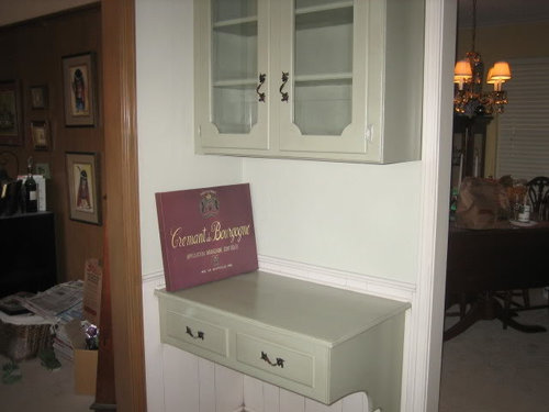
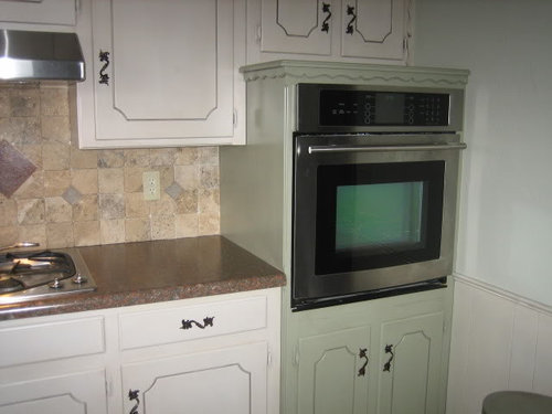
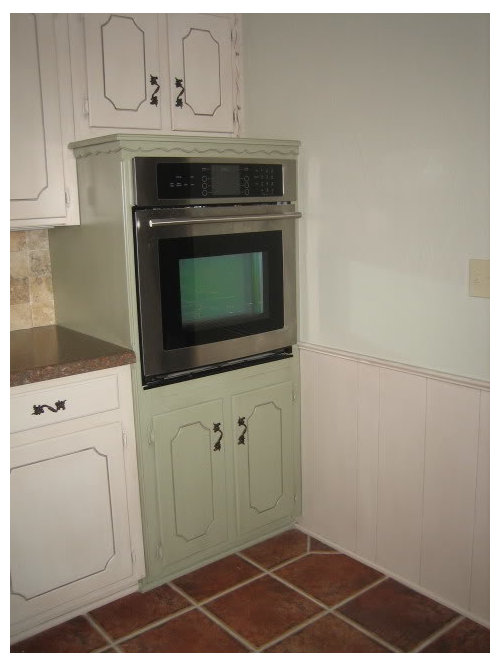
Hope I don't "wear out my welcome" posting in both forums. . . trying to quell a panic attack, but the painters finished Tuesday. . .and IÂm not sure I like the walls. Also excuse the mess. . .most everything is still in boxes in the LR. If I decide to make a change, I want to do it in the next couple of days. Love the cabinets/wainscoting. (China White with a Van Dyke glazeÂturned out almost a pale mushroom) and desk/oven stack (Rosemary Sprig with same glaze). The walls are Grey Mirage, a beautiful grey green. . .the 8 x 8 chips looked great with the R Sprig, but for some reason it is reading minty to me. Wonder if a light application of the glaze he used on the cabinets/wainscoting might bring it down "enough"? Or any recommendations for another color? Thanks so much for any help!!


Comments (12)

  • 16 years ago

    It definitely reads rather minty on my monitor and you say it looks minty by your own eyes. It does not even look like the same color BM shows on their website. Are you sure they mixed it right? Mistake do happen.

    According to this both colors should play nice. Does the color chip match the walls?

    If you are very happy with the Rosesmary Sprig maybe mix it with white and do a coat on the walls? I've done that with ceilings - mix in a little of the wall color with white so it is not so stark.

    http://www.materials-world.com/paint-colors/benjamin_moore/Benjamin-Moore-Color-29.htm

    Here is a link that might be useful: BM Color Chart

  • 16 years ago

    Yea, I have to agree, not loving the wall color with the other colors in the room.
    I think you almost need a darker color to pull the backsplash/countertop together.

    Or, I would just paint the upper wall the same color as the wainscoat.

  • 16 years ago

    Most opinions are thumbs down. . .I was hoping that perhaps it was just the change from the previous "brown hole" that was getting to me. Dilly . . . unfortunately it does match both the 8 x 8 paper sample, the dab on the paint can, and the wall. Although I have read/seen here on GW how things can change on the wall, I wouldn't have believed it would be this much!! The lightened Rosemary Spig is a good thought.

    Caroleoh. . .I'm thinking darker as well. I really wanted a color on the walls, but if I can't find something, the color of the wainscotting/cabinets may be the way to go.

    Thank you both!!

  • 16 years ago

    Can you just do a darker shade of the green on the lower cabinet? The cabinets are turning out nicely:)

  • 16 years ago

    I like the idea of Rosemary Sprig on the wall. You might try it at a lesser pigment OR it may look lighter anyway due to the different sheen from the cabinets.

  • 16 years ago

    Kjmama and Megsy. . .I think the R Sprig might do the trick as well. I think I'm going to take a deep breath, put the things back in the cabinet this week (so I can at least get some semblance of normalcy back into my meals) and attack the paint color next week. Will keep you posted. . . and again. . . thanks to everyone. This place is what keeps me going!!

  • 16 years ago

    That's odd. I was wondering what dilly did. I painted guest bedroom Grey Mirage (western facing) once. It came out so medicinal I repainted, it rendered a very gray base with almost olive hints in that room. Definitely not minty (your walls look minty on my monitor too).

    Check out Soft Fern too, if you're leaning toward R Sprig. I tried it as a sample once, it had surprisingly more oomph on the walls than swatch led me to believe.

    Your cabinets sure are pretty!

  • 16 years ago

    I like the green minty color.
    Keep it!
    ~boxer

  • 16 years ago

    I've been playing w/ Rosemary Sprig mixed in different proportions w/ white (for my future kitchen remodel). I think I'm going w/ a 3:1 (R Sprig:wht) mix for the walls and then do my island in full strength R. Sprig w/ (tentatively) Van Dyke Brown glaze. Lower cabs will be stained (a med. brown) and uppers painted a creamy white (SW Antique White)--at least that's my plan so far :-)

    The color chip dilly dally posted for R Sprig looks very brownish on my monitor, but does not read that way at all on my posterboard size sample...and the lightened version that I mixed is def. still green, but w/out the mintiness that seemed to occur when I tried just going up the color card to the Soft Fern. HTH

  • 16 years ago

    If you want to go lighter/darker, I'd stick with colors from that same strip since they are all the same pigments mixed at different strengths.

  • 16 years ago

    Thanks again everyone!!

    Moonshadow, if I didn't see it with my own eyes, I wouldn't believe it, but they all match (8x8, dab on the can, walls). I wonder if it's the red in the floors/counters that are doing something to it.

    Boxer, I did pull out some oldish fabric samples and found two that, amazingly enough, really seem to pull it together. The background of one is a dead-ringer for the walls (minty and all!!) and has some dusty pinks, lavendar, ivory and rust in some of the florals, and the R Sprig in some of the greens in the leaves. The other one is a "Middle Eastern" paisley with dk brown, rust, and a little olive in it. Only problem is that next to the oven stack, I'd have to find some art work with those colors in it. . .but a distnct possiblity if I decide to keep it!!

    Jbrig and SandraZ6. .I really think lightening up the the R Sprig with white might be the answer.

    When I get to the end of the road, I'll let everyone know what I did. . .and thanks again, and again, and again. . . you all are the BEST!!

  • 16 years ago

    Moonshadow, if I didn't see it with my own eyes, I wouldn't believe it, but they all match (8x8, dab on the can, walls). I wonder if it's the red in the floors/counters that are doing something to it.

    Oh yeah, that can do a number on the wall color! That room I talked about above that looked medicinal? Grey Mirage was color #2. Forget the name of color #1, but I painted right after we installed hardwood floors. The stain is a medium brown but has red tint in it. What it did to color #1 was just gross, lol. Then in my MasterBR I have a creamy white on 1 wall. That same white runs throughout the house in various places and renders creamy white. But in MasterBR where it picks up reflection of wood floors, it has a pinkish cast. Drives me crazy to this day.