Software
Houzz Logo Print
stranger4_gw

backsplash design/colour help, please?

14 years ago

I'm trying to figure out a backsplash. My countertop will be Caesarstone 9140 Charcoal/zulu:

This is about the colour:

This picture shows a little better what it looks like up close- some of the pieces are clear, so there's a little bit of depth to the colour:

This is a picture of it in use so you can see the scale:

The cabinets will be covered with this formica, which I think looks a little different than this in real life- it's not gray at all, it's a light, warm colour with a hint of pink. It matches the blobs in the counter pretty well:

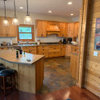
This is our kitchen. Mostly- there will be a decorative open shelf in the corner on the right side of the window instead of at the end of the uppers on the right side and all of the cabinets will be solid.:

I love sparkle, but we couldn't afford granite or even the sparkly quartz, so I'm trying to put sparkle in elsewhere. I bought crystal (well, probably acrylic at 2 dollars a piece) knobs and brushed nickel drawer pulls. I will have two pendant lights over the peninsula, which look something like this:

This is the shape (they're each a single):

with this design:

side note: will these look ridiculous in my kitchen? I looked at the kitchen things, but kept coming back to the sparkly, fancy things. I thought this would be a good compromise, since the shape is simple and kitchen-like.

I've fallen in love with iridescent and sparkly glass mosaic tiles and I was thinking of using some as an accent. I'd love something with a little bit of lightness- with blues or lavenders, but I'm not sure how well it would go.

I'm also trying to figure out how to lay them out as well. Money is very tight and we're already over budget with some pipe issues. I had wanted to do a base of square tiles, an accent strip and then the tiles above laid on the diagonal, but turning the tiles diagonally is too expensive. I'm trying to figure out if there's a way to have the accent strip look like it belongs, without turning tiles on the diagonal.

I've seen a few possibilities, but I'm having a hard time imagining what a whole kitchen would look like based on small sample piece. One thought was to use square tiles on the bottom, a few rows of accent tiles and then subways above. Or put the square tiles offset above to make it work.

I'm also not sure about colours- I was going to do a very basic cream/tan stone as the base because those can be had really cheap here (about 10 dollars per square metre) I don't love the mosaic mixes that are very high contrast, although I find the black/dark purple iridescent mixes are beautiful. (although probably too dark for my kitchen and field tile) Any ideas?

Comments (7)

  • 14 years ago
    last modified: 11 years ago

    Stranger, I have Caesarstone Smoky Ash which seems nearly identical to Charcoal/Zulu. It has a little taupe, but no pink (thank goodness). Its price was comparable to granite. I was looking for something dark gray without a lot of movement, so this fits the bill. Not sure I would choose it again, but that's academic at this point.

    My cabinets are white and my floor is red oak. I decided I wanted something more yellow/gold for my backsplash and the good people here at GW talked me out of it. I'm instead going with a cream crackle subway. Although I'm not convinced my first choice was totally wrong, I think a more neutral b/s is going to work better in the long run. It doesn't fight with my counter.

    I'm not having any special accent tiles or liners. I was surprised how expensive tile setters are and non-field tiles, like bullnose. I'm grateful I had just enough left in my budget to cover the b/s.

    Many here will suggest you just hang tough and wait a while until everything else is done. I tend to agree with that. Get LOTS of tile samples.

  • 14 years ago
    last modified: 11 years ago

    linelle- thanks for the reply! I've seen the smoky ash and it's similar to the charcoal, but it's a little whiter with bigger pieces.

    Can I ask why you wouldn't go with it again? We went with Caesarstone because it's the cheapest option on this side of the world, but I still wish we could have afforded granite.

    I have to decide pretty quickly- my GC wants to get the work finished as soon as possible. They demolished the kitchen and did the electrical wiring today. Tomorrow they do the plumbing and finishing work and as soon as that's done, the cabinets are going in!

    I was hoping that if the field tile was relatively innocuous, I could get away with a pretty mosaic accent. I don't love my counters and I would much prefer having a pretty tile to focus on. Do you think pastel blues/lavenders/greens would work?

  • 14 years ago
    last modified: 11 years ago

    Stranger4, I love the sparkle and contrast!

    I'm using silestone zirconium, which looks very similar to your Caserstone. My stained cabinets have shades of light reddish copper. I'm playing with stainless steal mosaics, picking up on the blacks, aluminum reflection in the silestone, coppers off the cabinets and flooring.

    Enjoy playing with the ideas!

  • 14 years ago
    last modified: 11 years ago

    What is the name of the Formica Pattern?

    I would suggest tones blending primarily with that--colors like you are mentioning might work well.

  • 14 years ago
    last modified: 11 years ago

    AnnaA- thanks! I love sparkly things and I've been drooling over my neighbour's beautiful granite- I love the movement! I figured that light fixtures and knobs aren't permanent- I can always change them out if I ever grow up. (not likely at this stage, but who knows:) I think stainless steel mosaics can be really lovely and if I hadn't fallen in love with the depth of the glass tiles, I would probably go in that direction.

    palimpset- The colour is officially called white pear (#5645 in the link below), but the colour on the site isn't very true to life- I think in real life it's somewhere between that and 5646-almond pear that's next to it.

    Does anyone have ideas about how we could set the tiles to make the accent work?

    Here is a link that might be useful: formica colours

  • 14 years ago
    last modified: 11 years ago

    I think adding some sparkle tiles would be lovely.
    Not sure about a specific pattern or accent.
    I like those pendants.

    Stainless is an option along with sparkle tiles
    or mosaics, or even mirror tiles....

    Many of these below can be found at Modwalls or Lowes.

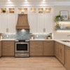
    Here are some visuals.
    ~boxer

  • 14 years ago
    last modified: 11 years ago

    Boxerpups! Thank you so much- I was hoping you'd weigh in. (I've been lurking a lot, so you're famous to me!)

    I noticed that all of the pictures you posted have white/neutral tiles. Do you think I should shoot for an accent that blends in with the field tile- a monochromatic look?

    I love the secound pic- it's got everything I love about black/purple iridescent tiles with that rainbow sheen, but in a lighter tile- it's really beautiful. I wonder how it would look if I did a matte white field tile and put two stripes of that tile? Would the white tile clash with my colours?

    The third picture is also gorgeous, but the herringbone pattern (which I love!) would cost a lot more to do.

    And I'm glad y'all don't think my pendants will be tacky- I was nervous about that.