

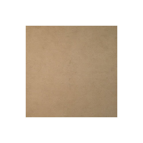
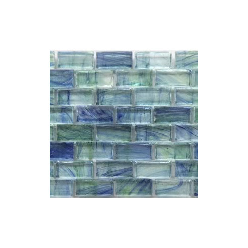
Master bath paint color
16 years ago


Sort by:Oldest
Comments (11)
Related Stories
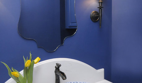
BATHROOM DESIGN8 Bold Paint Colors for Your Powder Room
Turn your powder room into a exclamation point with a bold shot of red, raspberry, hyacinth, rich brown or stormy blue
Full Story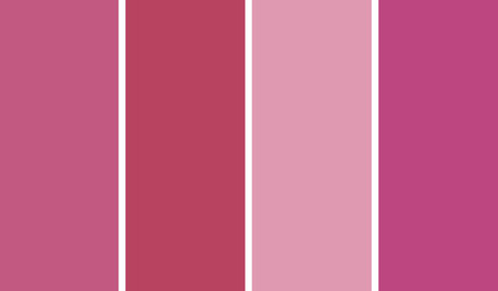
COLORBathed in Color: When to Use Pink in the Bath
Even a sophisticated master bath deserves a rosy outlook. Here's how to do pink with a grown-up edge
Full Story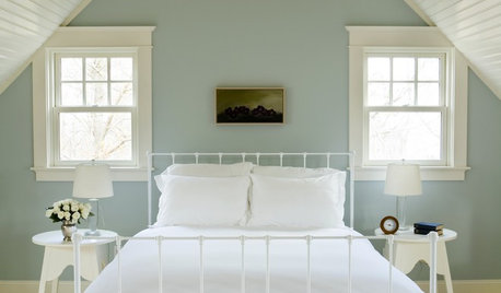
COLOR12 Tried-and-True Paint Colors for Your Walls
Discover one pro designer's time-tested favorite paint colors for kitchens, baths, bedrooms and more
Full Story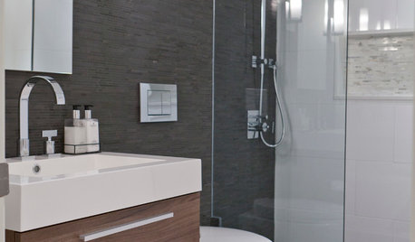
COLORBathed in Color: When to Use Gray in the Bath
Go for elegance and sophistication without going overboard on coolness, using these gray bathroom paint picks and inspirational photos
Full Story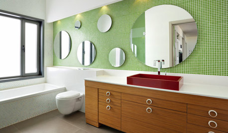
COLORBathed in Color: When to Use Green in the Bath
Splash some spring-conjuring green paint, tiles or accessories around your bathroom for natural appeal
Full Story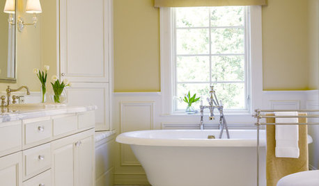
COLORBathed in Color: Favorite Yellows and Golds for the Bath
Get a golden glow for your bathroom with these expert paint picks and ideas for yellow walls
Full Story
BATHROOM DESIGNSweet Retreats: The Latest Looks for the Bath
You asked for it; you got it: Here’s how designers are incorporating the latest looks into smaller master-bath designs
Full Story
WHITERoom of the Day: Bye-Bye, Black Bidet — Hello, Classic Carrara
Neutral-colored materials combine with eclectic accessories to prepare a master bath for resale while adding personal style
Full Story
ROOM OF THE DAYRoom of the Day: Graphic Style for a Zen Master Bathroom
A master bath remodel in Southern California brings in light, river stones and bold ideas in bunches
Full Story
BATHTUBSRoom of the Day: Restorative Power of a Japanese Soaking Tub
A traditional tub made of hinoki wood sets a calming tone in this master bath renovation
Full StorySponsored

Columbus Design-Build, Kitchen & Bath Remodeling, Historic Renovations
jan_in_wisconsin
sis2two
Related Professionals
Dover Interior Designers & Decorators · Jacksonville Interior Designers & Decorators · Sault Ste. Marie Interior Designers & Decorators · Binghamton Interior Designers & Decorators · Hempstead Interior Designers & Decorators · San Angelo Interior Designers & Decorators · Lafayette Kitchen & Bathroom Designers · Rochester Kitchen & Bathroom Designers · Oxnard Kitchen & Bathroom Designers · San Angelo Kitchen & Bathroom Designers · Kennewick Kitchen & Bathroom Designers · Lake City Furniture & Accessories · Champaign Furniture & Accessories · Jamestown Furniture & Accessories · Lima Furniture & Accessorieshomebodymom
denali2007
robinst
dilly_dally
joannacaOriginal Author
vampiressrn
kden71
hudsonleigh
boxerpups