Software
Houzz Logo Print
buddyrose_gw

Help-Windham Cream toooooo yellow

17 years ago

Was hoping it would be more Cream instead it's more yellow. Is BM Rich Cream's this yellow?

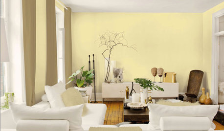
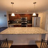
Granted, it's not as dark yellow as this photo but it is still YELLOW. Any ideas on a softer, warm cream color for the living room that looks into the Palladian Blue Dining Room? I almost feel like it's Easter between the blue and yellow. House is unfurnished still. Just got in white shutters and blinds this Monday.

Comments (37)

  • 17 years ago

    Rich Cream definitely looks more yellow than cream in my home. If you don't want yellow, I don't think you'll be happy with Rich Cream either.

  • 17 years ago

    No. my living room has three rooms facing the front of the house (which is closed in by a porch so they look dark) and two side windows facing east and one small window facing west. I like the color yellow and I like Windham Cream BUT I DON'T LIKE the yellow room off the blue room. Easter egg, anyone? I wanted a warm cream, not so much yellow. Brother, I feel like a diva if I repaint it cuz it's not horrible looking. It's just slightly off to my eye next to the Palladian Blue. Anyone know Muslin by BM? Or Powell Buff? Wonder if they'd be more cream? My painter may kill me. Or not. I'll have to pay to repaint.

  • 17 years ago

    Have you considered seeing what Rich Cream looks like when mixed at 50%? Just a thought.

  • 17 years ago

    It's the classic problem with yellows-they are too yellow on the wall. I have ruled out every yellow in the BM historical collection-they are all too "yellow" for those hoping for a creamy color. Windham Cream has no business being called "cream" IMO.
    Take a look at an old BM color called "Featherbed"-it's BM #928. You will think it's not going to be nearly enough color for you until you get it on the wall. I've used it in 3 houses. Just enough color to pop against trim and it integrates really well with other colors.
    BTW I love the Palladian Blue-looks gorgeous.

  • 17 years ago

    That Palladian Blue sure does frame a window nicely. I remember that from having it in our sun room in NC. I LOVED looking through windows with the Palladian Blue around them :)

    I'm looking at Rich Cream and seeing that it's got an LRV in the high 70s, like Windham Cream...I'm wondering if you would prefer maybe *less* "color" there, because the saturation, creating two definite color "presences", as it were, may be what's creating the easter egg effect you don't like. I could see a calm ivory in there, actually, almost an echo of the floors. Instead of looking at Rich Cream, try Ivory Tusk (the one above it--similar but less saturated, LRV 87.2) or Mannequin Cream (next card over -- LRV 84.1). Not that LRV is the be-all/end-all, but it can be an indicator of how much a color comes across.

    At this point you have a good indication of what's too strong, so you can paint up some sample boards (watercolor paper is what I use because it takes up less space than posterboard, so I can store more samples :)) and compare their effect to the Windham Cream.

  • 17 years ago

    And one little added note: I don't think that the Mannequin or Ivory would be *so* different in LRV that it would look like you painted one room but not the other :) - that can happen if you have a drastic difference in saturation...just thought I'd mention it. Like for instance, the Mayonnaise might be too light there next to the Palladian Blue, since it's clear out of the 80s into the 90s.

  • 17 years ago

    I have a couple pix of Powell Buff. In my house it can look cream, then sometimes way more yellow, then at night with lights, a tiny bit olive-y. Here is first try to post picture:
    Hmm, how do you get picture to show in msg?

    Here is a link that might be useful:

  • 17 years ago

    trying to show a few more here:
    think I got it. Not asking for advice (yet!-fireplace is getting new hearth and glass tile surround this week)Stumped on what to do above mantle-will be back for ideas.


  • 17 years ago

    here is the first one, replacing the link
    Ignore wires, was still hooking up music equip.

  • 17 years ago

    buddyrose-- perhaps try BM Ivory Tusk. It is a true cream, with a yellow undertone but it's not a yellow. I've used it in all my hallways and it looks great vs. white trim.

  • 17 years ago

    callieandkarin, great minds think alike (read my post :))

    And rdquilter, that powell buff looks better than I've ever seen it before. Nice pics :)

  • 17 years ago

    thank u flyleft and callieandkarin, I'll be looking at Ivory Tusk this weekend.

    rdquilter, thanks for the photos of Powell Buff. They're great. I like Powell Buff.

    flyleft, you're right, Windham Cream should not be called Cream... it is very pretty BUT IT IS YELLOW. Should be called Windham Yellow. I probably wouldn't mind it if it wasn't next to the Palladian Blue.

    Here's a photo of the DR with new shutters. I'm loving this room and it still needs furniture etc.

  • 17 years ago

    I very rarely like blue on walls but yours is really wonderful. It's soft and warm and yet still blue. Perfect!

  • 17 years ago

    Buddyrose, your new shutters look terrific!! Please tell me more about them. I too, have to do an outside mount and yours look very professional. I know you have BM Simlpy White on your trim and these shutters look like a perfect match. Love them and your blue walls!

  • 17 years ago

    hi everyone: brutuses forgot to respond to your post yesterday about diluting color: I'm not a fan of that just because there are a gazillion trillion colors already out there. I'd feel really crazy if I had to start being an alchemist! ;-)

    ingrid, I hate blue. period. never liked blue until now. Saw a friends dark blue bathroom and her study in pale blue and thought hmmmm pretty. And now I love this DR with the soft blue and crisp white. I'm usually more of a yellow, cream, gold person so it's funny that it's the yellow that's bothering me. I usually pick green over blue. Decided to try something new. HURRAY.

    zoey, yes BM simply white trim throughout my cottage. The window treatments are all Hunter Douglas in fake wood but because they're painted white, they look great. Once you paint something white, IMO, you don't need to spend the money on real wood. Love my blinds and shutters. they look great, feel great and operate like BUTTER. I had them professionally measured and installed. The guy picked out the white to match. I trusted him and am very happy with result. Outside mount was only way or else window would hit shutter going up and down. And my back yard in summer is gorgeous so wanted less window treatment there. Here's one view of my garden. LOVE MY GARDEN:

  • 17 years ago

    Buddyrose, did you change the paint color yet? And if, what color did you choose? Would love to see updated pictures.

  • 17 years ago

    Try SW Antique White. It's a creamy ivory with a hint of yellow, but doesn't read yellow at all. A rich buttercream.

  • 17 years ago

    SW Antique White is heavily dependent on your lighting, IMO. Our entire house's interior is painted SW Antique White (PO's choice, the walls and trim need a ton of repair work before we can paint) and in the rooms with low or north light it looks really dingy and depressing. :-( It's more successful with the brighter, south-facing rooms.

  • 17 years ago

    Whatever color you choose, I had to chime in to say how lovely the Palladian Blue is!

    Thanks to whoever it was that posted pics of this color way back when!

    I painted my bedroom and office/computer room Palladian Blue. It is gorgeous!

    My bedroom furniture is white and the office furniture is black. Palladian Blue goes great with both!

    I had to restrain myself from continuing to use this color! LOL

  • 17 years ago

    I also love the Palladian Blue so much! I am also not a blue wall fan but that Palladian Blue is so gorgeous that I would love one of my rooms to have it one day.

  • 17 years ago

    That palladian is wonderful...as is your pretty garden!
    Did you look at BM standish white???

    Let us know what you decide~

  • 17 years ago

    johnmari, sorry to hear your Antique White isn't working for you. I had Kelly Moore match SW AW, and I like it even better than the original. Today, as the sun was taking its time setting, the long wall in my ordinarily low-light living room was aglow with soft sunshine. Not yellow, just the creamiest ivory ever. It looks different, depending on the light, but today I went, yeah, that's exactly what I wanted.

    I've discovered it's not just light, but the shape of the room, the proximity of walls to one another, the stuff you have in your room. Two rooms with the same exposure, same paint, can look so different.

  • 17 years ago

    So much depend on the lighting in a space...I had our front hall painted with Aura "subtle" and it looked fine in the daylight...then I turned the light on...and it was YELLOW. I freaked out.

    Switched out the bulb for one of those "daylight" bulbs...and it was once again the creamy-with-a-hint of yellow that I wanted.

  • 17 years ago

    Oh, gosh, that Palladian Blue is lovely. I was lying in bed thinking of painting the room blue. And like a bolt out of the blue, I stumble over this thread! It's a sign from the paint gods!

  • 17 years ago

    I agree with johnmari on the antique white. It can look dingy very easy in lower light.

    This is SW Vanillin from my old house a light creamy color that I loved and thinking of painting instead of the dark yellow color we have now that is a big mistake on our part. It is tru in color on my monitor.

    {{!gwi}}

  • 17 years ago

    I just love that SW Vanillin on your walls with the white doors and white trim. It is such a pretty color. I think I would have been happier with this creamy color than the BM Philadelphia Cream that is gorgeous in pictures I see but in my back room at night it has a funny yellow green shade to it. Paint colors can look so nice in one room and not that great in another depending on the lighting (both natural and not natural can change the color of the way the paint looks I have learned the hard way) and what else is in the room.

  • 17 years ago

    It's funny how the BM creams are all yellow and their greys are mostly all green! Some of them are super-green. It's also funny how many of the BM colors are yellow and green.

    I think with palladium blue it would be nice to have something with some brown in it-- blue and brown/tan are so nice together. A really pure tan/brown would be my vote.

  • 17 years ago

    Okay. You're all not going to believe this!!!! But maybe you will. After all you're garden website people. I NOW HAVE GROWN TO LOVE MY BM WINDHAM CREAM!!!

    I finally got a bit of furniture in both LR and DR and what a difference that makes. I don't have my camera here today but I'll have it this weekend and take photos. My cottage is not completely furnished yet but every room has the main, large furniture in it now.

    My DR table and chairs are black and cherry finish over solid Asian hardwood and birch veneers. Which basically means table/chair legs are black. Seat and Table top are cherry. Chair backs are black. Love the 2 tone.

    LR sofa/chaise are a warm mocha color that has threads of gold color in the brown which looks great in LR and off DR.

    Plus my floors got refinished and they're lighter now so that also made a difference.

    And yes nesting, the BM creams are more yellow etc. etc. like u wrote above. funny.

    And for everyone who commented on the Palladian Blue I LOVE IT SO MUCH I WISH MY BEDROOMS WERE PAINTED THAT COLOR. But they're BM Van Alen Green (which is soft and pretty and I'm just not repainting ANYTHING unless I hated it.) I did paint my powder room Palladian Blue. I only have a small photo of part of the wall but here it is:

    but that Palladian Blue is my favorite color. My BM Lenox Tan kitchen would be 2nd favorite.

  • 17 years ago

    Love it! Palladian Blue rules.

  • 17 years ago

    Please post those pic's! Love what I've seen of your cottage and would love to see the pic's of it furnished. I would also like to see more pic's of your staircase. I am considering painting my banister white and would love to see more pic's of yours. Glad you decided to keep the Windham Cream-I think it's gorgeous.

  • 17 years ago

    Would love to see the finished rooms as well... :)

  • 17 years ago

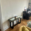
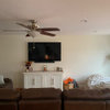
    So I'm not done decorating but I have my major pieces in each room; LR has sofa, DR has table and chairs. I won't get area rugs until Fall but these photos show how I tried pulling the Blue DR and Yellow LR together with brown furniture:

  • 17 years ago

    Perfect, you must be thrilled...it really looks lovely!

  • 17 years ago

    Absolutely beautiful!

  • 17 years ago

    So pretty! Thanks so much for posting!!

  • 17 years ago

    buddyrose, I also felt that way with Ralph Lauren Deep Cream (mixed in a BM Pearl finish paint) in my Master Bedroom when it was first placed on my walls. After adding off-white crinkle sheers to the sides of the windows, the walls no longer clashed with my Hunter Douglas Linen Architella Cellular Blinds. I now love the wall color. But I never liked it in my Master Bathroom since to me it clashed with the bone white sinks and toilet and Jacuzzi. Hence, I changed it to BM Navajo White which is so similar in color but did not have that tinge of lemon in it. I am learning that was you have in the room really affects the paint color as well as the lighting.

    The pictures are happy, bright, warm and pretty. I am so glad you now love the color on your walls.

Sponsored
Haus Studio
Average rating: 4.8 out of 5 stars28 Reviews
Franklin County's Preferred Custom Cabinetry & Design Studio