Software
Houzz Logo Print
ahmnj

Picking a Countertop - ARGH!

14 years ago

Well, since spring a year ago, we've been struggling with a kitchen update. See my posting back at:

http://ths.gardenweb.com/forums/load/kitchbath/msg0921305030180.html

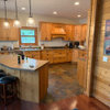
We've ended up going with Cherry Slab doors with a light stain, and pretty much using the original layout, with a recessed oven wall, giving 2' more width to the room. So the cabinets arrived last week - and I'm second-guessing my countertop choice, since matching to a single door is different than seeing the wood color all around you!

We had decided on Cambria Park Gate (http://www.cambriausa.com/our-collection/color-palette/Park-Gate/). DH really still likes it, but now I'm wondering if it's too dark/muddy for the space. We have lots of windows, but we've got lots of trees, so the light is always an issue.

Any thoughts? The tile we have coming in (long story too) is a porcelain travertine-style tile (http://www.tilesdirect.net/gsp1036724.html). So it's a generally light surface. So does that mean the countertop should be lighter, too?

I would be incredibly appreciative for thoughts - there are so many talented people on this board!

Last thing - here are the cabinets as they are today at https://picasaweb.google.com/ahmiowa/NewKitchen#5716070704163060706. Yes, I've got all of the Cambria chips along the top of the cabs...

Thanks!

Aletia

Comments (10)

  • 14 years ago

    Well, I couldn't get the links to work - and I've done it before. Guess this kitchen is affecting my mind...

    But here's the link to our photos on Picasa.

    Thanks!

    Here is a link that might be useful: New Cabs, Floor Tile sample

  • 14 years ago

    Nice pictures! I think the countertop looks great...but I would think about a lighter backsplash, more like your floor. It will also bounce around the light, if you're putting lights under your upper cabinets. Looks like it's going to be a beautiful kitchen! :)

  • 14 years ago

    Got your links to work. Your floor & cabinet choice are similar and will blend. The darker counter will add a bit of pop! Which is what you made need or all that light color could get boring. I assume that with the slab front that your leaning towards contemporary design. Some chrome handle's will be a great accent!

  • 14 years ago

    IMHO there is too much contrast between the light floor and dark counter. The darker cabs and counters with light floors could make the room look top heavy. I would go for a lighter counter to tie in with the floor and then in the BS keep the same color family as the counters and floor but bring in some darker accents to pick up the the darker tones/color in the cabinets. Beautiful cabinets!

  • 14 years ago

    Thanks for the thoughts so far!

    I've wondered about that (the tile/cab contrast) also, but I was concerned that too dark a floor would again make things too dark.

    To answer one question, yes, we do have undercabinet lighting coming in. So that will help either way.

    We'll see @ the tile - still could be open, since it arrived once, and didn't match the sample. They claimed that they have tile from that original dye lot - but it had to be brought in from Italy. If it still doesn't match, all bets are off! But right now, I'm assuming that it will work...and crossing fingers.

    I like the idea of a lighter backsplash, regardless of the countertop, to help brighten things, and reflect the UC lighting as well.

  • 14 years ago

    Here are you pictures.
    The slab cabinets are tremendous. In general with slab
    doors like this I adore the look of a light countertop.
    But your countertop choice is really pretty. I can see how
    you fell in love with it. Can you take an image of the
    floor tile next to the cab and countertop sample?
    That might be easier to see if goes well. DO you love the
    countertop option? Or do you love the tile more? They
    could work together but what was your bs again?

    As for light, if you space is already dark you might
    want to think about undercab lighting and possibly task
    lighting. Of course going with a lighter counter could
    help with that issue too. So much to consider in such
    a splendid space you are working with.

    ~boxer


    When I look at your kitchen this is the one that comes
    to my mind.
    The light counters just make me smile

    Burled Beach Quartz

    Here is a darker floor, with a lighter counter

  • 14 years ago

    The grain match on the cab fronts is superb-floor in a medium color but NON competing pattern would really make those cabs ROCK!!! And then stay lighter on counter and backsplash-the cabs as a glorious feature make a case for the lighter on top and just a medium floor. As smooth and non patterned you can handle...maybe the counter even if you go lightish could have some metallic flecks-I've seen those and they would keep it interesting yet the cabs would still stand out.Such pretty cabs!Just simplify the elements, but really good quality, and you'll never tire of it..

  • 14 years ago

    Before making a decision, think about your backsplash. I see close up how there are specs of color that match your wood. Thinking ahead for the backsplash, what colors in this dark counter will you draw from? Since you are also doing a tile floor, this too has to relate to something in the kitchen.
    So many of us have made the mistake of deciding on each element individually and while it can work out great for some, for the rest of us it was difficult to complete the process. Really more difficult than it needed to be.

  • 14 years ago

    I'm thinking about the floor pretty carefully - and thanks, boxer, for posting photos (that I spaced out on how to do).

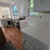
    I took a shot this morning of the countertop we had been considering, along with the floor tile sample on the cabinet. {{!gwi}}From New Kitchen
    {{!gwi}}From New Kitchen

    Getting out of the tile would be a struggle, but we can see. And ellendi, you're right about the backsplash - I've been thinking of a generally light backsplash, but haven't decided exactly which. You're right, it can be a challenge to make decisions one-by-one. And it is probably already more difficult than needed. I probably made it harder by being reluctant to use a darker tile, and also finding that most of the "beige" tiles were too yellowish or pinkish for my taste - the yellow pulling out that shade in the wood, and the pinkish beige tiles just didn't work.

    I am concerned that the tile is too light vs. the countertop... although I think this photo makes the contrast more than it looks to the eye.

    I appreciate thoughts!

  • 14 years ago

    We're making progress - and I think I've talked DH out of the Park Gate Cambria....but then what?

    In the pack of 100 chips, I ran into Cambria Buckingham... it looks really interesting - but would it be "too much"? It includes the colors of the wood, and of the floor, and has some grey - but all I've seen is two 4" squares pushed together. Is it just too busy?

    Most recent kitchen shot:
    {{!gwi}}From New Kitchen

    Thanks!
    Aletia

    Here is a link that might be useful: {{!gwi}}

Sponsored
Custom Home Works
Average rating: 4.6 out of 5 stars10 Reviews
Franklin County's Award-Winning Design, Build and Remodeling Expert