Software
Houzz Logo Print
gw_oakley

Help with accent colors..pics

17 years ago
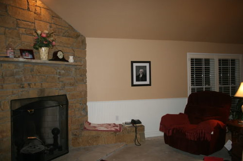
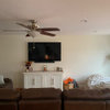
The rest of the house should be finished soon and I'll finally be able to decorate the new room. I've never had a problem doing accent colors before, and I'm fine with the other rooms except this one. Below are two pictures.

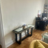
First, I love my coffee table, but does it fit with the room? I've had it for years and it is so functional. I'd hate to get rid of it. Oh, I have since laid a burgandy print table runner on it.

The green chair stays for now, in about a year or so I plan to replace it when DH isn't looking. :)

I'm searching for lighter accent colors and so far I've come up with white and yellows. There will be yellow in the dining room and kitchen. I do have a sage green wicker plant stand in there now, and it looks good.

I want to put some tall flowers on the mantel, and I'm leaning towards white. Would that be the best color flower for it?

I love the burgandy furniture, but dang it's hard to find colors to go with it!

I have a LOT of bright red accent pieces, but I don't think a bright red would go with the burgandy. Thoughts?

Ignore everything you see on the mantel and tables, I haven't even begun "decorating" until we get all that junk out of the room, and I can unpack the boxes of accent pieces.

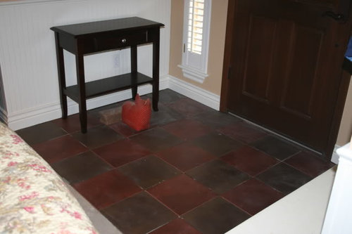
FORGOT! The floors will be a dark hickory. Here is a picture of the tile we have in the entryway below.


{{!gwi}}

Comments (6)

  • 17 years ago

    White flowers on the mantel would look very nice, perhaps in a dark pottery vase that will complement the rusticity of the fireplace. I'd keep the decor there very simple, perhaps the clock on one side and some stacked books on the other. Family photos rarely seem to look good on a fireplace for some reason.

    I like your coffee table but I wouldn't use a runner on it and instead would think about painting it a dark color, perhaps even black. Again, keep the decor on it simple and clean. I'd use plain cream colored pillows that have some texture on the burgundy furniture.

    Has the room been painted yet? If not, perhaps a more grayed, less pink and somehwat lighter color would be nice. The beadboarding is nice but in this room seems to cut the space in half horizontally and makes the area look disjointed. My apologies if this is an already completed project. The display case in the back is very nice but looks a little awkward at the end of that wall. Could it be put somewhere in a more prominent position in the middle of a wall. I think the wood flooring will add a lot to give elegance and character to this space.

  • 17 years ago

    IMO, the gold walls, white beadboard and the burgundy furniture are enough colors. You'll also have the brown in the wood floors added. You probably don't need more colors, just concentrate on those color families - gold, burgundy, white. Maybe some greenery, like a tall plant would be attractive.

    Gold and burgundy make a very classic color combination.

  • 17 years ago

    Ingrid, all the furniture you see in the room except the sofa, table and side chairs are there for storage. If you look closely you can see the dining room table and fridge. lol. All the furniture from the kitchen etc, is in the room until the house is finished. The curio cabinet is there only temporarily. I'm dying to use it!

    Are you seeing pink in the paint? We just painted it (apology accepted, lol) and it's pure beige with no undertones, at least in my eyes. SW Bagel. The room is around 630 sf, so the beadboard looks good in there since it does break up the walls, which I wanted.

    Hmm. Painting the coffee table sounds like a good idea. But should I paint the maple top or leave it? The table would be pretty in a nice mahogany. I bought it during my "french country" phase. lol. But I love it to death because it's 4 feet wide and has drawers. I have some small lace runners, I may put one on it. I have a lace runner on my sofa table. I'm old fashioned, I love lace!

  • 17 years ago

    randita, I think I agree with you! I might add a bit more gold, and get some copper or wrought iron wall art.

    I have to say, I really enjoy the colors in the room, and having the shutters gives me the choice of having it light or making it dark and cozy in there during the daytime! I'm glad the room is big enough to go dark.

  • 17 years ago

    I don't see pink in your paint on my monitor. It looks pretty true to color to me.

    I think leaving the maple on the top of the coffee table would be nice, but just paint the lower portion which is now ivory. I think the maple picks up the wall paint.

  • 17 years ago

    I love the idea of painting the coofee table base black and leaving the top as it s. It's a good looking, practical table and I can see why you like it so much. I do, too!

    I think that, if it were me, I'd look for a creamy light gold, rather than a white for the background of any accent pillows. Perhaps with a soft, muted green or burgandy print or even a muted, soft plaid . . . if it were the right one. I can imagine some that would work wonderfully, but I can also imagine many that would look perfectly awful, so I'd be careful in choosing. JMO, but I think that white might look too stark there in any pillows, even with the beadboard. But, white in a vase or other accent pieces might work great, depending on the piece and the spot you want to put it.
    BTW, that sofa looks extremely comfortable and very pretty!
    Lynn