Software
Houzz Logo Print
bbstx

Help me recreate this room

13 years ago
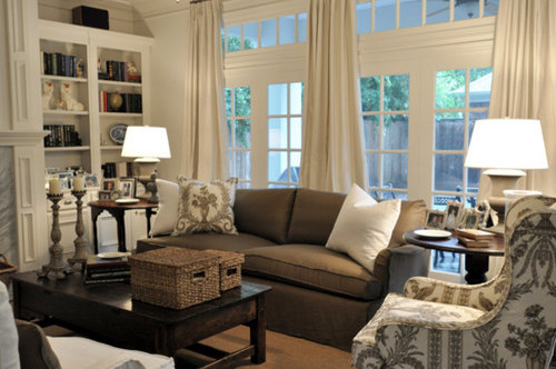
What elements are necessary to get the feel of this room? We already have the brown sofa. What else is necessary?

What would be a good substitute for the fabric on the wing chair? The fabric shown is a Vervain that is probably to the trade only. And even if it isn't, it is probably a little pricier than I want.

Below is a link to the entire article with additional pictures of the room. (While you are looking, do the Kooboo chairs used at the breakfast table look as uncomfortable as dining chairs to you as they do to me?)

Here is a link that might be useful: Cote de Texas Family Room, etc, re-do

Comments (49)

  • 13 years ago

    I would think a toile-y fabric would work. The easy things to replicate are the palette and textures. A little tougher but key, are the high ceilings, windows/french doors/clerestory and the nice woodwork.

    Lovely.

  • 13 years ago

    I was afraid you were going to say something like that! Would love to raise my ceilings another 3 feet, but that is probably not going to happen. I am fortunate to have a wall of french doors and windows, so I can check that off the list. And my crown molding and baseboard isn't awful.

    Any suggestions on the toile? What about Waverly Idyllic Days in Chocolate?

  • 13 years ago

    Wow, I didn't even notice the fabric on the chair :)
    To me: Linen curtains, light wall paint, sisal/seagrass rug, white slipcovers, dark wood tables, white/off-white table lamps, baskets, mirror over fireplace, lantern fixture, blue/white plates on shelves, and, of course, the built-in bookcases.

    If they are the Worldmarket chairs, they are actually quite comfy.

  • 13 years ago

    Neutral to the ceiling curtains, pale walls and woodwork, heavy slightly primitive dark wood coffee table.

    Large scale print with a lot of pale background on the chair. The toile you picked is good.

    Jute rug, could also use leaf or geometric in cream and brown.

    Accessories are either cream or a dark casual finish (bronze, brown, or cream)

    =========
    Notable lack of frou-frou, limited palette, no "pops"of anything.

    the style would be "British colonial" if you wanted to label it.

  • 13 years ago

    The scale of the pattern on the chair is quite large and bit airier than that toile, but itd be worth trying a sample.

    Do you have a bookcase in the room?

  • 13 years ago

    From looking at your link, I'd start with lots and lots of white or near white, and a few dark wood accents.

  • 13 years ago

    Do you have a picture of your room? That would be a huge help.

    If it were me, I would just copy most of the elements I see and like (that I can reproduce) in my own home.

    I think the toile could work but I might try and find something a little larger in pattern.

  • 13 years ago

    I do not have a bookcase...yet. I have a perfect place for one except there is a return air vent precisely where it would be (moving the vent isn't an option). An engineer friend who is also a fabulous woodworker and I have been brainstorming about possible solutions to the problem. I really want something with doors to hide the TV DH bought that can be seen from space! (Truly, we've had Martians knock on the door complaining that the brightness is keeping them awake!)

    The text that goes along with the picture says that the walls are a pale gray. Wonder if the ubiquitous BM Revere Pewter would do?

    Later, I can make pictures and post them. DH had a little minor surgery earlier this week. Every picture is going to include him in his recliner (the size of the Great Wall of China and almost as old). When he goes to nap, I grab a few shots of the LR.

    nosoccermom, the Kooboo chairs look comfortable, but a little too lounge-y for a table. But I'll have to say, it is a terrific look.

  • 13 years ago

    The last comment on the post has the paint color. Pratt & Lambert Mirage Gray. Don't count on it looking the same on your walls, though. Definitely sample! The light in the Houston area has a completely different quality than other parts of the country.

  • 13 years ago

    Yes, Houston's light is hot, and warms up pale neutrals.

    The color as it shows in the photo is not white - it's deep cream with a brown-olive undertone - to my eye, a perfect paler tint of Wedgwood's Drabware. And it's that color that gives the room its elegance and sophisticated serenity. The curtains and the lamps are a perfect match to that tone. A clearer white would be pretty, but it wouldn't have the same effect at all.

    The pattern on the chair is, I think, larger in scale than the very pretty toile you're showing - and it's botanical, showing a lot of cream ground, which is also different. the second pattern you show is nice, but without the pale background and the picture quality, it wouldn't have that same effect.

  • 13 years ago

    The key is keeping a narrow color palate of cream and brown. As far as fabric for the chair, an ikat might work.

  • 13 years ago

    bronwynsmom, I agree. The toile is like a poor relation to the fabric in the picture, even though I like the toile. If anyone can give me a name for the Vervain, I would love to see if it is affordable for me. I've been searching brown and white prints all afternoon. Most are not appealing.

    I like Ikats, especially Marrakesh. I got a swatch of it once in the cobblestone colorway. Regretfully, it was very very dull and not at all suitable for what I needed. But, for purposes here, I think I need something less graphic/geometric (and DD always complains that Ikats drive her nuts because it looks like her eyes are blurry.)

    Here is a link that might be useful: Marrakesh Cobblestone

  • 13 years ago

    Not the same, but I like it:

  • 13 years ago

    Would this toile be better? All of the best pictures I can find, save as .png, so I'm posting a link.

    Here is a link that might be useful: Turkish Toile in praline

  • 13 years ago

    Or this...

  • 13 years ago

    I'm no help with suggestions because all I'm thinking of is Martians marching along the Great Wall. LOL!

  • 13 years ago

    ...and, boy, were they mad!

  • 13 years ago

    I'm glad you all brought up the light being different in Houston and I suppose other parts of the States. But I have never understood this.

    I don't want to hijack the thread, but where can I read more about it because I have no idea what words to use in a search.

  • 13 years ago

    I like your toile idea.

    A Vervain fabric at a great price (click photo to go to store URL):
    {{!gwi}}

    An affordable Waverly that might provide a similar spatial sense to the original?
    {{!gwi}}

    Different, but in the same tone? Dwell for Robert Allen:
    {{!gwi}}

    Or you could reverse the cream and brown:
    {{!gwi}}

  • 13 years ago

    oo, I too will be interested to hear if you can find more about light.

    When I lived in the Dallas area, we had a loft that was painted a medium sage green and I loved it. When I moved back east of the Mississippi, I painted my LR the same color. It depressed me to no end. Last month I had it painted cream. Not a color I love, but if I didn't get rid of that depressing green I was going to commit mayhem! Now I'm thinking of jumping on the Revere Pewter bandwagon.

    My sister picked up a piece of scrap sheetrock at a construction site (she asked politely first). It was about 3'x4'. Before she paints anything in her house, the sheetrock gets painted and hauled around the room at various times of the day. When she finally chooses a color, there is no surprise.

    I have never been to Greece, but I've always heard that the light is magical. Mom went to Greece. When she returned I couldn't wait to ask her how the light was. She looked at me like I was a lunatic and said it was fine, mostly sunny.

  • 13 years ago

    Hmm, just went back to look at the original. You're looking at more sepia tones than chocolate. Sorry!

    Bella Damask perhaps?

  • 13 years ago

    cp, all of those fabrics are gorgeous. The first, Vervain Tatiana, almost looks like the reverse of the one in the picture.

    Wow! Bella Damask is only $5.24/yd. The negative space seems to come close to the chair in the photograph.

  • 13 years ago

    As far as paint and quality of light, I haven't seen any article that addresses it. Funcolors could explain it, I'm sure :) Not that she's the only one.

    My experience comes from living it. The colors I used and loved on my walls in KCMO would be horrific in my current home, which is south of Houston. What was warm turned harsh. Gray is hard to get right, in particular. I would NEVER have used it before, but it's so much nicer in this light. It turns green or blue very easily and it took me a looong time to get a gray that looked gray. Yellow is difficult, anyway, but yellow down here stumped me for quite a while. I ended up mixing my own color for the paint store to duplicate. I wanted my bedroom to look candle-lit. Not easy.

    I think that the light further south is very intense, even in my north facing family room that is dim all of the time. Look out the window and you wonder where your sunglasses are!

  • 13 years ago

    Bbstx, I have wanted to do a chocolate and vanilla room forever so I am loving this thread. I already have my furniture chosen but wall colors are driving me around the bend!

  • 13 years ago

    Fun idea, can't wait to see how it works out!

  • 13 years ago

    BB, the story about your mom cracked me up! I'll ask my DH later, he knows all about that stuff.

    Is the sun lower up north and higher in the south? :)

    BTW, I adore the colors you chose. I don't think you can go wrong since you already have the windows you mentioned.

  • 13 years ago

    bbstx, I have seen a solution to the return air vent where the book case will go. One makes the bottom of the book case have "feet" and can be covered with a decorated grille or vent. It doesn't have to be more than a few inches high to allow air flow. If the vent is on the wall, the backing of the book case can be opened and the vent face attached directly to the back of the shelf or a ventilated back placed on it. bracket or floating shelves in that area would also allow for air flow. best wishes

  • 13 years ago

    The light in Greece is indeed ethereal.

    John Singer Sargent did a series of watercolors on Corfu that give you some idea of how the sun on the little cycladic houses breaks in to blue and golden yellow.

    Color, as you all doubtless know, is our perception of reflected light. So what the sunlight passes through, and what it bounces off of, and at what angle, affect what we see.

    In Greece, for instance, particularly the islands and coasts, the sun arcs high in the sky, and reflects off the water of the Aegean and the Mediterranean. The light is clear and hot, the soil is sandy, rocky, and golden; and the vegetation is comparatively low and sparse.

    Here in the States, the cool New England light is kind to tweedy heathery autumnal colors. In the South, the soft southern sun is flattering to pastels, leafy greens, pale sky blues, and creamy whites. In the desert, the hot strong sun washes out those pale colors, and in the tropics, brilliant flower colors that would look too bold in South Carolina and ugly and garish in New Hampshire look lush and gorgeous.

    Here is a link that might be useful: Sargent in Corfu

  • 13 years ago

    It's due to the Tropic of Cancer. Duh me.

  • 13 years ago

    Bbstx, we have a return in our bookcase. The first shelf is elevated off the floor about 7-8 inches to keep the worst of the dust away, and the space below that filled in with vertical board trimmed with moldings. Since a return has to have a certain square footage and a standard vent return was too large for this board area, we placed 3 small horizontal ones along that board. Obviously, if a return were too high, it would have to be brought down.

    BTW, this is an answer I had to come up with and present to our HVAC guy and contractor for them to agree it would work. You know, "Well, could we..."

    Regarding copying that lovely room, once again (well used technique these days, I guess), most of the dark is clustered down low and the upper reaches mostly light, especially in the first picture you posted. They do bring some dark up, like in the bookcases, but they are dealing with a different situation.

    I think you could get more of a feeling of a high ceiling by placing most of your dark in the bottom third or so, having less and less dark accenting as you move up the middle third or so, and then eliminating it altogether in the top third or so. Let the rest just float like a cloud, nothing to grab the eye and say, "Actually, I'm right HERE."

    Along the same lines, although you may end up interpreting this room in a somewhat different way, to get that look I think it would be important to have a lot of negative white space in the chair and pillow fabric, not just because they did it but because your ceiling is lower and the white is light and airy and a heavier print would be...heavier.

    Although someone said no froufrou, to me that fabric qualifies, and I imagine it was carefully chosen to balance the rustic elements, and vice versa. A geometric, for instance, would give a very different feeling in combination with that sofa and coffee table. Nice, but a different direction.

  • 13 years ago

    Good points all! Rosie, could you send me a picture of your vent area?

    My vent is 32"x12" and about 8" off the floor. The wall it is on is 64" wide.

    Attached is a panorama of the wall where the vent and TV-from-hell is. Starting at the far left is the front door, chest in the entry hall, TV and accouterments with vent behind, fireplace, kitchen el behind club chair, beginning of wall with windows and french doors. I stopped just short of DH and his recliner (think Frasier's dad).

  • 13 years ago

    close up of the vent

  • 13 years ago

    Pretty room. I think you can replicate the tone-on-tone look easily with browns and creams (thinking you don't want olive brown). I was going to suggest Fabric Guru. I found the perfect linen for a pair of French Os de Mouton chairs there - paid for 4 yards what 1 normally costs. Also bought some very nice French gauzy fabrics for bathrooms, but have yet to find time to sew. Just check often, as their inventory changes quickly.

    Hope you'll post pictures of progress as you go along. (Edited, since you added pictures while I was taking so long to hit "enter!").

    Has the bookcase been designed? You could use a decorative metal/wire in the base that would add texture/visual interest (painted same color as bookcase) to allow air flow.

    Here is a link that might be useful: my Fabric Guru bargain

    This post was edited by allison0704 on Sat, Jun 15, 13 at 11:37

  • 13 years ago

    I've bought samples from fabricguru.com before, but I've never bought yardage. I'll keep looking there!

    btw, Alison, I love your Os de Mouton chairs!

  • 13 years ago

    Oakleyoak ... Basically, different amounts of different wavelengths reach the surface because of differences in altitude (how deep the air is where you are) and latitude (what slant the light arrives at) and humidity (differential absorption of some wavelengths by water vapor).

    it affects the red/blue balance of the light slightly, but enough to make a visible difference.

  • 13 years ago

    Thank you! Don't know if you read, but I looked for affordable pair for year - this was set of 4, but he broke for me. They sat unfinished for over a year, but even in their unfinished state I loved and used them. I'm sure anyone that came in the house (other than friends that knew) thought I was done... or crazy.

  • 13 years ago

    You can handle the "vent from hell", if it's an air return, by making a cabinet section with no floor in it, and with feet or a fake toe-kick so the air can flow under the cabinet and up into the vent.

    Make the front of that part with shallow shelves in it - DVD storage?

  • 13 years ago

    It is a return air vent. Cool idea about the shallow shelves. We don't collect DVDs, but I could tuck paperback books there!

  • 13 years ago

    Bbstx, finding the thingie to download and then remembering how to insert is a ridiculously long project, but the top picture is similar to what we have but with three 3 x ?12 vent plates set in over their 13' width. There are some attractive plate patterns on the market.

    [Traditional Hall[(https://www.houzz.com/photos/traditional-hallway-ideas-phbr1-bp~t_743~s_2107) by Somerville Design-build Firms Morse Constructions Inc.

    Here are a couple with a return below cupboards,

    by

    href='https://www.houzz.com/photos/william-hefner-architecture-interiors-and-landscape-traditional-home-office-los-angeles-phvw-vp~119587-Hefner-Architecture-Interiors---Landscape-traditional-home-office-los-angeles'>;

    [Traditional Home Office[(https://www.houzz.com/photos/traditional-home-office-ideas-phbr1-bp~t_732~s_2107) by Los Angeles Architects & Designers Studio William Hefner

    And how about this? Vent as feature. :)

    [Eclectic Living Room[(https://www.houzz.com/photos/eclectic-living-room-ideas-phbr1-bp~t_718~s_2104) by Los Angeles Media and Bloggers Lisa Borgnes Giramonti

  • 13 years ago

    Thanks for the posts, Rosie. I appreciate your going to the effort to post those pictures. Very clever solutions to a problem similar to mine. My engineer friend says a lot of air moves through my vent and I shouldn't obstruct it. I suppose I ought to just get over it and have a bookcase built with grill inserts in the lower doors.

  • 13 years ago

    It's important to make it work, of course, and I know nothing about the engineering, but the specs are for a certain square footage of opening, and we met that and a bit more with our horizontal grills. Three of them at 3x14 inches, I think, gave a bit more square footage than a standard one and pulled air in from different points (which an ignorant person likes to think is good). In any case, since the bottom shelf rests on the vertical front board, the area behind is all open space. Our HVAC guy thought it was fine.

    As opposed to my insistence on not putting the meter smack in the middle of the most important living room wall where it'd give the most accurate readings. With all our windows, no other wall in the entire house would do for him. Uhuh. (Now I know why so many homes, especially older ones, have the control on the only wall long enough for a sofa.) I told him we'd just have to learn to adjust for inaccurate readings. He wasn't happy, but we did and we are. Summer and winter it reads 1-3 degrees off actual temperature, depending on how extreme the weather is.

    Have fun with your room. It's going to look really nice.

  • 13 years ago

    Our thermostat was on a wall adjacent to the fireplace when we moved in (in the panorama, it was just above the electrical switches that are above the plant). I had it moved around the corner. Now it is just behind the floor lamp. Not ideal. I'm sure it gets skewed by the heat from the lamp, but better than adjacent to the fireplace!

  • 13 years ago

    bbstx, I found this fabric on a search of sale ones at HouseFabric. Thought I'd show it to you, as at 1/2 price at $8.48 a yard, it looks quite nice. I took the photo from eBay where there is an auction for 9.5 yards for $85.50. Auction number 190744418616.

    'Duralee Fabric 100% COTTON SLUB OXFORD weave traditional Willaimsburg pattern. 27" repeat. 54" wide '

    Here is a link that might be useful: 20682-178 Driftwood

  • 13 years ago

    so many lovely fabrics!!
    the key to the room's look is limiting the colors to creams and the same tone of darker brown and having very limited pattern...
    the revere pewter, imo, would be too dark (and possibly not neutral enough depending on your lighting) to pull off this room's 'look'...

  • 13 years ago

    My idea is the same as alison's but I would put the decorative wire in the base. Like this example, but on a normal base that matches your baseboard, not legs:

    [Eclectic Living Room[(https://www.houzz.com/photos/eclectic-living-room-ideas-phbr1-bp~t_718~s_2104) by Brooklyn Architects & Designers Ben Herzog

    Possible products:
    http://www.homedepot.com/p/MD-Building-Products-3-ft-x-3-ft-Aluminum-Mill-Cloverleaf-Sheet-57166/202091746#.UefwRI0sk0E
    http://www.homedepot.com/p/Crown-Bolt-24-in-x-3-4-in-x-24-in-Metal-Plain-Expanded-Sheet-45840/202183529#.UefwR40sk0E

    Honestly though I'd be tempted to park an IKEA billy in front of it and cut up the cardboard back. You couldn't do doors and it's about 1/2" too narrow though.

  • 13 years ago

    All good ideas, but not my problem any more. I sold the house! On a whim, I contacted a friend who has always loved my house and asked if she'd like to buy it. She said sure! Oh, my! We are going to build nearby.

  • 13 years ago

    Wow! What a turn of events! Congrats to you!!!

  • 13 years ago

    The buyers are not only good friends, but the husband builds fantastic furniture as a hobby. He has already figured out how to build a cabinet to house the TV and allow for proper air flow!

  • 13 years ago

    Well, congratulations. I'm guessing this little exercise may have helped in some manner or other with your new living room. Have fun.