Software
Houzz Logo Print
oopsie913

need help with this barren wall!!!

16 years ago
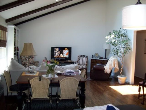
Sry, unsure how to post photos directly into this post, but link is provided. The walls as you see are very pale (dove wing and trim is white dove. Pay no attention to the upholstery on 2 chairs you see (or any clutter for that matter lol). I am about to have things reupholstered in blacks (houndstooth and a black patterned) I am not so traditional in my artwork tastes even though i have a lot of traditional and antiques. Can anyone advise? I am thinking something more abstract or contemporary with bright colors. Have never had walls this large to work with. kitchen is on opposite side of the wall, which is black and white and light brick walls. Thanks for any help on decorating or artwork.

Here is a link that might be useful:

Comments (25)

  • 16 years ago

    here you go

  • 16 years ago

    Thank you thank you ms.graywing! Would also like help in deciding a good chandelier for over that table too. We already have the electric ready to go for something hanging there. My husband wants a ceiling fan there but i THINK I have him talked out of that.

  • 16 years ago

    do you have any artwork to start with? or are you starting from zero?

  • 16 years ago

    I think I want to start from zero.

  • 16 years ago

    Perhaps like this one?

    Or do you prefer cooler tones?

    The best way to look -- simply go to art.com -- and browse through their "Abstract" section.

    Jan at Rosemary Cottage

    Here is a link that might be useful: art.com

  • 16 years ago

    Hi Oopsie917.

    A lot of people think that traditional pieces look best against traditional backgrounds & modern pieces look best against modern backgrounds. Certainly, that self-enclosed approach to things can work, and in the right hands, the results can be fine. In less skilled hands, the results of that approach ts can be utterly boring & predictable. It's like anything else. Skill counts.

    Those boring, predictable rooms are why a lot of people prefer to mix things up, instead. They think that, by doing that, good results will be easier to achieve than if they were to follow traditional rules of decorating, when in reality, half the rooms billed as 'transitional' or 'eclectic' merely look incoherent & unfocused. Unfortunately, whether you take Approach A or Approach B, there's no sure-fire guarantee of success, either way. But the chances of success are better if, when mixing disparate styles, there's a clear dominance of one thing or the other, so that the other thing is set off to advantage. Half-&-half mixtures just come off looking indecisive.

    So, since you've already got some interesting antique pieces, it only makes sense to go for a totally modern background, and fortunately, the clean architecture of your room reinforces that. But here's the thing: that wall already has a genuine focal point--the TV--rather than a pretend focal point like a fireplace which is never lit or a bookshelf full of books that don't get read, so rather than clutter up that giant wall (and to me, "barren" is only one way to view empty space) with a big painting that will only get into a shouting match with the TV--a match that the painting can never win because it has no volume control--why not just let the wall be blank? We no longer suffer from the horror vacui of the late Victorians or the Country Geese fans, so not every surface needs to have something on it. Your furniture & its bold new upholstery should provide plenty of interest, and the expanse of pristine white plaster can be the perfect foil for it.

    Spanish Colonial interiors--and here, I mean the real thing, not the parody of the style that's infected the snew suburbs in the the southern half of the country in recent decasdes--are a good example of the handsome combination serious, solid, dark wood furniture down below with clean while plaster up above. It's a strong y look, and that unfussy aesthetic works just as well in a lot of Modern interiors, too.

    Anyway, when it comes to figuring out what to do about that big white wall, rememeber this: when Tiffany's wants to showcase a handsome necklace or a collection of sparkly new rings in its windows, it doesn't clutter up the background. Less is more.

    Regards,
    Magnaverde.

  • 16 years ago

    Why not start by moving that ficus tree (or whatever it is) into the corner closer to the TV to bring some height into that space. Maybe have the chest swap places with the tree.

  • 16 years ago

    YOU KNOW, MAGNA, I catch your drift completely. In fact I have chosen very pale walls as a backdrop for what I may do with upholstery and books and accessories, lamps, rugs, etc: like a canvas. I will think about this but still feel that there needs to be more on or near that wall (for instance a swagged lamp to left of TV) I definitely like to mix styles, but I will look at Art.com.as well, Jan I Do like the squares, but prefer cooler colors.
    Thanks so far. I have included this print we have had in various rooms/houses over the years that I thought was not so great with the pale gray wall, but now, if I follow Magnas advice, I could put on that adjacent wall. Opinions?

    Here is a link that might be useful:

  • 16 years ago

    Lordy do I hate that thing. But it won't die and I guess I am more a tree hugger than I would ever admit and cant just KILL it. LOL. We have had it for years as a PO left it in our previous house. I think I WILL do a switcheroo with the chest and the ficus if possible. Good one!

  • 16 years ago

    I totally agree with Magnaverde, I would leave the wall above the tv as is.

    I would however put a heftier lamp on the corner buffet, create interest on that surface ; I can't see what kind of art you have on that wall, the ficus is hiding it.

  • 16 years ago

    Does the TV have to be there? can it be against the wall where the tree is? You may need to move the couch/chairs around... but then you really will have a blank canvas wall to play with without fighting with the TV?

  • 16 years ago

    mitch, thanks. I was NEVER going to go above the TV, but wondered if some artwork to the side (prob right) of it would work. and the artwork, mitch? I posted further down a picture of it and have since moved the chest and ficus. Its better, but but you're right about the lamp...any ideas???

    or, ummmm the tv does NOT HAVE to be there but it works the best for viewing from kitchen and from the rest of the room. I know something is not quite right yet. maybe when we get the chairs all done and moved around it will come together better.

  • 16 years ago

    Is your sofa serving as a divider between dining and living? I would put the sofa against the wall and the TV where the ficus is. I would also put lights on either side of the sofa and then artwork. Your chairs would then fit as conversation pieces facing the sofa. Personally I would use a round table and open up the space.

  • 16 years ago

    Yes, nana, my sofa is used as a divider with the table on the other side (different chairs soon) and we have thought about putting it on the long wall but we all have a thing about what we stare at when we are sitting on it and the focus in this room is the TV and the bookcases/windows and i don't necessarily want to turn sideways to watch TV. I just don't know. it is a bit of a challenge, this room and ideally we would like the TV to be able to fit into the book casing so we could look at both but then I wouldn't get to see it from the kitchen. I DO have a large round coffee table though in front of the sofa if that makes you feel a bit better. we are still in a state of rehab so will probably try things every way we can figure and get opinions on. thanks again, anyone/everyone.

  • 16 years ago

    You could take the white book case you have on the left wall and move it to the right of the t.v. not hugging the right wall but filling some of that space, Then move the Queen Anne chair over to the left and move the t.v. to the left a bit. Now you have more balance to the room. Move the small chest that's kitty cornered to where the tree is now. Remove the small striped chair from the room. Find a good reading lamp for next to the Q.A. chair and with a little tweaking the room will be perfect.

  • 16 years ago

    Hey yaya, good ideas, and I probably will move the striped (soon to be another color) chair anyway... ONE LITTLE BITTY PROBLEM THOUGH LOL..... that white book case you see is BUILT INTO the wall and window seat and another bookcase on the other side of the window...it does not move. I do want to find a cool reading lamp for the QA chair which will also be reupholstered soon in a black pattern. Thanks you, thank you!

  • 16 years ago

    That wall cries out for BIG ART! A black and white quilt? An interesting rug hung as a tapestry?

    A large cluster of related prints in smaller sizes?

    My sister had a similar wall, and she hung a huge banner (souvienir of QE II's coronation) on it, and balanced the rest with a collection of small prints hung as a "cluster" and some other stuff.

  • 16 years ago

    Unlike Magnaverde, I have never seen a blank wall that didn't give me a craving to hang good art or rugs on it.

    BTW, some fabric on those walls will improve the acoustics.

  • 16 years ago

    That's such a beautiful wall and room. Your furnishings look great in it. I wouldn't, however, use that wall for the tv. It's only an object that detracts from it and is too small anyway. It's difficult to really see what you have there but I'm thinking maybe another furniture arrangement. Maybe the sofa on that wall? Asymmetrical gallery of great art above? A console for the tv that can even allow it to be placed in an open location? Does look like a multi-functional local for the tele-tube but maybe there's a spot for a small tv in the kitchen if you want that entertainment while you're cooking. Mealtime is for conversation ;) so I wouldn't worry much about losing that feature. A good book, magazine, or crossword while eating alone can fill that bill.

  • 16 years ago

    ... have since moved the chest and ficus. Its better, but but you're right about the lamp...any ideas???

    Did you take a new pic?

  • 16 years ago

    If you consider another location for the tv, remember there are tv swivels that could provide different viewing locations for when it's in use. Linked is one example. There are probably different types. There are also consoles that hide the tv (maybe open to view when inside at lower seating level too?) then lift it up through the table top.

    Here is a link that might be useful: TV swivel

  • 16 years ago

    I think you can work with the arrangement you have, but balance it better.

    Here's what I'd try first:
    As you look at the room from the vantage point of the photo, move the TV a foot to the left. Push the sofa to the right, centered on the TV, and put small tables on either side (a square next to the wall with a lamp on it, and a demilune on the right side). Center the table behind it. You will still have plenty of room to walk around it.

    Turn the chest to sit square to the wall and closer to the doorway on the right, and hang a good-sized picture over it. Move the ficus into the corner, and set a door-sized floor mirror behind it facing out, which will give the illusion of a hallway continuing through that wall. That should snap the room into focus without adding much to it.

  • 16 years ago

    It would be great to see a few other views of the room, if you could. One standing in the doorway by the ficus, looking at the window wall, and another standing there looking toward the kitchen.

    What I am thinking is giving thought to moving things around (thereÂs a surprise coming from me LOL). In particular, whether you might consider turning the table and placing it in front of the window to open up the volume of the wonderful space you have. Rather than cutting the room into little sections, it seems like there might be a way to really open the space and work with it.
    I could see the tv mounted on an articulating arm on the end wall opposite the bookcase, to allow it to be turned toward the kitchen or the seating, and have the couch on the long wall where the tv is now. Or perhaps, if the couch would fit, putting that on the end wall opposite the bookcase, and have the tv in the corner by the bookcase, again on the wall.

    It is just hard to judge how the whole space fits right now from the one pix.

    But for now, if the furniture is going to stay as it is, for sure I would move the tv to the corner where the marble-topped chest sits. That still allows viewing from the seating and the kitchen. Doing that would open up the wall space for art. Putting something there now will only compete with the tv for attention, and feel disjointed.

  • 16 years ago

    My thoughts were as Les suggested in her last paragraph, move the TV to the right corner of the room, on an angle, in place of the marble topped chest. Put the leather recliner where the wingback chair is, and the wingback where the striped chair is. The striped chair could leave the room, or be put on an angle next to the tree. THEN look at the walls and decide what, if anything, they need.

  • 16 years ago

    I have listened to all and HAVE actually moved the couch to the large wall and moved the TV where ficus originally was.
    the layout is really less awkward and the TV definitely looks less lost.
    Now I just need to find a new upholsterer, look for a chandelier, new lamps, art etc.... so much to do.
    will post tomorrow what it looks like now but still much to do. I am actually enjoying the view from the couch now as I can see whats going on in the kitchen.

Sponsored
Whisler Home Improvement
Average rating: 5 out of 5 stars9 Reviews
Franklin County's Committed Home Improvement Professionals