

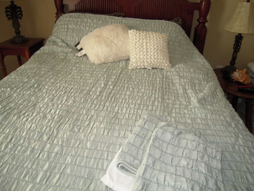
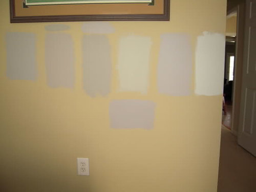
Desperately need help with gray paint! (pics)
15 years ago


Sort by:Oldest
Comments (10)
Related Stories
KITCHEN OF THE WEEKDark Gray Sophistication in a Shaker-Style Kitchen
Rich paint used throughout this compact London space helps create a kitchen that’s contemporary and inviting
Full Story
KITCHEN DESIGNDesign Dilemma: My Kitchen Needs Help!
See how you can update a kitchen with new countertops, light fixtures, paint and hardware
Full Story
GRAYChoosing Paint: How To Pick the Right Gray
Which Version of Today's 'It' Neutral Is For You?
Full Story
EXTERIOR COLORWhen to Paint Your Home Gray
This perfectly neutral and highly versatile color can create subtle distinctions among exterior architectural elements or stand on its own
Full Story
KITCHEN DESIGNObsessed With Gray in the Kitchen
See How to Use This Sexy Neutral to Heat Up Your Cookspace
Full Story
MOST POPULAR50 Shades of Gray
Gray is hotter than ever, thanks to a hit novel full of risks and dark secrets. Tell us: Which paint shade possesses you?
Full Story
EXTERIORSHelp! What Color Should I Paint My House Exterior?
Real homeowners get real help in choosing paint palettes. Bonus: 3 tips for everyone on picking exterior colors
Full Story
COLORBathed in Color: When to Use Gray in the Bath
Go for elegance and sophistication without going overboard on coolness, using these gray bathroom paint picks and inspirational photos
Full Story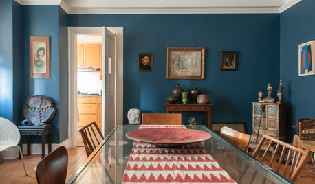
COLORPaint-Picking Help and Secrets From a Color Expert
Advice for wall and trim colors, what to always do before committing and the one paint feature you should completely ignore
Full Story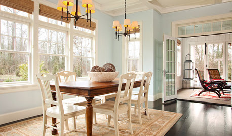
COLORPick-a-Paint Help: How to Create a Whole-House Color Palette
Don't be daunted. With these strategies, building a cohesive palette for your entire home is less difficult than it seems
Full Story
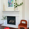
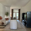
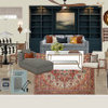
B H
mjsee
Related Professionals
Sault Ste. Marie Interior Designers & Decorators · Rutland Interior Designers & Decorators · Phoenix Interior Designers & Decorators · Juneau Interior Designers & Decorators · Riverton Interior Designers & Decorators · Montréal Interior Designers & Decorators · Gulfport Kitchen & Bathroom Designers · Greenville Kitchen & Bathroom Designers · Florence Kitchen & Bathroom Designers · Williamsport Kitchen & Bathroom Designers · Pullman Kitchen & Bathroom Designers · Lagrange Kitchen & Bathroom Designers · Valdosta Furniture & Accessories · Frisco Furniture & Accessories · Farmington Furniture & AccessoriesUser
always1stepbehind
jockewing
gmnolenOriginal Author
gmnolenOriginal Author
tracey_b
busybee3
ptamom