Software
Houzz Logo Print
cosiegirl

Help with LR Curtains, please!

15 years ago
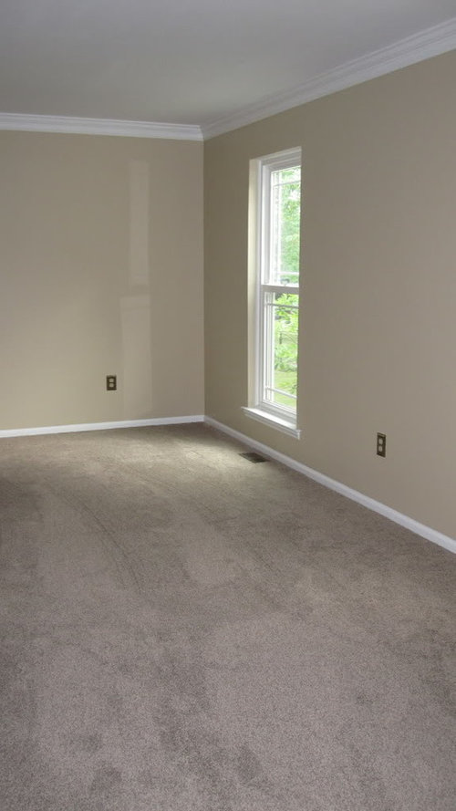
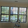
I have new paint and carpet in my LR/DR (adjoined) and I am questioning the curtains I just ordered. The background is very neutral so I was hoping to add a pop of color with curtains (sofa and matching pillows to follow later).

My problem is, I tend to like a more monochromatic palette so picturing the green curtains in this space is feeling odd to me. Now I'm wondering if I should order the same curtains in a more neutral color...sigh.

What do you think? Theoretically, couldn't I get away with any color in such a neutral space?

The curtains I ordered are from JCP, but the picture doesn't quite do them justice.

Comments (14)

  • 15 years ago

    What color are the walls? I really like the color.
    I can empathize with you. Although I have color all over my house, I would be happy with beige, ivory and off white wth many a bit of color in the throw pillows. I am always drawn to monochromatic rooms.
    First off, do you really love the green drapes or are you talking yourself into a pop of color? You will have to bring this green around the room in accessories and throw pillows to for balance. What do the other curtans look like? You can still get your pop of color with throws, pillows and art and keep the drapes more neutral.

  • 15 years ago

    I have light walls and green curtains (because of my former sofa-- had to) but it is sort of too much contrast for me.

    I could see you doing a lot of neutrals and focusing on different textures-- like those curtains have enough interest (the circles and shiny material) to hold their own in beige. I'd get something neutral for the sofas, and add in, as ellendi said, the color in things you can easily change. That kind of green is lovely.

    I just don't want you to always have to work around those curtains if you are not in love with that look. Would it be too hard to get them also in beige and try them both?

  • 15 years ago

    My first perference would be for a more monochromatic color scheme in regards to the wall and WTs. I think it would look stunning in a greige or ivory. I have walls painted a similiar shade and used drop cloth curtains. I love the more subtle, textural difference and it really highlights the pops of color, art and black frames which I want to emphasize. That said, I do think you can work with the green for a more modern look if that direction you wish to go in.

  • 15 years ago

    If you prefer more monochromatic settings, then I would switch these out for a more neutral set. You may tire of it after a while. It also limits you in the art and accessories dept.

    btw, the color on your walls is very pretty.

  • 15 years ago

    Honestly, I do not care for them....sorry.

    What about a brown or a mocha color?

  • 15 years ago

    I find neutral with a so-called "pop" of color usually leads to very unsuccessful rooms. Partly because people think neutral goes with anything. It doesn't. Your paint and rug have pink undertones that clash with the acid green curtains.

    I agree with anele. That room could look great in all neutrals but with lots of texture. Find interesting furniture, stone sculptures, nubby knotted modern throws, some white upholstery. Here you'll do better going for the look you like anyway.

  • 15 years ago

    What color is the sofa/chairs etc? How many windows are we talkng about? Another option for "some" color is to use a neutral colored panel and add a band of fabric or grosgrain ribbon (maybe something brighter) to the lead edge of the panel.

  • 15 years ago

    i think as long as you're going neutral with the sofa and furniture, lots of color in your curtains can be fine!

    if your furniture is all very neutral and you hang neutral curtains, it can be a very nice soothing look or it can look very BLAH....depends on your fabric choices and accessories.... it is very difficult to choose curtains if you don't have an overall plan though. BUT, ready made curtains are cheap compared to nice furniture, so it's easy to change them out if you get tired of them (or change them out seasonally if you like change!)...

  • 15 years ago

    Maybe what you are really looking for is pattern and texture. I just saw these @ west elm and thought they looked very nice and neutral but w/some pattern.

    http://www.westelm.com/products/ikat-ogee-linen-window-panel-r917/?pkey=cwindow-panels-curtains-shades

  • 15 years ago

    marcolo, I see your point about the pink undertones. Seeing this, I would agree that those curtains in green would not go.

  • 15 years ago

    Oh no, don't say pink undertones! I think that may be the picture, I tried hard to stay on the gray/taupe side.

    I am just reading all comments and agree with pretty much everyone. As I tried to visualize the curtains what I saw was too much contrast. I think a neutral (off-white) curtain would look much better. I even tried to cancel my curtain order but it was too late.

    I think my problem is that I like color pops when I see designers do it, but I just can't pull it off myself. I do better with matching tones, and I prefer light/neutral spaces overall.

    Thanks everyone. I guess I'll have to do more shopping.

  • 15 years ago

    cosie, I think it's just a monitor thing. On my laptop I saw pink-- now I definitely do not in your wall color. Maybe a little in the rug, but I'd never think about it.

    I think the color pops look a lot easier to achieve than the reality of pulling them off . . .but I find this true of decorating in general! And remember, you can still use color, only your bottom "layer" will be neutral.

  • 15 years ago

    Don't be scared to try a pop of color! Check out pipdog's amazing room.

    Hopefully it will inspire you. It sounds like you know what you want and are just having trouble getting it to materialize.

    Jennifer

    BTW - I don't see pink but monitors vary so much....

    Here is a link that might be useful: Talk about

  • 15 years ago

    I do pops of color or black with throw pillows, picture frames etc, but my main palette is neutral.