Software
Houzz Logo Print
crackedincolorado

Finished this today

18 years ago
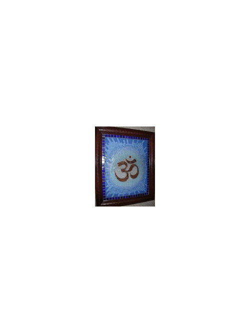
It didn't turn out the way I wanted it to; i.e. like a sunburst; I'll just have to try again! grrrrrrr. What programs do you all use to transfer an image to paper??? I think I'd have better luck if I didn't "wing it!"

Comments (30)

  • 18 years ago

    VERY COOL CRACKED!!!
    I love how the color changes into the other.
    Great frame too!

    Hazie

  • 18 years ago

    It's still way cool! Even though it didn't turn out the way you wanted, it's still a great piece. Good job!

  • 18 years ago

    I really think its awesome...sorry it didnt turn out how you wanted it to. It really is cool though!!!

    I wonder if you could have gotten the better startburst pattern you were looking for if you had drawn it out with graph paper??

    I still love it though!!!!

  • 18 years ago

    That turned out beautiful. I like the color changes too. Funny, I'm a computer geek but I tend to wing my mosaic designs. I've layed out concepts on the computer but I end up free forming on the item.

  • 18 years ago

    I think it rocks. I love the change of colors, you did a great job, even though it didn't turn out how you wanted, it still rocks.

  • 18 years ago

    This is just BEAUTIFUL! The colors are sooo nice and the frame is great! I think it looks like you planned it just this way...

  • 18 years ago

    Well I do not see any problem with it at all. I think the color blending is GREAT!! So pretty.

    I just drew out a pattern today on paper and transfered it to my dresser top using, GASP, Tracing paper. Hehehe

    Chris

  • 18 years ago

    I agree with everyone else, it's a beautiful piece!! I love the colors!

    Maria

  • 18 years ago

    GOODGRIEF!!!!!!!!!!! How could you be dissatisfied w/that beautiful piece. It looks pretty perfect to me. It's WONDERFUL.

  • 18 years ago

    Wow! It is so beautiful! I don't know what you had in mind, but this looks great to me!.
    I am not familiar with that symbol, can you explain it to this unenlightened one?!
    Lori

  • 18 years ago

    Very pretty design! I, too like the way the colors graduate and blend together!

    Pat

  • 18 years ago

    Very nice, I guess it didn't turn out the way you had envisioned it, but it's great. I really like it,
    Cindy

  • 18 years ago

    I love the color graduation !! To me it looks perfect !

  • 18 years ago

    Looks great to me too..you're shading is beautiful.

  • 18 years ago

    I think it's beautiful! I must be ignorant since I don't see anyone else asking...lol What's the symbol?

    oh wait Meadel and I are both lost and confused (waving at Lori)

  • 18 years ago

    Oh, I like it a lot, its beautiful. Nothing wrong with that mosaic IMHO.
    Bianchi

  • 18 years ago

    Very nice! Love the shading!

    I'll join those who don't know the symbol, but
    it seems like I saw something like that on the
    movie "The Mummy".

    Is it Egyptian?

    KM

  • 18 years ago

    The sunburst works for me! I too would like to understand the symbol? Looks Farsi to me...

  • 18 years ago

    I like it. The sunburst effect looks great to me. Why are you not happy with it?

  • 18 years ago

    I think it looks better this way than if it was a symetrical sunburst. Goes better with the free flowing center. Anywho, it is really pretty and a great combination of colors and frame.

  • 18 years ago

    Whew! I am glad you all like it because I made it at the request of a friend of mine! Now I won't hesitate to send it to her!

    That is the "OM" symbol. It is a sacred syllable in the Indian religions. It is placed at the beginning of most Hindu texts as a sacred exclamation to be uttered at the beginning and end of a reading of the Vedas or previously to any prayer or mantra. The Mandukya Upanishad is entirely devoted to the explanation of the syllable.

    Thanks again for all your compliments...now I have to find a box to ship it in....

  • 18 years ago

    I like it too! The symbol reminds me of the one the music group New Monsoon has as their "symbol"
    but since I don't know what theirs is either, I'm stumped also.

    Here is a link that might be useful: New Monsoon

  • 18 years ago

    Funny I didnt even think to ask what the symbol was. I thought it was a fancy 30!!! What a dork I am!!!

  • 18 years ago

    Well, I don't know what was is your mind's eye, but this turned out great! The color radiates nicely from the Om. I think your friend will be thrilled to receive this!

  • 18 years ago

    Have to agree with everyone else, it looks great! Color choices, design, and all! Patterns are made to be broken (or not followed). : )

  • 18 years ago

    New Monsoon's symbol looks like the Roma numeral 5.

  • 18 years ago

    Cracked, I keep coming back to this. IT'S SIMPLY BREATHTAKING! I love religious symbols. I showed this to my DH he thinks its beautiful too.

    I think New Monsoon's symbol is a lower case n over an m.

  • 18 years ago

    I gotta agree with mosaicwench1; roman numeral 5...
    crystal01; i can make you one if you want...

    NOT!!! LOL!!!

  • 18 years ago

    I should know what New Monsoon's means, my nephew travels with them & does the merchandising. I'll have to ask him again. It does mean something if I'm not totally off track.

  • 18 years ago

    Uh, gals..when you get to New Monsoons site, click on the CD cover (which the title is apparently the roman numeral for 5) Then you will get to their site where you will see their symbol.

Sponsored
Wannemacher Interiors
Average rating: 5 out of 5 stars26 Reviews
Customized Award-Winning Interior Design Solutions in Franklin Cnty OH