Software
Houzz Logo Print
rjr220

Yet another request for backsplash opinion

16 years ago
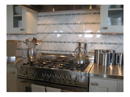
We've gotten to the point of a backsplash decision. Our kitchen is stained birch with black venata soapstone (love love love love. As it becomes less oiled every day new sparkles pop up. It is so lovely). I have publicly professed my love for this particular backsplash design in prior posts:

However, our Venata is very veiny and showy and we want it to be "the star". We've gotten a sample of the Porcelanosa Carrara knock-off -- which is quieter than the real stuff -- and it just seems to compete with Ms. Venata. So I think that although I love the concept, it won't make me happy. And isn't the point to make me happy? (please just nod your head and let me think that it is.)

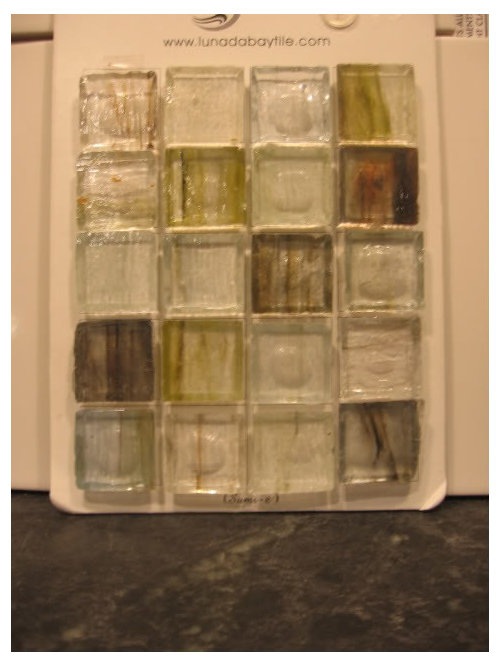
I also like Segway's 6 x 8 subways, and have fallen in love with the Sumi-e ongari 1 x 1's, which look like this.

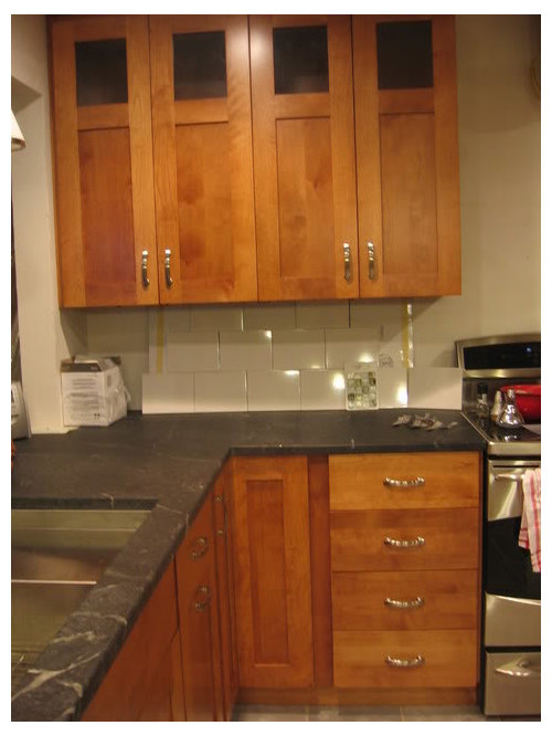
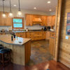
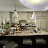
So, I am thinking of using the marble/glass concept, but with Segway's 6 x 8's and the Sumi glass, and a whitish grout. Here is the mock-up in my kitchen. The glass tiles copied much darker than they are IRL -- and please excuse that I am showing you where my plastic bags are stored.

{{!gwi}}

However, I also like it without the glass -- my DH thinks that it is too plain. My mind is tired of decision making. We're thinking of painting the kitchen/adjoining DR a gray/green/blue -- who knows? I'm hiring a designer to come give me a color opinion, but would like to decide on whether to use this splash design, and include the glass tiles.

So please, I trust the opinions expressed here. What do YOU think?

Comments (27)

  • 16 years ago

    I love the look of the tile without the glass tile. The white tile is simple, but looks so nice with your soapstone and cabinets. Very classic and timeless which is what I personally like. Good luck!

  • 16 years ago

    I can see why you are in love with your soapstone! It is gorgeous and so nice with your cabinets. Reading your ideas I thought I would prefer the plain subways, but looking at the pictures, I think I prefer the glass detail. Both choices allow your lovely soapstone to be the star!

  • 16 years ago

    Thanks, sis and jrueter -- any tiebreakers out there?

  • 16 years ago

    I like it with the glass tile. The stripes are not my personal favorite, but I think it does evoke your inspiration pic without being too busy, especially if the glass is as light as the close up shot. It looks dark in mockup, but if it's lighter in person as you said, then I would go for it.

  • 16 years ago

    I am confused. Would the glass be where the horizontal stripes appear in the subways? Anyway. I would opt for the glass detail. However, full disclosure. For whatever reason, I am not a fan of most subways (there are occasional exceptions) and I am a fan of unusual tile.

  • 16 years ago

    I agree with sis2two - the subway tile by itself will show off the beautiful cabinets and soapstone without being boring at all. The glass seems to make things just a little too busy, especially if you have other items along the wall that break up the horizontal lines of glass. Try putting the coffee maker, knife block, i.e. whatever you'd place along that wall, in front of the tile mock-ups to see if you like one better than the other.

  • 16 years ago

    I understand why you like the inspiration backsplash. But I IMO I don't like your version of it. I see why you like the small tiles. How about subway tiles all around and use the small ones in an interesting backsplash above your range? It looks like you have room there. I have plain subway tiles in crackle finish and love them! But all of this is a matter of what you personally like. So far your cabinets and counter look great together and when you get the backsplash up it will look even better!

  • 16 years ago

    Those glass tiles are gorgeous. I can see why you want to use them. However, I don't love their placement in stripes. Not very helpful as I don't have any other placement suggestion. I think the plain subway is also very pretty. It won't look as stark when you have items on your counter.

  • 16 years ago

    If you are looking for a happy medium between the two styles, how about using the subway tiles with just one row of glass tiles above the first row of subways?

  • 16 years ago

    My vote is for the last pic.

  • 16 years ago

    I'd vote for a single row of glass tiles or glass tiles in a special place. Of course, my view is that of simplicity over the long haul.

    Good luck
    Suz

  • 16 years ago

    I love the plain white!

  • 16 years ago

    I think that the plain white looks better under the cabinets. I agree with Zazutoo that you should save the glass tiles for a special place--maybe over the cooktop, in a wide stripe instead of the single row of tiles?

  • 16 years ago

    Hmm... I agree with the idea of either a row 2 tiles tall of the glass or in a special place.

    The white looks okay but what really strikes me is the shape or size of your white tiles. If I am seeing your inspiration tile correctly, they are more of a traditional subway, i.e. long and narrow. Your sample tiles are basically squares and to my eye that is what is not working in your sample layouts above.

    I highly recommend going with a more traditional subway look with the glass mosaic tiles in a liner look two high. The longer look will repeat the shape of your cabinets and tie in the backsplash much better than the squares will.

  • 16 years ago

    I love the look of the plain subway tile. Very pretty and classy.

    I also fell in love with a tile very similar to your accent tile but with maroon tones - it may have been the same one. I could not find a way to fit it into the kitchen, though.

  • 16 years ago

    Thank you to all, and to giving me a few more options to think about -- I have also been attracted to 2 x 8's, but those aren't ones that are easily available as samples to stack up. I think I've also seen 4 x 8's somewhere. I am being drawn to the plain design more and more, and the option to punch it up with other accessories.

    Really, this and paint colors left. Just as bad as choosing pulls.

    Good news: I unpacked the last box just a few minutes ago. I have 6 empty drawers . . . . and 8 empty upper shelves. And I threw very little away, as when we moved 5 years ago I did a major thinning. Thanks to good guidance from all, I have major functional space. Oh, and I have the pork chops thawing on the soapstone while the pizza dough rises under the xenon UC lights. Never thought of that trick while planning the kitchen!

  • 16 years ago

    I think it would look good to keep the glass tiles, but band at least 3 rows together, possibly 5 and run the this thicker slash of color through a neutral subway tile. That would look great IMO. I haven't gotten to tile yet, but I'm leaning that way myself. I'm looking at Sonoma Tilemakers "Slivers" glass inserts. Wow! I love them.

  • 16 years ago

    I thought exactly what earth_pal said - the subways are too square. Then, when you add the strong horizontal line with the glass tiles, they look even more square.

    Aren't the tiles in your inspiration photo really long and thin, like 18x4 or at least 12x4? I think that's what makes the horizontal glass line work well in the inspiration photo. And I think your choices would look equally beautiful if the field tiles were much longer.

  • 16 years ago

    Have you looked at subways in other colors? Daltile Rittenhouse Square 3 x 6 comes in a number of colors and a plain subway but in a tile that provided less contrast to the black soapstone and the dark cherry might be the ticket. There are almonds, biscuits, puttys, greys...

    Here is a link that might be useful: Rittenhouse Square.

  • 16 years ago

    The subway tiles in your inspiration pic look like 3x6s...whereas your mockup has the 6x8s...I think to make that look work you would need to do the 3x6 tiles. Something about the rectangular lengthiness of the 3x6s with the square tiles running through them just work better linearly. Using Seg's 6x8s, while beautiful (and I believe Segbrown has only the 6x8s), don't work as well with the glass tile inserts. Which is why I think a lot of people prefer the plain version with no glass tile accents.

    I do like the way the glass tile picks up the dark colour of your gorgeous, gorgeous soapstone. I just don't think the 6x8 subway tile works with it.

  • 16 years ago

    Yes, Segbrowns' backsplash doesn't have any type of glass tile accent. Which is why i think it works so well. You may remember my kitchen has the 2x8 subways, and again have no type of accent, as I think the distorted shape is the style point...and if either of us tried to overcomplicate it by adding another material, it would take away from the main draw of it being an unusually shaped, non 3x6, subway tile.

    Here is a link that might be useful: {{!gwi}}

  • 16 years ago

    Redroze raises a point that I think I *saw* but I didnt realize it until I read the last comment.

    The inspiration is tone on tone, everything is low contrast and in the realm of cool whites and greys. You are trying to pull off the same look with the high contrast of black, white and orangey brown. Try it with a grey subway tile and see what happens--something to lessen the contrasts.

  • 16 years ago

    I vote for the white tile. I very much like the glass tiles, but find the mosaic size to be too small and feel it is too busy. I also think it is out of proportion to the cabinets and counters and therefore competes too much. The subway size tiles are in better proportion and create a longer line and more peacefulness. I am still searching for an pearl aqua glass tile in subway size, but have yet to come across it.

  • 16 years ago

    Oh palimpset and redroze -- I believe we have some kitchen ESP happening. I was just on Daltile's site in the early evening looking at their subs, wondering if I could interest DH in another color, actually looking at the bisque and then the gray. They have some 4 x 8's available (can't remember the color anymore, since it's been a whole 2 hours ago)
    And Redroze, I've had your 2 x 8's on my mind, and showed my husband your kitchen on Saturday. He isn't a fan of 3 x 6's, and is attracted to the unique sizes and like yours . . . And I think you hit it on about the "non 3 x 6" size being a focal point itself.

    I have tomorrow off. I will be running around trying to find some varied color, non 3 x 6 subs. Wish me luck in this wee Southern town.

    I cannot tell you how much I greatly appreciate this input. My husband is OOT this week, luckily he's used to coming home to changed game plans about the kitchen details. He's learned that the ideas I have been offered here are fabulous!

  • 16 years ago

    My husband also pointed out that based on your photo, the 6x8 tiles make the backsplash space between your countertop and upper cabinets look short. Technically you have three tiles stacked under your upper cabs, just like Segbrown. However Segbrown has two main spaces with lots of backsplash area - the long run of backsplash with the stainless steel shelf, and also the area above her sink. She also has upper cabs with glass doors to make it feel more open and airy...whereas the photo I see of your kitchen has the glass cabs that are stacked on top, but aren't full glass like hers. Not sure if your kitchen has some large backsplash features like hers.

    Anyway, just something to keep in mind. I love your cabinets and soapstone by the way. Something about them looks very classy and expensive while still feeling homey. Have fun shopping!!

  • 16 years ago

    Your kitchen is gorgeous...but I also am not loving the tile selections. Looks like you are going to grab some different options so look forward to seeing them. Think you need some color...or the gray sounds good too.

  • 16 years ago

    rjr:
    There's a difference between your kitchen and the one in the photo: it's the rectangular lines in your cabinets. Take a hard look at the more dominant pattern of your wood horizontals and verticals compared to the painted ones. Your kitchen already has such significant grid features in the cabinets that a second grid or horizontal line feature works against it. Ask yourself: what is this wall about? If the answer is "It's a warm wall of fine cabinets competing against a wall treatment of horizontal lines" you see what we're seeing, based on a couple photos.

    Consider something softer, perhaps even plain paint?
    A matte or slightly irregular surface texture would complement the wood and stone; not a fan of anything shiny there.

    At the very least, grout the tiles in a color which makes the grid disappear.