Software
Houzz Logo Print
nineteenoeight

Warm or just CRAZY?

14 years ago
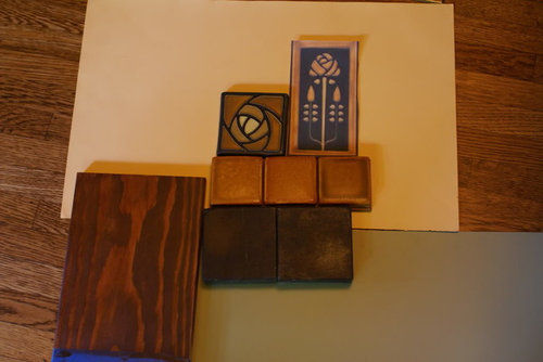
I'm pretty nervous about this but we are going for a very strong colored kitchen. Hoping it looks warm.

Plan is -

dark wood trim (similar to rest of house, very old)

yellow walls

Lower cabinets - green (not certain which green)

Uppers - there aren't uppers, just built-ins with the dark fir trim around them, glass doors, and open shelves against the yellow paint. One pantry cupboard to the side will be of dark stained oak.

Tile backsplash - see photo. The earthy orange will be the field tile, center will be the Dard Hunter Rose, flanking it will be two of the 'long roses.' Around the walls the tile will be only 8' high, the earthy orange with some black accents here and there.

Counter is soapstone

Floor is oak

What do people think? Warm or just CRAZyYY?

By the way, this forum has been a LIFESAVER. Hoping to pay forward the debt by posting more as we narrow down to finishing this huge project. My time is not my own these days.

Here is a link that might be useful:

Comments (17)

  • 14 years ago

    I think the combo looks terrific, with a few cautions.

    Your paint color choices actually look great on my monitor, but make sure you test out LARGE samples in the actual light.

    My other concern is the size of the field tile. How big is it? Are you covering the backsplash with a small mosaic (which I am not sure that I'd like) or am I misreading proportions here?

  • 14 years ago

    I think we are on a very similar path of destruction! :) We decided on Cherry cabinets (w/o stain) to lighten it a bit. I think everything you have picked out is fabulous. The trick may be in your lighting. We just put in some LED canned lights, and will be adding LED under cabinet lights on a dimmer. I want to see it when it is done!

  • 14 years ago

    Oh, thank you for saying terrific!!
    Sorry for the confusion with the tile sizes. The field tile is a sample - the size is 4x4, exactly the same as the Dard Hunter Rose. The tall roses will be 4x8. And the soapstone is a slab, not tiles, those are samples too.
    I put a mockup of behind the range (which isn't the right colors but a general idea) on the photobucket site.
    I am stressing so much about the paint color. It is changeable, but what a hassle on the cabinets. So hoping to get right.

  • 14 years ago

    Warm and wonderful, harking back to an era of a fine design, time tested, and time honored. This is exciting, and how nice to hear both of you are designing out of the current box, wonderful as it is. Marcolo's points are really good, also the issue of the right lighting. Scale--are those feature tiles large enough, or small enough, for the space they'll be accenting?

  • 14 years ago

    Oh, I feel better now that you've explained.

    What you're doing isn't crazy by any stretch of the imagination. Yes, getting the colors right will be a pain. Just remember your sample swatches have to be painted BIG BIG BIG. The bigger the better, so you can really see what they look like over a large expanse.

    Get some sample pots, and get painting!

  • 14 years ago

    Wonderful colors and materials! I can't wait to see this. The soapstone and green lowers will balance the stronger warmth nicely, I think. Very rich.

    Just curious after checking out your album. Will you be posting your layout for input, or is this a layout you've worked with and like already?

  • 14 years ago

    Warm and Crazy Good! Can't wait to see it.

  • 14 years ago

    rhome - I did post my layout for input, but I can't find the thread, I got some good advice. I ended up doing the one that I left in the album. Too late now for input, lol - we gutted and went out 4 feet north, it's all closed up again - just waiting on cabinets, then the slab can be measured & we'll wait on that. I hope to get the before, in the middle and after pics up eventually, just have been overwhelmed by the whole process and the amount of decisions. We not only did the kitchen, but also redid the electric & plumbing from basement to upstairs on that side of the house, gutted and replaced the upstairs bathroom, and cleaned up the basement (and that's another story).
    I have been lurking on here since February and I am utterly, utterly grateful to everyone who gives input and support. Even when it isn't your own kitchen, it is useful and helpful to read the advice and suggestions and commiseration! I hope to participate more now that I'm feeling slightly more in control of my life.

  • 14 years ago

    I think it's fantastic! Just be sure you have enough lighting planned, and it will be fabulous.

  • 14 years ago

    Oh, good. Either I missed it or forgot! Now that you say so, though, the layout seems familiar. Looking forward to seeing the finished result!

  • 14 years ago

    The dark hunter rose tile is so nice! I'll definitely be watching for your kitchen nineteenoeight.

  • 14 years ago

    Very pretty.

    Sunset Magazine did an article in Feb. 2011 where they showcased a vintage dining room. They used a fantastic combination of green and a "greenish tanish yellowish". They used BM Twisted Oak Path #226 and Cleveland Green #1525.

    They might work with your plan.

  • 14 years ago

    Fabulous...can't wait to see the finished product. Love craftsman anything.

  • 14 years ago

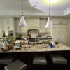
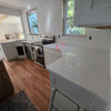
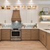
    I certainly don't think you're crazy. Here's part of my still unfinished kitchen...

    I went brighter than you, but similar color choices.
    And here's the nearby powder room:

    Ditto, Marcolo's advice on large swatches of paints. I went through...no lie...16 shades of yellow between the powder room and kitchen before hitting on the right ones.

    Sounds fab to me.

  • 14 years ago

    melissastar- Which yellow did you end up with? : )

  • 14 years ago

    2 little fishies: I ended up with Rich Cream on the kitchen walls, Cream Yellow on the yellow cabinets (not pictured above) and Crown Hill Yellow in the powder room. Rich Cream is yellower than it appears on a small chip, Cream Yellow was just to me the perfect yellow...soft, buttery, neither greenish or orangey. Crown Hill Yellow is richer than it appears in the pictures, but perhaps it only appears that way in the powder room, which is small, and has only a small stained glass window, so the color reflects back on itself and seems to intensify....another good reason to make sure you swatch big. I used posterboard that I covered with the paint and then could move the posterboard around the room to see the color in shadow, bright light, etc.

  • 14 years ago

    Melisstar, your kitchen was one of my inspiration kitchens!! My husband and I both loved your tile and the green cupboards and the whole craftsman feel. I have looked at it often. :)

    1929Spanish - thank you!! I am off to find the article and/or the paints.