Software
Houzz Logo Print
a2gemini_gw

Tile design and pattern

14 years ago
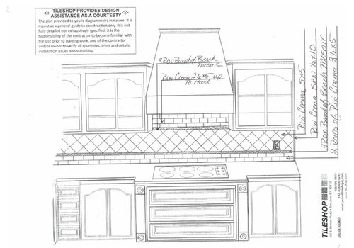
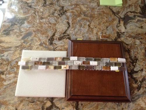
As some of you now (probably most of you), I picked my tile :-)

Now on to design. The TD (tile designer) sent a plan using bricks followed by a strip of accent and then diagonal 5x5 above to the cabinets.

Over the stove - there is a second accent strip and then switches back to bricks.

At first I didn't like it - but I am starting to like the concept. Thoughts??

Plan

In case you forgot my choices with so much flying around..

Cambria Buckingham, Brookhaven Autumn Cherry with black glaze, BM Coastal Path wall color

Thoughts?

Comments (35)

  • 14 years ago

    Like it!

  • 14 years ago

    Me too!

  • 14 years ago

    Looks good to me, if you don't want something special over the cooktop....

  • 14 years ago

    I love it! I think the counter has so much movement and the accent tiles will contrast the field tiles enough that I don't think you need anything more complex over the range.

    I just love your counter! I saw something similar yesterday and it's really making me think hard about stone vs Corian. Guess I shouldn't worry until I actually get some cabinet quotes.

    I can't wait to se your kitchen! It's going to be fantastic.

  • 14 years ago

    I really love the BS but not so in love with the area above the cooktop. Trying to decide why . . . . . . .

    Love the mosaic across bottom of the upper cabs. I think it is what's happening above the mosaics that is bothering me. Maybe if you took the mosaic all the way up instead of the subways, or if you added some of the single tiles from the mosaic as an accent in that area, or continued the on point tiles above the mosaic? Maybe even if you used the larger tiles in a brick pattern instead of using the mosaics?

    Just trying to give you my HO. To me, it looks like subways were slapped up there because you didn't know what else to do.

  • 14 years ago

    Would it work size wise if above the cooktop you did a 5 row band of mosaic and end with a 2 row of the 2 1/2 x5?

  • 14 years ago

    Hmmm. To me, it's very pretty, but too fancy/complicated for your cabinets and rest of kitchen. I see that kind of backsplash in a kitchen with raised panel or beaded cabinets and more elaborate hardware. To me, your kitchen reads as traditional/transitional but with clean simple lines.

    I love the mosaic you found and the idea of an accent strip. But I'd rather see it presented more simply, not with switching from brick to diagonal to brick again. And maybe...just one accent strip? I would think, though, that you could do something with a bit more of the mosaic behind the range if you'd like. FWIW.

  • 14 years ago

    I think melissastar hit the nail on the head. Very pretty, but not in keeping with the simple, clean, but rich feel of your kitchen. I do so love that glass mosaic accent!

  • 14 years ago

    I also think it's a pretty combination of tiles...but too busy. Maybe keep the beautiful mosaic strip all the way across, but just use the diagonal tiles above the cooktop...outlined with the mosaic?
    {{!gwi}}From Cottage house plans

  • 14 years ago

    'nother thought. How about abandoning placing the squares on a diagonal, but still using them? Just line them up brick style too. It will till be a bit on the busy side, but I think it would tone it down quite a lot.

  • 14 years ago

    Or... try squares, mosaic, brick in middle, mosaic, end with squares

  • 14 years ago

    I really like the brick, then the mosaic and then the squares on point. I think that plays better with the simple lines of the kitchen than the brick, mosaic, brick.

    Maybe it would look better if the square on point just continued up to the hood instead of being broken up by the mosaic? I love it other than that part above the hood.

    I wouldn't do a single row of the mosaic. It is way too pretty and perfect to use just one row, but it may look better not having that extra strip below the hood.

  • 14 years ago

    I like lavender's idea. But I also like the larger square tiles as the larger area. How about keeping the bottom bricks, then accent, then squares for the field with the area over the stove still having the accent box and diamond pattern?

  • 14 years ago

    Since you are getting lots of suggestions for alternate layouts of your backsplash, here is one more. Use the 2 rows of brick and the band of mosaic as shown in your first post. Use the diagonal squares as planned but on the top of the diagonal tile run a band of the mosaic under the cabinets all the way across past the cooktop area to the end of the run, (instead of the band just being between the uppers on each side of the cooktop). This way the diagonal tiles will be boardered on the top and bottom for the whole length of the backsplash area. Continue with the brick above the new longer top mosaic band in the area blow the vent hood. Perhaps make the mosaic bands be 4 high instead of 3. Sorry I don't know how to draw it out for you. Hope this idea makes sense to you.
    What ever way use choose will look nice.

  • 14 years ago

    I think what is bothering me about that area is the lack of balance between the bricks. They are two deep below the mosaic and three deep above. I wish I could whip out drawings but I can't.

    Aren't you glad you asked for opinions now? lol You're going to end up with a gorgeous BS. Just needs a little tweaking and it will be perfect.

  • 14 years ago

    On my phone and not great at texting! So a bit cryptic.
    Wow! Lots of ideas.
    Thanks!!
    I will look more closely when on the computer.
    As most of you know, the drawing isn't my actual kitchen design. I didn't post any of the zillions of pictures from my kitchen. I will try yo post one or 2.
    Sorry if this confused anyone.
    Back to sleep for now!

  • 14 years ago

    Back again to include a picture of the kitchen (not finished) so you see the cabinet style. I will do some measurements of the hood area. The hood comes down 9 inches from the cabinet.
    I want to thank all for input - this is such a great forum. I am liking Pooh's idea of the brick, accent, and then all diagonal and not going back to brick and also remodelfla
    Pooh - I think you are suggesting putting the band of accent higher - above the few plug/outlets - and then only use one band? And maybe a slightly thicker band (5 rows instead of 3?
    Another option would be to stay all brick.
    I am glad others were bothered by the second band of accent and the switching back and forth.
    pawa, linelle, annie - thanks for your support - feel free to add other comments based on the others.
    williamsem - Pretty amazing what they can do with Cambria and other quartz these days! And non-porous. If you buy Cambria - they send you a beautiful cutting board after install! (Not sure they always do, but I got one!)
    Four - Not sure what you are saying - but I am thinking you want 2 sets of accent - how about one thicker one higher?
    Lavender - great idea also - still cogitating on having something different behind the cooktop - I always love your ideas.
    Hope I didn't miss anyone- have to run - I have a date with my bicycle (with my DH). Stress reliever from all of the mess!

    West and South wall

    North wall

    Close up of the cooktop area

    Close up of the north face

  • 14 years ago

    Oops - I think I am rushing - that was my GW "soul" mate Badger who suggested the upper accent all the way around - sorry Badger

  • 14 years ago

    Well, that makes ALL the difference, A2gemini. I was agreeing that 4x4s set diagonally (which I love) just weren't going with the arched insets and different angle of the hood. As it actually is, I think the diagonal lines will add their usual perky energy to the whole picture, while the horizontal lines continue those of the cabinets.

    Because the actual space behind the stove is taller than wide, versus wider than tall, though, I'm wondering whether something else would be better than a relatively short horizontal line near the top, same for the oven area.

  • 14 years ago

    I'm not sure what I'm saying either, a2. I love your accent tile, and would love to see more of it, but not sure if two bands would make the BS too dominant a feature. Maybe just one low, thick band (5 or so high)?

  • 14 years ago

    I wanted to share better pictures of GFs kitchen as I really like how it came out, and I think it's important to see that the pattern of solid color tiles is more subtle than in a B&W drawing.

    Also, my taste is to really make the area over the cooktop a focal point in the kitchen...in a2's case it is as a balance to the window over the sink.

    Close up of tile pattern


    This is similar to what a2 has in mind in that the accent tile colors come out of the granite and the field tile is a soft background.

  • 14 years ago

    The BS has one basic job. Be an easy to clean surface for when the kids lift the electric mixer out of the bowl before turning it off.

    If it we me, I would just go with a brick pattern. You wonderful cabinets and counter tops. Why give something else too draw the eye away from them them.

    Bill

  • 14 years ago

    Another vote that brick and square combo will be too busy. I love Annie's friend's backsplash. Just use the squares the way she did and then also do the focal point like she did.
    If your counter was not so busy, I would say go with the different tiles, but in your case it will just add confusion. (Designers, bah!)

  • 14 years ago

    I am nixing any thoughts of the combo - Love your comment ellendi! LOL
    Annie - thanks for sharing GF's kitchen picture - that is a possibility - but no bullnose in the series - just rounded edge - I could still just pop in some highlight accent pieces.
    Or just go with all brick...
    Four - LOL - I really don't like the look of two bands either - so plan on one band.

    I can go with a single band just over 5 inches from counter or a single band at about 13 inches from counter - so would be over plugs.

    Anyone with a picture of a higher band?

    Rosie - another good option - but not sure my eyes could adjust to vertical - even though I love Badgers.

    Stay tuned and thanks!!!!!!

  • 14 years ago

    Your field tile is so subtle that I don't think you could do anything with it that would end up being busy. The pics of GF's kitchen show that. That is hardly a busy BS. I think it looks really lovely.

    I'd keep the mosaic under the light switches. I wouldn't put it up high. You want it to be an accent, not a focal point and I think raising it up makes it more of a focal point. I'd do either two rows of brick on the bottom with three rows of mosaic as long as they stay below the light switches. I'd do the larger tiles on point above the mosaic and just carry that all the way up the hood if you're not wanting a focal point under the hood. If you do want something under the hood like in GF's kitchen, there are lots of options.

    No shortage of advice here. lol

  • 14 years ago

    Oh, I definitely wasn't suggesting any verticals. Heavens. I just didn't like a short band across the upper area accenting the narrowness. Sorry for the confusion.

    I agree with Poohpup that being too busy is not a problem with some variation of what your KD recommends. Right now the lines of the cabinets in the unfinished state are striking me as a little same-old, same-old. The diagonals would add some movement while being integrated firmly into the whole picture by the other, conforming tile.

    I also feel the stove backsplash is smaller than desirable for making it a major focal point. If it were mine, I think I'd go for a small subtle detail to finish this area, the sort of thing that's not discovered on first scan. Such as a set of small quiet tiles of similar color in the middle with a favorite engraved message. Or? A chance to inject a custom touch.

  • 14 years ago

    Rosie, Pooh and Four - thanks! I think we are on to something

    How about the row of 5x5 standard with 3 rows of accent - like GF's kitchen
    Then go with the diagonal 5x5 with a few highlights using the copper pieces in the cooktop area and maybe under the window depending on how the cookies crumble when installed?

    So much fun having so much help!

  • 14 years ago

    a2gemini, I think the would look really lovely. You can use some of the mosaics to make little squares that you could use as your highlight tiles over the cooktop. Those mosaics give you lots and lots of options. And they LOVE your kitchen. :)

  • 14 years ago

    I agree with Rosie that there's not enough room to make the cooktop a focal point. I think you'll realize that once the hood's in. The glass cabs wall is the focal area imo, with the big drawers and the cute angled cabinet. It could be even better with some colorful dishes that pick up your accent colors. The clear glasses disappear.

  • 14 years ago

    Thanks Pooh - coming from you who has one of the most stunning kitchens around is really nice - Thanks!

    May Flower - thanks - Actually, we will add some other items to the glass cabinet but until the backsplash is in, some items are still boxed, so for now - just glasses...

    Yup those drawers are BIG - but loving them so far. The angled cabinet had me a bit worried on functionality and thinking I should have used a double door - but the most used items are in front.

    So bottom line - I am printing out a copy of GF and will figure out how to incorporate some accent pieces.

    You are all the best!! My kitchen would have been a disaster without this group. (And I had already started when I found GW or other items would have been enhanced.

    Thanks

    PS - My usual disclaimer as the work week rolls around - I will have limited time for GW as our project goes live this week - could be some long hours!!! I will probably be able to sneak peak but less likely to be able to respond - but will try.

  • 14 years ago

    Bump to make it easier to find ;-)

  • 14 years ago

    Did you ever install your tiles, yet, a2gemini? I am considering the rixi crema tiles, as you were in this post. I also want to have a row of mosaics, too. Did you ever install it? Could you post pictures, pretty please?BTW, I love your color choices. Those mosaics are so beautiful! Thanks.

  • 14 years ago

    Not yet - trying to figure out the cooktop area but holding firm on the Rixi Crema and the mosaics
    Thanks

    Saw you picture - wondering if too cream for you counter top but hard to tell

  • 14 years ago

    A2 .... love the tile on the diagonal. We did that too, with the Jeffrey Court, 6x6 tiles. And I wanted the bottom rows like you had, but to simplify, I used the 6x6 (diagonally) from the counter up and have an accent behind my sink with 1x1 mosaics.

    Check my FB page if you want to see it. I like it more every day ... goes very well with my granite (delicatus).

    jody

  • 14 years ago

    Thanks Jody - The JC made it to the final round but the color wasn't quite right. I will have to log into FB - I remember that GW helped talk you out of too many accents.

    Now - just have to remember by FB password....