Software
Houzz Logo Print
laurie_2008

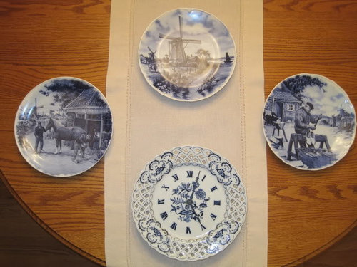
Decorative Wall Plates and Clock

16 years ago
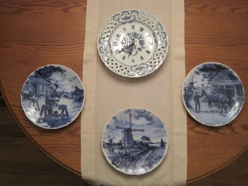
Which do you think is best...Clock on top or clock on the bottom?

The clock is slightly larger than the 3 plates. It's about 1 inch larger in diameter.

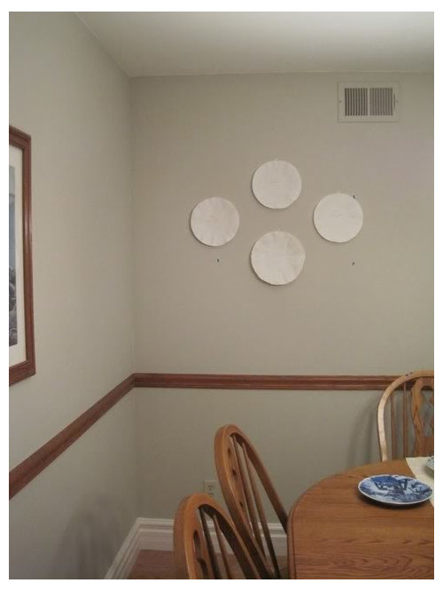
The paper mock ups are cut to the same sizes as the plates & clock. Ignore the little bits of blue tape on the wall. That's marking where the wall studs are located.

If you think the entire arrangement could come down a little lower on the wall or if you have any other suggestions you think of, let me know.

Eventually, I will find something to go on either side of the framed rowboat print.

-Laurie


The pic below shows the "clock" (slightly larger diameter) on the bottom


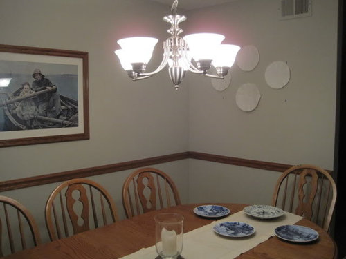
This pic below shows the "clock" on the top


Other views

Comments (22)

  • 16 years ago

    Pretty plates and clock. I also like the picture on the wall.

    I would put the clock at the top and would try moving the arrangement down a little bit.

  • 16 years ago

    I don't think it will look bad whichever way you choose to do it, but I'm kind of leaning towards the clock on the bottom.

    Laurie

  • 16 years ago

    I like the clock on the bottom.

  • 16 years ago

    Very pretty. I like the clock on the top.
    Dee

  • 16 years ago

    sheesharee, Laurie, dianalo, & Dee - Thank you for your responses! I appreciate your extra set of eyes in helping me out.

    Two of you like the clock on top and two like it on the bottom.

    I took sheesharee's advise and moved the whole arrangement down. I marked "clock hands" on the paper mock up clock piece and took some more pics.

    I moved the arrangement down 2 inches (from their original positions I posted) and took 2 pics (one with clock on top, one on bottom). Then, I moved the arrangement down another 2 inches (total of 4 inches from original post) and took 3 more pics.

    Do you like it lower and if so, 2" or 4"....or possibly in between??
    Thank you!

    2 inch drop / clock on top

    2 inch drop / clock on bottom

    4 inch drop / clock on top

    4 inch drop / clock on bottom

    4 inch drop / side view

  • 16 years ago

    I think the clock would look best on top. In my mind, for the purpose of "reading" the clock, it seems like it makes sense that it is on top.

    Those plates are going to look nice ther.

  • 16 years ago

    I think it makes more sense to have the clock on top -- they're usually hung higher. Also, I like the 2" drop better than the 4" drop.

  • 16 years ago

    I like the clock on top with the 4" drop because from the side view, the top of the plates are in line with the top of your art on the other wall.

  • 16 years ago

    always1stepbehind, sueb20, & caroleoh - Thank you : ) Great points that all of you brought to my attention. You three have now broken the tie! Two for the clock on the bottom and five for the top.

    From the floor to the top of the frame (art on other wall) measures 6' 2".

    From the floor to the top of the "clock on top" arrangement (in the 4" drop picture) measures 6' 3".

    So, that 4" drop does bring the top of the arrangement closer in line with the framed print on the other wall.

  • 16 years ago

    Hey neighbor, I like the clock on the top. That way the other plates seem to frame the clock.

    I prefer your 4" drop arrangement too.

    You need to come down this weekend and check out our new dining room and kitchen art.

    Jodi-

  • 16 years ago

    Clock on the bottom, because it is the different piece with the most visual weight. Hang the pieces so that the center of the arrangement is the normal eyesight line, just like you would hang a piece of art. I would say your later pix look about right.

    Be sure whichever way you hang them, that the one with the man and the one with the horse each face into the center. You want your eye to be carried into the arrangement, not away from it.

    A blue candle would be nice in the candleholder on the table.

  • 16 years ago

    Normally I'd agree with Les on the visual weight thing, but because this is a clock, I think it makes sense to put it on top -- otherwise anyone looking for the time is going to miss the fact that it's a clock, because no one is going to look at (approx.) the 4' mark to look for a clock, if you know what I mean.

  • 16 years ago

    I totally agree about making certain the plate images face in, but I feel the weight of three plates along the bottom keep the slightly larger clock from looking to top heavy.

  • 16 years ago

    Jodi, les917, & sueb20 - you all bring up good points to consider..."weight", images facing in, center at normal eye line/level, and keeping in mind that a clock is involved in the mix (as opposed to all "pure art" pieces) are all things to think about. I learn new things every time I read posts and I appreciate everyone's views.

    Jodi - I'd love to see your new dining room and kitchen art!
    I'll give you a call or email before I walk down. Afterwards, I'd like you to come over and take a look at this mock up in my dining room. Sometimes, when you see things in their full context (standing/sitting in the room with all the stuff surrounding you) it helps a great deal. I have always admired your eye for design : )

    les - I am going to get that blue candle!

  • 16 years ago

    I vote for clock on top and keeping the grouping in line with the art. It is going to look great.

  • 16 years ago

    I think the clock should go on top, and then one plate below it. The clover design isn't working for my eye. The other two plates can go on either side of the picture on the other wall. Pretty collection to work with!

  • 16 years ago

    Laurie, I should be home all day today so come on by. We can then drop by Ginny's and borrow Randy's laser picture hanger. :-) It is sooo handy for getting things lined up just right.

    Jodi-

  • 16 years ago

    Thanks for responding ctlane and sasafras - I'll keep your ideas in mind when Jodi comes over to my house to take a look.

  • 16 years ago

    Jodi_in_so_calif came over to my house and confirmed her opinion that it appears to look best as the 3rd to the last picture (4 inch drop with clock on top). I will wait until I can borrow our neighbor's laser picture hanger thing to make sure everything gets lined up just right.

  • 16 years ago

    Can't wait to see!

  • 16 years ago

    Laurie and I had a blast catching up (we've been neighbors for nearly 30 years and live only four houses apart). We also talked about paint color, fabric samples and of course wall decor. And we discovered our dining rooms are the same wonderful color. I can't take any credit for her plate layout, I think she already knew what looked best and just needed a second opinion.

    Jodi-

  • 11 years ago

    Clock on bottom.