Software
Houzz Logo Print
youngdeb_gw

Backsplash time...would love some input!

14 years ago
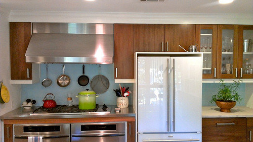
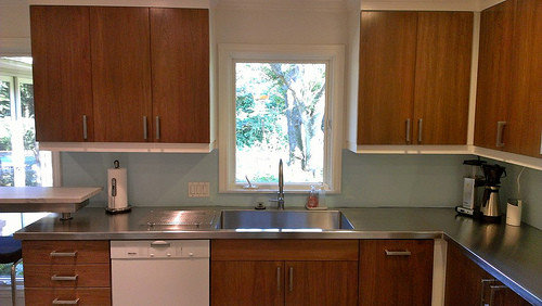
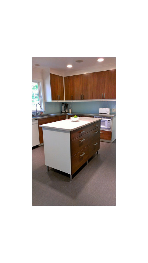
We're on the home stretch!! This is a refresh, we just painted and refaced, replaced the island, counters and floors. We were only out of the kitchen for about a week and a half, so I haven't felt the need to rush, which is why things are dragging out. But now I'm really ready to be done, kids are back in school and I can check these things off my list. Other than paint touch-ups & the floor seams, we need to pick out a backsplash. The place needs some color, and so that's where I start to get uncomfortable.

I am thinking fireclay debris in a 2 x 8 in a running bond, all one color with white grout. I painted it to get a sense for how it would look with a light blue-green (trying to get at the "crater lake" color), but I'm not convinced. Other thoughts are a yellow, or even a white with a colored grout? I'm over green, I have it everywhere and I think it might make this all too zen.

Love to hear thoughts from you guys, you've seen it all!

Comments (27)

  • 14 years ago

    With these colors you might do better with debris gloss with engobe. Here's crater lake

    {{!gwi}}
    in 4 x 4


    Sea Blue

    Have you considered their Crush glass tile?
    This is island flower
    {{!gwi}}
    Forget me not
    {{!gwi}}

  • 14 years ago

    I get that you want blue (it's my favorite color). Instead of a single color tile, I think you should consider a stronger bs look, one that incorporates some browns for a more pulled together look.


    If you don't like the size of the mosaic tiles, you can get a similar look incorporating brown tiles below with your blue choices using the larger format Fireclay debris with engobe, or glass.

    Fireclay Debris gloss with engobe in Adobe


    Gobi

    Fireclay Crush in Willow
    {{!gwi}}
    Camelia
    {{!gwi}}

  • 14 years ago

    that more muted pencil tile with multi colors[2nd one in above post] is a nice look. More nuanced-a nice polished look for your upgraded kitchen.

  • 14 years ago

    Love the 1st and 3rd mosaic tile options. While I like the plain blue color, I too think the backsplash could shine with a mosaic option.

  • 14 years ago

    I'm trying to keep an open mind...I dismissed glass mosaics initially for two reasons - 1) I'm kind of a minimalist, and don't like visually busy things and 2) I kind of think they're overdone. I think I mostly think the 1" square mosaics are overdone.

    That said, that second one is speaking to me. If it were more blue instead of tan, I would be really tempted.

    What about these?

    1:

    2:

    3:

    4:

    5:

  • 14 years ago

    I prefer #2 of the ones you posted. If you want BLUE, here's a suggestion. =) I actually think it is very pretty, but it's looks loud. 8o)

    From a line called Groovy Stiix, and this one is Nocturnal Sea. Not as fun a name as the others in the line, like "Moody Blues," "Stairway to Heaven," and "Love Shack," (seems somebody was having a 60's flashback when they named them) but here ya go...

    {{!gwi}}

    I really liked this one, but the color didn't work for me. I think it appears a bit more gray-blue in the pics than it did in person (Eclipse Tile in Marina). Would bring in your white also, and the gray/stainless...

    I love the linear BS glass. So many pretty options... which makes it so hard to decide!

  • 14 years ago

    Youngdeb, I like that #3 tile mosaic that you posted, the one that is a bit of a hex shape. I like it because there is not so much variation in color and the shape is modern, to me, in the way it is used. You've got one hot kitchen. The #1 is very pretty in its periwinkle way, but I like the clarity and straight forwardness of your kitchen and # 1 might be a little too dreamy.

  • 14 years ago

    the cobalt blue shade can potentially dominate your kitchen.I'd be careful with anything in that blue family....the cabinets look really good...I'd want that nice shade and grain to talk,rather than the busy nature of some of these tiles. Easy does it.

  • 14 years ago

    I posted the cobalt herb and I totally agree it is very BLUE! Was just putting it out there because while I think that line of tile is fun, I haven't seen a place where they really work yet. But they do make everything else look tame, don't they?

    I do like the second one I posted. I think it ties things together well and like many of those you posted also youngdeb. Good luck!

  • 14 years ago

    Beeps, I like that second one you posted too. I'm trying to keep it a little light, there's no way that cobalt will work. Cobalt is one of my favorite colors, though. It needs a white painted kitchen.

    I think right now it's between my #3, Beeps' #2, and the fireclay 2 x 8's in some combination.

    I can't clip the address for some reason, but this example on the fireclay site gives an example of something we could do, maybe without the ecru and cobalt tiles...

    http://www.fireclaytile.com/gallery/Sandhill_100_Recycled_Glass_Tile_Kitchen_Backsplash_Blue_Blend

    Keep em coming!

  • 14 years ago

    I LOVE the #3 from glasstileoasis- the shape is unexpected and the color is gorgeous!

  • 14 years ago

    Hmm... I feel I've led you down the wrong path.

    The only reason to go with mosaic tile (whether glass or ceramic, sheet mosaic or one you construct yourself out of 2" x 8" tiles) is to help incorporate some browns into your blues so the blue belongs there, so that it has some context.

    None of your choices, pretty though they are, serves that purpose, so if you don't even like glass mosaic tiles, go back to what you like. With the ceramic tiles you could do something like the image below, from the Fireclay gallery using your colors.

    {{!gwi}}

    Whatever you do, it should be what you love, even field tile. If you don't love it, don't use it.

  • 14 years ago

    Hmm... This is kind of fun.

    {{!gwi}}

    {{!gwi}}

  • 14 years ago

    Where do you guys find all these gorgeous tiles? I look online and find nothing like these. (and I'm glad I'm not deciding- I like the fireclay, but the glass seems to fit more with a modern, clean kitchen like yours.)

  • 14 years ago

    {{!gwi}}
    {{!gwi}}
    {{!gwi}}

    These are all Sumi-e large brick tile from Stone and Pewter Accents

  • 14 years ago

    You are so smart to paint... I am unable to visualize how a tile will look without photoshopping it. So here goes :)

    Crater lake

  • 14 years ago

    Mosaic...

  • 14 years ago

    Blue...oh I like this...

  • 14 years ago

    Soothing...

  • 14 years ago

    I do love Fireclay tiles BTW.... but admittedly had a very hard time photoshopping the colors from the samples provided on the website. Here is "Light Camel Matte"

  • 14 years ago

    OB2B that's awesome. It makes it it easier to visualize.

  • 14 years ago

    Somehow I think square ceramic tile plays best with the overall feel I am picking up from the kitchen.

  • 14 years ago

    If you're a minimalist and you don't like busy, don't do any of those mosaics. I agree that they are very pretty, but I don't like how they look in your photoshopped kitchen. The fireclay would be a better pick I think.

  • 14 years ago

    One more - Heath tile. Have you considered anything grey?

  • 14 years ago

    I like that last OB2B the best!!

    Nancy

  • 14 years ago

    OB2B, that is amazing!! Thank you so much!! I can really see how much more finished it will look with a backsplash. So motivating!!

    I haven't considered gray because I felt like we needed some color in the room. Am I wrong? I'm trying to use your pics to visualize the Heath pattern in the crater lake color, and I'm liking that a lot. Although that "soothing" one is really gorgeous too. Very tempting.

    I also still like the wave glass mosaic. So many good choices!!

    One of the things I'm trying to do is relate to the pool outside, which you can see from the window and three huge windows to the left of the sink run. That's one of the reasons for the blue.

    I'm not sure I'm feeling the lure of putting brown in the backsplash, EAM. I feel like it muddies things a bit. Maybe it's the miminalist in me, I like things to be very clean, and so tend to either use color or pattern, but not both.

    I need to noodle this a bit!

  • 14 years ago

    With re to the pool tie in and your original color... this is very pretty. Oops. Can't post the pic. I posted the link below because it wouldn't allow me to post the actual pic - but go to the second and third pics and you will see a blue very close to what you are going for.

    They actually have glass called "pool." You might look at the blues on that site a little.

    I see why this is the hardest for most people - it seems to me like there are more awesome options for a BS than any other part of the kitchen! (That may not be the case, but it seems like it to me.) Too many options = really difficult decisions. Good luck with the noodling! :) Let us know what you decide.

    Here is a link that might be useful: Sorry couldn't post pic...

Sponsored
Mary Shipley Interiors
Average rating: 4.8 out of 5 stars34 Reviews
Columbus OH Premier Interior Designer 10x Best of Houzz