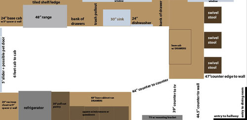
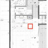
Hi everyone! This is my first layout post. I mostly lurk here. I've gotten lots of great tips already. So thanks for that. I have a sort of weird space with lots of openings (ie. windows, doors, entries to other rooms). I don't have a drawing of the current layout because it is just crazy (you would say what were "they" thinking!) and we are going to do a complete tear out to the studs. We are removing a wall that divided it into 2 spaces, laundry room and kitchen. (Don't worry we moved the laundry upstairs already) On one end, you'll see a slider that leads to the backyard. Currently there is a door and a small window next to it and that is the old laundry room area, only about 6 feet deep. The slider would replace the old door/window combo. The other windows will stay where they are in this layout and will have to be replaced and raised to counter height. Our space is long and skinny, no room for a traditional island and is not going to get any wider with the renovation. This is it. This is the space I have to work with. Dining room is staying a separate room. I tried the layout with it open and it just didn't give us any advantage. Plus I really like some walls between kitchen and the living room (the room beyond the dining room). I don't want to hear what's going on in there while I'm in the kitchen. We do eat in the kitchen casually most meals, so hence the counter seating. I do use the dining room for holidays, company, sewing and other projects.
We are woodworkers and DIYers. We have a pro-grade woodshop. We've made cabinets for our woodshop and my photo studio, furniture for our bedroom and living room, so we know what we're doing. All cabinets will be made by us and custom.
Some problems with our current kitchen:
It is so wrong, nothing is right! Okay except the dishwasher is by the sink, but that is all! No stretch of counter is greater than 32". Where you walk in, you are flanked by a refrigerator and a wall oven (2 tall big honking appliances) making it feel claustrophobic and dark. The work zones stretch over very long distances (ie. Sink is 10' from stove). Eat-in area is in the middle of everything breaking up the flow. It is ugly 1972 badly painted cheap cabinets, ugly wallpaper, not enough storage. The list goes on and on.
Our goals:
Although I am the sole cook in the house, hubby does pitch in with clean up and fetching items for me while I'm cooking or just keeping me company. So has to be room for 2 and also have room for company (ie. Guests or non-cooking ppl) to be in the kitchen and not in the way. We do a lot of holidays and family gatherings. People always come to the kitchen to hang out with me as I pull the meal together. So want a place for them to perch while I do that. I have a large garden and need counter space for washing my harvests and canning.
The 48" range is somewhat decadent, but it will be used! All those holiday and family get-togethers require lots of food. I currently have a 30" electric(!) range plus an ancient 1972 wall oven. I need 2 ovens, and could use more burners, so the 48" range seemed perfect. Please don't even think of making it smaller!
My hubby's mantra thru this has been storage, storage, storage. My mantra is counter space, counter space, counter space. So we decided to make the cabinets/counters extra deep. This also makes the walking distance from one side of the room to the other a foot less, which I like. We mocked it up with sawhorses and plywood, walked back and forth, pretend opened dishwasher/oven doors, etc. It worked fine.
I have not marked any wall cabinets on the window wall. For now, they are on hold. Since we are making everything ourselves, I want to live in the space and see if I want wall cabs. If we put any, it would be to the left of the range hood and between the 2 windows, but only filling half the space and closer to the sink side of things.
Okay, so as for the eat-in counter space, I have two versions of that. I vacillate between the two.
The first one has a peninsula that goes from the window wall out. The second has more of a small island, where someone could sit between it and the window wall. I have picked out stools that swivel so hopefully people won't have to pull out stools much to get in/out, but the layout shows the stools in the out position.
I'm pasting a small jpg here, but will also link to a larger more readable file. I am looking for constructive feedback and ideas. If there are any glaring errors, or something I left out? I have no idea what, but I've been looking at this so long... I need new eyes on it. Thanks so much!
Jen
Small Island Larger Jpg.
http://i1096.photobucket.com/albums/g326/jenhp/kitchen-plan-B-large.jpg
Here is a link that might be useful:







blfenton
Buehl
Related Professionals
Cumberland Kitchen & Bathroom Designers · Columbia Kitchen & Bathroom Designers · Florence Kitchen & Bathroom Designers · Stockton Kitchen & Bathroom Designers · Cody Kitchen & Bathroom Designers · Crestview Kitchen Remodelers · Orlando Kitchen Remodelers · Hays Kitchen Remodelers · Cumberland Kitchen Remodelers · Rolla Kitchen Remodelers · San Antonio Custom Countertops · Richmond Custom Countertops · Wheeling Custom Countertops · Fresno Custom Countertops · Anchorage Custom CountertopsjenhpOriginal Author
jenhpOriginal Author
Buehl