

input on my simple backsplash mock ups?
16 years ago
Sort by:Oldest
Comments (18)
Related Stories
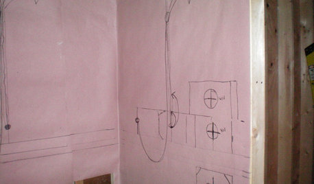
REMODELING GUIDESMust-See Mock-ups for Your Remodel
Avoid 'oops' and 'oh, no' with real-life tryouts of any design elements in question
Full Story
INSIDE HOUZZInside Houzz: A Walnut Wall of Storage Opens Up a Kitchen
A 30-foot wall of storage frees up cooking areas and counters for food prep and entertaining
Full Story
BATHROOM DESIGNLight-Up Mirrors Offer Bright Design Solutions
If you're taking a dim view of a problem bathroom area, try the flash of design brilliance that is the electric mirror
Full Story
CONTEMPORARY HOMESHouzz Tour: A London Townhouse Lightens Up
A dramatic redesign of this multistory home transforms its dark 1970s-era interior into an all-white Scandinavian idyll
Full Story
ECLECTIC HOMESMy Houzz: Family’s Personal Style Warms Up a New House
A Northwest family seeks out a kid-friendly neighborhood and makes a ‘development home’ their own
Full Story
MATERIALS10 Modern Marble Looks
Marble has broken free of the standard kitchen countertop slab and is showing up on bathtub backsplashes, modern dining tables and more
Full Story
KITCHEN DESIGN10 Gorgeous Backsplash Alternatives to Subway Tile
Artistic installations, back-painted glass and pivoting windows prove there are backsplash possibilities beyond the platform
Full Story
KITCHEN DESIGNCountertop and Backsplash: Making the Perfect Match
Zero in on a kitchen combo you'll love with these strategies and great countertop-backsplash mixes for inspiration
Full Story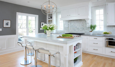
KITCHEN DESIGNHow to Add a Kitchen Backsplash
Great project: Install glass, tile or another decorative material for a gorgeous and protective backsplash
Full Story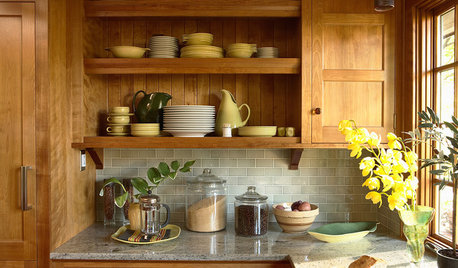
KITCHEN BACKSPLASHESHow to Choose a Backsplash for Your Granite Counters
If you’ve fallen for a gorgeous slab, pair it with a backsplash material that will show it at its best
Full Story
pinch_me
remodelfla
Related Professionals
Peoria Kitchen & Bathroom Designers · Alpena Kitchen & Bathroom Designers · Bartlesville Kitchen Remodelers · Texarkana Kitchen Remodelers · Gary Kitchen Remodelers · Lebanon Kitchen Remodelers · Utica Kitchen Remodelers · Joplin Custom Countertops · Sedalia Custom Countertops · Elgin Custom Countertops · Saint Cloud Custom Countertops · Willmar Custom Countertops · Phoenix Custom Countertops · San Francisco Custom Countertops · Olympia Custom Countertopsellendi
dianalo
cpartist
vampiressrn
doggonegardenerOriginal Author
marytwit
hilarymontville
jakabedy
doggonegardenerOriginal Author
phoggie
lisadlu
padola07
davidro1
Jody
doggonegardenerOriginal Author
malhgold