Software
Houzz Logo Print
emh107_gw

Wrong color backsplash?

14 years ago

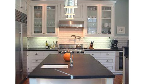
I don't know what to do. I chose Johnson Minton Biscuit backsplash because I thought that the whites were too white. Now I feel like it does not go with the cabinets and backsplash. The cabinets are pained BM Mascarpone and the counters are Typhoon Bordeaux. The color of the tiles looks even darker with the the under cabinets lights on. I really can't spend any more on this kitchen! Did I chose the wrong grout? It's white. The tile man suggested it to make the tiles pop. I also have a window with white trim over the sink. Thanks!

Here is a link that might be useful: Erin's Tile Backsplash

Comments (16)

  • 14 years ago

    I think it looks really wonderful. It really harmonizes well with the countertop. Having a slightly different shade from the cabinetry and/or window trim adds to the beauty of the kitchen -- it would be a lot less desirable to have it match the cabinet color exactly. Relax, you made the right decision.

  • 14 years ago

    In the pictures it looks fine to me.

  • 14 years ago

    I do not see a problem with the color. Perhaps my monitor is distorting the look?

  • 14 years ago

    Quite frankly... i think the color looks perfect!

  • 14 years ago

    It looks good to me.
    I think it strikes a good middle ground between your cabinets and your beautiful countertops.
    Also, I agree with your tile guy about the white grout.
    Give it a week and see what you think then.

  • 14 years ago

    Color looks good. You could scrape out the grout, and re-grout with a color that brings out more of the "Mascarpone tones" in the tile. We just used it in our family room/entryway, and it definitely reads more yellow, more cream, more neutral, during different times of day, so the white grout could be what's throwing it off for you.

    For example, we chose TEC Antique White grout for our travertine floor tile in the same rooms. Another color, Birch, would have gone with the tile just as well, but that grout is more of a grey (or reads more grey) and would have brought out the greys in the tile vs. the cream/beiges we wanted to highlight.

  • 14 years ago

    Yes, I do too. The backsplash color is a good transition from the white of the cabinets to the cream in the counters. As I learned, the backsplash has to RELATE to something. In your case it is relating to the counter but also as I said previously, it is a good transition from the cabinet to the counter.
    I think the white grout was suggested to tie in with the white of the cabinets. Right now, this might look to stark for you. When my cabinets were first put in, my daughter said they looked like an operating room, so white and sterile! As I added the backsplsh and then accessories, things came together.
    As we remodel, we naturally look closely at the newest element and critque it.
    See how you feel when everything is in place and you are actually using your kitchen. Then, down the road you can always change it. (I did, as have many other on GW)

  • 14 years ago

    I think it looks great!

  • 14 years ago

    If it were whiter, it would look wrong with the counters. I think this is a very good combo.

  • 14 years ago

    I think it's absolutely perfect. I wouldn't doubt this choice for a minute! Great job.

    Sometimes we torture ourselves and question a lot of details about our choices when we first implement a big remodeling/design change, but I find that once people live with their choice for a little while, it becomes clear that it was the right one and we end up wondering why we worried so much!

    Objectively speaking, IMHO, this is a great backsplash for your application, I agree with the previous poster that you went "just white enough" and I hope you come to love it!!

  • 14 years ago

    Looks great--now just enjoy!

  • 14 years ago

    I LOVE the BS with the counters and cabinets, warm and elegant. I am not as sure about the "window frame" of stark white. It looks shocking the way you have it displayed lying across the counter. I doubt that it looks like that in reality when seen around the window next to the cabinets and BS.

  • 14 years ago

    Thanks everybody!! The more I look at it, I feel better. Your comments are reassuring.

    Advanced, the paint on the windowsill is decorator white, which matches the trim in the rest of the kitchen and the house. You can definitely tell the difference between that color and the mascarpone, but it's okay for now.

  • 14 years ago

    EMH107

    Not only is it not the wrong color but I think you've just given me a great idea for my back splash. On my monitor its a perfect match. It looks fantastic. I've been trying to match TB granite with Cherry cabinets for more than 4 months with no success. Thanks for the inspiration.

  • 14 years ago

    Erin- Its great! So happy to see your results! I think we all start to feel regret at the end of our project, regardless of whether or not we should feel that way. Just enjoy it!

  • 14 years ago

    Looks gorgeous to me. I'm still trying to find a backsplash to go with soapstone counters and White Dove cabinets. Should be easy. Not! Yours is perfect!