Software
Houzz Logo Print
lmwright

Cheeky retry!

11 years ago

Happy Sunday, all!

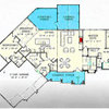
I posted these alternative floor plans yesterday on another thread and didn't get any replies, so thought I would have another stab at getting some. Architect sent these through on Friday as a second option. Would love some feedback!

Second floor posted below....

Thanks everyone!

This post was edited by snuggie on Sun, Jan 11, 15 at 8:25

Comments (17)

  • 11 years ago

    Second floor:

    This post was edited by snuggie on Sun, Jan 11, 15 at 8:26

  • 11 years ago

    I like disciplined, balanced floorplans, so overall I like it a lot.

    I like semi-open plans more than open, but this one seems pretty good but I tweaked a few things that I would consider doing and they are circled.

    I don't care for certain areas to "bleed" into each other.
    I added a wall across from the front door to help improve furniture placement and alter the view from looking straight through the house at what would be mostly the sides or backs of furniture from the front door. It creates a bit of separation and I think a piece of artwork or a mirror across from the front door is better looking than the side of an end table.

    I also added a slight wall at the end of the counter run because that end of the counter kind of peters out at the dining area which is not very define, number one and number two that spot might be a catchall.

    I also made the window in the guest room study balance the door placement in the laundry pantry on the front façade.

    In general it could be difficult to furnish and light the great room because it is all wide open. Again this is my bias because I prefer living spaces to be lit by lamps and not by recessed ceiling lights and great rooms don't provide much opportunity to plug in lamps.

  • 11 years ago

    I just stumbled on your post in the most recent threads. One thing that I would do is rearrange the guest room bath so the toilet isn't what you see if the door to the bathroom is left open. Perhaps switch the toilet and vanity and reverse the door swing so the toilet is a bit tucked away.

  • 11 years ago

    Upstairs, the way the windows on the bed walls conflict with the furniture placement bugs me.

    I would shift the doors to the secondary bedrooms back a little to create a bit more "hallway" space outside the rooms so it's not a box of closed doors sometimes.

    I don't care how the master bath juts out and breaks the symmetry started with the double doors at the entry and the doors out the back. Also it's a long walk from the closets to the bathroom area.

  • 11 years ago

    Wow -- good catches, palimpsest and olychick. Thank you!

    I hadn't even thought of these things. You guys are good! :)

  • 11 years ago

    So the indent of the ext. walls at the powder room does what? (besides symmetry)
    It is a drawback IMO; 8 to 10 extra linear feet of exterior walls, and six feet of overhanging roof makes it like a cave. The window in the powder room is for view, not light. The extra jogs in the foundation are costing you, too.
    If that is the area-way for a basement entrance, then it's justified functionally, but think about either getting rid of the indent or emphasizing it by giving it more architectural value. I could see taking the roofing off of that part, but leaving the skeleton (rafters) so that light gets in there, so it could be planted, or make it an actual entry porch for the laundry, or simply straighten the wall and reconfigure the rooms to take advantage of the reclaimed space. You are seriously already paying for that space even if it is outdoors, it complicated the foundation and framing and has a roof above, you may as well use it.
    Casey

  • 11 years ago

    Can we see an exterior? I can't imagine how those two indentations and two exterior doors towards the front will work out.

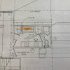
    Laundry room: This room is large, but it could be more efficient. A dryer vent where you've placed it is quite possible, but it would be cheaper and easier to vent the dryer straigtht to the outside. And you want to place the sink next to the washer so you only need water in one wall -- this is a big money saver.

    Do you really want three doors opening onto the veranda? Consider how that'll cut into your furniture placement. It'll really cut down your usable space.

    I'd like to see a window at the top of the stairs -- it'll open up what could otherwise be a dark space, and it'll be a lovely addition.

    In the downstairs guest room bath, I'd move the door to the end (and reverse the swing) so you'd open and see the sink first -- so much nicer than a toilet!

    Upstairs, I don't like the double doors opening into the master. I think it'll look odd: Two plain doors, one set of double doors. Sesame Street says, "One of these things is not like another, one of these things does not belong." Also, double doors aren't quite what they're cracked up to be: Remember, you have to put the light switch behind the door -- so you'd have to enter the room, close the door, and reach around for the switch.

  • 11 years ago

    Good architectural design is a blending of inside plans and outside appearance. It's never just about one or the other. And anytime that one (inside or outside) takes precedence over the other, you can bet it will be at the expense of the other. Said differently, if you want a well designed house you have to constantly evaluate the interior and the exterior together as one.

    So much of the discussion on this forum is "critique my plans", which is a consumer approach to architecture that doesn't consider either interior spatial quality and exterior aesthetic quality. These sorts of comments tend to focus on door swings, number of cubbies in the utility room and that level of critique.

    Your architect has obviously worked very hard to get the strongly symmetrical organization for your floor plans. I can only assume that this is based on wanting to create a certain exterior aesthetic. I can't imagine anyone suggesting anything that alters that symmetry, since it is so clearly and obviously an overriding consideration.

    Why don't you post the exterior perspectives or at least the major elevations so that everyone can get a much better sense of what is happening and why.

    And I caution you about many of these personal opinions about floor plans since that's what they are--opinions.

    Of course, you asked and you are getting what you asked for. I hope you ask for as much advice from your architect and take the responses at least as seriously.

    Good luck with your project.

  • 11 years ago

    Just as pal moved the bedroom doors in, and MrsPete switched to a single master suite door, I'd slide that door into its hallway a bit. The upstairs hall is so tight, it needs that bit of widening out. Also, consider a solatube up there. It'll make it nice and light, feel less closed in.

    Is the door under the stairs to a basement, or to a closet? Because I don't see a front/guest closet. My concern is that the powder room opens right off the living area. If that is a closet under the stairs, you could just add a short wall opposite pal's entry wall, just to make a little "entry" to the closet/powder room "suite". If those are stairs, and If you can move the powder room forward, flattening out the front of the house, you make the powder room a bit more private and you could have room for a guest closet. Or would that destroy the front elevation?

  • 11 years ago

    Sorry for the delayed response. I am laid up with stomach flu and not up to reading and responding to all your helpful posts in any detail. Just tried and nothing makes sense to me at present. I am posting the front elevation though, since people wanted to see it. This plan is not as symmetrical as our original one (posted in my other thread). Our architect designs beautifully balanced homes and was simply responding to his own concern that given the symmetry in the first plan (all bedrooms exactly the same size, for example), we had not used space efficiently. This is simply an alternative idea. It is similar in many ways to a previous plan that turned out to be too expensive for us to build -- but yes, the balance in the original plan (at least in the interior spaces) is no longer evident.

    We will definitely be talking to our architect about all of this, virgilcarter. I was mainly looking for feedback about how the two different plans might live, with key areas moved from one floor to another. Thanks, all!

  • 11 years ago

    turned

  • 11 years ago

    Thanks, palimpsest.

  • 11 years ago

    I tweaked the laundry room because I think the upper part of the house has such a strong symmetry that the lower façade is a bit weak. I think the laundry room layout was a bit better before but I think I'd sacrifice a bit for the façade:

  • 11 years ago

    Updated façade:

  • 11 years ago

    Not sure where the driveway is, but what if the laundry room door opened on the side of the house? I do like a protected entry, though.

  • 11 years ago

    The drawings are troubling me.

    Will the ceiling height be 11 ft or is the stair drawn incorrectly? It also seems as if the upper part of the stair doesn't align with the lower part and the interior walls appear to be about 10" thick.

    As for the exterior, your architect should be showing you a perspective instead of elevation drawings. Elevations describe the building to a contractor; you need a drawing that will tell you what your house will really look like.

  • 11 years ago

    Agree about the perspective.

    I like pal's change. I would also make the laundry a right handed inswing. Then move the kitchen entry to the left. Right now, your prime cooking zone is in a direct traffic path.

0