

Critique My Entry Table!
11 years ago
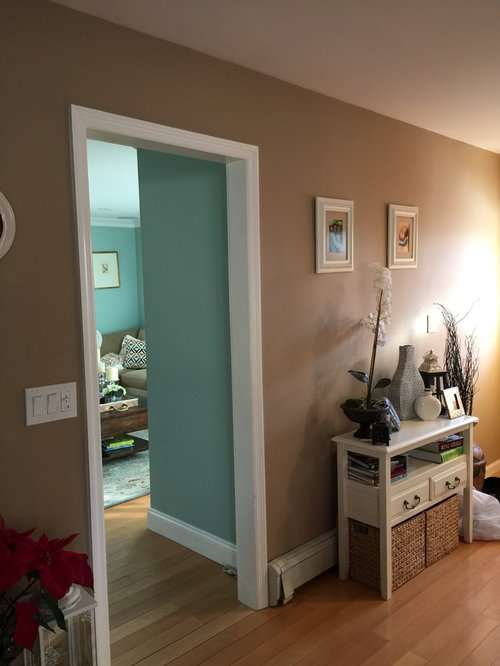
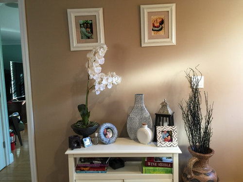
Featured Answer
Sort by:Oldest
Comments (7)
 11 years ago
Related Professionals
Fayetteville Interior Designers & Decorators · Johnson City Interior Designers & Decorators · Austin Interior Designers & Decorators · Hackettstown Interior Designers & Decorators · Williamsport Interior Designers & Decorators · Burlington Interior Designers & Decorators · Bridgeport Interior Designers & Decorators · Mesquite Interior Designers & Decorators · Vancouver Interior Designers & Decorators · Ashland Architects & Building Designers · Fort Worth Architects & Building Designers · Fredericksburg Architects & Building Designers · Olean Architects & Building Designers · Amarillo Architects & Building Designers · Jackson Architects & Building Designers 11 years agolast modified: 11 years ago
 PRO11 years ago
 PRO11 years ago
- PRO11 years ago
- 11 years ago

Related Stories
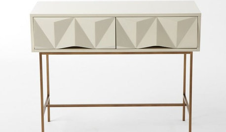
PRODUCT PICKSGuest Picks: 20 Terrific Entryway Tables
Impress your guests with a well-dressed entry, grounded by one of these fab and functional console tables
Full Story
ENTRYWAYSMake the Most of a Console Table
Set up your entry for a dramatic (and useful) welcome
Full Story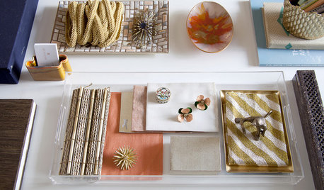
7 Areas to Accessorize With Style
Here's how to make your table, entry, mantel, bedroom and kitchen shine
Full Story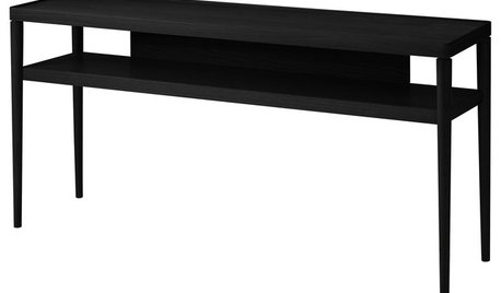
PRODUCT PICKSGuest Picks: Accessories for a Dashing Entryway
A slim table, a place for keys and a few personal touches create an entry that's both welcoming and functional
Full Story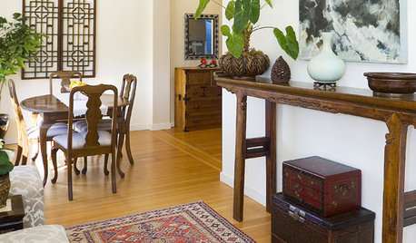
FURNITUREChinese Altar Tables Set a Soulful Tone at Home
Antique or contemporary altar tables add a touch of the unexpected when used as a console, sofa table, vanity or buffet
Full Story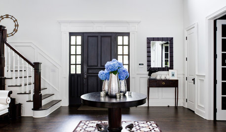
DECORATING GUIDES8 Ways to Decorate a Center Table
Make a feature table look grand no matter what its size, with artistic arrangements of flowers, vases and more
Full Story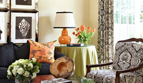
DECORATING GUIDESTable + Lamp: 10 Perfect Pairings
No more dithering over scale and style. We take the guesswork out of matching lamps to credenzas, coffee tables, nightstands and more
Full Story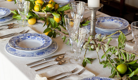
HOLIDAYSLuxurious Holiday Table Settings for Less
Pair colorful glasses, gorgeous garden finds and hand-stamped napkins for a holiday table that looks positively rich
Full Story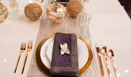
ENTERTAININGHoliday Party Prep: Plan Your Table Settings
Do a dry run with dinnerware, table decorations and the buffet setup now to avoid surprises and stress later
Full Story
DINING ROOMS5 Instant Dining Tables
Company coming? These console tables expand into a party-sized dinner table
Full Story


User