

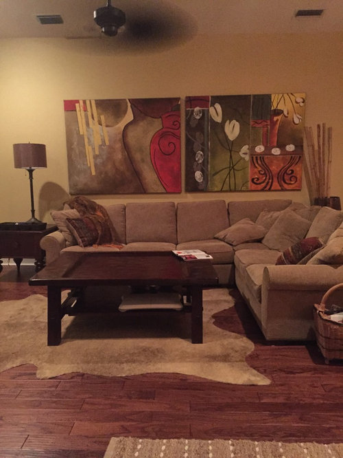
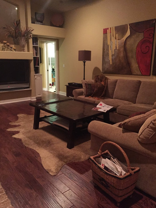
Does this rug work?
11 years ago
Featured Answer
Sort by:Oldest
Comments (24)
 11 years ago
 11 years ago
Related Professionals
Waterloo Interior Designers & Decorators · New Bedford Interior Designers & Decorators · Stockton Interior Designers & Decorators · Temecula Interior Designers & Decorators · Las Vegas Interior Designers & Decorators · Casper Interior Designers & Decorators · Leamington Interior Designers & Decorators · Bronx Interior Designers & Decorators · Parkersburg Architects & Building Designers · Taunton Architects & Building Designers · Brainerd Architects & Building Designers · Helena Architects & Building Designers · Sanford Architects & Building Designers · Rocky Mount Kitchen & Bathroom Designers · Grand Island Kitchen & Bathroom Designers- 11 years ago
 11 years ago
 11 years ago
 11 years ago
- 11 years ago
 11 years ago
- PRO11 years ago
 11 years ago
 11 years ago
 11 years ago
- 11 years ago
 11 years ago
- 11 years ago
- 11 years ago
 11 years ago
 11 years ago
- 11 years agolast modified: 11 years ago
- 11 years ago
- 11 years ago
 PRO10 years ago
 PRO10 years ago
Related Stories
KITCHEN DESIGNHow Much Does a Kitchen Makeover Cost?
See what upgrades you can expect in 3 budget ranges, from basic swap-outs to full-on overhauls
Full Story
HOUZZ TOURSHouzz Tour: Istanbul Apartment Does a Double Take
Two apartments and two contrasting design styles combine in a single stunning home with a view in Turkey
Full Story
RUGSEnjoy the Tactile Beauty of Braided and Hooked Rugs
Rugs born of Colonial days offer the most color choices — and the most homey feel — of any floor covering around
Full Story
DECORATING GUIDESHow to Choose an Awesome Area Rug No Matter What Your Space
High use, a low door, kids and pets running amok — whatever your area endures, this insight will help you find the right rug for it
Full Story
PATTERN17 Gorgeous Ways to Work In a Patterned Area Rug
Add spark underfoot and pull a room together all around with a patterned rug as bold or subtle as you please
Full Story
RUGSHow to Shop for a Persian Rug
A Persian carpet is an investment that can pay design dividends for years. Here's what to look for when you go shopping
Full Story
RUGSRugs to Covet: Madeline Weinrib
Opulent patterns and lush colors put this New York designer's carpets and textiles high on our yearn-for list
Full Story
RUGS10 Tips for Getting a Dining Room Rug Just Right
Is the rug you’re considering the right size, shape and weave for your dining room? Here’s what to keep in mind
Full Story
DECORATING GUIDES11 Area Rug Rules and How to Break Them
How big should an area rug be? These guidelines will help you find the right size and placement
Full Story


groveraxle