Software
Houzz Logo Print
fearalex

Wall colors and courtains

13 years ago
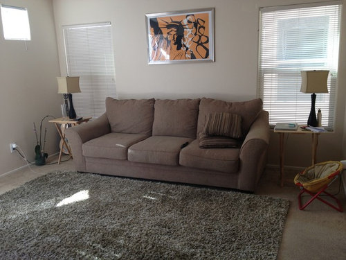
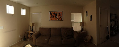
I recently bought a home, I want to keep my sofa and area rug, the space is a bit dark so I want to add colors to the walls that will make it "happier" and also curtains because it's really cold downstairs. Any ideas?

Comments (19)

  • 13 years ago
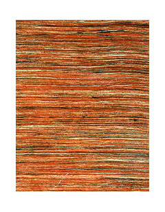
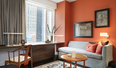
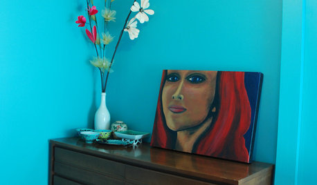
    Well... it would be bold, but I do like that color in your print - it would really brighten up the space as a wall color in a lighter shade
  • PRO
    13 years ago
    I agree, some bold colors would add some "cheerfulness" to the room.

    FORMA Design · More Info
  • 13 years ago
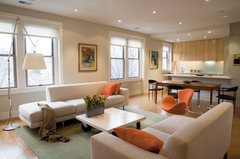
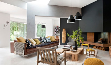
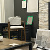
    Also like that color in your print. You could look for some drum shades in a pop-of-color shade to brighten the room and also warm up the color of the light in that room if it's cold there. I used a silk orange drum shade in my kitchen eating area and it helped accomplish this challenge. Love the bird-nest like chair and pillows Dytecture's pic shows. Doses of orange are low commitment fun.
  • 13 years ago
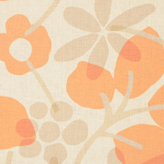
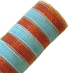
    I have to ask... Is that the neighbor's window seen through your window? My, that's close! You might try Sherwin Williams 0010 Wickerwork as a variation on the color in your art. The art would look better if the bottom landed about half way between the window shash and the back of the sofa. Always try and keep art below window and door tops unless you have super high ceilings and huge art. Here's a fabric idea for your draperies too.
    Burlington Tangerine Fabric · More Info
  • PRO
    13 years ago
    Consider bold color as emzc says - and some bright contrast pillows to add splashes of color to the sofa. Consider a cocktail ottoman, again in a strong bold color to lighten the rug.

    I like your print too, but think it's hung too high, (should be about a foot lower) I know, I know... Try it for a week - it will "ground" the space.

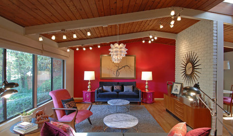
    Color suggestions: a deep rusty red would warm the space visually, with cream color curtain panels on both sides of each window...
    Or, yellow walls (lighter than the print background) and a geometric pattern, two color curtain panels...red/yellow, or teal/brown, or.... Once you pick a direction of color, the ottoman can be within it, or totally different. Just be careful not to have any more browns/taupes...
    If you can't deal with strong colors, then at least use a buttery cream as visual breaks.
  • 13 years ago
    ps--maybe also hang the print @ 6 inches lower and put a picture light above it (great "not your grandmother's version" at Ikea or online) and that will bounce some light back into the room. consider also some up-spots into some plants or focal points in the corners to add some indirect ambient light. I think lighting may be as much a fix as happy color given it gets dark there given picture one vs. picture two.
  • 13 years ago
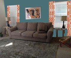
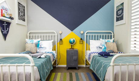
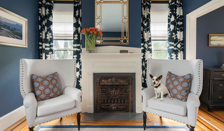
    How about a complimentary color like:
    Fair Isle Blue Paint by Benjamin Moore · More Info
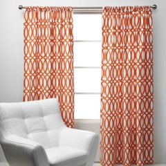
    Maybe some drapery panels on the two windows will add color:
    Modern Curtains · More Info
  • PRO
    13 years ago
    I love the pic that Dytecture posted. The above one looks interesting but not what I would consider. Though I would love to know what program they used to do it. You really need to lower that painting.
  • PRO
    13 years ago
    @houssaon what computer program did you use?
  • 13 years ago
    I WOULD KEEP THE WALLS NEUTRAL AND NOT PAINT THEM BLUE.

    whoops!

    Some suggestion for the fabric for the drapes:
  • 13 years ago
    How about SW ryegrass green...or SW Summer Day!
  • 13 years ago
    Sorry..couldn't get the Summer Day pick to upload, but you can look it up on Sherwin Williams site. There's also a nice color that BM has....in the coastal collection...some nice pale blue/green/grays...Tranquility was one of the colors, but there was a better one I couldn't find out the name of. You have many options with your neutral furnishings....so pick something in the family that is one of your favorite colors!
  • 13 years ago
    trying the color again...summer day
  • PRO
    13 years ago
    I would suggest painting the walls, adding trim to the windows, hanging curtain rods and one curtain panel on each window pulled back to the side (right window, pulled to right side and left to left) It looks like you may be using tv trays for end tables? You need something far weightier as end tables, maybe something with three drawers. For a coffee table you could go with something light and airy....metal and glass maybe. And last but not least your picture is hung far too high. It needs to come down at least ten inches. Best of luck!
  • 13 years ago
    last modified: 13 years ago
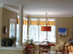
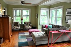
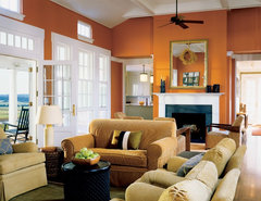
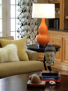
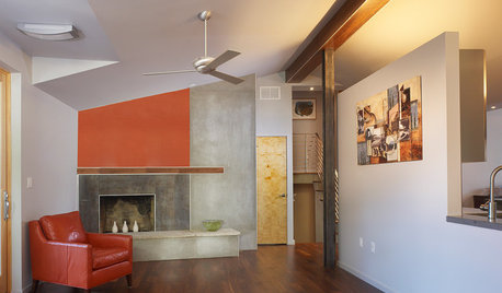
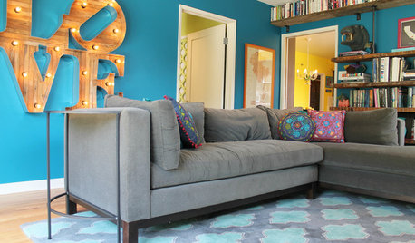
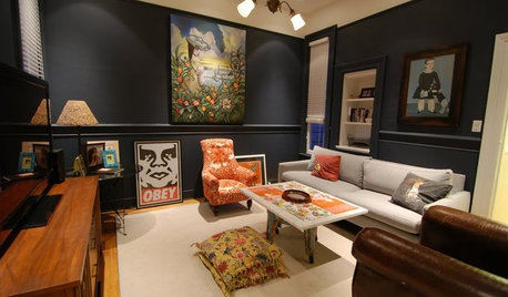
    Hi---some pics for color and pattern inspiration. Orange walls, various textures, black/white bold fabric, eclectic pieces. Hope it's helpful... Good Luck!
    [houzz=
    Green Springs Farm · More Info
    ][houzz=
    Den · More Info
    ]
  • 13 years ago
    I agree with what most people here have said already. The picture is too high, also the front feet of the couch should be on the rug. I like the idea of an accent wall that compliments the print, but can you post a picture of what the room looks like when you are sitting on the couch?
  • 13 years ago
    I use MS paint. Pretty crude, but it give me an idea how colors react.
  • PRO
    13 years ago
    I would actually recommend going with a Roman Shade in those windows . I think that putting drapery will close in the room to much. You would need to move all your furniture out a good few inches for drapery.
    Which is why going with a Roman Shades you can still get the drapery affect in the fabric you choose and it will fit nicely inside you window frames.

    http://www.blindsdirectcanada.com/blinds-toronto/roman-blinds-shades.html