Software
Houzz Logo Print
hzdeleted_16647

Shutter color continued, finding the perfect teal

11 years ago
last modified: 11 years ago

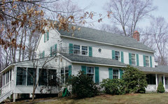
Next week the shutter guy is coming to wash the house and paint the shutters. As you may recall, my thoughts to paint them as well as the front door teal got a big thumbs ups. Well, dh didn't want to paint anything, especially the front door so we compromised. The door will remain white and shutters will get a new color. I've been looking for the right teal ever since but they're either too bright, too dark or too light. So here is what I have so far and I'm hoping someone with a better eye can either point me in the right direction or offer an opinion on this particular shade.

This putty color is the closest match I could find for our house color. It's Glidden Ruffled Feathers and is pretty close, but in certain lighting, our house color seems to have a slight undertone of green in it. It's the color we're painting the new shed.

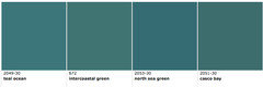
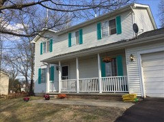
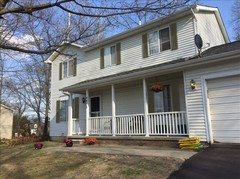
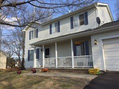
This is the best shade of teal I have found so far, which is Valspar Island Blue, but the paint guy uses SW paint. When I put the sample next to the other shades of teal, it looks considerably less bright but my concern is that homes in the area are conservative with colors that blend into their landscaping. I love the teal, but we don't want to stick out like a sore thumb. If there is something you think would be better let me know too please! Just no plumb or purple, yellow or orange. Here is a new shot of the house, we live on a hill so it's a task to get one at a decent angle!

Comments (26)

  • 11 years ago

    SW Cape Verde


    Poseidon


    Green Bay


  • 11 years ago

    SW Nifty Turquoise


  • 11 years ago

    BM colors


  • 11 years ago
    last modified: 11 years ago
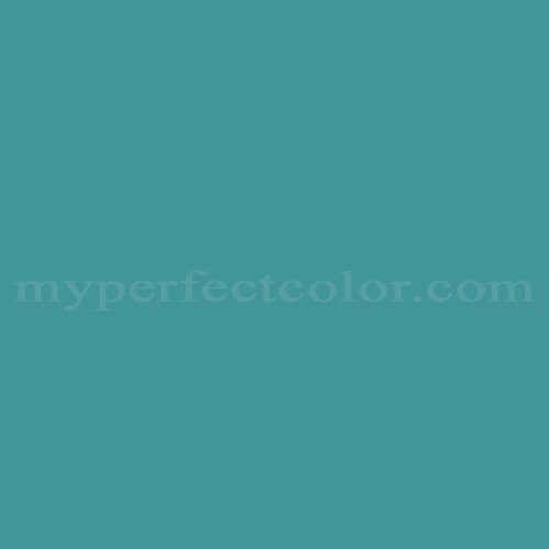
    Thank you for the suggestions, I've found similar colors, SW Green Bay and BM Peacock, they are all very pretty but I'm wondering if in person they would look too similar to the hunter green the shutters are now. Maybe, I need to lean more towards a turquoise or even an aqua tone like the SW Great Falls or even the Lake Shore shown below, too light? Too Blue?

  • 11 years ago

    I honestly think what would look best would be black shutters and the front door painted in the teal or another bright color. I realize you and your husband have already had this discussion, but perhaps the idea of black shutters will allow him to reconsider the color of the front door. You have a farmhouse thing going on there, so personally I think the more classic black shutter and color door will enhance your house's style rather than colored shutters and a white door.

  • 11 years ago

    I think if you want that much color and contrast, I wouldn't do teal. The colors posted say Florida to me. Try googling the names + front door and you'll see what I mean. It's a little garish for your Michigan home in the woods.


  • 11 years ago

    Thanks Tibbrux, I know they're popular, I'm just not a fan of the black, but I have to agree with May and maybe that is why I am fighting all the colors I'm seeing and liking.

  • 11 years ago

    Are you not a fan of black or of black shutters? There is a big difference because color for architecture is very different than one's 'favorite color". For instance, my favorite color is green, but not for houses, interior or exterior. Color is very weird when it comes to this stuff because your least favorite color in the world can be the exact right one for what you're looking for.

    How about a barn red for the shutters and a, yes, black door, or another color? I think what you're struggling with is that your taste doesn't match the architectural style of your home, and it's tricky to stray from a style too far.

  • 11 years ago


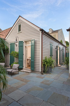
    French Quarter Residence · More Info


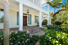
    West Indies House Design · More Info


    Quality Wood Shutters · More Info


    I think selecting a deeper shade will avoid the florida look.

  • 11 years ago
    last modified: 11 years ago

    Tibbrix, that was a good question, I am a big fan of black both inside and out. And I even like when I see black shutters on say a cute pure white bungalow with a bright red door, when done right it is perfection, but our house has almost a minty green tinge in the white and I don't think it will come off looking as nice. Another problem I have noticed while on my color hunt, is that many of the custom looking colors in navy, gray or red look faded. I saw an older ranch not too far from our house that had the teal and it was so fresh and happy looking, plus I admit, I'm just a sucker for color. The other thing is that dh isn't going to budge on painting the door. I agree 100% that is should be painted but he usually lets me do what I want and since he is digging his heels on this it must really matter to him. I think Ann might be right, I did some mock ups and the difference between the darker teal and hunter green isn't as close as I was thinking it would be

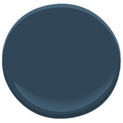
    I'm avoiding reds because that is what another house similar to ours has. Hard to tell but this last one is a shade of black, I kind of like the navy blue too

  • 11 years ago

    I like the black shutters best, they look great with your roof, and in your climate. If you have your heart set on teal shutters, I'd go with a very dark one, like the Cape Verde.

    I agree that black shutters and teal door would look perfect!

  • 11 years ago

    thanks for the feedback, Tibbrix, Ann and JLC. I am in a real quandry.

  • 11 years ago

    Good luck! ;-)

  • 11 years ago

    While I like the deep teal (the ones that appear to have black undertones), I like the near-black. It looks like a dark charcoal on my monitor, and really looks good with the roof. Navy isn't bad either, but I'm not one who usually favors blue but for your style home, it's looking good.

  • 11 years ago

    I would suggest Charleston Green for the shutters (it is pretty much black, with a hint of green). It looks great on white houses.

    When you narrow down to your top three, why not order small cans and paint two posterboards of each and make sample shutters of each one to hang and see how you like them?

  • 11 years ago

    Outside, I like the blue too and am reeeeally trying to envision the dark charcoal but I'm just not feeling it the way everyone else is. Maybe because in person our house isn't the traditional pure white typically seen, or maybe it's that when driving down our road, every single white house has black shutters. I'm still drawn to color.

    Sreedesq thanks for the suggestion, I will take a look at it.


  • 11 years ago

    Don't know if you are still considering teal, but I have used SW Grand Canal and I love it.

  • 11 years ago

    I am!!! Do you have a pic you can post!?! please please please don't make me beg!

  • 11 years ago

    I'm a fan of dark navy, e.g. BM Hale Navy

    Or Gentleman's Gray, which has a little teal going on and would go really well with your house color.


    gentlemans gray with coordinating colors

  • 11 years ago

    Gentlemen's Gray goes great with your orange and burgundy flowers too!

  • 11 years ago

    I'm sorry Lurkkish, I just don't have the ability to post a pic. online. I went through a lot of different teal paint samples before I chose the SW Grand Canal. I painted a poster board for each sample and taped it to my door to see what the color looked like in my west facing light. My siding is a true white and it really stands out without being garish. If I can get a picture of it and manage to post it I will. My house is tiny and has a "cottage" look to it being tiny and white, and older. I get compliments on it from the neighbors.

  • 11 years ago

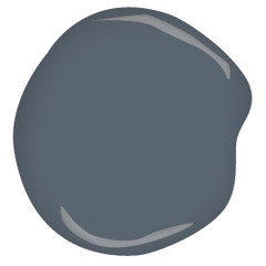
    It's a rich blue with a bit of gray in it, and I used it in my living room below the chair rail, not outside. But here is a picture (not mine) of Ben Moore Andes Summit. I chose it to show you as it has a color that could represent your house body color next to it.


  • 11 years ago

    That's ok Katrina, I still appreciate the color suggestion. I have the SW fan deck and it is a very pretty color and especially perfect for a cottage look.

    My3dogs, thank you so much, I had to put this down for a day or two to just mull things over. The more I look at the navy blue(s) the more I'm drawn to them. I like that it isn't so bright but is still a color with presence. I have the color booklet for the BM Williamsburg line and there's a color in it called Washington Blue. In person, it looks similar to the way the Andes Summit looks on my screen. I'll run to the store tomorrow and get a sample of the Andes Summit. It looks great in the pic!

  • 11 years ago

    Nosoccermom, That hale navy is popular and in line with what I'm leaning towards instead of the teal. I saw it in the store and it's really pretty. I like the other color too but think It may be too dark.


    I don't know if its a local thing or nationwide, but the Benjamin Moore store I go to has started charging a dollar for each of the pre-painted sheets they carry. The girl told me the store donates all sales towards finding a cure for Parkinson's. Our neighbor has that so I am going to buy the sheets for these colors and any others I find interesting.

  • 9 years ago

    I ended up using Newburgh Green, which looks like a deep blue green teal.

    You can see them here and I hope it helps.


    Shutters are painted!